Given that many individuals can still not leave their houses, operating a business online is the optimal response to the society we live in. However, every business needs to be promoted, and web banner advertising is an extremely efficient way to achieve this on the internet. Therefore, this post will go through the fundamentals of web banner design (dimensions for web banner), so you can design your banner.
When someone clicks on your banner, they will be taken to a landing page on your website, where they will be presented with an offer. Read more about how to make a personal banner in web on these pages if you have any questions about the process.
Dimensions for Web Banner

Every major website, including Google, Amazon, Facebook, and LinkedIn, has its unique dimensions for banner ads. However, here are the several dimensions for web banner from which you will be required to choose:
- Leaderboard: Located at the top or bottom of a web page.
- Skyscraper: Vertically oriented spaces that can be positioned on either the right or the left side of a webpage.
- Wide skyscraper: Long and rectangular. Skyscrapers, and particularly wide skyscrapers, are notoriously difficult to notice.
- Half page: Large area with plenty of space for additional graphics and visuals if required.
- Medium rectangle: a rectangle of moderate size.
- Large rectangle: A rectangle that is somewhat larger than medium in size.
- Mobile leaderboard: Suitable for mobile interfaces.
According to Google Adsense, the following forms of web banner advertisements are the most successful:
- Leaderboard: 728 x 90
- One-half page: 300 x 600
- Medium rectangle
- Large rectangle: 336 x 280
The web banner size criteria are revised on an annual basis. Thus it is in your best interest to design according to the standards. You can waste work and incur additional costs if you choose a size that deviates from these norms.
How to Design Web Banner
Within the first couple of seconds, a well-designed online banner will be able to grab the reader’s attention. When making a web banner advertisement, seven stages need to be taken:
1. Utilize a visually rich image
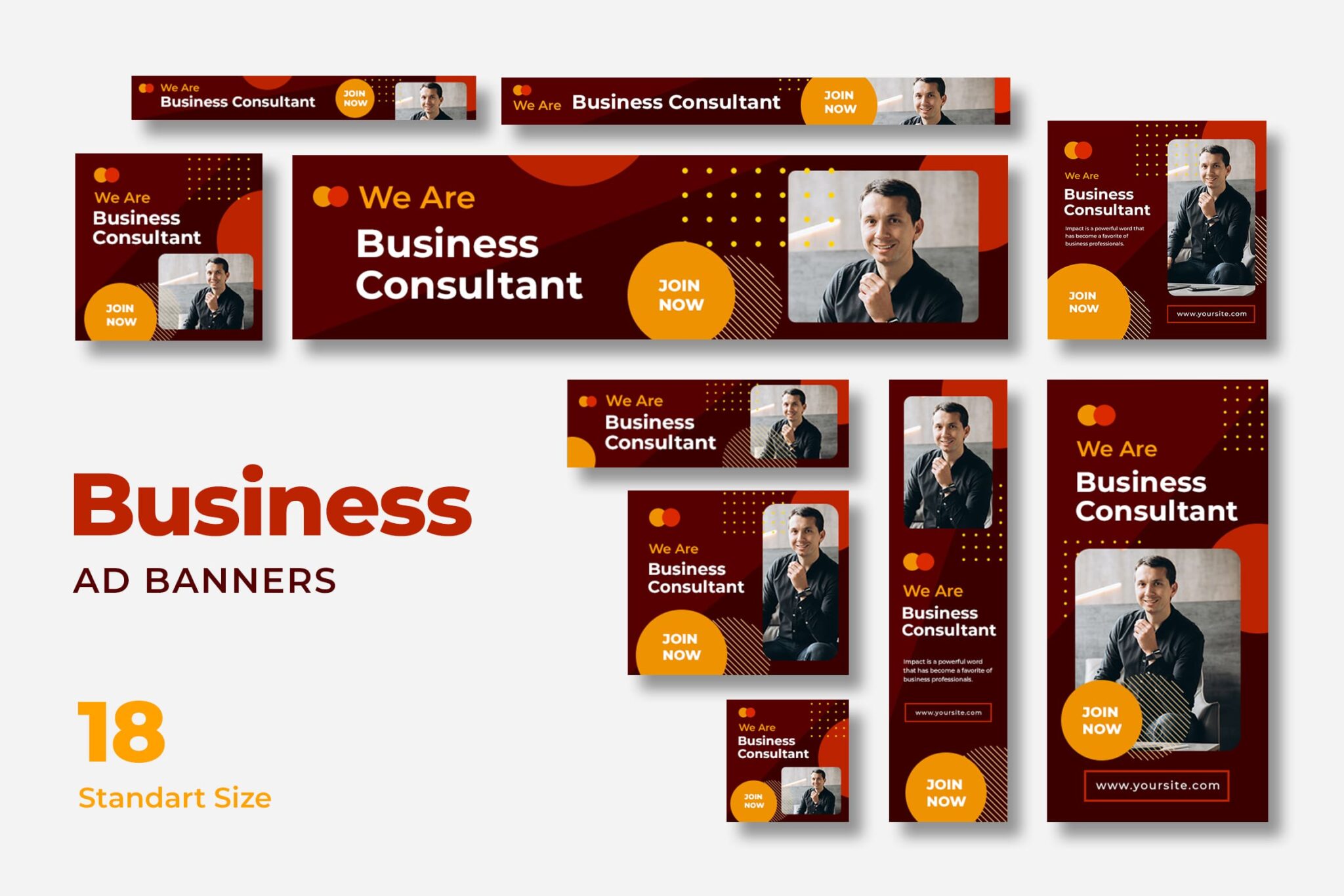
The ability to process visuals is approximately 60,000 times faster than the ability to process text, as shown by scientific investigations that were carefully calibrated. However, a picture that is too generic will probably not attract much attention. You should either make your photos or choose ones that would encourage potential customers to pause and read the text.
Remember that the image on the banner will serve as the viewer’s initial impression of your brand. Your advertisement will receive more hits if it is fascinating, innovative, and emotionally engaging.
2. Static or animated Web Banner?
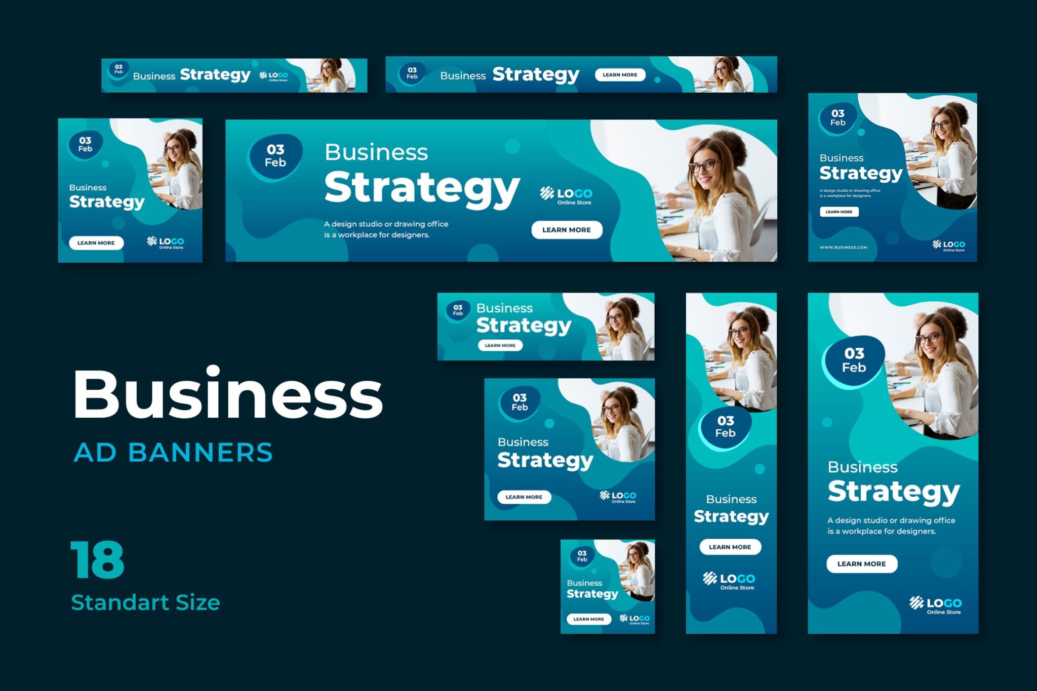
A static web banner design does not move and instead consists of a still image coupled with text in a JPEG, PNG, or GIF format. These are not interactive. Thus, people tend to pay less attention to them.
Generally, GIF, HTML5, or Flash are used as these formats. The most user-friendly option is HTML5, which does not require the installation of any other software plugins to view the advertisement. Additionally, HTML5 is supported by every browser. However, animated GIFs can have a quality issues, and those who want to view Flash files need to have the appropriate plugins installed on their computers.
3. Pay attention to selecting your colors
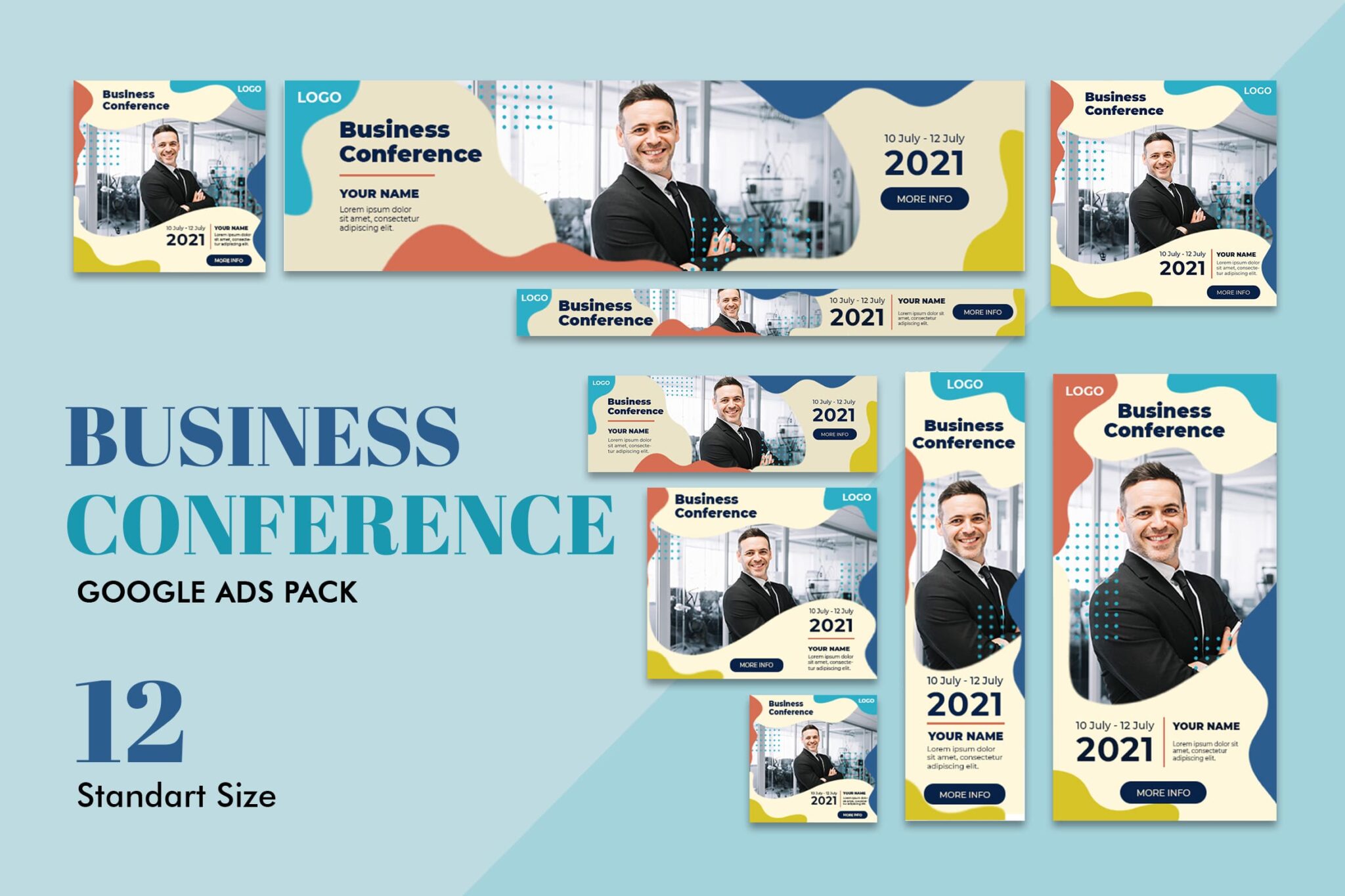
One of the most effective methods of nonverbal communication is using color. It gives rise to powerful feelings and directly impacts the degree to which one is liked. For this reason, color is an important choice when designing the banner for your website.
There’s a good chance that something as unassuming as the color of your product is the driving force behind whether or not it sells. The all-powerful subconscious often influences conversions!
Because men and women choose color palettes differently, it is essential to research the most recent findings regarding color preferences before developing a banner for a product explicitly geared toward one gender.
When designing the banner for your website, remember that different colors create different feelings, and choose hues that best represent your company, even if either gender may wear the product you sell.
4. Keep the length of your call-to-action to a minimum

The user must be directed to your website after the banner successfully draws attention. This is accomplished by including a call to action on the banner.
More than 200% more people are reached by banners with CTAs than by banners without them. If you want to boost the number of leads you get, you should include a call to action (CTA) that is easily visible and has essential content geared toward action. This will encourage the reader to click and go to your website.
5. Maintain a clear image
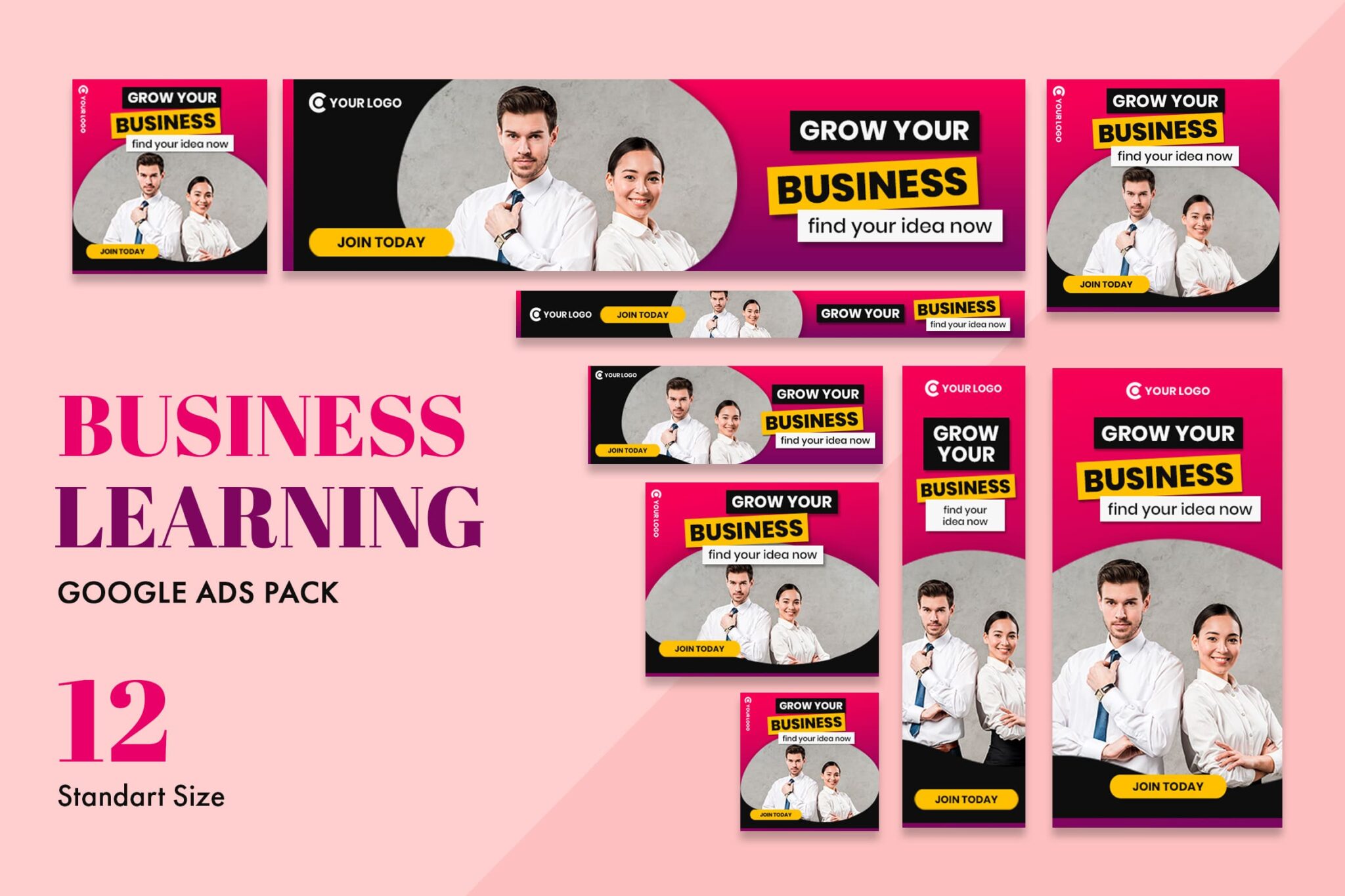
Maintain the preciseness, concision, and concentration of the web banner. Steer clear of clutter and focus on conveying a single, engaging message to the visitor of your website. This should encourage them to check out your site.
Unclear messages will only result in inaction, and the objective of a banner will no longer be served in its entirety.
Typically, a web banner will consist of:
- A logo\sImage
- Activation button with a call-to-action line of text
- The less complicated you make it, the less of a distraction it will be.
6. The Text for Web Banner
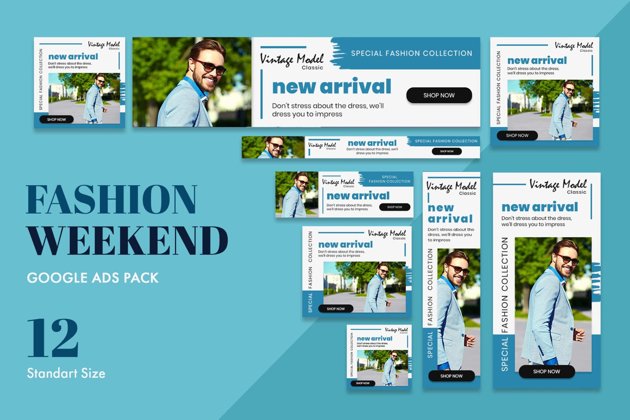
Check that the headline and the rest of the text are easily distinguishable and set in different type sizes. The copy should be brief and not go on for more than three or four lines. You shouldn’t use more than two different fonts at a time. When writing in cursive, you should avoid using fonts.
7. Make the most of the sense of urgency
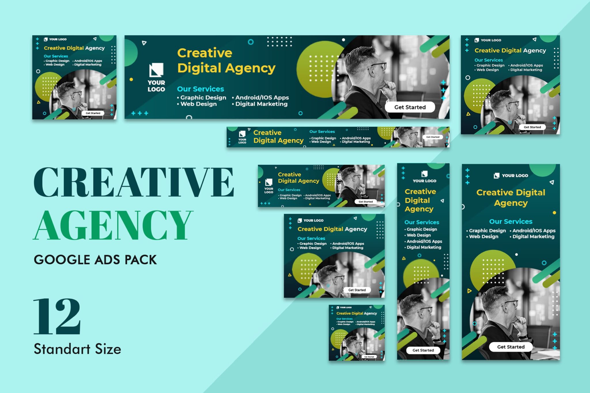
A sense of urgency should be conveyed to the viewer of a web banner advertisement through the accompanying text and visuals. Applying contrasting and vibrant colors is one approach to accomplish this goal visually.
The text needs to be appropriate, well-thought-out, and have the desired impact on the people reading it.
Conclusions
Your company’s growth may accelerate dramatically if you use banner ads. To review, the following are the fundamentals of creating an eye-catching online banner: Include a message that is clear, uncluttered, and appealing, as well as imagery that is potent and evocative. Incorporate a feeling of enthusiasm and urgency, and differentiate yourself from others to be recognized. The key to being successful in the digital age has a web banner design that has been well considered.
If you don’t have any skill in designing your web banner, you can use UI Creative collections of web banner templates. You just need to adjust the color, images, and text. It’s easy, isn’t it?
Also Read : 10 Best Premium Caligraphy Font
Also Read : 10+ Signature Fonts for Logo and Branding
Also Read : How to Choose The Right Admin Dashboard
Also Read : Boutique Flyer Design Ideas to Grab Consumer
Also Read : 8 Ideas to Create Website Background Design
Also Read : 10 Best Handwritten Font for Design Graphic
Also Read : Tips on Choosing Best Website Template
Also Read : 7 Steps on How to Design Web Banner
Also Read : Tips on How To Create Packaging Design
Also Read : 7 Things To Consider Making Pricing Template
Also Read : 10 Tips to Improve Instagram Feed Template
Also Read : Ultimate Guide: How to Create Flyer Design


