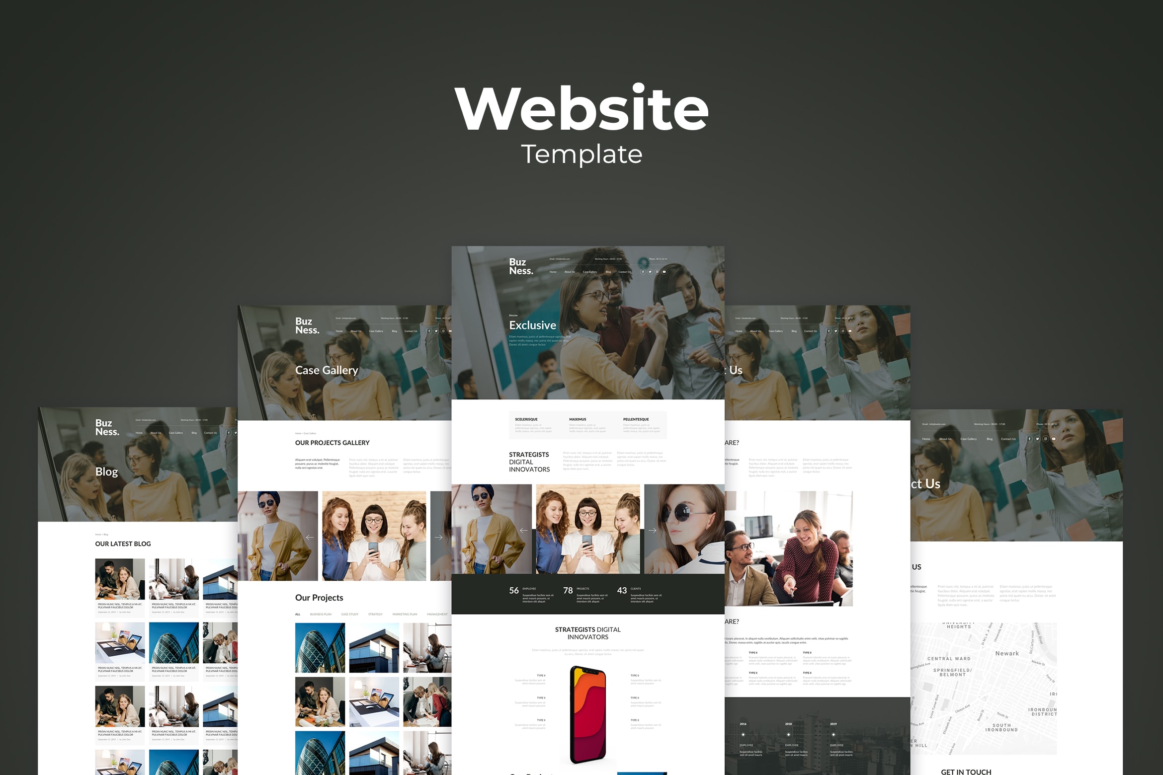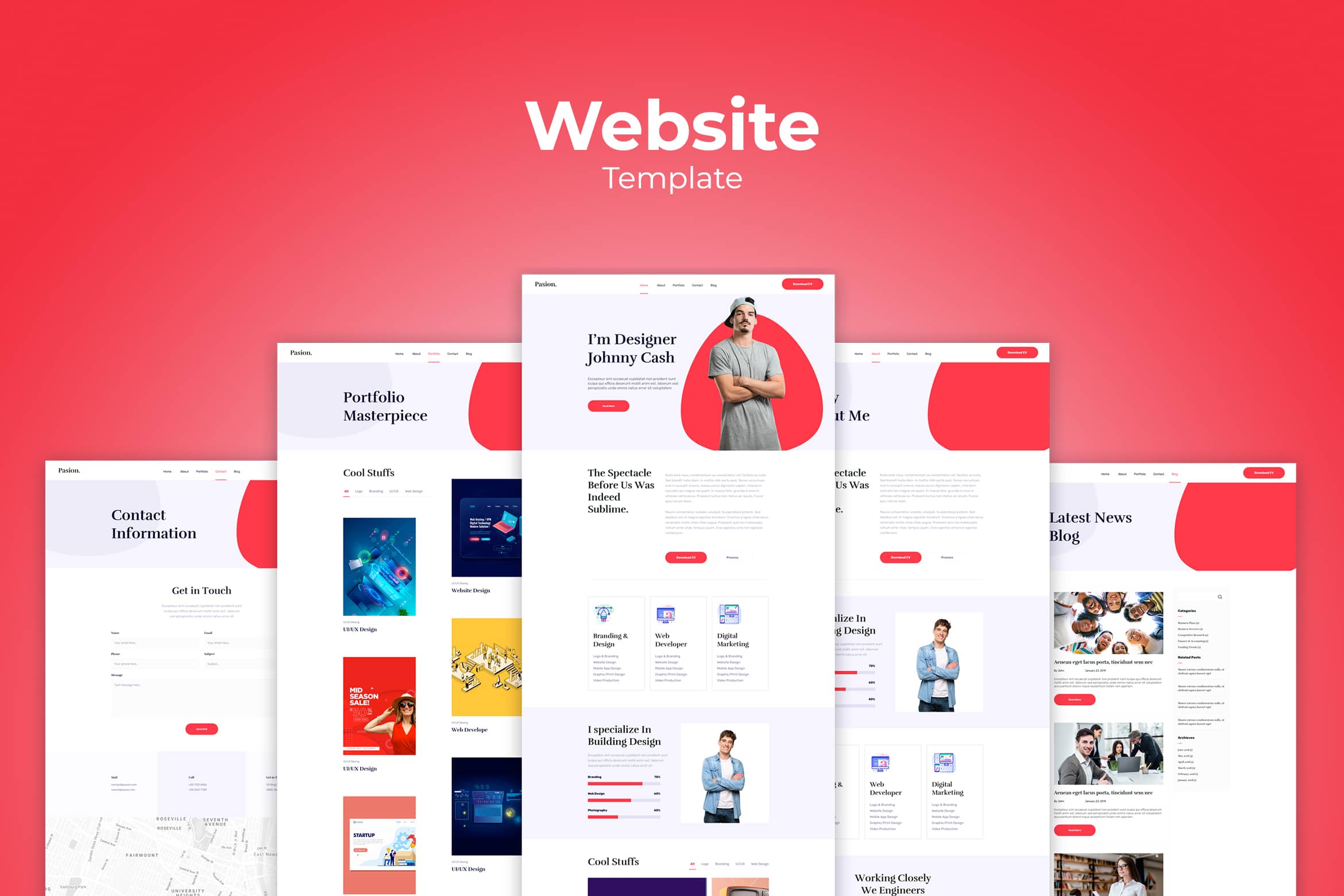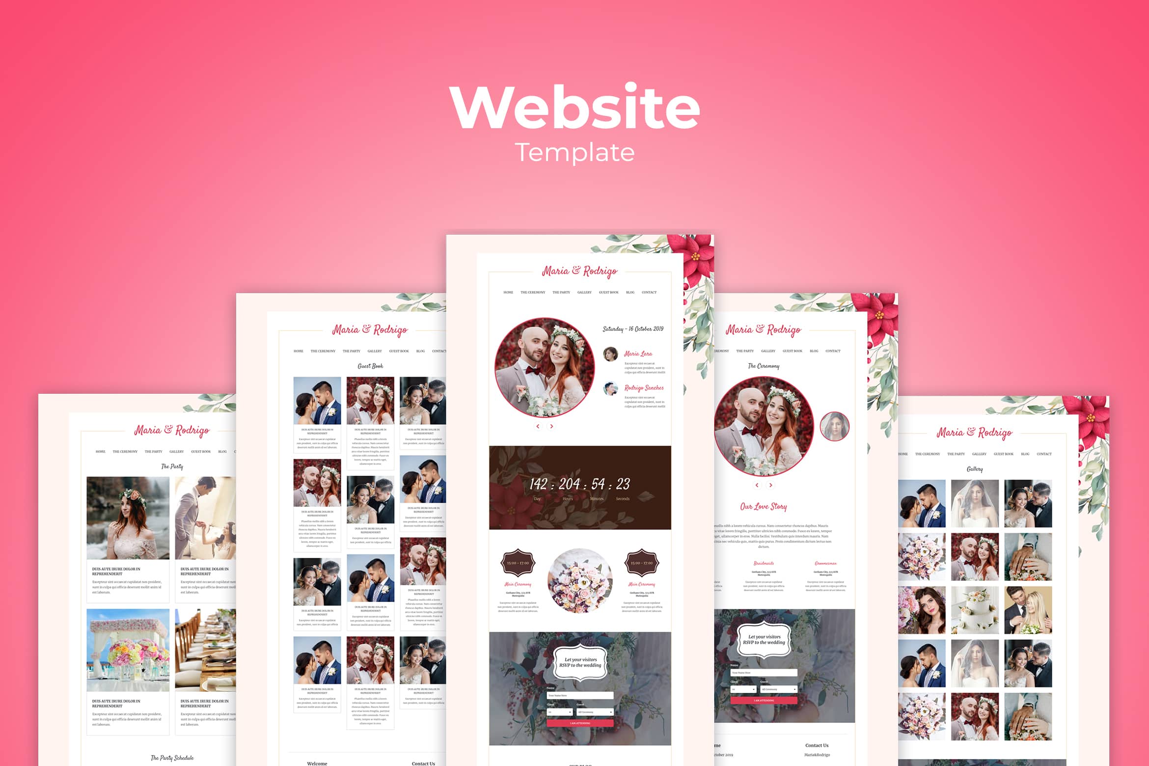
UI Design Rules Before Applying Website Templates Design
in How To, Inspiration on December 19, 2023Website Templates Design becomes the brand or company awareness. You could design it well after you know UI design rules. The user interface brings new visual effects for Website Commerce Template Design. Let us begin with the rule!
a. Get to Know With User Interface (UI)
The interaction from internet users with your website is managed by UI design. The best one will allow users to skip technical components and they will only get what they want. The process is quite distinct. You should notice the difference between Ui, UX, and web development.
UI design enhances user experience on digital interfaces such as navigation menus, buttons, typography, and icons. An integral part of this is considering user comfort, such as the implementation of features like Google Chrome Dark Mode, which demonstrates how color schemes and visual settings can significantly impact the user experience. The focus remains on helping users have a pleasant and smooth experience with the website’s use and visual appearance.
b. Common Forms of UI to Help You Decide Website Templates Design
Before you make or decide on website commerce template design, here are some common forms of UI to notice.
- Voice-controlled interfaces including it sound and interfaces that require voices to initiate an action. These are becoming more popular these days. Some examples are Apple’s Siri, Amazon’s Alexa or Google’s Bixby.
- Graphical user interfaces: It is the visual representation of buttons, menus, or control panels, essentially anything that a user will interact with. An example of this is your computer’s desktop or your mobile phone’s interface.
- Gesture-based interfaces: Including user’s gestures that affect the action of a product. An example of this would be Virtual Reality games.
Each of these design modes enforces a different set of limitations upon a designer. You must be studied carefully to allow users to have the most seamless experience possible.
c. Check the Good UI (Not Only by Checking Its Website Commerce Template Design)
A good UI design should be carefully organized. You need to know what you want to achieve. Sometimes it is easier to know the app or web you want to create than to set the rules. However, you need to keep in mind that:
- The UI design should be accessible
- Help users to complete their tasks easily and quickly
- Simple and pleasing
- Focus on your service and products as a bridge for customers
- It offers assistance, so people could interact and navigate in a way they choose.
When all of these elements are combined, you’ll end up with a UI design that is both simple and powerful. It is possible to you to allow users to achieve what they want to quickly, and without searching through multiple pages to find the necessary information.
d. The Basic Rules Before Take an Action of Website Templates Design
Here are some rules to note before you make a great website templates design.
-
Good UI design is consistent
Make users notice your consistency not only in your template design. Every element should indicate your products and services. Develop your brand first and manage the consistent texts and colour schemes, so your user never wonders if they are still on the same website.
A colour and branding scheme can also be used to indicate to your users how to use your website. Colours can make it easy for users to recognize the important functions of your website. Users can easily find similar actions they are looking for by simply scanning the website. Remember to be consistent because if you make different colours, fonts, and buttons in every action, it just makes users hard to find what they need.
Similarly, creating a button with the same font, size and colour for two different actions can confuse. For example, you would never want both your “cancel” and ”submit” buttons to be the same colour. It will bring a complicated action for users.
2. Good UI design avoids making the user work too hard
You can make it happens if you remove as much work as possible from your website. UI websites can use many techniques to do it like making text readable and more complex process.
To get started on reducing work on the user consider the following:
- Visual clarity
It means how you arrange the elements on your webpage. It is to show how important it is. For example, buttons or links that are larger and more colorful will attract someone’s attention.
You can also provide plenty of visual cues to the user. Provide visual aids and reference points to help guide users through your interface. Try to make navigating your website as predictable as possible. You never want a visitor to be wondering what a button or link is for or where they are.
- Balance of text and images
To reduce the amount of text that you have on your website, you could do it simply and it will balance your image and text. Website visitors already have a short attention span. It is forcing them to read through long blocks of text. It isn’t going to make things any easier for them. Users should be able to scan through and easily identify the sections and information they need to find even only at a glance.
- Simple process
Users should get their goal in no more than three mouse clicks. Therefore, most functions of your website should follow this three-click rule.
3. Good UI design puts users in control
Organic Food RestoGreat UI design makes it easy for users to navigate your website in the ways they want to. They are empowering them and instilling a feeling of control. You should ensure that your website works for your users. Do not forcing them to learn a complex user interface in order to access your services.
The most common things to consider if you want to apply this rule are:
- Include some kind of main menu or anchor with links to commonly used pages. It will help users easily navigate your website.
- Provide feedback when a certain action is completed or the result of an action. For example, creating a password, let the user know what meets the requirements and what is missing.
- Make it easy for website visitors to backtrack and go back to a previously visited page. It is easier to use and it also encourages users to explore your website and allows them to be in control of their journey.
- Provide real-time updates of system status to prevent impatience in users. For example, when a request on the interface is completed. The users can see a status update in the form of a linear progress bar that moves through “processing,” “delivering,” “downloading,” and more.
- Provide visual and word labels. Make it clear what tab is for which action by using common symbols as well as clear labels.
- Going a little further on the same subject. Error messages should be carefully crafted to avoid inciting frustration. Error messages should include links to pages that might be helpful for the issue they are having, such as a link to reset a password.
- Enable auto-save to avoid users losing their previous work when a button is mistakenly clicked.
4. Good UI design makes the user comfortable applying in website templates design
It means ensuring that all visitors to your website feel comfortable and confident when they are on your website. Some ways to do this are:
- Avoid jargon
Don’t use language that your audience won’t understand. However, it is better to know your audience scope of ages. Think about your audience and use the terms and language they would know and use. For example, some individuals who work in the clothing industry might refer to the offer “buy one get one..” as BOGO, but placing “BOGO free” on your website to promote the offer wouldn’t make sense to many visitors. And it might confuse and deter customers from your website.
- Be inclusive
Inclusive language is important to help users be quick on travelling around your website. If you want to be a professional, it takes time. However, you still have another option than learning all by yourself. It is not a sin to have a ready-to-use website templates design. Even when you want to build website commerce. You can start it now by checking the collections in UI Creative. We are here to help you on saving your time, effort, and fund.
You may not skip UI Creative from your professional helper list. It would help you to get the great banner and sure all you have to do is just browse and click. Select the one you desire and save it for the future. Is there anything you want to have in your website – wanna- be? The template affects your website visitors’ impression. When you would like to have great brand awareness or company awareness, start by having an appropriate and consistent template. Try it first, but if you do not want to waste much time, it does not matter to take one from us and try to organize it as yours. Invest in the beginning is better than too late in the end.


