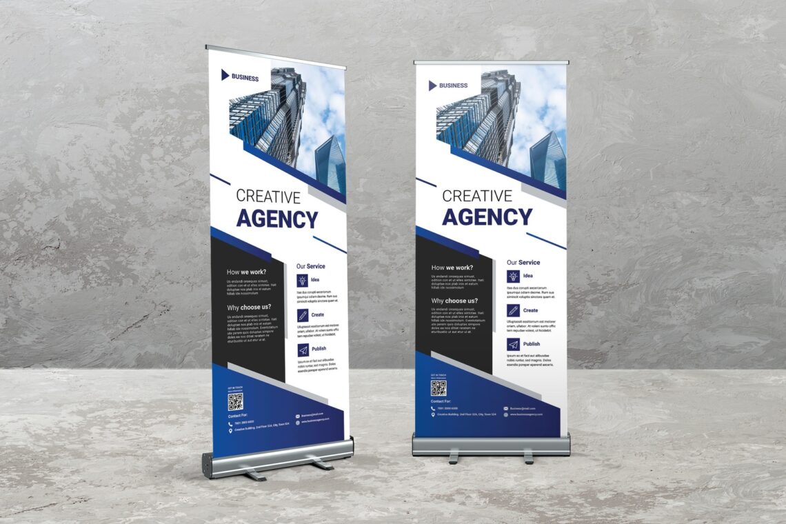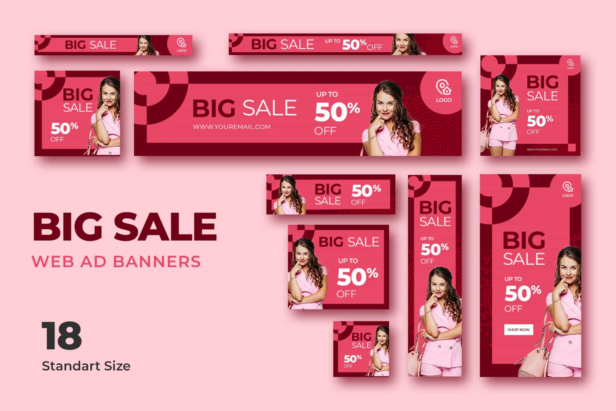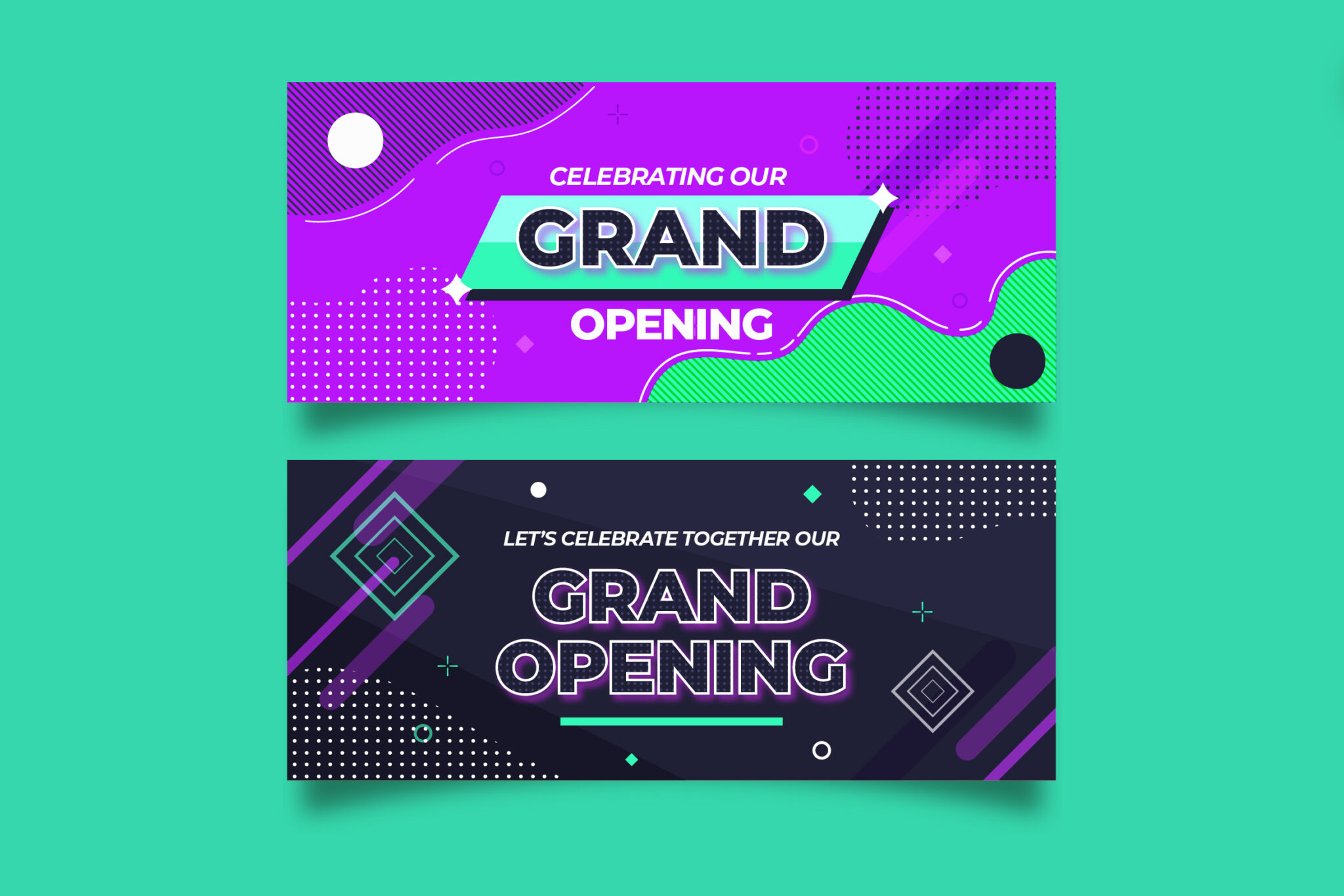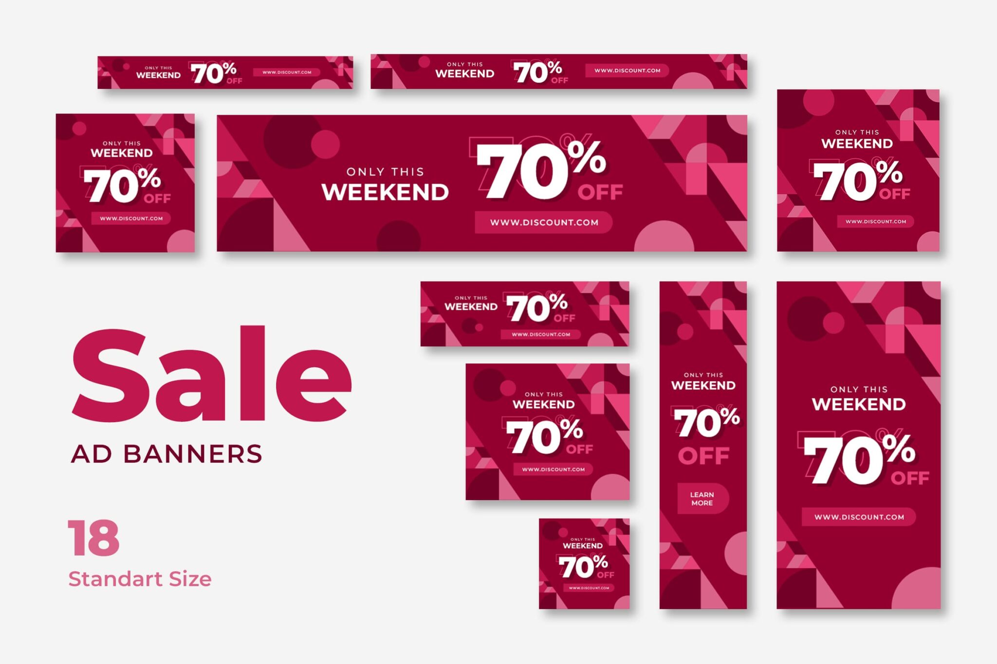
The banner template advertisements are one of the most common types of online advertising used today, and they serve as a primary revenue generator for many websites. The idea behind it is straightforward: in exchange for payment, site owners make available a portion of their layout that an advertiser can occupy in the form of a banner ad (a banner design template).
However, just like any advertising, the success of a particular campaign can be easily undermined by an unappealing design. But, a web banner template is different from a printable banner template.
Creating a banner ad that it will feature on another person’s website is distinct from the process of constructing a whole website for the same reason using your domain name. The design process has hurdles, such as restricted space and control over positioning. Still, with careful planning and attention, these challenges do not have to have as significant of an effect on your advertisement as you may expect.
Measurement, standardization, and detailed description
Because the vast majority of banner design template is designed specifically to be displayed on the websites of other businesses, to be more specific, a website over which the designer does not have control of the design.
It is required that several decisions be made by the general agreement held within the industry. This aspect is more significant when managing a campaign not limited to a single region.
The Interactive Advertising Bureau, often known as IAB, maintains a specification of the criteria to which most banner advertising conforms. Using this as a starting point when developing your advertisement is brilliant.
What size illustrator template for a banner?
The IAB Display Advertising Guidelines provide information on standard ad unit (banner template) sizes. It ranges from enormous 970 x 250px Billboards to more minor 300 x 250px Sidekicks. Then, older, “delisted” units are gradually being phased out in favor of newer, more up-to-date ones.
That is fantastic if you already know where your advertisement will be displayed and understand the dimensions of that area. However, if you do not, limiting yourself to the proportions recommended by the IAB will ensure you have the best chance of compatibility when you discover a place.
On the other hand, the IAB’s recommendations cover a lot more ground than just the size of the advertisement. In addition, the Bureau releases rules on specifications, such as the maximum video frame rate, the limit of the Z-Index of the unit, and the maximum file size.
Even though they are merely principles, adhering to them is a good practice that may help ensure that your advertisement will be as technically efficient as it will be aesthetically pleasing.
Clear copy and images banner template
Chances are a user didn’t seek your ad. Instead, they’re here to read another article and see your banner template ad. Since consumers aren’t seeking your ad, graphics and explicit content is crucial.
Apple-style ads with one image and a few words aren’t necessary. The ad isn’t meant to replace a website or other media. Instead, trim your ad to what will interest a user. Offer readers a reason to click, but don’t use an excessive marketing material.
There’s no cookie-cutter advice for banner template ads in this regard. Take the time to understand what you want the user to do when they see your ad and design accordingly. Keep it basic but intriguing.
Call To Action (CTA) – Banner Template
You should consider the Call to Action and your banner template ad’s other persuasive features. Also, the primary point of any advertisement is for the user to engage with it. Your CTA could be a button, a QR code that leads to a particular webpage or video, or anything else you can think of.
Users will not take action until your ad gives them explicit instructions. To increase the likelihood of a successful conversion, your ad should encourage the reader to “find out more” or “purchase it now.”
As such, you should prioritize creating a visually prominent CTA. Also, it makes it abundantly evident what you want the viewer to do next in the design of your advertisement.
The integrity of the plan
In the same way, a website should have cohesion between the various pages that make it up. An advertisement’s visual design should be pertinent to the website’s content to which it directs you.
The user’s experience is severely degraded when they click through a website with little to no visual relationship with the advertisement they initially saw. This will undoubtedly cause the majority of users to abandon the process.
Your advertisement should use colors, graphics, and fonts that are similar to, or ideally identical to, those used on your website. This will allow users to become partially habituated to your website before visiting it.
Because it is crucial to keep people on the course and not let them drop off when they question where they’ve ended up, it is essential to emulate the critical design decisions of the target in your advertisement. For example, you wouldn’t expect an ad for Coca-Cola to be built up in Pepsi blue.
Responsive design banner template
Lastly, considering the responsive banner template design is essential for future-proofing your advertisement designs and maximizing their effect across several screen sizes and devices. This is because responsive design adapts its layout to the screen it is being seen on. The development of responsive advertisements is becoming an increasingly important factor in achieving success.
You should provide advertisements in various sizes when designing a campaign for a website (or websites) with responsive designs implemented. However, it would help if you considered that the changing form of the advertisements does not invalidate any of the other points we have already brought up.
Conclusions
Designing advertisements is complex since having an eye-catching layout that does not irritate users is essential to the campaign’s success. If you use just a little bit too much animation in your advertisement, you run the risk of preventing any engagement with it.
If, on the other hand, you make sure that your advertisements go right to the point and include a compelling CTA that links to a website that has visual cues consistent with the original ad. Visit UICreative collections of banner template now!


