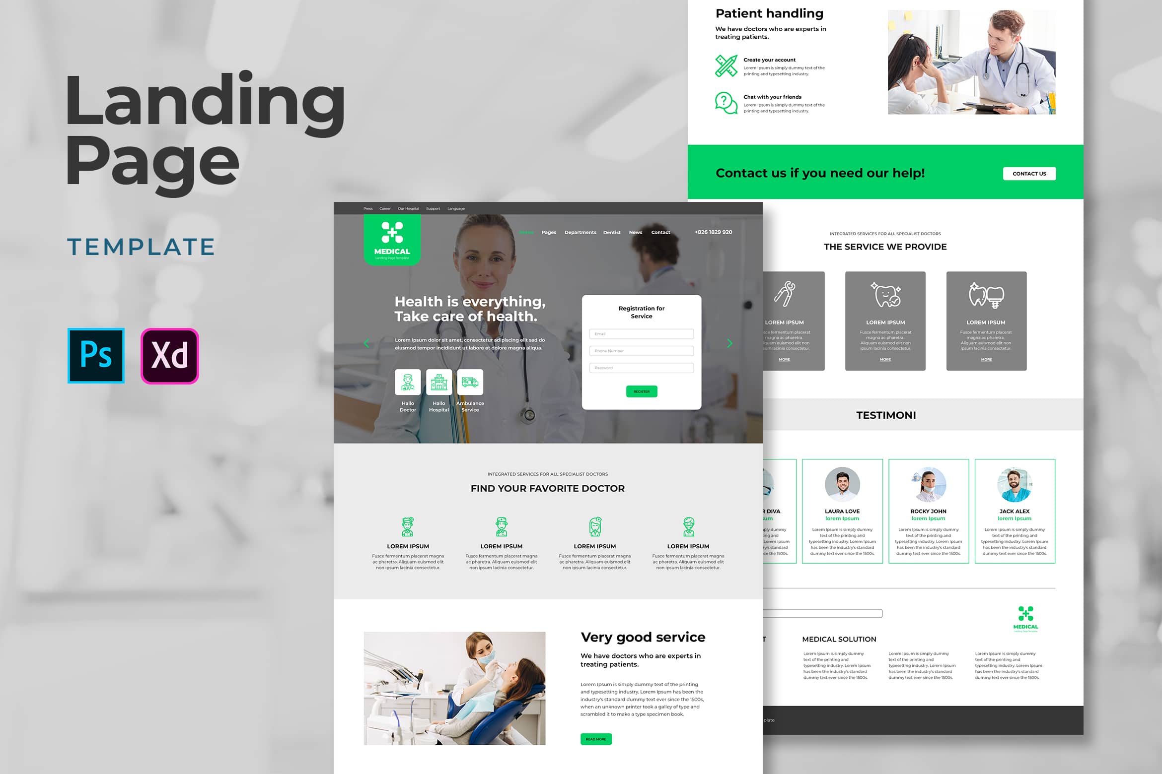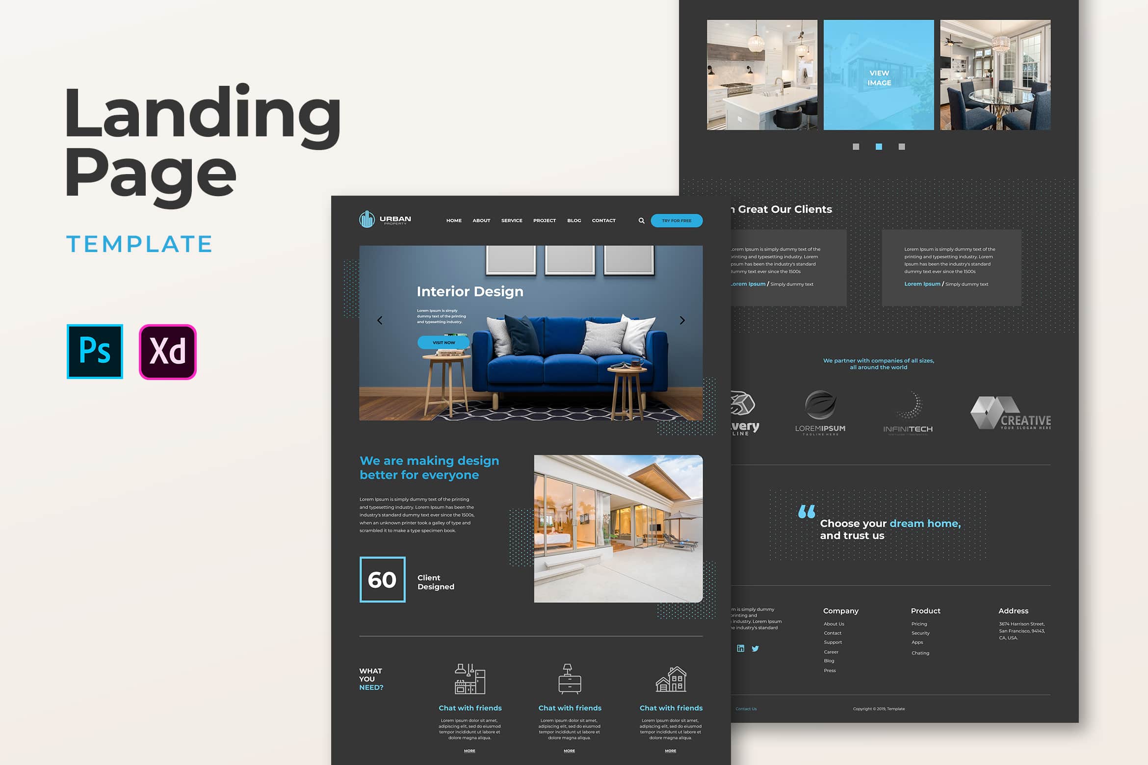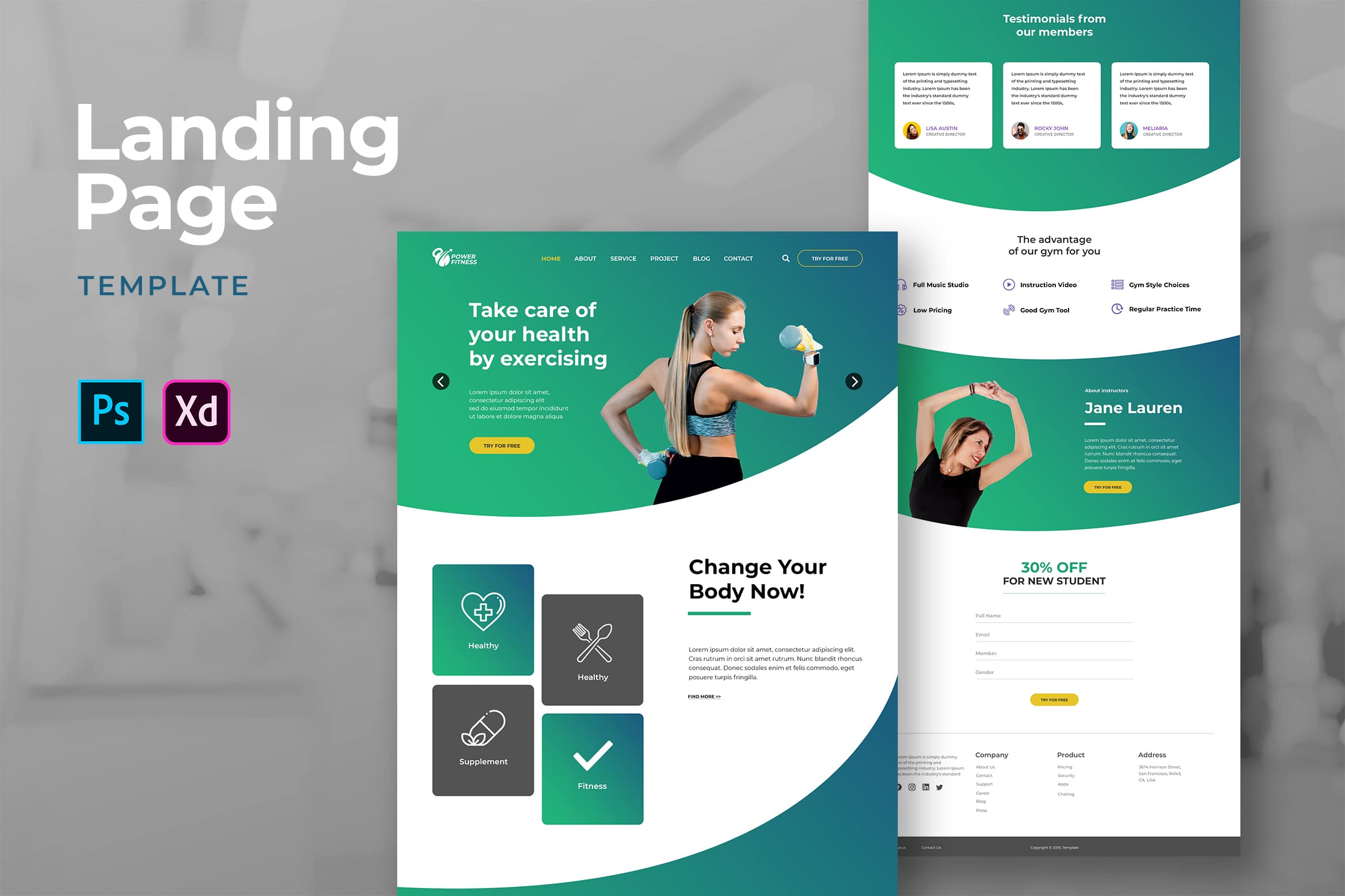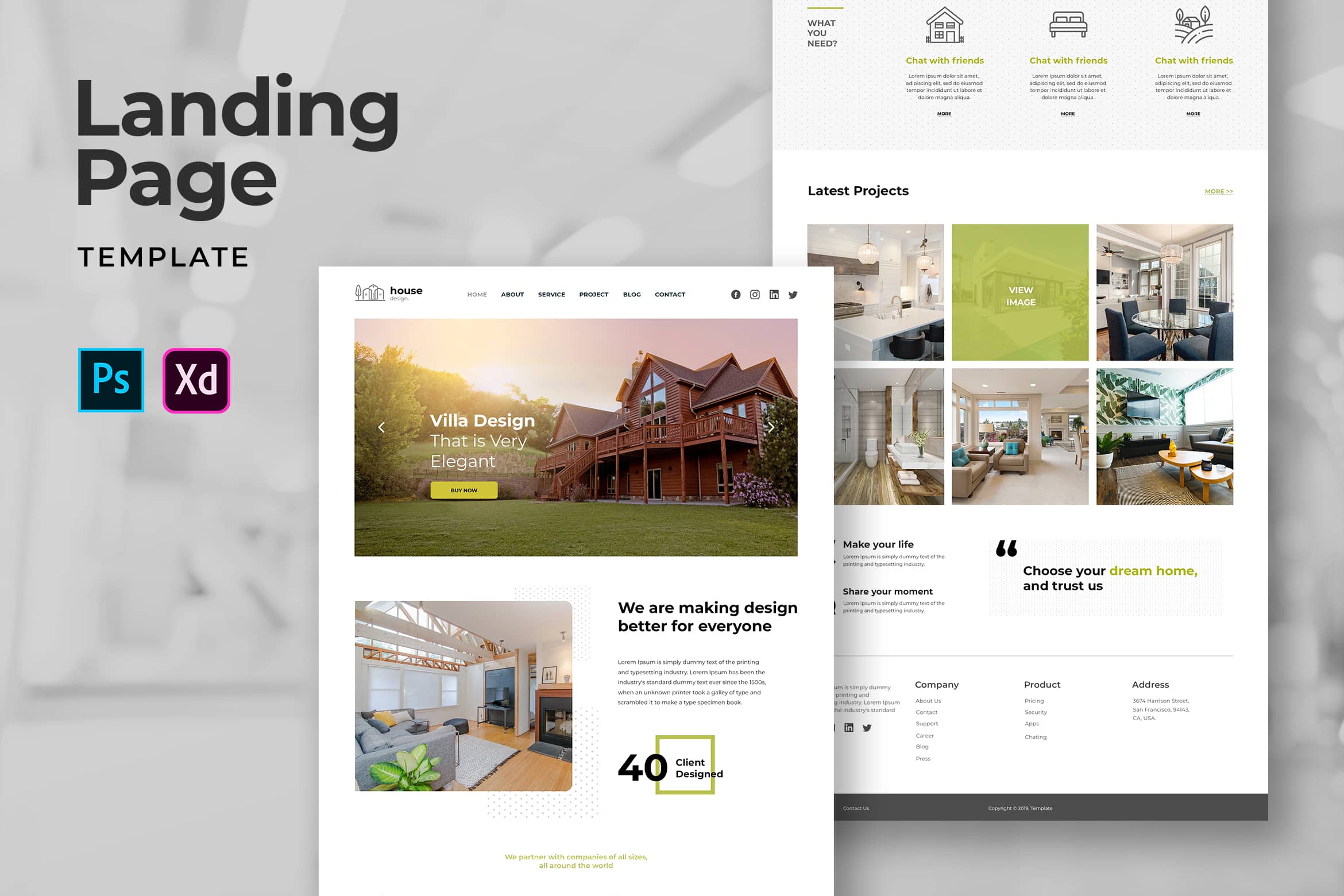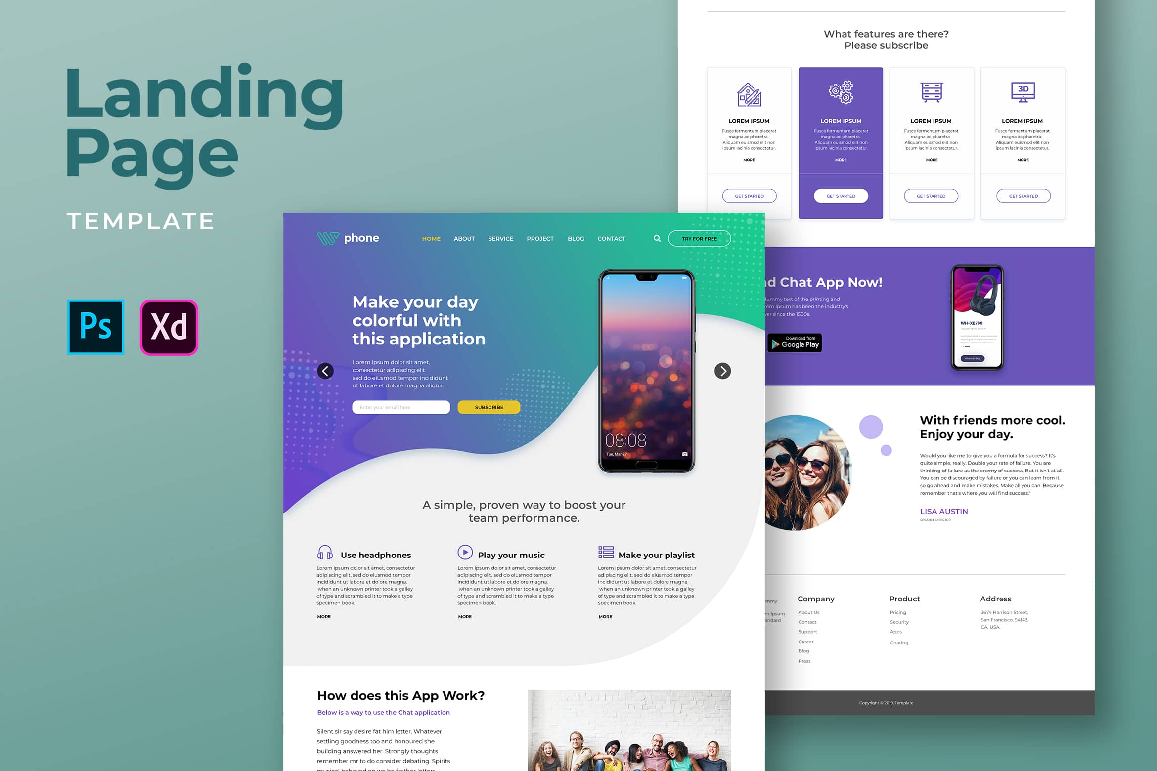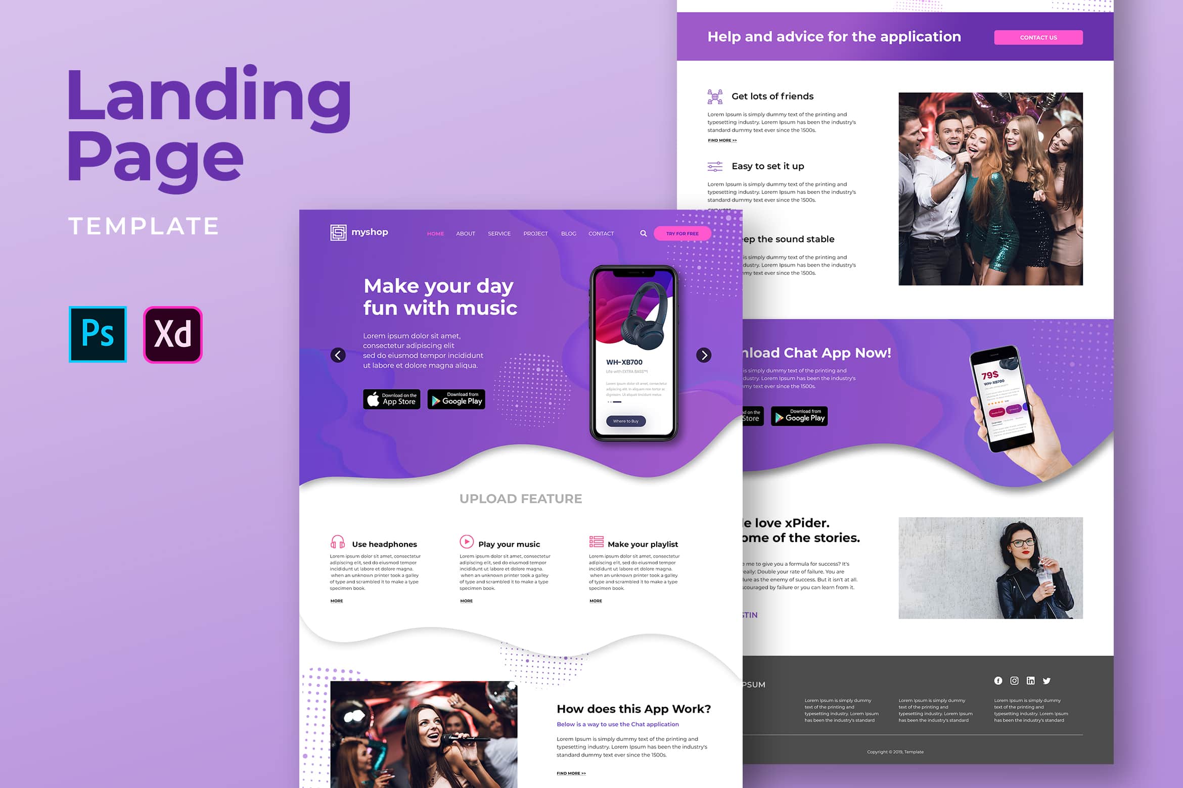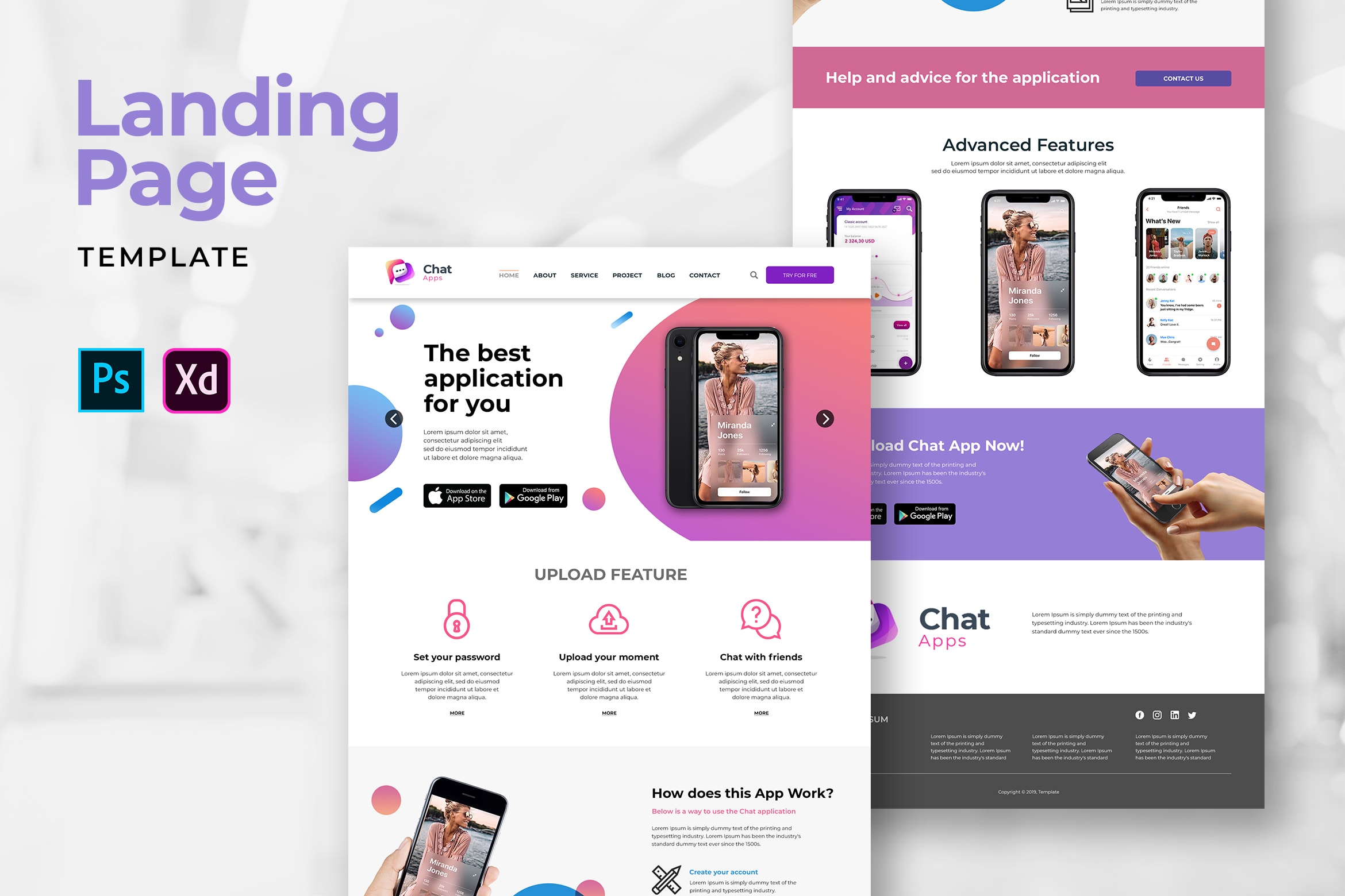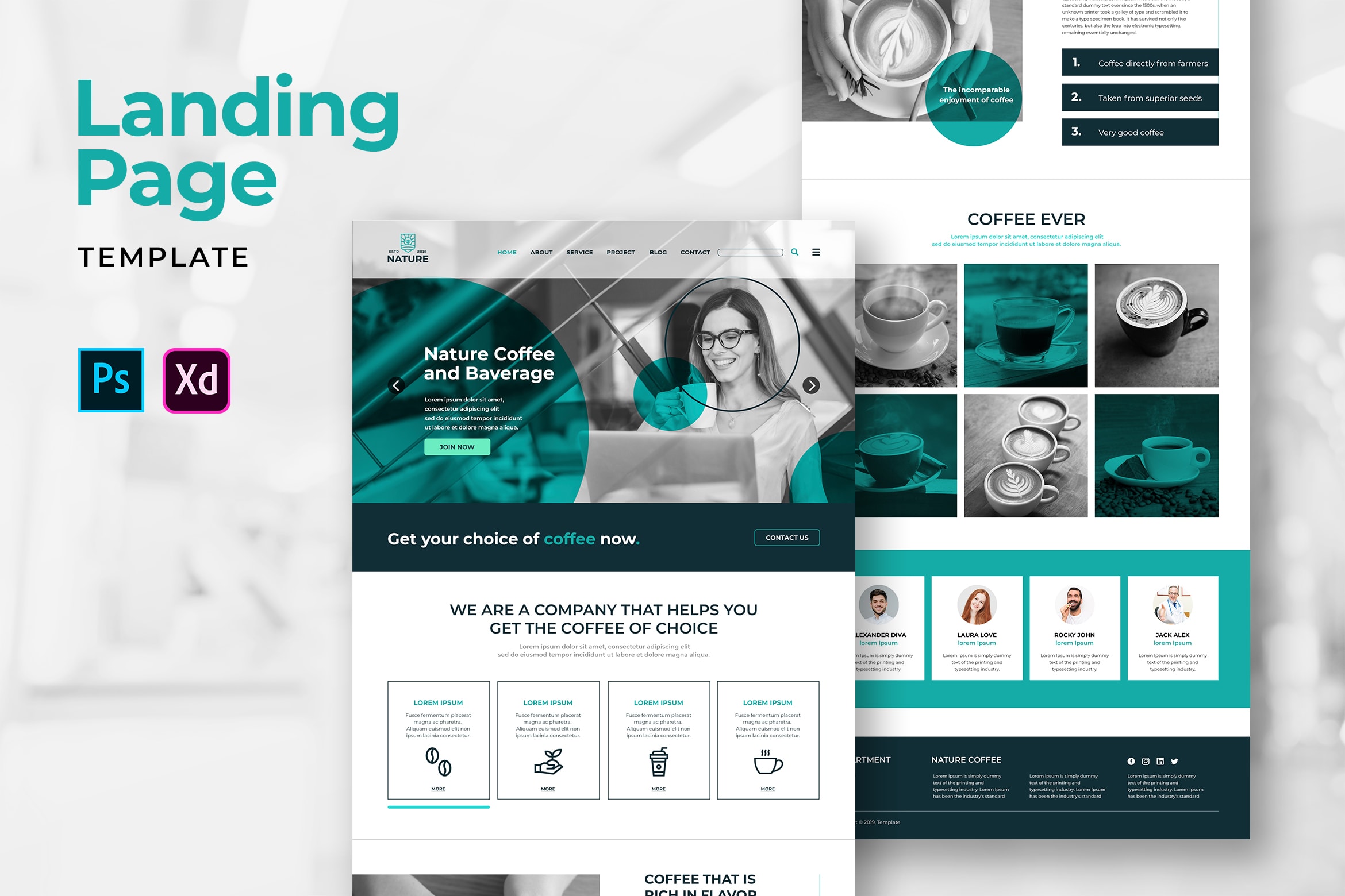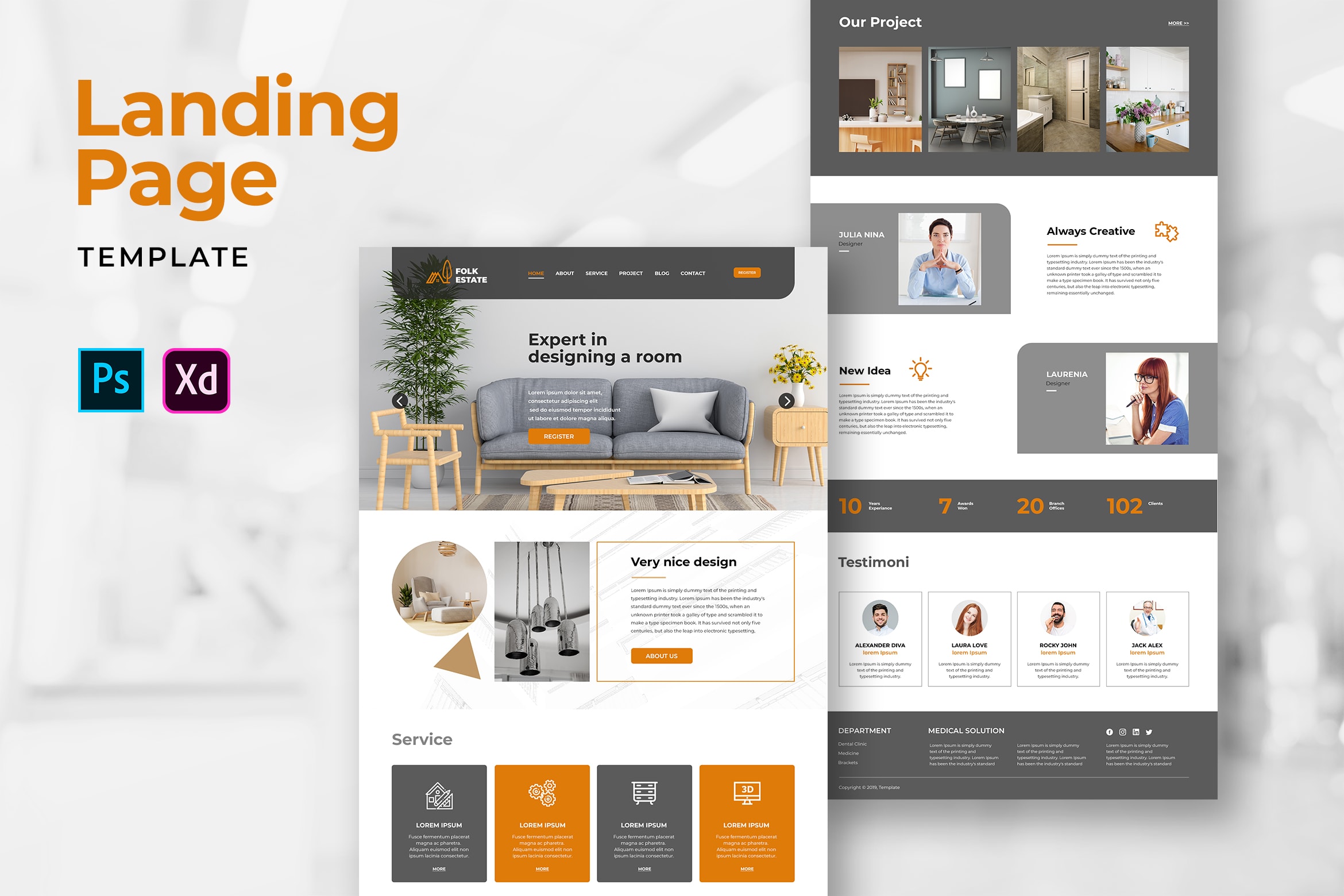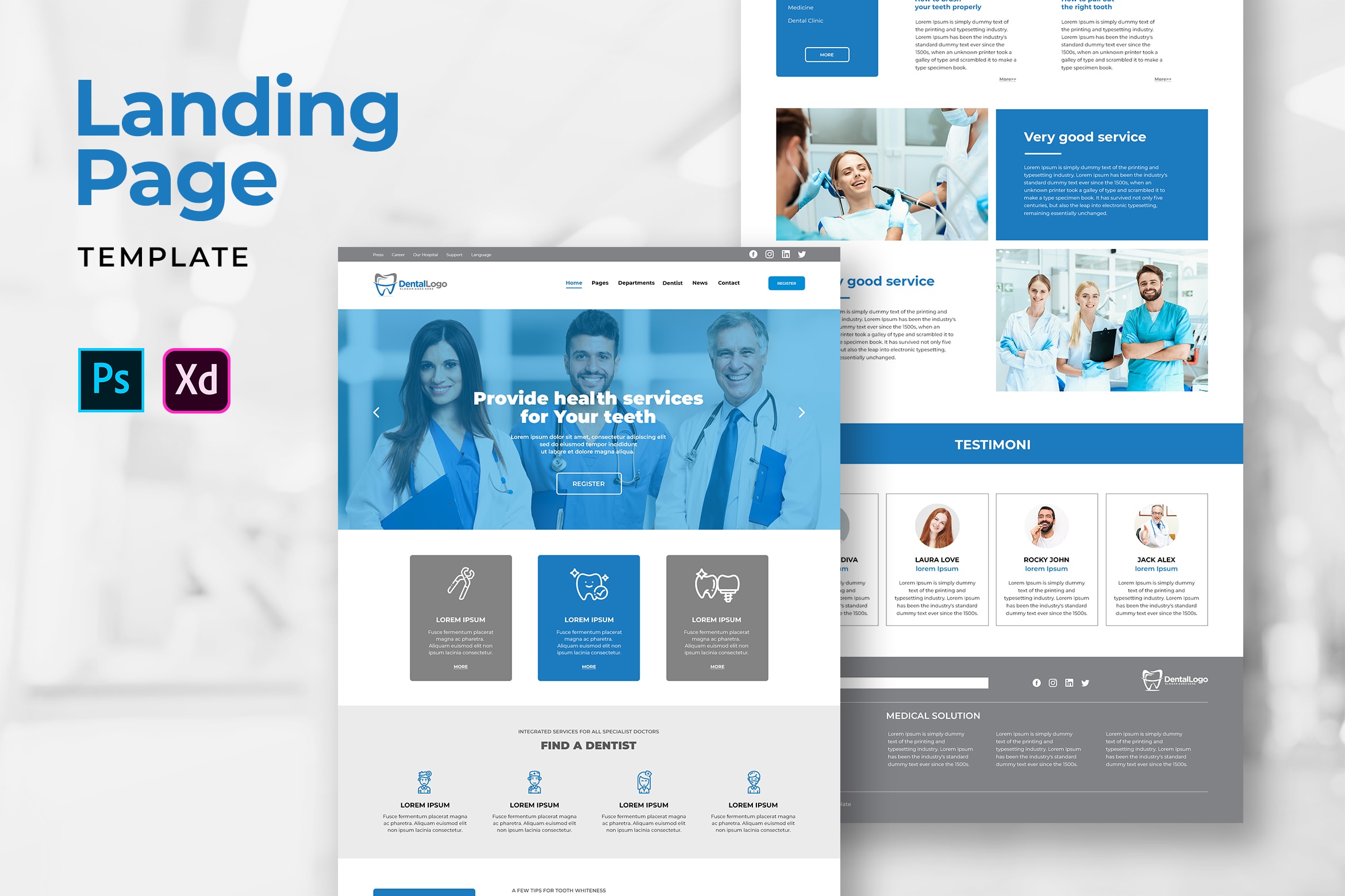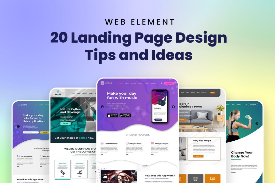
20 Landing Page Design Tips and Ideas would help you to gain customers loyalty and profits. Read this tips and find your suit landing page design templates. In addition, you need to notice competitors landing page templates. Landing pages are a powerful way to drive conversions, and with these tips you’ll have everything you need to create landing pages that get more clicks and signups, generate leads, and increase sales for your business.Therefore, you could evaluate the strength and weakness of yours. Here are what you should do:
1. Select Your Goal Before Select the Landing Page Templates
This is the initial step to do. Two options to choose are sign up landing page or products landing page. If you choose sign up page, it means you want to get more prospective customers. Building a community to get data of customers are the goal of signing up page. Therefore, you do not need to show off the whole products and service you have. On the other hand, if you choose product page, you should prepare the fascinating page to attract visitors and customers. Give them the whole things related to your products.
Practicing on using landing page. It is the first page for user, so it has to be eye catching. Put the smart copy which will influence visitors. Therefore, it is great to insert image that spread happy mood for readers. Illustration could be good to persuade readers decision, especially if they are decision makers in their family. Stock images are okay to use, but make sure they are high-quality and suit your brochure. Search online to find databases filled with free images.Make it effective and smart by these things:
Also Read : 30 Best Isometric Landing Pages Design
2. Increase the Loading Time
It is better for less than 3 seconds. Make sure your landing page is not having the heavy elements and graphics, estimate weight of the page and its loading time, use graphic editors to edit height and width images, and compress images first before upload. Take a few and short quotes. Edit its grammar and spelling mistakes. Put them in the back of page. Do not skip the name of customers. Before you do that, make sure you already get customers’ permission. The testimonials offer a description of the product, service, event, but you need to customize this section. An example of a good testimonial quote for a pest removal service is, “I’m so glad for the quick response time. It was the middle of the night and that is very worth for me!”
3. Check the Clarity
Readable title is a must. Use non descriptive wording such as “we work for your rest”.It makes visitors curious on your website. They will keep to looking for anything in your website before directly click X button.
– Splash color.Keep to learn from competitors. Gain inspiration by visit their website and see how they decorate their website.
4. Must Be Responsive
Make effective, interesting, and high quality web pages. Therefore, you will try to learn more and think to make your website adaptable for mobile.
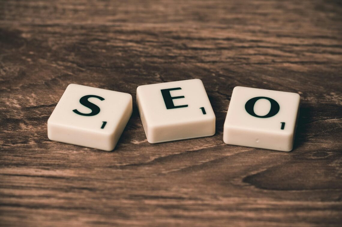
5. Concern on SEO
It is a good marketing tool. Improve its SEO by using minimal layout, simple and clean design. Do you ever read reviews about a business or a product before making your final decision? If so, you already know that online reviews can directly impact a business—shoppers care what other shoppers think.
6. Bold Background to Attract More Customers
It helps to boost readability of your website and it influences your performance. You may input letters, numbers, elements, and icon, but use various devices. You may choose different colors too and balance the scales. Lifestyle images are a great way to tell the story of your product and to help your customers imagine how they might use it in their everyday lives. Incorporate locations, props, and people that will give your audience more context about the thing you are selling.
7. Compelling Headline to Attract Attention
Creating or destroying your website comes with this action.
8. Controlling Visitors
Although they are curious to your website content, lead them to only focus on some parts. Therefore, you can provoke them using sound signals, bright colors, and large fonts. Activate elements and moving parts. It helps them to keep engage. Take advantage of the positive feedback you have received from your customers by including their testimonials directly on your landing page. Not only can their comments help you advertise your business or products, they might also be the final nudge a potential customer needs before making their final decision to buy.
9. Options Should Be Offered
Always give visitors option when they visit your website. It is to build your impression and to build your service. Design and send personalized order confirmations, invoices, and other customer notification emails to people that make a purchase. Or, automatically follow up with buyers to thank them for their purchase, provide helpful product information, or ask for feedback about their experience.
Also Read : 15 Best Illustration Landing Pages
10. Structure Your Landing Page
Put the page elements in a logical sequence will help keep visitors moving deeper into the page, toward taking the right actions.You also could use bright photos, pointer, and arrows. Make a catchy headline, use a contact form, a relevant photo or picture, and features of product or service. In addition, reviews, case studies, and social proof should be managed.A properly structured landing page increases the conversion rate significantly.You also need to know your audience.
11. Connect to Social Media
Social media is a fast social network. It is important to have social media today. Therefore, it is great when you could integrate your website to social media because it could empower your business. Share buttons, follow buttons, and use a widget to show Facebook comments are the great idea to build an engagement to social media.
12. Make Simple and Intuitive Design
Keep to focus on large target audience. The landing page should be clear for anyone. Whether visitors familiar to your products or not, make it as your homework. Use only an easy navigation and do not overload the landing page. If you use too much buttons, information, and images, sure your landing page would be overload. Help your customers visualize what the item looks like in person by using images from different perspectives or proximities.
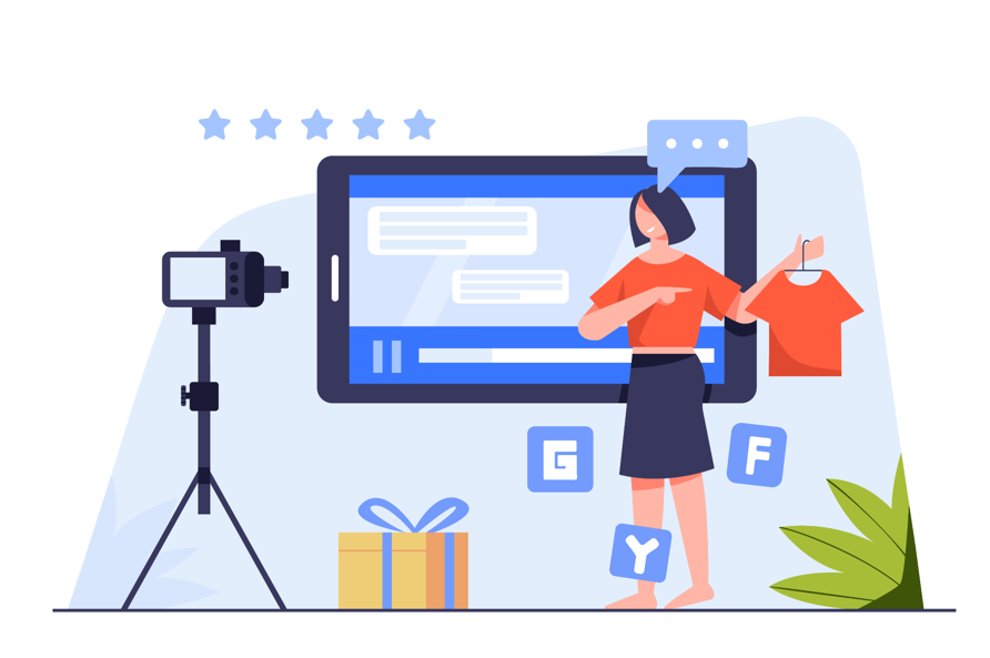
13. Input Video
Promoting a product would be better by video. Reading a paragraph is less meaningful than click play to watch video. Yes, we are too lazy to read and prefer to do less effort on knowing something.
14. FAQ Section is Required
It is better to answer most questions in a form. It could increase trust, loyalty, and conversions. Visitors could find answers of their question fast. It help you to get impression. It is show everyone the benefits they get after working with your company.
15. Use Chatbots
customize your landing page by chatbotand make your visitors engage with it. It is an application to help visitors chat with real person imitate. When a client can ask a question at any time and immediately receive an exhaustive answer, loyalty increases and sales grow. If the company processes a large number of similar orders every day, the chatbot can help customers with the choice of goods and accept applications.Follow the rule before you want to use it.
16. Sales Notification Pop Up
This is a great tool to improve sales and build brand trust.It has social proof. The good design one could bring lots of benefits. Small popup with notification and not aggressive is god because it help customers make decision.
17. Put Email Subscription
Giving option to let visitors get update of your business by email sometimes need to keep the engagement. If you need the design of attractive email newsletter, UI Creative would help you with it.
18. Countdown Timer
Visitors will get motivation to take action on your site if there is special discount available. Fear Of Missing Out or FOMO is a solution for potential customers to think too long. Therefore, they cannot change their mind on it
19. Good Typography Design
Some text need to be easy and comfortable to read. The readability of the text depends on the characteristics of the font, the distance between letters, paragraph size, etc. A landing page contains a lot of important information, so the font for the texts should be chosen carefully. Do not make visitors spend much time on reading. It is important too to improve your content quality. Even the position of landing page should be consider. Playing with the shape and image is challenging. You should know how to make it great and refresh others eye. Talking about technology means you notice the parts, the use, and icons in contrast color and detail. Let customers have more choices. Grab it from UI Creative and feel free to use font. You also have a choice to grab the vector.
20. Adding Logo
Logo is used to help companies enjoy your service and product.Use the simple and clear text blocks, testimonials, attractive photos, and noticeable CTA button. All of them build customers trust. You can ask customers about their experience using your product or service and publish it to your landing page.
Isometric landing page helps you to give the clear information without you have to write down too much stories. Geometric shape is a combination between more than one shape to be 3D style. Websites look good to have it as their frame, background, borders, in order to make an attractive website and decorative one.
Which one of the landing page templates style you prefer? Follow the tips or get the instant design in our website.
You can also check our product!
special restaurant company profile | digital marketing agency company profile | car repair company profile | company brochure | business development service web banner | modern marketing company profile | marketing agency company profile | technology agency company profile | interior design brochure | finance business company profile | bag collection catalog | product design brochure | digital marketing seo brochure | invoice green white theme | modern home design ig carousel | fashion business company profile | employee management admin dashboard | business card founder company profile | digital business company profile | company news business magazine
You can also check our categories product!
company profile print template | web element background | web element admin dashboard | web banner web element | social media | mobile ui kit | handwriting | anual report print template | sans serif font | fonts


