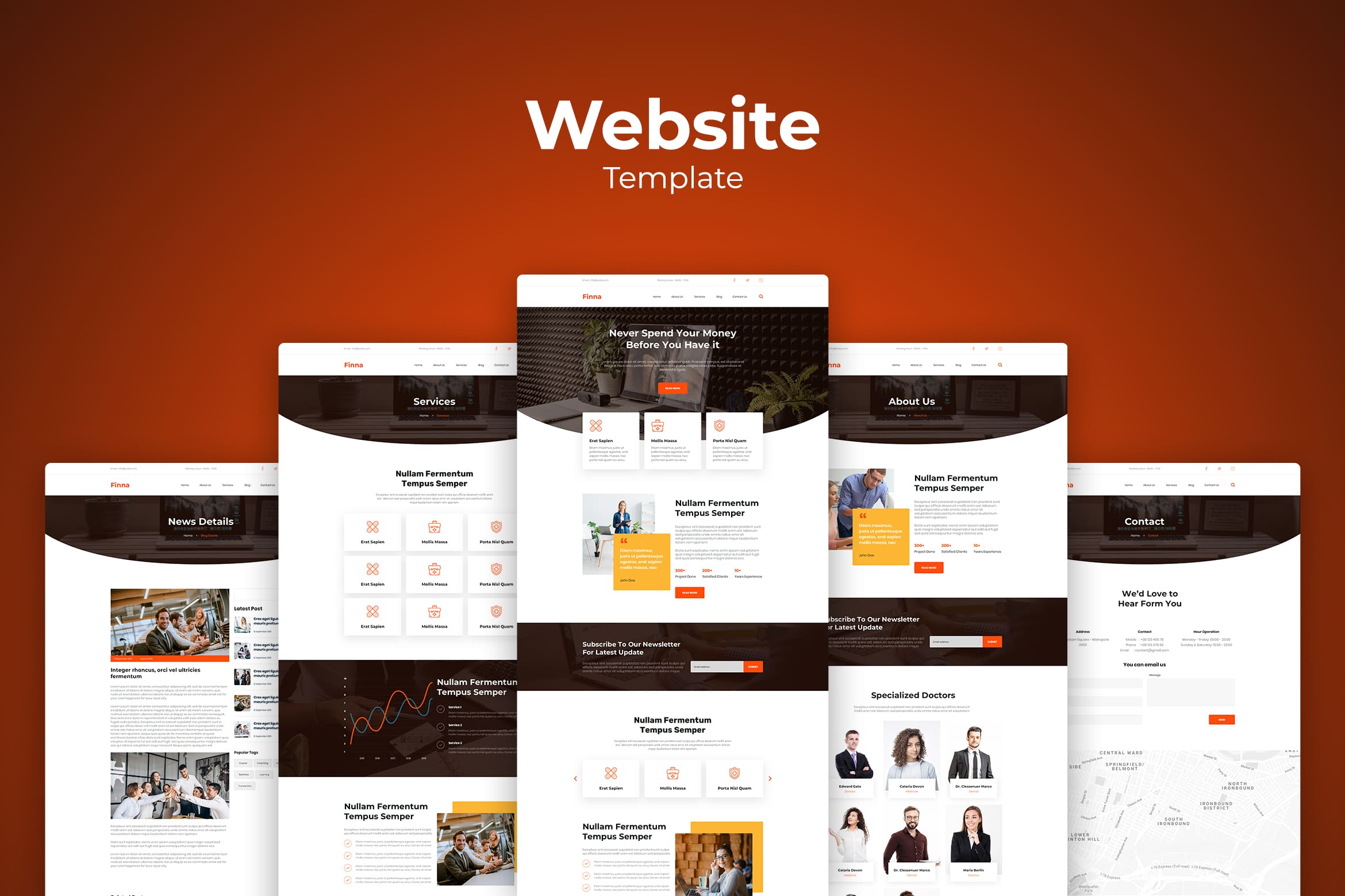
15 best illustration landing pages help your website to look perfect. We already pick these samples for you. This is an effective internet marketing. It makes visitors focus on what they want to buy, the best offer from your company, and variety of products you have. Here they are, our illustration landing pages.
1. Professional Web Development
The use of landing page is to make a website more attractive. It also to navigate visitors especially for them who are not used to use website. They have to concern many things like menu, navigation, and the way to purchase. Therefore, landing page could be the lead or poor experience guide for them. This design has been created for web promotion of a helpful digital product for those who love education like lessons and academical purpose.
Also Read : 20 Landing Page Design Tips and Ideas
2. Artificial Intelligence Programs

Many functions of landing page than only selling and buying. They are for educational resources, mobile applications, communities, charity platforms and activities, meetings and events, and information and special announcements. Make sure you know the purpose of it. Check whether your landing page has catchy hero image, clear visual hierarchy, readable and bold typography, short scannable tagline, concise and readable description, visible call to action element, and the color palette.
3. Express Package Delivery

Now more and more digital products are created not to sell, offer, inform or educate, but just to connect people that can solve problems of each other. Here this effect is reached with a super cute digital illustration that is also informative and instantly gives visitors the idea of the technology benefits. The choice of font for the tagline also supports that mood while the bright color accents make the CTA clear and visible.
4. Online Doctor Consultation

The dark background here doesn’t hurt readability in any way due to the thoughtful choice of fonts, but it really helps to make the image look deeper, atmospheric and eye-catchy. The bright and catchy hero image and color palette instantly set the positive mood and harmonically combine with the tagline and interactive tab. Color accents effectively unite all the layout composition.
5. Discover Creative Ideas

For a mobile app, the goal behind a landing page is app installation and the core task is to concisely cover its benefits and functions. What’s more, you can create multiple landing pages for one app based on various segments of the target audience. It is an effective way to reach users and give them a quick presentation of the app telling and showing more than just screenshots on the AppStore.
In terms of high competition, one of the factors any event success depends on is its promotion. The landing page is an effective tool to unveil the benefits of the event and simplify the process of booking or buying tickets. As well as get potential visitors stunned with wow-graphics and effects setting the right mood and building up strong emotional appeal.
6. Software Development

It visually reflects the style of the illustration and makes them harmonically work together as one composition. It is simple, but quietly soft and meaningful.
Prominent call-to-action elements instantly focus users’ attention on the core interactive zones. Color also helps users understand the hierarchy of CTA buttons: filled “Make an order” button get the higher visual priority
7. Find & Meet Apps

This landing page was designed to promote a digital product of that kind: it allows users to build interactive maps for their smart homes, offices and even public spaces. The catchy and concise layout with an artistic and a bit experimental hero image becomes an integral part of strong product branding.
8. Popular E-Commerce

The goal of the page is to inform the visitors about the offer and let them join the community sending the email address. Animated interactions add fun and life; generally, the design strives for the balance of business-like but friendly mood. One of the big challenges is communication in numerous channels, from email inbox to messengers and social networks.
Give your customers time to experience your website. At least you should know what you have to point. For example if you are an online store, try to point your products. On the other hand, if you are in service business, display your contact number on it. We cannot generalized customers. Some of them might be in hurry. If you try to walk around the bush, they leave your website only some seconds they have visited. Promotional website might include the reasons for customers to buy your products like this design showed.
9. Best Online Course

This landing page demonstrates how to do it in case of an e-commerce website by means of digital art. Here’s the page designed for an online store selling online learning. Prominent and artistic illustration instantly sets the theme, gives aesthetic pleasure and creates a strong emotional appeal, especially in combination with sophisticated typography chosen for the layout.
If this is your new website, it is good to play visual design. The first person who visits your website needs something attractive. They love to see clean and clear images and content. There is also the short explanation in it, but do not leave the call to action words. Play with simple design could be the great choice, but do not skip the right navigation. It is helpful to make visitors notice everything well. They will not get lost in your website journey.
10. Remote Working

The composition and color palette of the hero illustration support the emotional appeal and create an instant message about the theme. Visual hierarchy of the webpage sets the basis for scannability to make the major information, infographics, and CTA instantly visible.
The page uses a split background with a light part for the bright graphics and the dark part for the text content. CTA button works as an element uniting the general composition as a white element on the dark part. The icon of a computer mouse gives the visitor a prompt that the page can be scrolled for further information.
11. Online Marketing Services

Marketing service can be anything in digital platform. The illustration has shown what your company could do for online marketing. Simple title and navigation make visitors only focus on your service. Even the illustration is already described transaction and process during marketing service. Try to evaluate the palette color and any not suitable font size in it. You need to insert call of action words here. Make sure there is a place for logo and your brand.
Also Read : 30 Best Isometric Landing Pages Design
12. Trusted Travel Agency

What do you need to start traveling? Good weather? Good season? Casual style? Leader who could accompany you to travel? Well, this illustration landing page has everything you need and doubt.
It is eye catching, attractive, and improve visitors desire to travel. The effective marketing service is ready here. Website visitors would contact you soon, especially if you already input the contact number in large size on front. Blue background and light blue inside such a heaven for visual content. Therefore, you could be quite confident to catch more customers today.
13. Brand Service & Solution

Call to action and the navigation elements are important aspects to have here. UI Creative pick this hero header design for your modern and stylish website. No matter what you want to sell, it is better to perform nice appearance in light color.
Not only landing page, input geometrical shape will great.
14. User Experience Service

People who visit it will directly pay attention on it in some seconds. They build their impression. The place of hero header could be in full page or part of page. Whatever it is, you need to make it consistent. We pick the good design for you who have food business. You may use this template which contains of three parts. The menu of website, the high resolution image, and the welcoming words.
15. Team Working & Collaboration

Illustration landing pages from the whole explanation above is effective to promote your product and gain more loyal customers. Therefore, it is time to start building your brand awareness.
Therefore, we try to give you this option. If you need a deluxe style in your website, try this one. If your website is informational major, you may have the small header, but keep in mind to find the suit landing page too.Illustration can be geometric style too. The website that suits with geometric background is e-commerce, blog, artists, corporate, and business portfolio. Whatever it is, the geometric style must look in tone with the brand. To make geometric design, you may use difficult way like endless combination and manage them. For the quick result, you may use professional service like what UI Creative offers. Browse and find the most suitable design. Geometric shape is a combination between more than one shape to be 3D style. Websites look good to have it as their frame, background, borders, in order to make an attractive website and decorative one.
Most Viewed