Beyond Aesthetics: How Web Design Agencies are Mastering User Experience
Web design isn’t just the interface of a website, it’s so much more. Don’t you just love it when a neat website visual appears to be an actual integrated function? Click it, and an unexpected pop-up appears, or you’re re-directed to where you want to go.
But the actual user experience starts way before, from the moment a client first lands on your website. And you only have about 2 seconds to make it right and grab their attention. Are you going to risk it all, or maybe hire a good web design agency to help you go beyond the aesthetics and master both user experience and interface?
This guide will provide more insights on what to look for in a good web design agency beyond stunning graphics and visuals. Following are some key examples of proficiency and proven results of good work in the field of UX, as implemented by this top-ranking San Diego web design agency.

Emphasizing Visual Hierarchy
Design agencies prioritize visual hierarchy to direct the user’s gaze toward key elements swiftly and effectively. By strategically adjusting the size, color, and positioning of elements, designers craft a visual path that enhances the user experience. This technique makes the user journey easier, ensuring the most critical information catches the eye first.
- Larger fonts for headlines to draw attention and set the stage for the content that follows.
- Contrasting colors for CTAs to make them stand out and prompt user action.
- Strategic placement of important elements above the fold ensures they are seen without scrolling.
Utilizing Negative Space
The artful application of negative space, often referred to as white space, is crucial in creating a clutter-free and enjoyable browsing experience. This space around text, buttons, and other web elements allows the content to breathe, making it more approachable and easier to digest.
It’s a subtle tool that significantly impacts focus and comprehension, guiding users naturally through the website’s content.
- Adequate spacing between paragraphs improves readability and encourages further reading.
- Margins around images and buttons create a clean and uncluttered look, enhancing user focus.
- Empty space around logos and important information emphasizes branding and prioritizes user attention.
Implementing Color Psychology the Right Way
Understanding and applying color psychology can influence users’ feelings and how they behave on a website. Design agencies meticulously choose color palettes that resonate with the brand’s identity and evoke specific emotional responses, thereby improving user engagement and readability.
The right colors can set the tone for the entire user experience, from calming blues to energizing yellows, each hue plays a part in the narrative.
- Blue for trust and security is often used by banks and online stores to encourage transactions.
- Green for relaxation and environmental focus is ideal for wellness and eco-friendly brands.
- Contrasting colors for readability and focus ensures that text stands out against its background for clear visibility.
Enhancing Readability / Accessibility through Typography
The careful selection of fonts, attention to font sizes, line heights, and color contrast can significantly improve readability for a wide audience, including those with visual impairments. Briefly, this concept is known as typography, and design agencies use it to master the field of UX.
- Readable Font Choices: Opt for fonts that are easy to read online, like Arial, Calibri, or Verdana, which are designed for clarity and ease of reading on screens.
- Adjustable Font Sizes: Implementing responsive typography that allows users to adjust font sizes without breaking the site layout ensures that text is accessible to users with varying visual capabilities.
- Sufficient Line Heights: Spacing between lines of text should be at least 1.5 times the font size, improving legibility and providing a comfortable reading experience.
- High Contrast Text: Ensuring high contrast between text and its background, such as black text on a white background, helps users with visual impairments read more easily.
Following Certain Design Patterns
Design conventions are essential tools that combine innovation with the intuitive navigation users expect. These guidelines evolved from creative ideas into standard practices across the industry, ensuring websites are not only visually appealing but also user-friendly and efficient. By implementing these tried-and-true methods, designers can craft experiences that users navigate seamlessly, enhancing both usability and satisfaction.
- F/Z-pattern Reading Paths: Guides visual flow, enhancing content readability and user engagement.
- Hamburger Icon: Streamlines navigation, offering a familiar touchpoint for accessing menus.
- Progressive Disclosure: Manages user focus by displaying information progressively, reducing clutter, and enhancing interface interaction.
Leveraging Icons, Images, and Visuals
Leveraging icons, images, and visuals in web design is not merely about aesthetics—it’s a powerful strategy for enhancing user experience and engaging directly with the audience. These visual elements serve as essential communication tools, conveying complex information quickly and effectively, while also appealing to the users’ emotions and cultural sensibilities.
When thoughtfully integrated, they can elevate a brand’s message, making it more accessible and resonant with diverse audiences. This approach not only enriches the visual narrative of a website but also strengthens user connection and brand loyalty.
- Icons for Clarity: Utilize clear, universally recognizable icons to simplify navigation and function explanation.
- High-Quality Images: Select images that reflect brand identity and convey key messages to enhance narrative and emotional impact.
- Visual Storytelling: Employ visuals to narrate your brand’s story, using thematic imagery to evoke specific emotions and reinforce messaging.
Avoid stock photos, by any means!
Incorporating Interactive Elements for Engagement
Incorporating interactive elements into web design, such as buttons, sliders, and animations, is a key strategy for boosting user engagement on a website. These elements transform passive browsing into an active experience, inviting users to engage with the content in a hands-on manner.
By making interactions more dynamic and meaningful, websites can capture users’ attention longer and make the user journey more memorable.
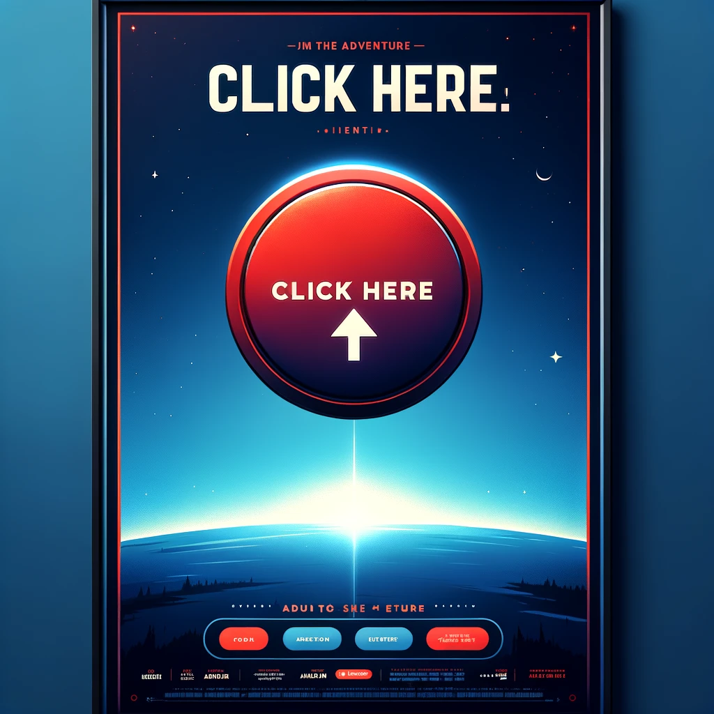
- Animated CTAs: Incorporate subtle animations on call-to-action buttons to draw attention and encourage clicks.
- Sliders for Content Display: Use sliders to showcase multiple products or services in a compact space, allowing users to interactively explore options.
- Feedback on Interaction: Design elements that respond to user actions, such as changing colors or expanding upon hover, to provide immediate feedback and keep users engaged.
Designing for Conversion
Ultimately, the goal of combining visual appeal with usability is to guide users towards taking desired actions, whether it’s making a purchase, signing up for a newsletter, or contacting the business. Agencies strategically design visual elements to draw attention to calls to action, using contrast, placement, and persuasive design techniques to increase conversion rates.
- Clear and Compelling CTAs: Craft call-to-action buttons with concise, action-oriented language that stands out visually.
- Strategic CTA Placement: Position calls to action in high engagement areas such as at the end of impactful content or floating on a scroll to remain in view.
- A/B Testing for Optimization: Regularly test different CTA designs, placements, and messages to identify what works best for your target audience.
- Persuasive Copy Near CTAs: Include compelling and concise copy near CTAs to motivate action, using emotional triggers and value propositions.
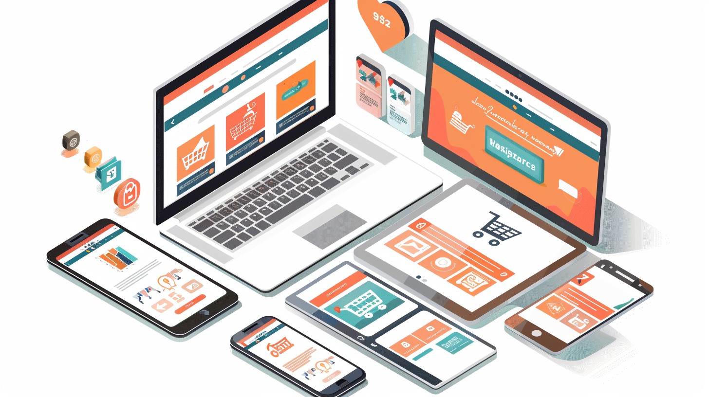
Multi-Platform Optimized Designing
This multi-platform optimization involves designing websites that provide a seamless and consistent user experience, whether accessed via desktop, tablet, or smartphone. Design agencies focus on responsive design techniques, flexible layouts, and adaptive images to ensure content looks great and functions properly on all screen sizes.
The goal is to ensure that no matter where or how a user accesses a site.
- Responsive Design Techniques: Utilize CSS media queries to create a flexible layout that adjusts to the screen size of the device.
- Touch-friendly Interfaces: Design buttons and navigational elements to be easily tapped on a touch screen, enhancing usability on mobile devices.
- Speed Optimization: Prioritize fast loading times with optimized images, minified CSS/JS, and leveraging browser caching, crucial for mobile users with limited bandwidth.
Adopting Best Practices for Ensuring Accessibility
Ensuring accessibility in web design means creating websites that everyone, including individuals with disabilities, can use effectively. It’s about removing barriers to information and interaction, which not only enhances user experience across the board but also supports inclusivity.
Following the Web Content Accessibility Guidelines (WCAG) sets the standard for accessible web content, improving SEO, and fostering a positive brand reputation, making it a good place to start your accessibility considerations. Here are some examples:
- Alt Text for Images: Offers descriptive text for visual content, aiding those using screen readers.
- Transcripts for Audio and Video: Ensures users with hearing impairments can access multimedia information.
- Video Captions: Provides a text alternative for audio content, crucial for users with hearing challenges.
- Keyboard Navigation and Focus Indicators: Enables navigation for users with motor impairments, ensuring all interactive elements are reachable via keyboard.
- High-contrast Options and Resizable Text: Assists users with visual or cognitive impairments by improving readability and site navigation.
Final Thoughts
Achieving the perfect blend of back-end functionality and front-end appeal is an artful mastery. It’s about more than just making sites look pretty; it’s ensuring they work seamlessly across all platforms and truly meet user needs.
However, there’s not a single solution or formula for success. So, stay bold in your design choices, be human-centered in your approach, and always keep evolving. And also, never underestimate the power of simplicity and clarity in creating impactful, lasting web experiences.