20 website hero header design is your option to have a wonderful website. To attract more visitors and get loyal customers, make a professional website is a must. Try to find the match design here. We already pick 20 best for you.
Donuts Pleasure – Hero Header Design Templates
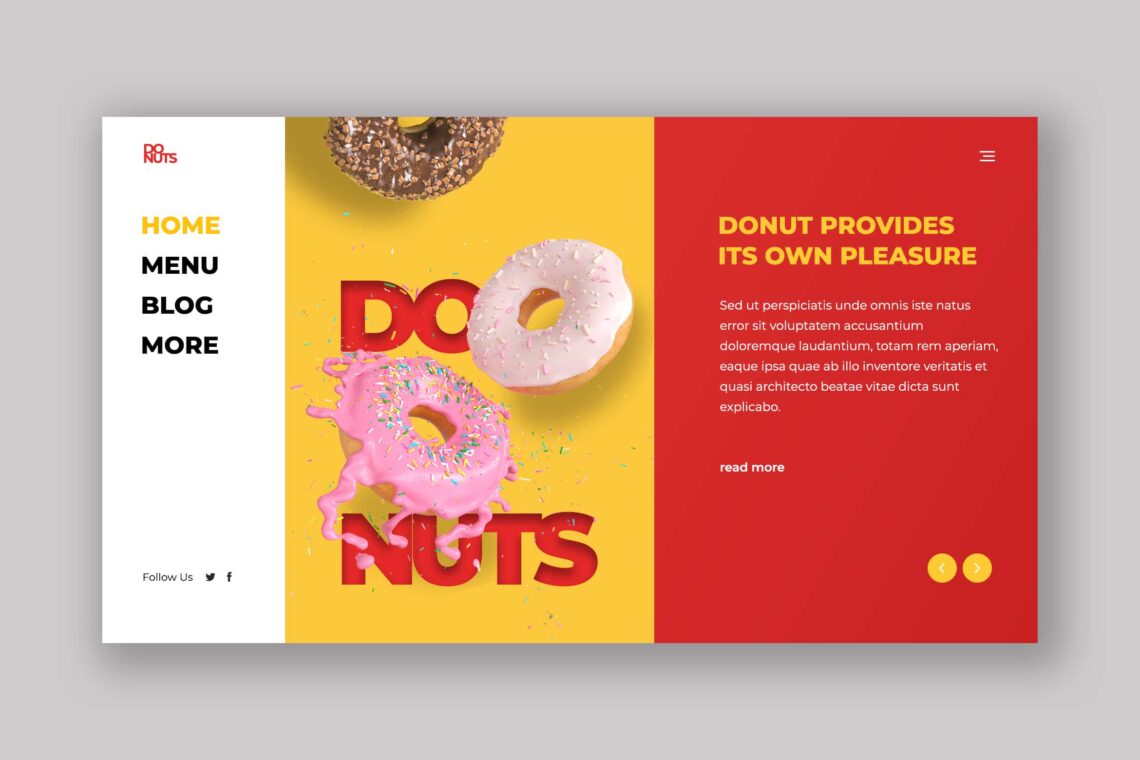
Hero Header Design will be the head of your website. People who visit it will directly pay attention on it in some seconds. They build their impression. The place of hero header could be in full page or part of page. Whatever it is, you need to make it consistent. We pick the good design for you who have food business. You may use this template which contains of three parts. The menu of website, the high resolution image, and the welcoming words.
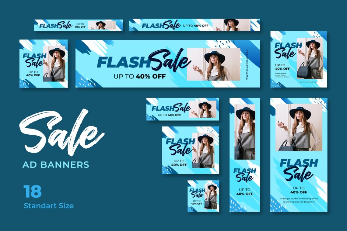
Women Blogger Web – Hero Header Design

It is good to notice what you want to show in your website. For example is in your hero header, you would like to perform your brand logo, service, and play customers emotion in it. Call to action and the navigation elements are important aspects to have here. UI Creative pick this hero header design for your modern and stylish website. No matter what you want to sell, it is better to perform nice appearance in light color.
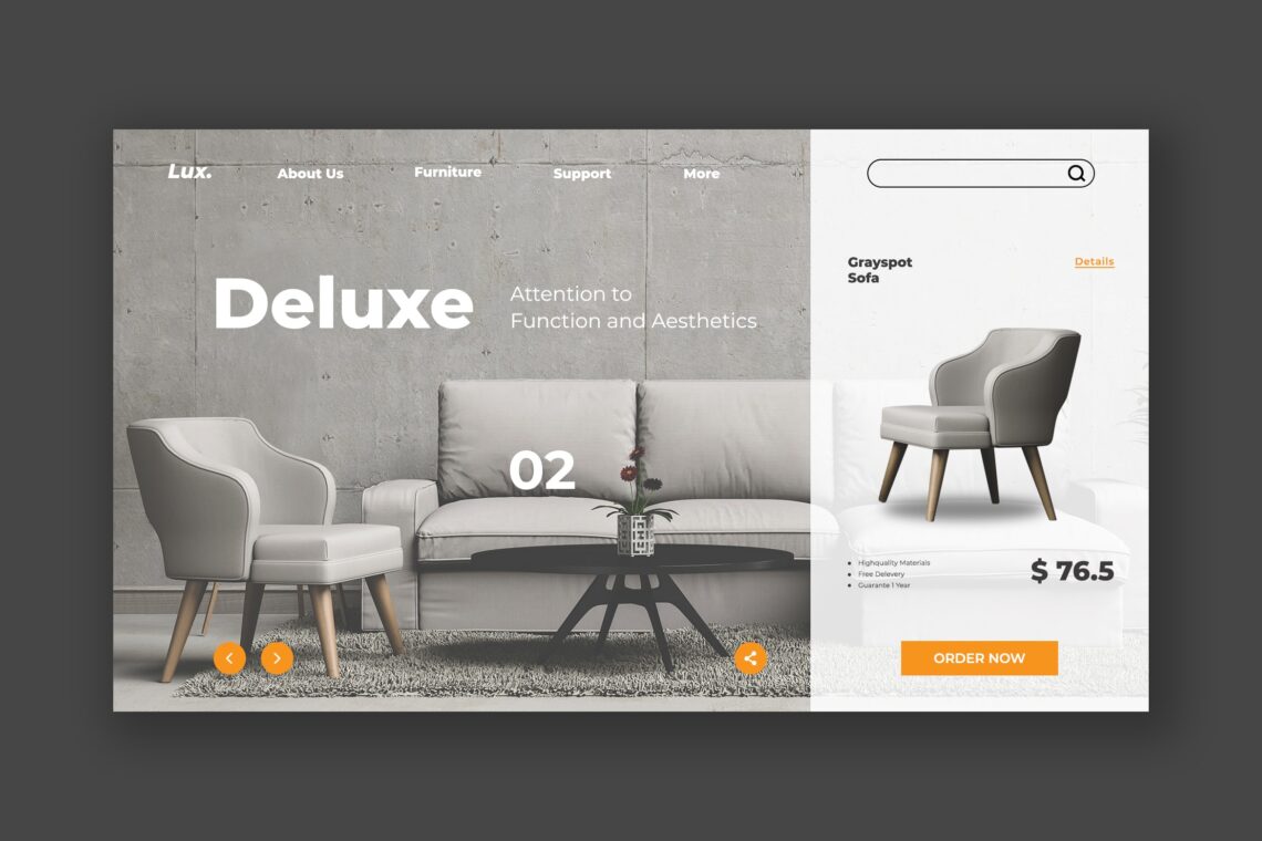
Deluxe Furniture

It is not good to make your hero head crowded, but it is not good to make it empty too. Therefore, You need to arrange the layout, menu, and format before applying a hero head. Therefore, we try to give you this option. If you need a deluxe style in your website, try this one. If your website is informational major, you may have the small header, but keep in mind to find the suit landing page too.
Futuristic Architecture
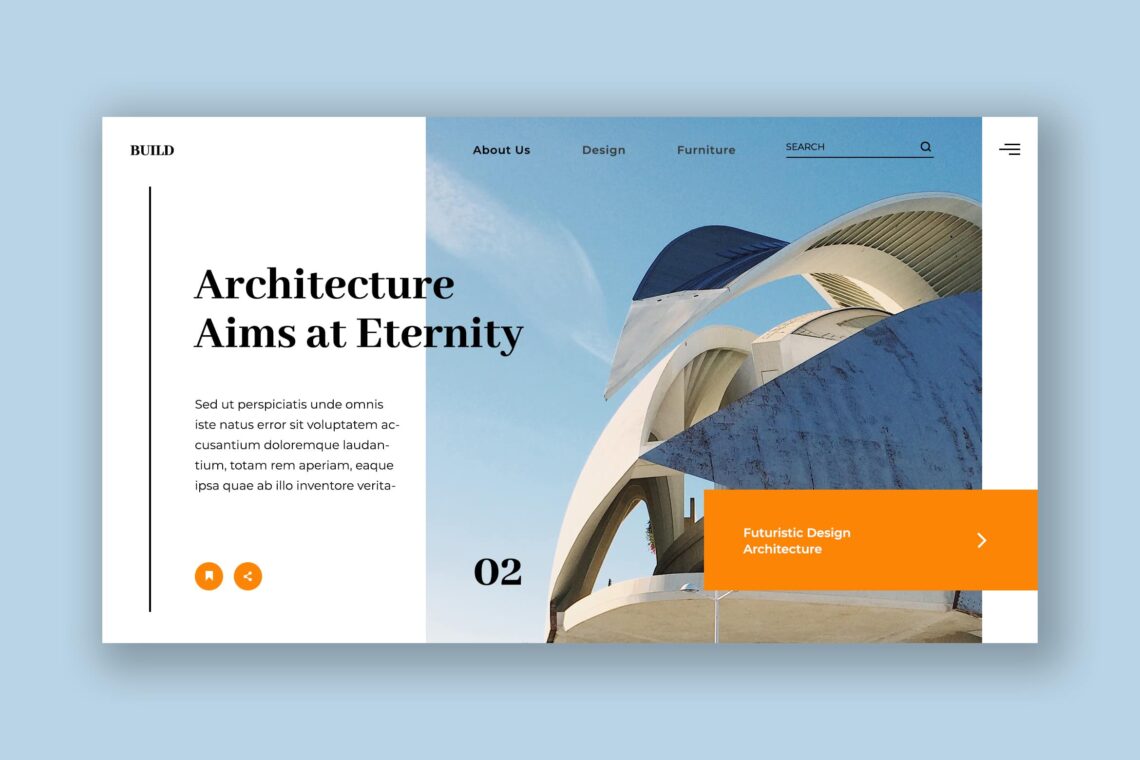
If this is your new website, it is good to play visual design. The first person who visits your website needs something attractive. They love to see clean and clear images and content. There is also the short explanation in it, but do not leave the call to action words. Play with simple design could be the great choice, but do not skip the right navigation. It is helpful to make visitors notice everything well. They will not get lost in your website journey.
Interior Minimalism Design
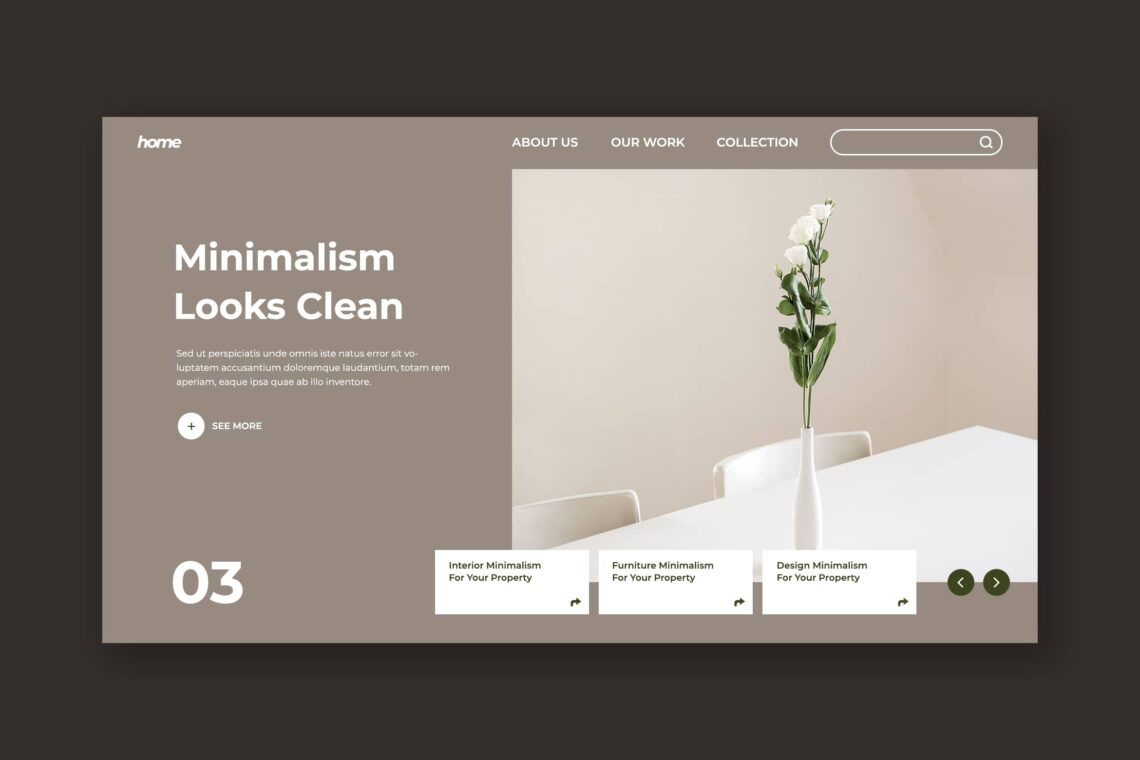
Give your customers time to experience your website. At least you should know what you have to point. For example if you are an online store, try to point your products. On the other hand, if you are in service business, display your contact number on it. We cannot generalized customers. Some of them might be in hurry. If you try to walk around the bush, they leave your website only some seconds they have visited. Promotional website might include the reasons for customers to buy your products like this design showed.
Social Literacy
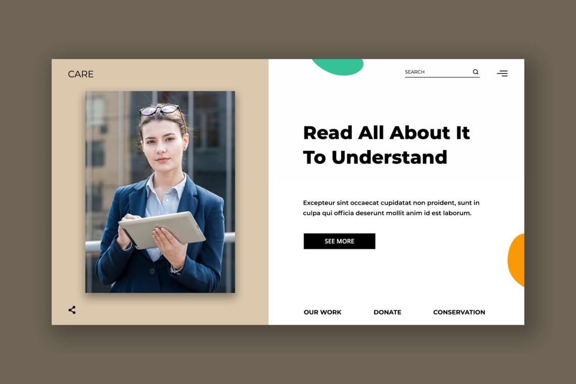
Whatever your business and website design, try to pick only relevant image as hero header. You may call an action in some words detail. However, keep to consistent in its content. Therefore, it is better to use one website for one business. When you want to mix service and products, it looks like you should put extra effort in its head hero design and landing page.
Fashion Casual Gallery
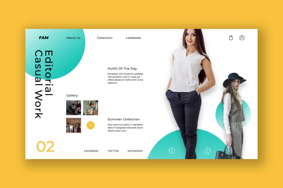
The small thing but important is how to gain clients trust. You may add testimonials of your customers in your website. There should be a small column for it in sliding style. It happens for your product too. You could use sliding image, so visitors will be easier to see the whole collection of your products. Collaborate it in light color and nice font.
Fashion Perspective
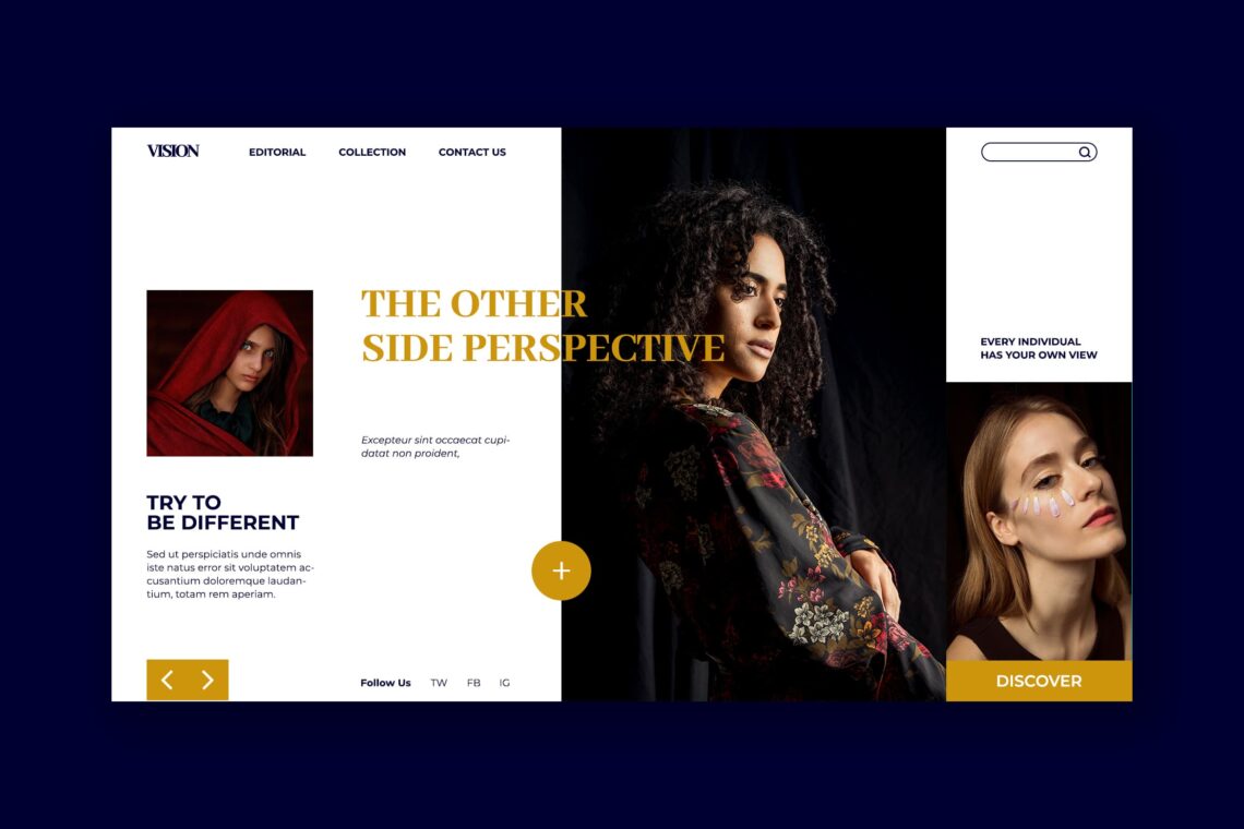
Sometimes you need more than just ‘normal image’ for your website. It is better if you could play in illustration, vector, and apply them to your landing page. Although it needs special efforts, everything will be meaningful after you see the increase of visitors. If you expert in it, Video and short movie would be better too.
Men’s Fashion Soul
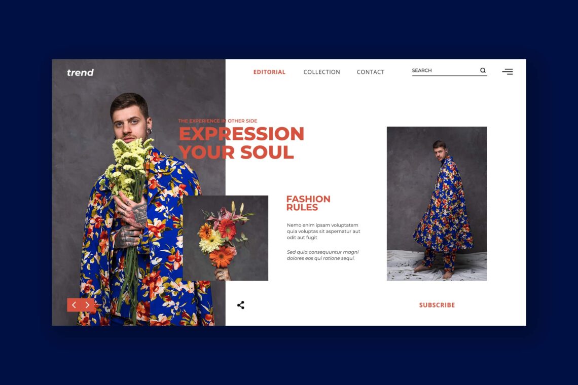
After you find the design to pick, it is time to pay attention on its font. Keep to use clear and readable font. It is time for you to make it in line. You cannot use fancy font only to look cute and modern. Do not also use the big size font and make it mess. Try to bold the font if you use the large hero head.
Film Studio Action
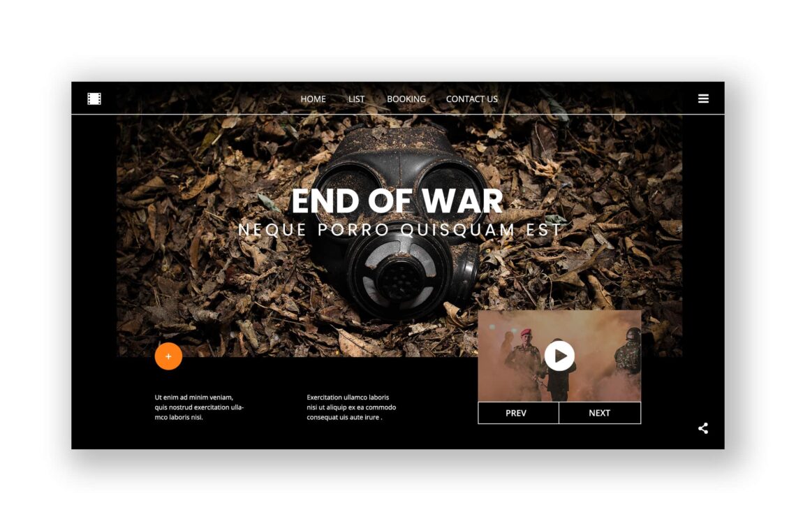
Depends on your purpose, if you only want to promote the new offer in hero head, hide navigation. Make it in Hamburger style and no one will get difficult to find it. On the other hand, if you want to perform the company profile on it, explore the menu and navigation. Customers should explore your website fast and quick. Make the head simple in its design. Focus on the thing you want to get attention.
Eternal Ethnic Fashion
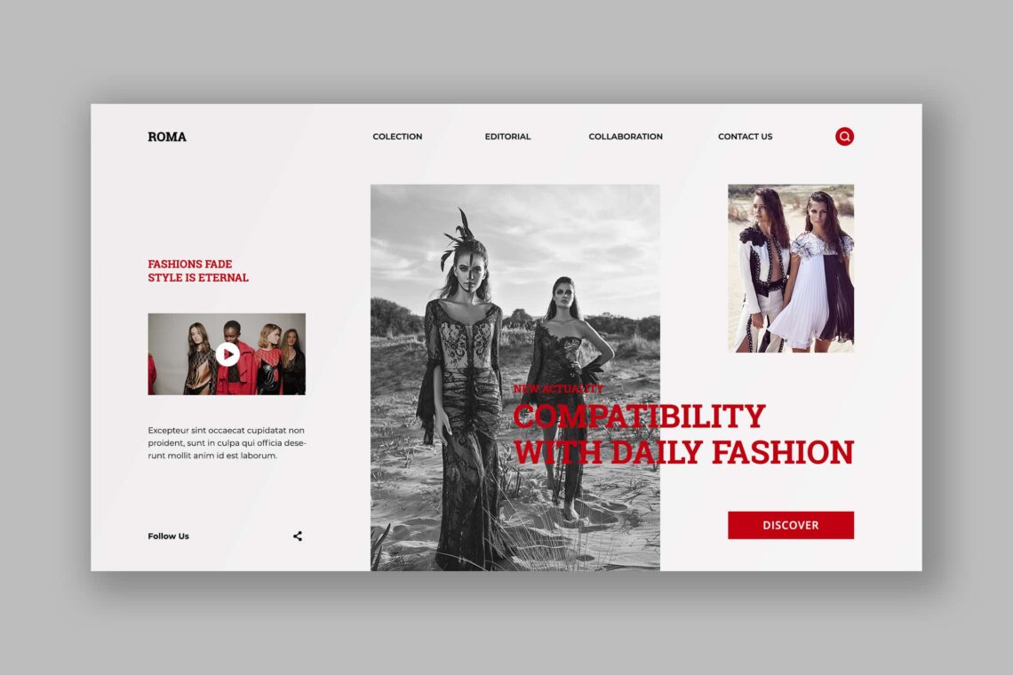
UI Creative offers you simplicity. You could focus on other things than put much effort in designing. Hire professional designers is not always easy too. Since many people use smart phone today, you need to consider mobile header too. Therefore, customers could access it everywhere and every time. Try to put simple action call and ask them to sign up.
Instrumental Music Album
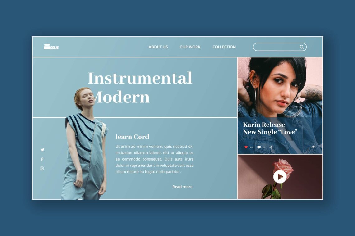
Not most of people love something eye catching, blink, and glamour. The mature people love something soft and modern. Therefore, you need to know your market target. If they are mature women, choose the soft color as a header. The hero header template should be simple, neat , and clean. Therefore, they would interested to visit the website more and more.
Fashion Stage
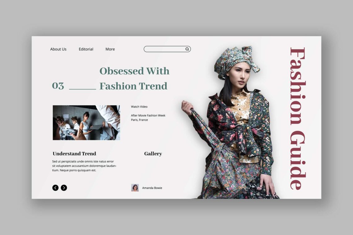
Whether you want to sell product or just giving information in your website, it keeps important to make it interesting. You do not have to add all of them at once. It is necessary to find a balance between the abundance of information and its harmonious arrangement. Use only the data you need, overloading a header would not prove beneficial, however important all the links may seem.
Stylish Treatment
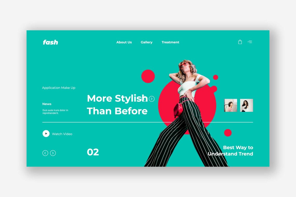
Leaving the header too empty is not a good idea either. A user who cannot figure out your interface in a few seconds will most likely leave and not return. A bad header can push visitors away to another site with inferior content.one of the most difficult aspects of website building is ensuring the effectiveness of every screen size. And even if two screens are of the same size, the resolution might be different, so the users will not see the same thing.
If you have a round shaped logo then it’s acceptable to place it in the center of the screen, though its effectiveness will still be lower compared to the ones placed on the left.
Facial Wash Product
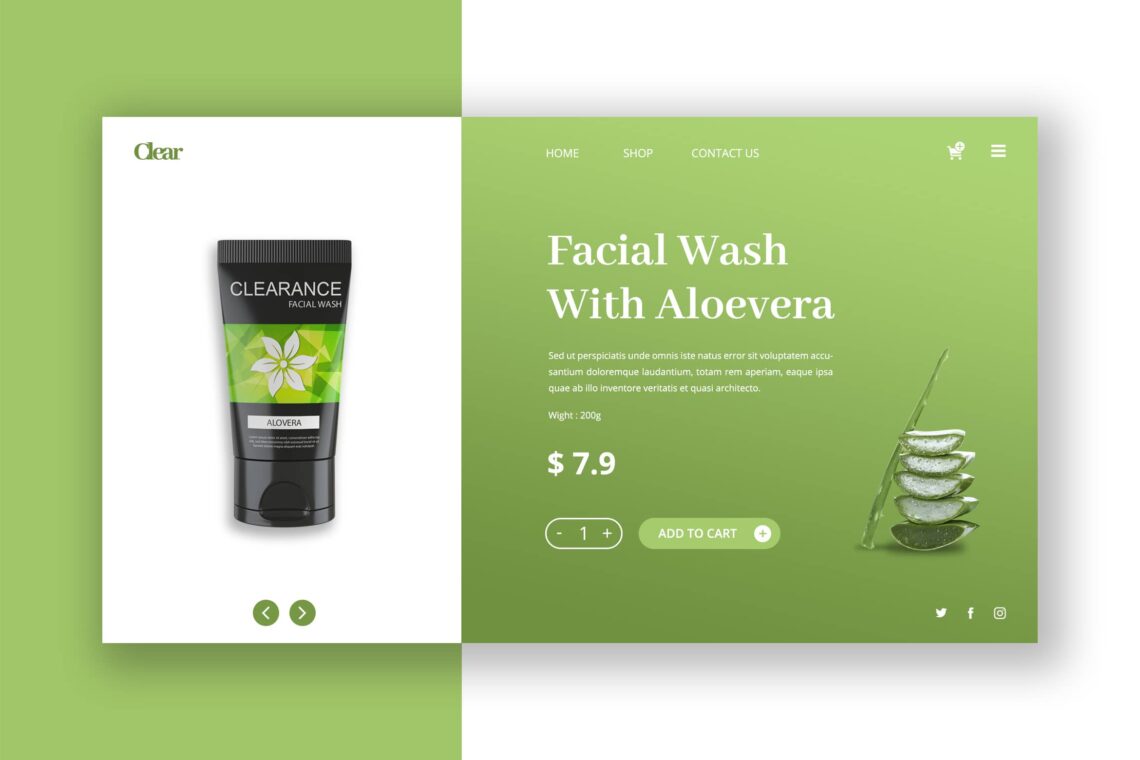
Too many make over on your website make people do not want to keep their time on it. Make the sticky header. It may not influence the around design. It needs to be fixed in mobile and desktop format. When you want to promote a product, make it in good quality of image. Stay on every side of it. Give the clear information related to the product. If it is an online shopping website, you should provide the best and fast way for customers to purchase. Input only important message on the header. Use related navigation on it too. The cursor to see the side of products and the way to add amount of product become necessity.
Food Restaurant
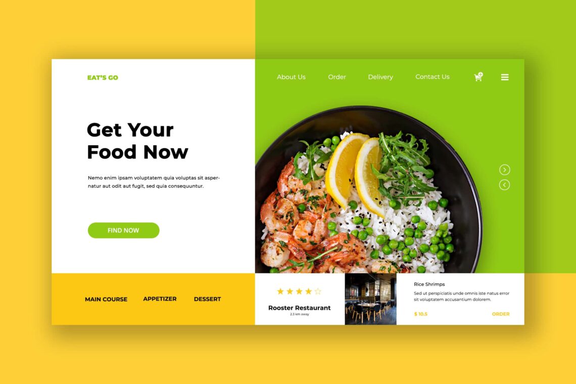
Talking with food means you should know how to build someone’s appetite. Learn more on how to capture food image. When it comes to promote your restaurant, you need to insert some photos of your place. Insert menu title to help customers reach it easily. Therefore, if you want to handle anything in this website, you need to select the right font size and color. It should be light and increase happiness. People really concern on their first impression.
Smartwatch Store
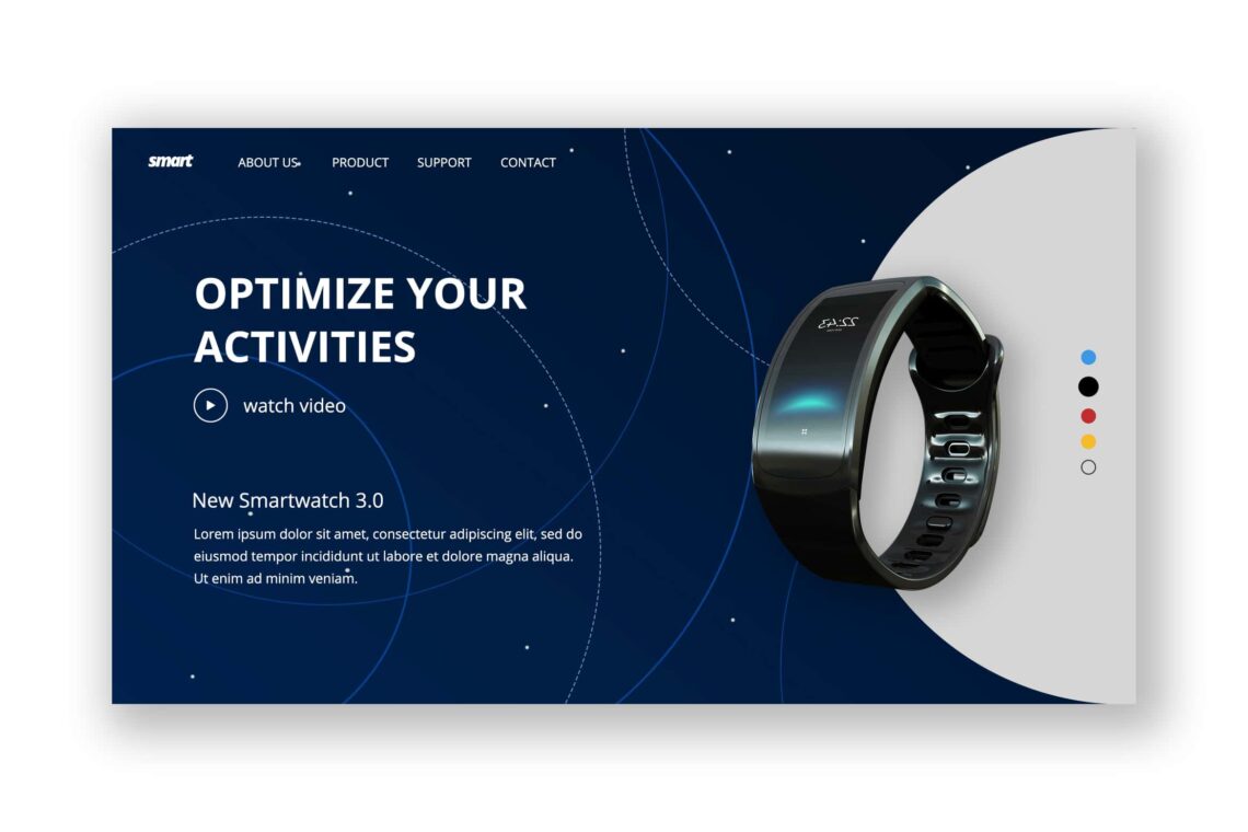
Modern and high technology product to sell should promote in high effect way. Since you want to show everyone about the best feature of your technology, explain it in attractive color and design. Geometric landing page is you need to make it more attractive. Having animation maybe a good choice but concern on its capacity and duration of short video. People will not like to watch the long duration of explanation. You should know how to make them not bored when they want to visit your website. Remember to keep the clean and clear information on it.
Choosing blue or navy blue for the background and white as the font color looks like a perfect combination. Adding the video in full illustration and animation to attract more people to watch. Influencing people until they make a decision to buy is not always go smooth. You do not need too many menus and titles inside your header. You also do not need too many icons on it.
Original Pizza
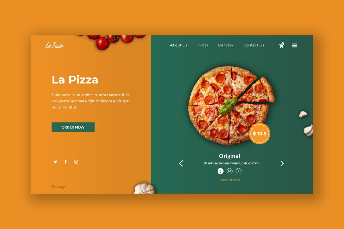
Perfect template for food head hero is light and dark. A point view should be in dark and background will be light. Therefore, people would focus on something darker. The menu ‘order now’ could be in dark color. It saves time for people who already notice your website and in hurry desire to order. This design is simple, but it keeps look attractive. What are you waiting for? Small, medium, or large pizza?
The color determines the visual color. When you need to play someone appetite, mood, and impressive, choose the meaningful color like your brand main color. It holds in customers mind. Update your website regularly, so people who visit it notice your business is still exist.
Electrical Guitar Sore

Music instruments have their own fans. If you are the one who wants to create the rock music instruments sore, choose colorful color in head hero. It does not mean you cannot use the soft color, but it means you should suit it with instrument character. For example is piano. It is identical to romantic and soft image. Therefore, choose the soft color for it. Even if you have to combine the color, make sure both of them are soft.
You need to show the features and every side of the instrument. It is god to add videos on it, so customers cold make a fast decision whether they want to buy it now or never.People who visit instrument online shop usually are ready to purchase. They see the items because they desire to have it. Except if your website contents incluse tips or new key note for new songs and others related to music. People would visit your website to learn rather than to purchase. Whatever their aim, make sure you have proportional side in your website including the great image.
Road Bike Store
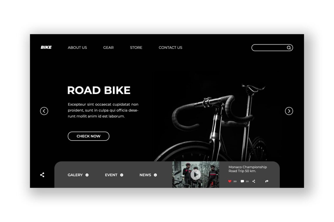
Cycling is a popular habit today since everyone desires to stay healthy. If you consider to sell bicycle, no matter the style, it is better to make deluxe style of head hero. The reason is because people who will visit your website is they are who have more money or rest money. Black and white component is the safe one. It gives a modern image and great impression. Slide navigation will be effective to give short and pointed information. To attract more customers visit your website, insert the latest information about cycling like the route, the great tricks to maintain the bicycle, and how to select the good bicycle depends on your track.
Hero head design build the competency of your image and business. Be careful on the add inside your website. It should be relevant to your content. If it is annoyed, move it into the small spot in the edge. Make sure customers will not get disturb by the add.
Are you ready to start making hero head design templates? Let UI Creative helps you to find the best one. Browse what you need, purchase it in affordable cost. Get the file and edit as your desire.


