20 Google Web Banner Tips and Tricks 2022
20 Google Web Banner Tips and Tricks 2022 is like the fresh air for you. Now you can boost sales throughout the world and make your company is known in the digital world. What should you do?
1. Organize The Banner Size
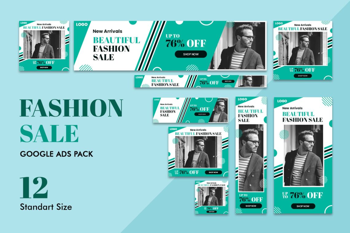
What do you want to get from the web banner? The main aim for sure is to market your business and products. People prefer to use it because it is cheap and effective.
To gain the optimum benefits, you should know what Google wants.
- 728×90px — Leaderboard
- 300×600px — Half Page
- 300×250px — Medium Rectangle
- 336×280px — Large Rectangle
Those are the recommended size for your banner to lead the market.
2. Placing the Banner in the Right Place
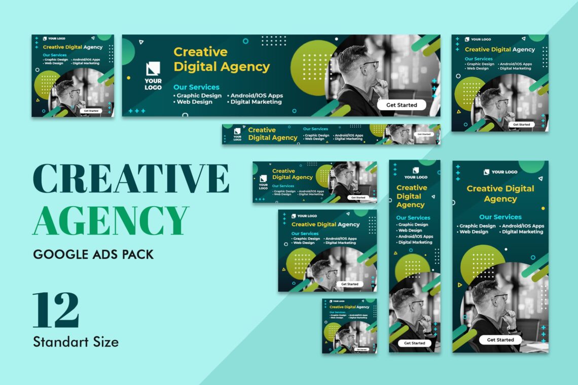
Ask yourself about the appropriate place for the banner. Make you in the audience shoe. Usually, website visitors would love to see the banner close to the main content.
3. Watch Out The Hierarchy

This part will be important to follow. You should notice that three kinds of things in this part cannot be skipped or unstructured.
What are the components?
a. Company Logo
It should be included to build brand awareness. Make sure it’s visually dominant. However, it is not as dominant as the value proposition or the call to action.
b. The value proposition
It showcases the service or product you provide and calls attention to itself with attractive offers and prices. Add two magic words like“High quality” or “50% off” or “Limited time offer” that might take up the most space in your ad and be the first thing that viewers’ eyes see.
c. The call to action
It is the text or button that invites users to click. Try to adopt these phrases like “Learn more” or ‘” Get started” or “Watch. Make sure you put it at the end of the ad.
4. Limited Space Asks to be Simple
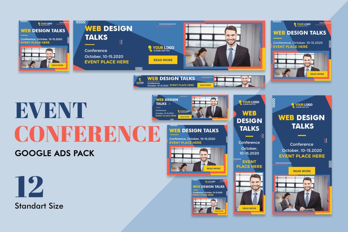
People don’t have much time to see your ad. Therefore, make it simple in its visuals and words.
5. Play with Button
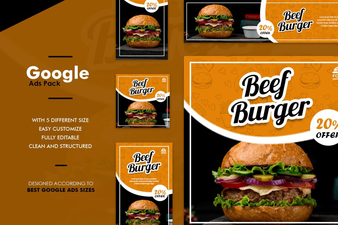
Take your time to contrast but a consistent button. You can put more buttons too. Make sure to place them after your copy on the lower right side. The buttons would increase your click-through rate. Wanna try?
6. Insert the Message Inside of Frame

All right! To raise the effectiveness of the ad, don’t forget to place one deeper frame tone. The white ad needs a grey frame. So psychologically, people would look from the top side to the bottom. It is great when you can contrast it.
7. The Text Should be Readable
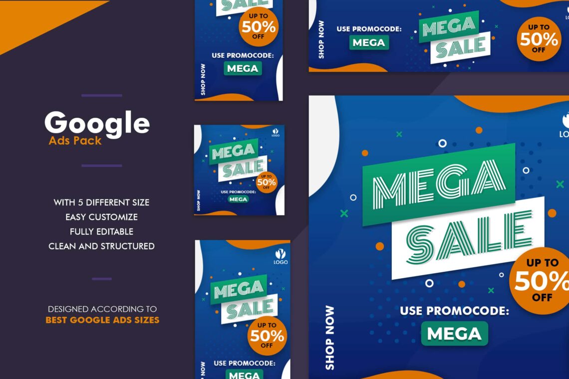
Even you only have a narrow space, having readable text is a must. Therefore, you need to know the appropriate font size and its colour before applying them to your ad. Headline should have a different size from the body text. Four lines are the proportional length for it. Well, avoid the curve, thin, and less than 10pt fonts, except you want to write a disclaimer.
8. Animation? Why Not?
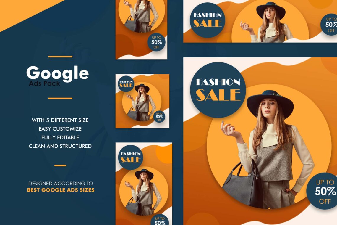
Commonly, animation is often to be used in static banners. However, the exception is yours. It means the animation will be very effective if it doesn’t disturb your message in the ad.
Use simple animations that last no more than 15 seconds. Make sure that they don’t loop more than 3 times. Consider making the last frame of your animation a clear call to action.
9. Wanna Complement? Blend but Show!
It’s blackout when you skip contrast for your Google web banner. However, this is the way to maintain followers to be loyal to your website. Some people think that ad campaigns are just disturbing. That’s why the vendor will be very careful to place campaigns. He doesn’t want to miss his loyal customers, so he tries anything to make them comfortable by blending his ad with the same colour as the web theme.
If you want to do the same thing, don’t forget that your ad should be fascinating even it is hidden.
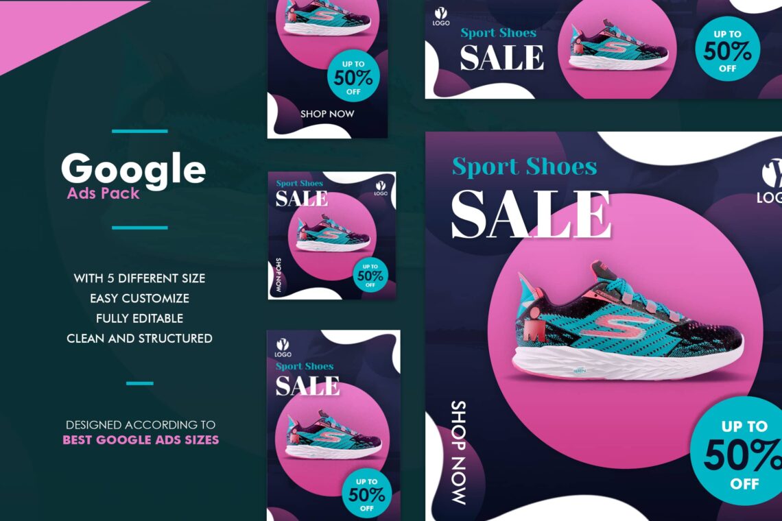
10. Be Consistent to Your Brand
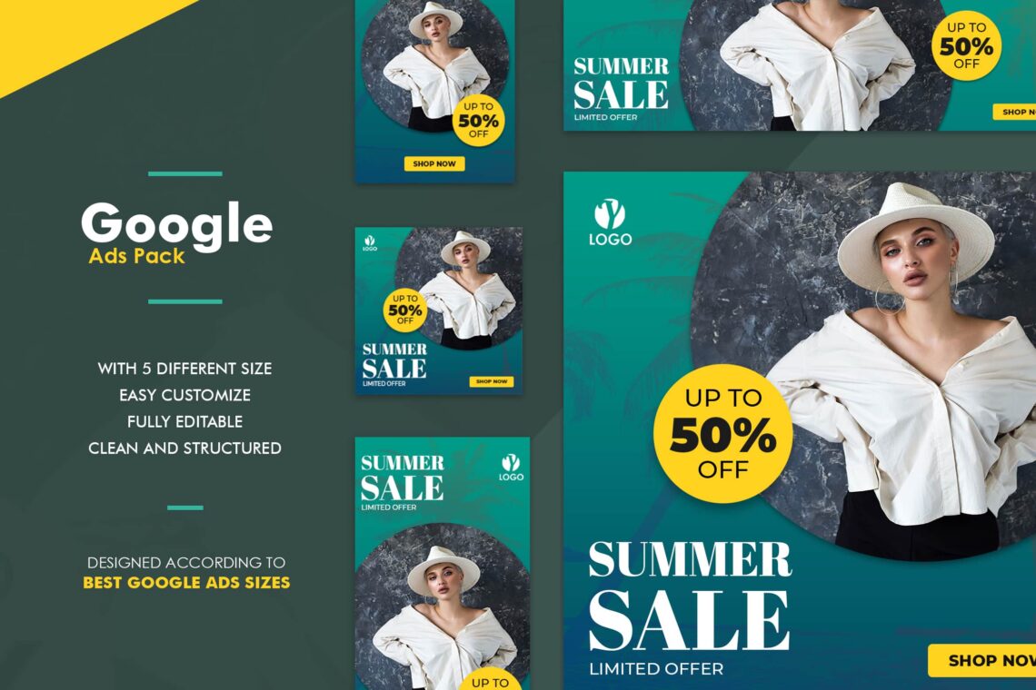
Do you know what is the most difficult thing when you want to start something? Start! It is the most difficult action to do. Therefore, once you successed to start, make sure to take a deep breath and keep to try on be consistent to your brand. Match it to your web ad.
11. How Much You Need Visual Urgency?
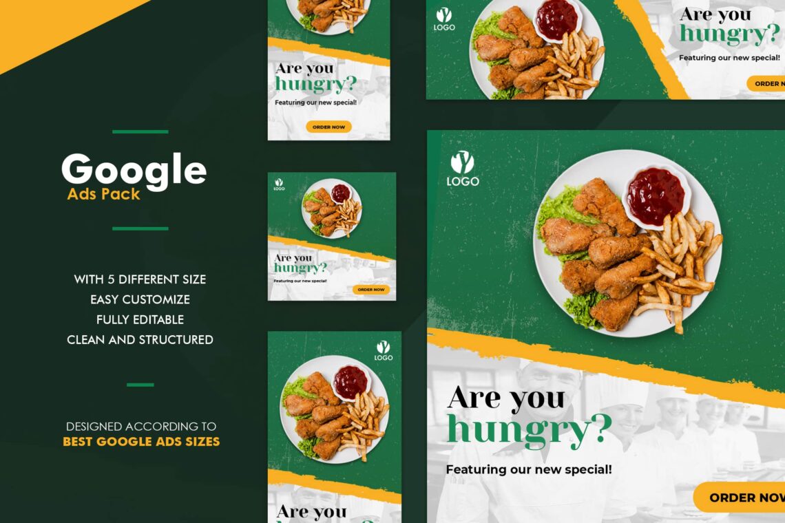
Google web banner is something you have to deal with visual sense. Boost the visual urgency by having spectacular view. How to do that? Just play with the bold and font color. Bold important message, select the right font and size, and more.
12. Input Elements and Graphic
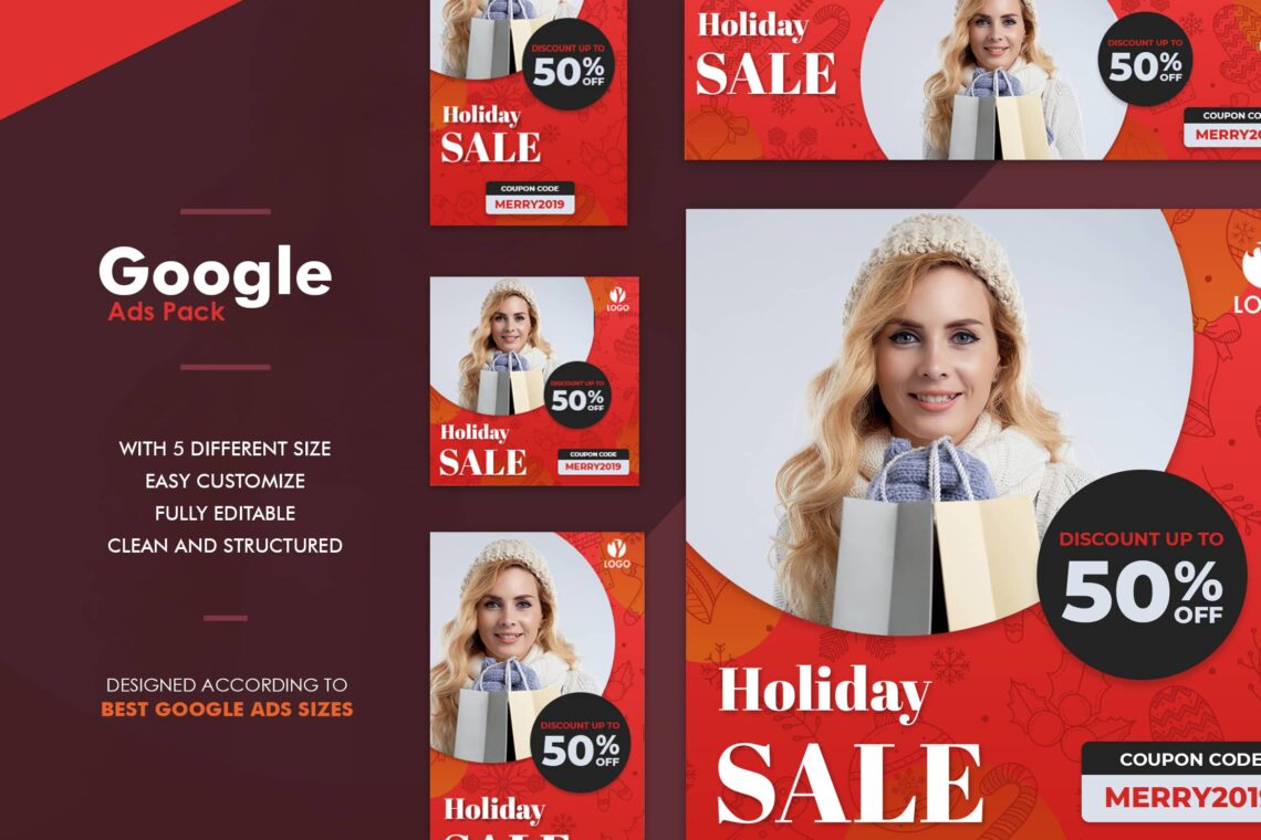
Images are not always important to insert in your banner. However, it is not for the elements. We need it to make sure the visual of this ad becomes great. In addition, you have to concern the proportional elements, graphics, and some shapes to deal.
Whenever you think it is difficult, hire a professional to help you. You also could find the ready – to – use web ad.
13. Play With Colors
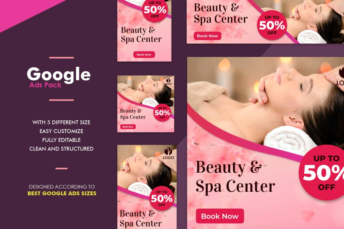
Picking up colors cannot b random. Here are some meanings behind them. Colors are also subjective and have different associations in different cultures. You need to study your target audience when making your color selections.
- Red: Passion, anger, excitement, and love. This powerful color is attractive to most audiences. Use it in moderation. If you’re aiming for a classic, mature, or serious look, don’t use it.
- Orange: Playfulness and invigorating feelings. Orange still stands apart from the crowd and exudes energy even it is not as powerful as red. It’s a great color for a call to action button.
- Yellow: Cheer, sunshine, and friendliness. Yellow is eye-catching and sends out an energy that is youthful and affordable.
- Purple: Luxury, royalty, extravagance, wisdom, magic, femininity, and creativity. It has a soothing, calming effect on a viewer.
- Green: Health, freshness, wealth, the environment, growth, nurturing, and new beginnings. It’s easy on the eyes, too.
- Blue: Safety, trust, clarity, maturity, serenity, intellect, formality, refreshment, coldness, and masculinity. Blue appears in more than half of all logos.
- Pink: Love, sweetness, femininity, youth, and babies. Pink is typically associated with all things feminine, but has a real range based on brightness and tone.
- Black: Exclusivity, mystery, modernity, power, prestige, luxury, and formality. It’s traditional, and black text on a white background is the most readable color combination.
- White: Purity, cleanliness, modernity, sterility, simplicity, honesty, and innocence. White creates feelings of economic sense and youth.
- Brown: Nature, wood, leather, seriousness, masculinity, toughness, and humility. Brown balances out stronger colors and is good for background colors and textures.
- Gray: Neutrality and practicality. When used as a background, gray intensifies other colors.
Wanna combine them?
14. Small File Size
You will insert the ad on some websites. You ask for help to promote your brand in others territories. So, need to respect the web owner. They should build up their web content more than ads. Do not try to put your shoes on your business. Make it in a small file size and be ready to get help from the website owner.
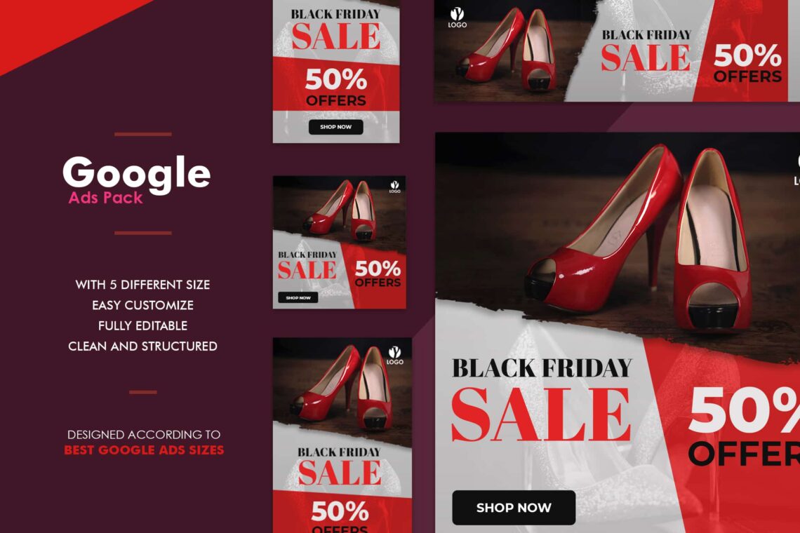
15. Right File Format
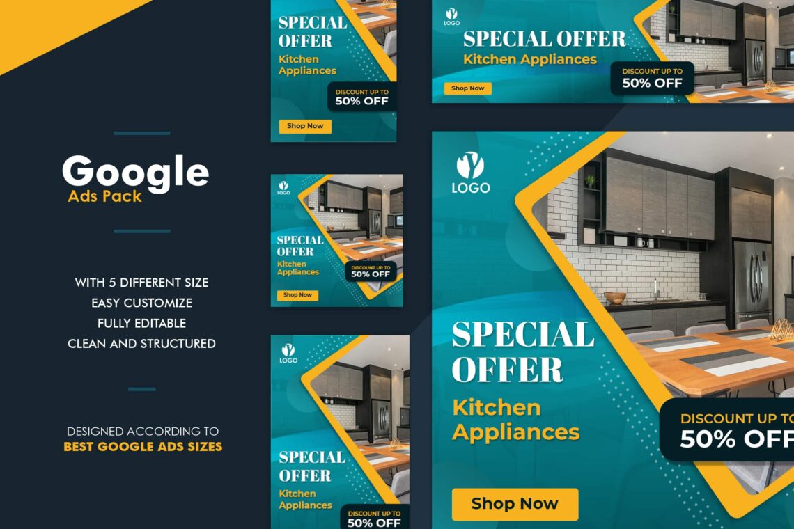
JPEG is the popular image format, so do the web ad. PNG, GIF or HTML5 files will be your working deliverables. Your designer will typically work in Adobe Illustrator or Photoshop to deliver JPG, PNG, or GIF files, or in Google Web Designer or Adobe Animate for HTML5 files.
16. Trying for Flash Ad
It is a good idea to be more modern and up to date. Start to make Flash Ad into your ad. Be unique and be ready to get viral.

17. Hire Professional
Having a professional helps you to be less stressed. However, you have to prepare some spare money for it. Therefore, it needs good preparation and thought. You need to calculate correctly.
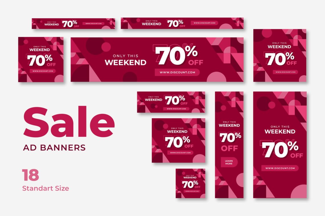
18. Update Information on Ad
It must be terrible and just like a trap when you have the old issue on your web ad. It is just like something awful when prospective customers click on your web banner but they cannot get what they desire. Remember to keep your brand image good. Once you create something lie would influence your brand image.
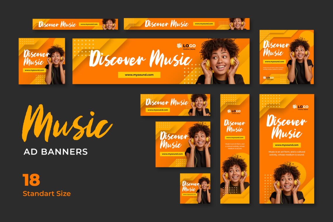
19. High Quality Images
The first impression comes from visual perception. To attract more prospective customers who would click your ad, make sure you notice the way to attract them. Insert only high quality images. Just back it to yourself whenever you see an advertisement that has a broken image, what do you think?
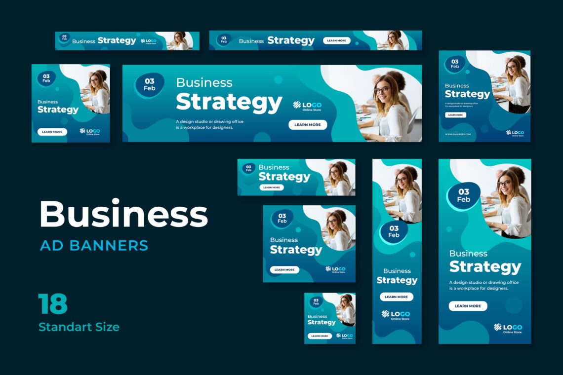
20. Discover Ui Creative
This is the last but not the least tip for you. Anytime you want to make a Google web ad, you may not skip UI Creative from your professional helper list. It would help you to get the great banner and sure all you have to do is just browse and click. Select the one you desire and save it for the future.
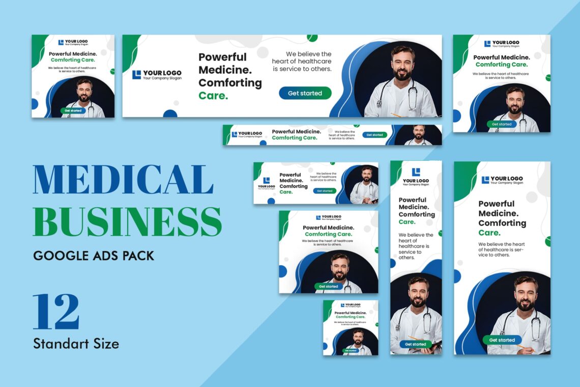
Google web banner now can be found in some popular websites. Make sure it has a high click rate and boost your sales.