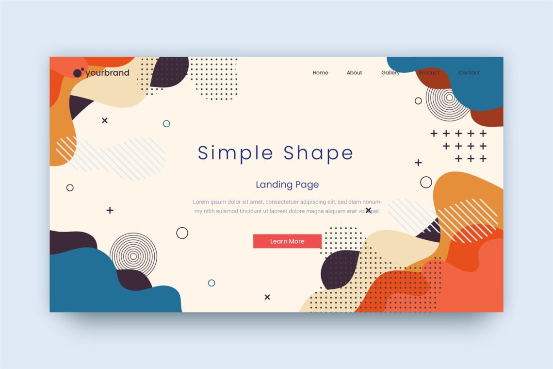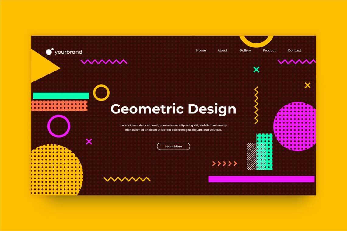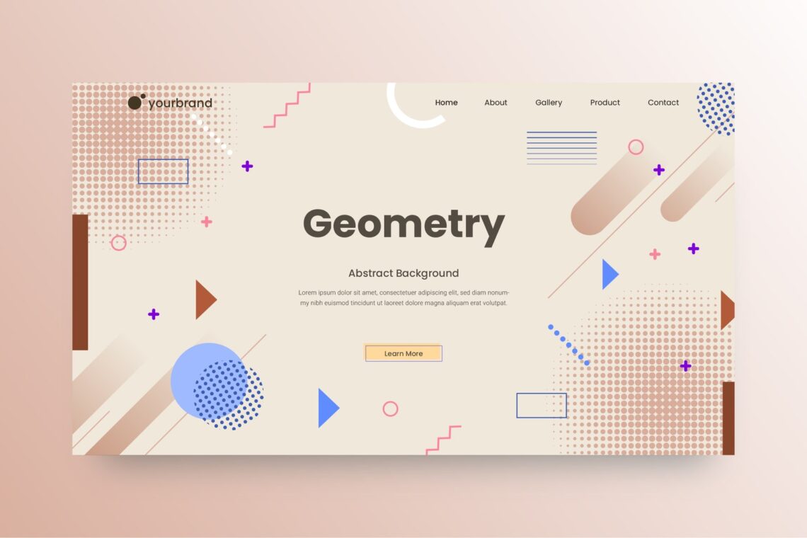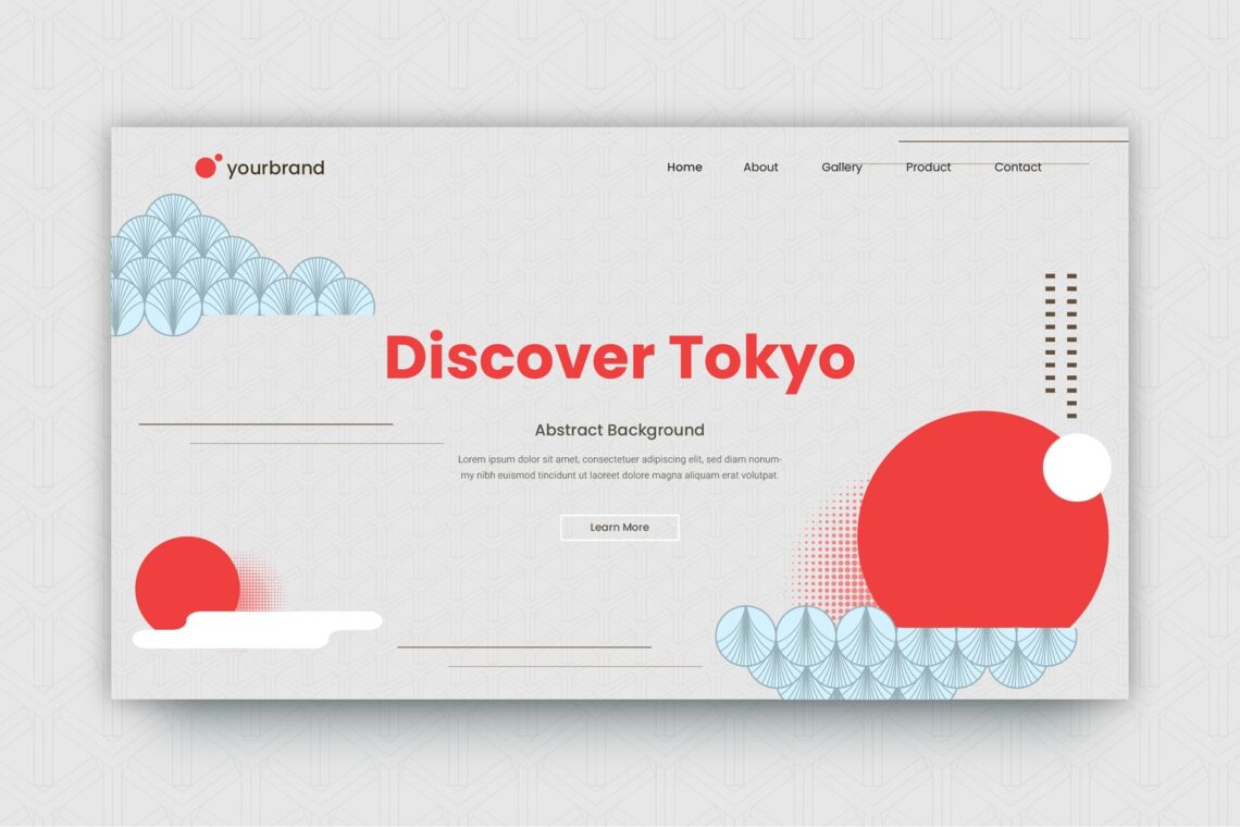
Website background is like our daily life. To decide successful life or not, it should be interesting. Therefore, to concern your website success, you should make it interesting. What is it actually?
Well, website background is the components that fill your website. It includes image, color, and design in the screen (website). It is a key for your website to be popular or having good impression. It is because of people who visit website will see it at the first sight they open a website. Whether it is a website for business or brand, it is important to make it looks good and leave a kind impression.What you have to fill in it is the message of your brand.
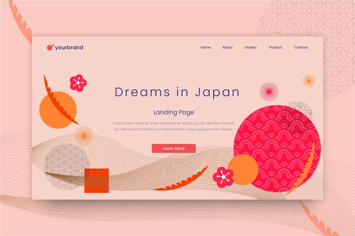
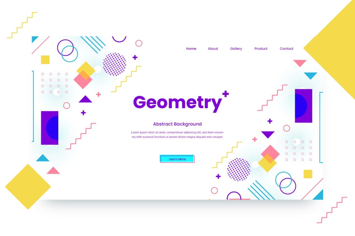
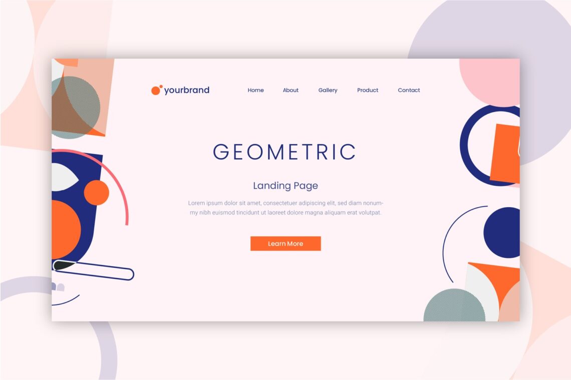
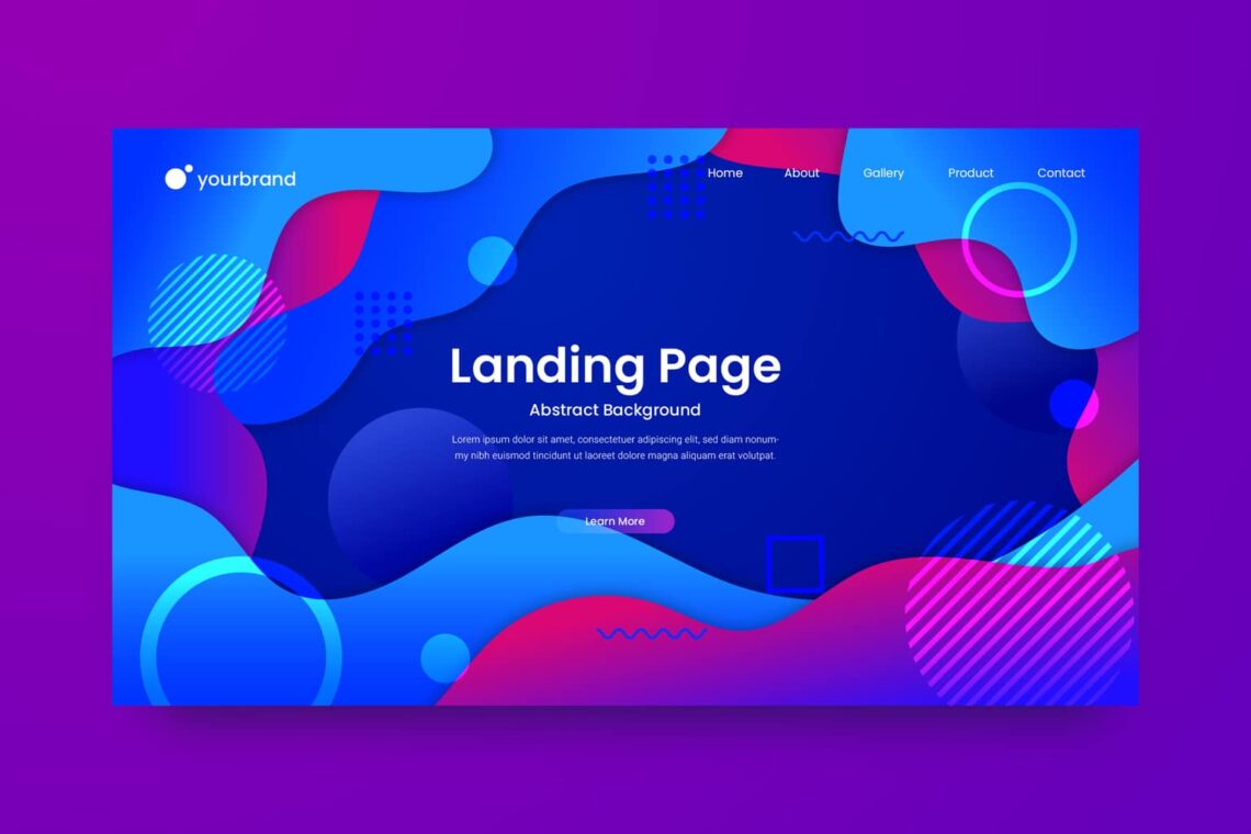
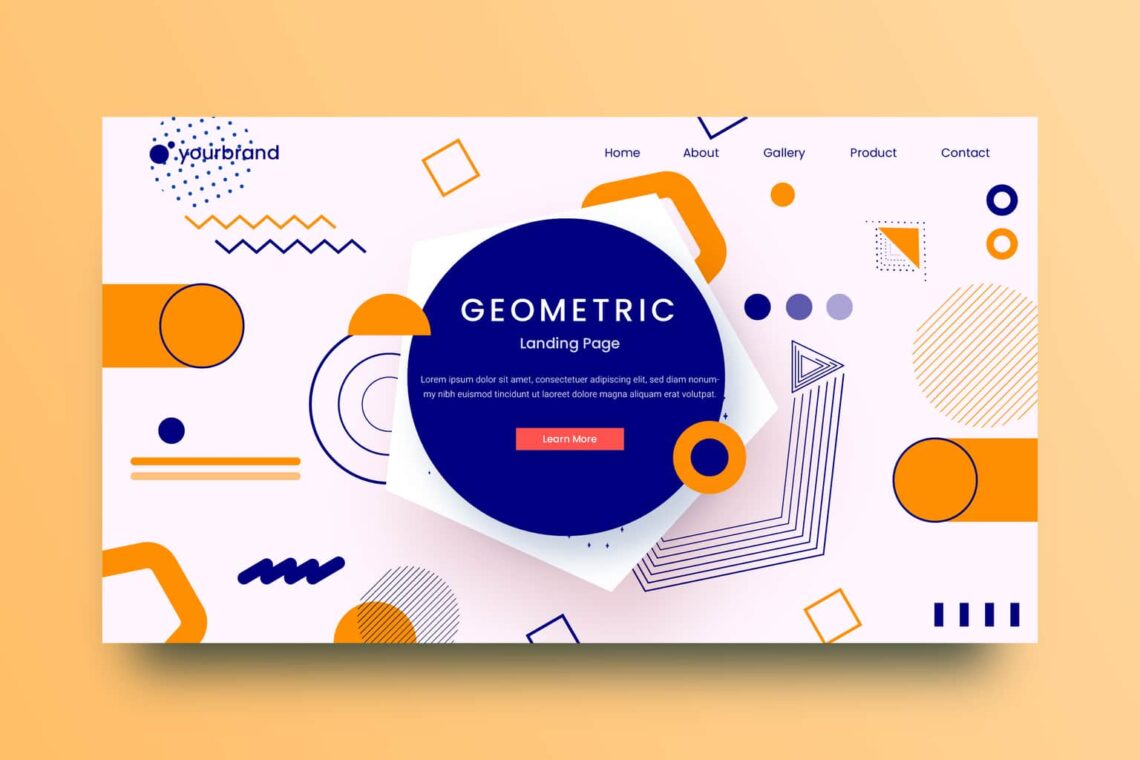
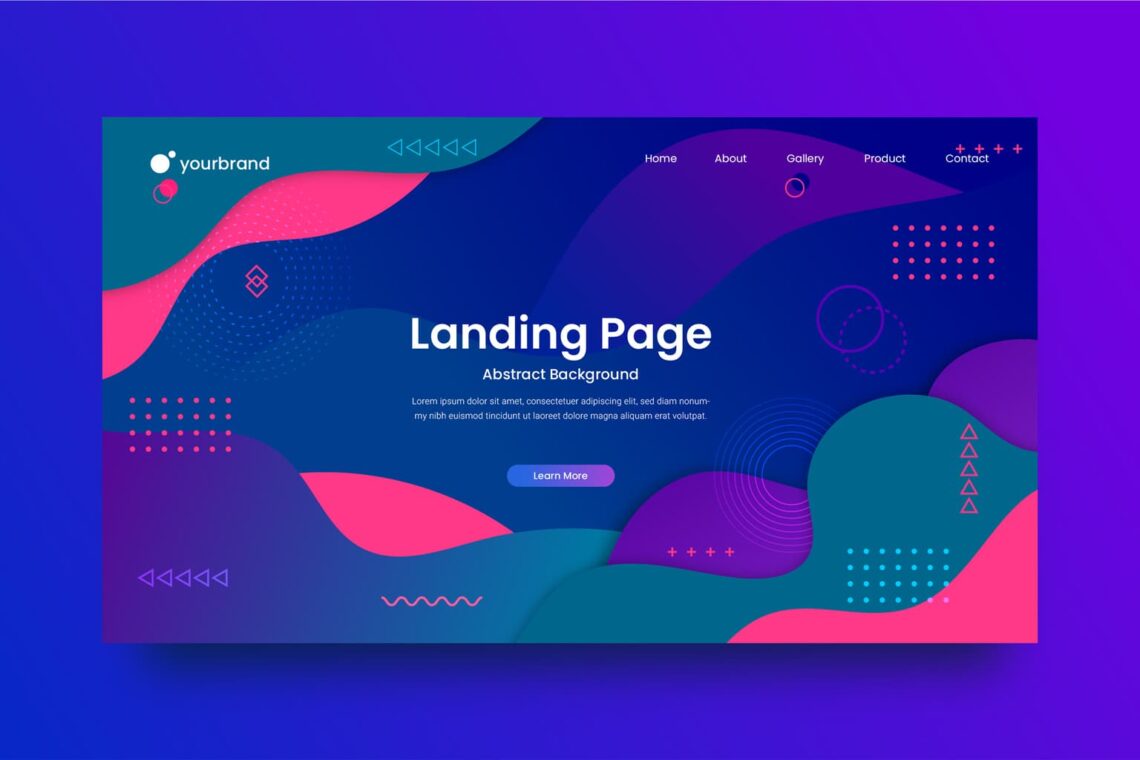
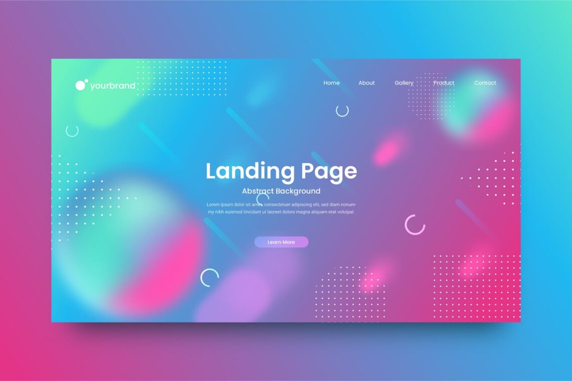
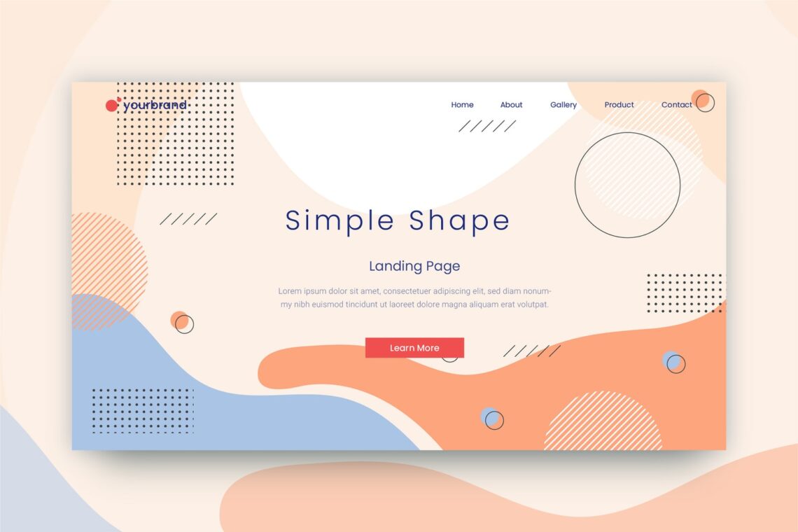
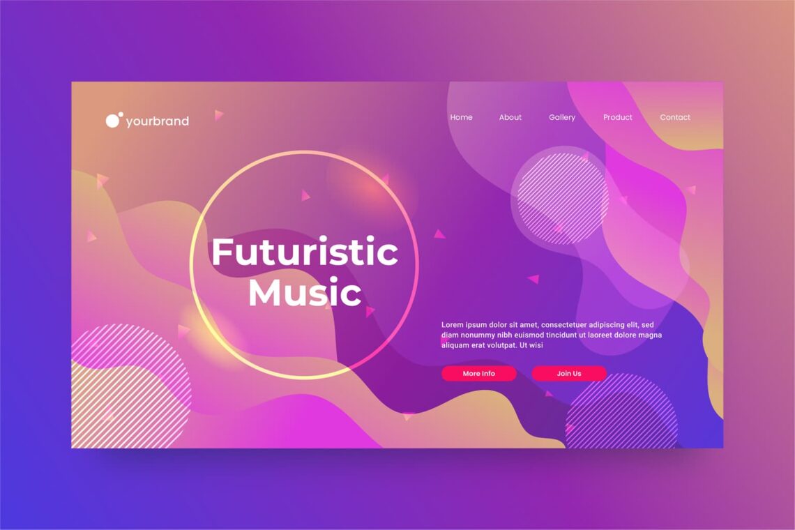
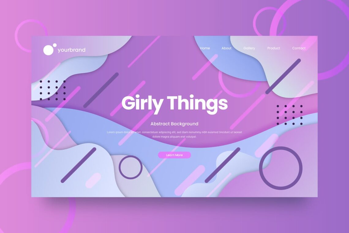
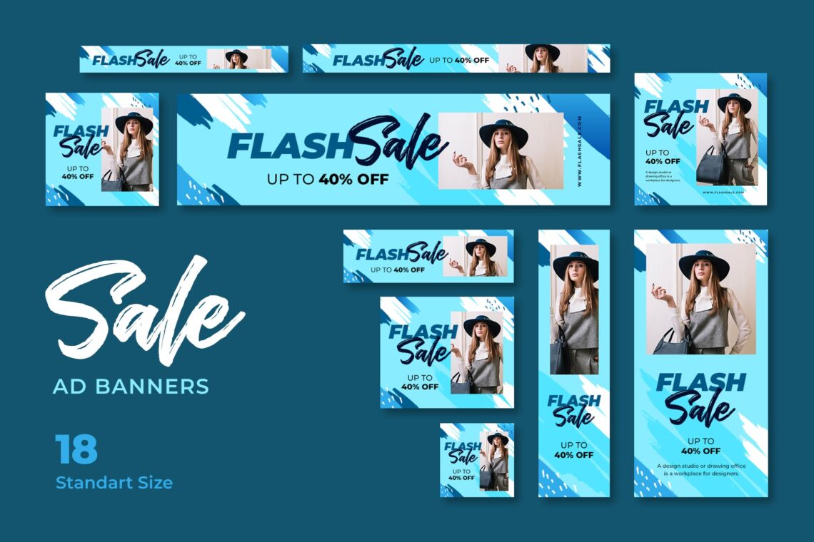
It is not only have to look good, but it should deliver good users experience. Here are some examples of it from UI Creative.
How to make it? You should know the basic of making gorgeous website background.
Website background consists of two types of area. They are body background and content background
1. For Extra pop, use Header
Since header is on the top of your page, it has main part to attract more visitors. It is a place to show your website personality. Add more eye catching elements like icons, illustrations, splash of color, and more items that will not distract your website. The good background make the tone of website and complete the content. You can add it by HTML or CSS too
2. Concern on the contrast
The wrong color contrast make the website difficult to read, especially the content. Before you go, check the contrast ratio first. In addition, you should remember that a solid colored background will be the most basic type and the default basic color is white. It is very clean and sleek.
Maybe you need combination colors, so you need colors that complement each other. It is important to pick theme colors that go together. You may start with black, grey, and white. In color theory, there are three color categories. Primary, secondary, and tertiary. Business person should notice it. Mixing light or we know it as additive color mixing model helps you to create various intensities.
CMYK (Cyan, Magenta, Yellow, and Black) will suit to printers and screen. If you use red, green, and blue, they would result in inaccurate color, especially if you print it. Complementary colors make imagery pop. However,if it is used too much, it would be tiresome.Analogous color in brand is not only peaceful eyes, but also effective to instruct the visitors to take action.
Triadic color makes visual contrast and harmony simultaneously. Each item would stand out.Branding and marketing are two key points to play with colors aim.
Also Read : 10 Tips for Creating Website Background
3. Use graphic
The distinctive style from your website comes from graphic elements you insert. However, make sure you make a consistent effect for customers. Use the same line as your website vibe. Remember whatever the text font, image theme, color palette, and design options you choose, they are in the same decision.
When it comes to loud and clashing colors for graphic, it could evoke epilepsy in a small number of web users.
4. Run Your Background
A timeless choice is white website backgrounds. The full body backgrounds need impression to make huge impact. The body background in gradient, solid block of color, and full image would execute the website appearance. Therefore, you should make sure if the image is not too bright. The most important thing is users could read the content clearly.
Adding layer masks or use CSS would help you to make image becomes readable. If it is not help you more, you can try to choose the right font type and its size.If photography is not suitable for your website, try to use illustration. However, make sure the color aligns with your brand.
Also Read : 20 Amazing Website Design Templates
5. Welcoming the Highlights
It is a thin lines and made by different color and section in your website. It is used to break up solid color blocks. it is also to increase legibility.
Not only about the highlight. You need to use intuitive design for navigation, menu icon, search bar, and helpful links. For navigation options, place it at the top of the page. In the top left corner would be menu icons. In upper right side will be a search bar. Helpful links like contact us will be in the bottom of the page.
6. No Cluttered Images
When you want to add text over your image, you come to the clear image. Do not miss the message you want to put on website. Eye catching and cluttered come from landscape style background image. Keep them minimalist like cool tone colors, black on white text pages, simple graphics, and simple tone of elements. You can bring your website looks professional and attractive.
If you do not know how to get minimalist websites, come to website creators. On the other hand, an alternative to minimalism is brutal ism. It has harsher lines, bold text, bright colors, and minimum images. It has less of following than minimalism. However, it depends on your website content that suit to your website.
7. Concern on Trendy Website
Your website needs to look contemporary and new. Use luminous color, geometric design, dark mode, or immersive 3D design. You need to update your background soon. Using animation design would attract visitors to enjoy your website content. Use parallax effect for it.
Parallax effect is optical illusion. It is a good immersion. The computer screen would go into something closer to theater stage. It is like magic.You also could use abstract art like geometric style of circle and square. Simple, minimalist, and restrictive. That is the point. Focus on good colors for eyes because people use computers or long time.
You also may use trendy topic as the website background. For example, if today we are in pandemic, you could find a design with message to stay safe during pandemic. Or when it comes to Halloween, you may use it as the theme.
8. Use Gradient
When you already play with animation, it is time to play with gradient. It similar to color transition and good for your website pop. It is gradual blending and make two shadows. The gradient trend is versatile. Bold or subtle, it influences the focal point of design. On the other hand, it is also influence a background element. Gradient could mix and blend different shades of color and make a new color from it. Different and modern. That the two key points on it.
Gradient becomes trendy since it is eye catching and attention grabbing. Designers feel surprised with the coming back of gradient. The larger brands use it like Instagram. For website background, you may add photos in it.
How to start using gradient? Decide the color first, use it wisely. Since it is versatile, you can go with logo and website background, but notice your audience. Traditional business people is not suitable for neon pink. You also need to make it fun like you could try to combine another color.
Also Read : How to Personalize The Website Design Templates and The Advantages
9. Make Your website Mobile Friendly
Your website should be responsive. Make people easier to find the information they need. You do not need to use flash. Input the view port meta tag and turn on autocomplete for forms. You can make the larger button size to work comfortably on mobile. Use large font images and compress your image and CSS.
The amount of your attention is equal to desktop website development. To get more web traffic, you should know the new people habit on their mobile. Most website creator will automatically create a mobile version. Follow this information like ensure the buttons like site links are large and easy to tap. Avoid to implement features that cannot be viewed on mobile like Java and Flash. It is bad to not optimized your site into mobile friendly. Begin with Google’s mobile friendly test. You will get the areas to repair for mobile visitors. Your desktop content needs to be mobile friendly. It to gain more visitors. Ensure your navigation is adaptable for your website on mobile. Whether single bar double bar, you should know how to make it great on mobile.
10. Make a Determination
From scratch website is created but you have to understand HTML Coding. You can easily create website by free hosting service. It will be easier. You should learn HTML and CSS if you want to code your own website. You need to hire professional because it seems quiet long to learn every detail on website making.
Considering to map out your site by noticing the pages amount and the content. You can draw rough pictures of them and do not need to only determine it in paper. The direct links to important pages of your website should be in the home page. Make it easy to access.
It is not always easy to deal to website. You need to make unique choices. Do not be afraid to buck trends. You can place website elements asymmetrically. You also could use overlapping elements to make a layered appearance. Squared-off elements, sharp corners, and elegant touch are less favorable than rounded and soft elements.
Once the website has done and you already make gorgeous background, it is time to optimize the website. Avoid on using too many photos per page. It is struggle for mobile and desktop to load pages. It is good for your website to load in less than three seconds.
The contact page like phone number and email address should be available. Whenever users need solution, they will not getting frustration. A source said that you could create custom 404 page for has been not set up page or the page does not exist. Customize yours with a light hearted error message, a link back to the site’s home page, a list of commonly viewed links, and an image or logo of your website.
Also Read : Website Design Templates for Beginner
Do not skip the search bar. Users could quickly navigate to a specific page without they have to click navigation options. Search bars are also useful when your audience wants to search for a general term without using trial-and-error. When someone arrives on your website’s home page, they should get the gist of your website’s theme immediately; in addition to this, all elements of the home page should load quickly, including navigation options and any images. Inviting graphic, keywords, a call to action, and a navigation toolbar or menu become something to consider.
It less functional when you already make beautiful website but you do not want to update as its age. Remember that design trends, photos, concepts, links, and keywords are change as time goes by. You should make changes of your website continually. Ensure it is up to date. You need to check your website performance other similar websites. At least you have to do it in every three months. It is better to have more often.
Find more benefits when you update your website often. The up to date website content influences the website structure. Crawlers would detect the new content or the new life of your website. This is a decision for website visitors to visit or leave your website. The index of your website also would be find in search engine easily. Do you know the meaning of index? It s a list of URLs provide by search engine. Make sure your website structure helps visitors get what they are looking for. In addition, the important aspect is to make crawler realize your index.
To help you play with image, all you should do is make sure the size of it is website friendly. For example the JPG format is less than PNG. It is more adaptable for your age and will not make it loads long. The faster load website will attract more visitors. Use rich keyword name for your image. The crawlers would get useful hints from it. The description of image should be accurate, readable, and including special related keywords. It would help users experience to be better.


