Tips to Make Great Website Design Templates For Beginner: Best UX or UI Design
in Web Element on February 12, 2022Website design templates affect your website visitors’ impression. When you would like to have great brand awareness or company awareness, start by having an appropriate and consistent template. Considering these tips will help you to make it like yours. Notice some tips from many professional companies here too.
– UI and UX: What Are They?
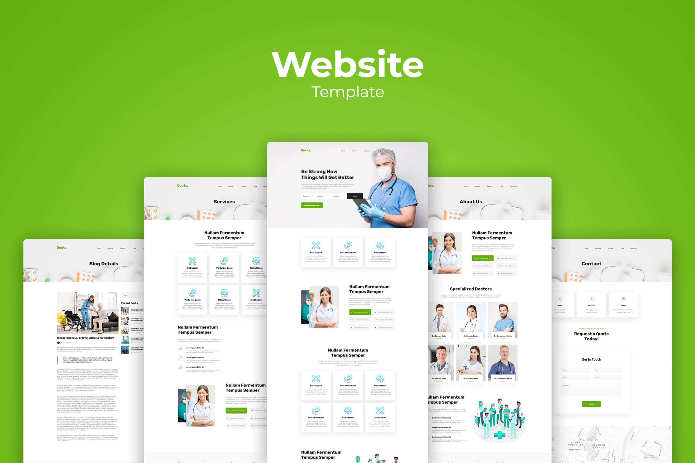
Before we start to make commerce website template design, let us begin to notice UI and UX. UX stands for “user experience,” which refers to the user’s behaviour or “journey” using a website, app, game, etc. UX design influences users’ first impressions by seeing the screen layouts. It would give users the experience to see the controls on a website.
UI stands for “user interface,” which refers to how users interact with the design controls, buttons, gestures, and speech input. Its design focuses on areas like how the buttons look, hiding controls to save screen space, or translating hand gesture controls from mobile devices to desktop versions. You will find a lot of design elements involved in perfecting functionality; like using typography that’s legible or choosing colours that don’t crash.
Also Read : 10 Tips for Creating Website Background
– Learning from Udemy Before Creating Your Website Templates Design

Udemy is a big name in online courses. You could learn both about UI and UX. This company would help you to learn from students’ perspective, so the lessons will be well received. Udemy offers more than 300 courses just in the UX design category. Some of them are free. Course lengths vary. You can learn from articles and videos.
What to learn here is not only about the techniques, but also the steps to use design tools and find jobs. Of course, it spends around $100 but sometimes they are on sale. You could get it on under $20.
– NN Group: The First Step to Create Adorable Website Commerce Template Design
This group is a part of the Nielsen Norman Group (if you see it on YouTube). NN Group has been the advanced UX design since the beginning. You will learn extensive UI design here. Do not worry about its legality because this is one of the trusted sources to learn about user experience.
You will not get bored to learn because their videos are just a few minutes and have individual topics. Hundred of videos cover many things you need to know and they are available in the playlists. Get them free!
– Learning Tutorials from Envato Tuts+
So tiring for beginners when they start to make website template designs that are appropriate to their products or services. Envato Tuts+ offers an amazing selection of UX tutorials and UI tutorials in the written word, so you will not get tired of watching videos. You will get ebooks and blog-style articles of the same quality as videos.
Your chance to get something free is here. The company offers free UX/UI design tutorials. How to nd particular blog guides are available. If you need something special, subscriptions get you to access to paid courses and ebooks. Don’t worry if you are a student, you will get a 30% discount.
– Begin the Course at LearnUX

This company focuses solely on UX/UI design tutorials and courses, so that streamlines your choices a bit. One of their specialties is how-tos for design tools: they offer separate courses for Sketch, Adobe XD, Figma, InVision Studio, and others, including an HTML & CSS workshop. If you become its member, you will get access to all of the videos. Just for your information, this is a great resource to find your tool to use before you take a draw to make a website commerce template design.
– Laith Wallace: Technique and Theory of Website Template Design
This YouTube channel gives you more UX/UI design tutorials like giving you career advice. He is at his best about getting UI/UX jobs and maintaining you as a freelancer to deal with your project. This is free learning to you, so you can see and make a note in the list of his theory and application.
– Find Your Design Editor Tutor with Caler Edwards
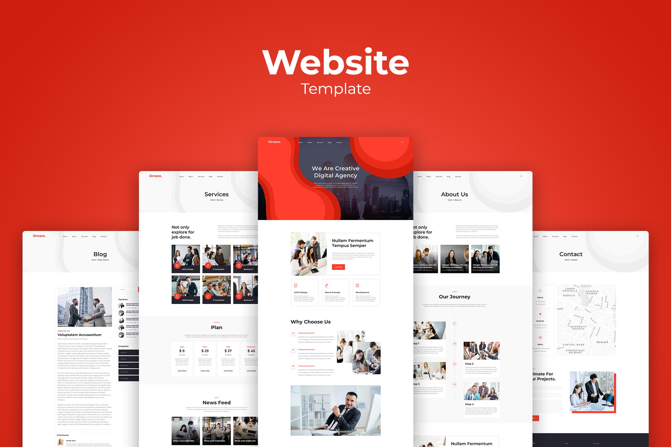
He is a popular designer who shares his knowledge on his Youtube Channel. Many topics are available from his design process in time-lapse to Adobe XD product news. His design playlists will show you his specific UX/UI tutorials. Like a real course, you need to spend more than two hours on 8 videos. They are about wireframing (in Adobe XD), site design (in Webflow), responsive design, and launch.
If you are a beginner and still figuring design editors, he would be a great resource for you. You could find a new UI element every day for 60 days too. This is additional information for you who want to play with colors later.
Picking up colors cannot b random. Here are some meanings behind them. Colors are also subjective and have different associations in different cultures. You need to study your target audience when making your color selections.
- Red: Passion, anger, excitement, and love. This powerful color is attractive to most audiences. Use it in moderation. If you’re aiming for a classic, mature, or serious look, don’t use it.
- Orange: Playfulness and invigorating feelings. Orange still stands apart from the crowd and exudes energy even it is not as powerful as red. It’s a great color for a call-to-action button.
- Yellow: Cheer, sunshine, and friendliness. Yellow is eye-catching and sends out an energy that is youthful and affordable.
- Purple: Luxury, royalty, extravagance, wisdom, magic, femininity, and creativity. It has a soothing, calming effect on a viewer.
- Green: Health, freshness, wealth, the environment, growth, nurturing, and new beginnings. It’s easy on the eyes, too.
- Blue: Safety, trust, clarity, maturity, serenity, intellect, formality, refreshment, coldness, and masculinity. Blue appears in more than half of all logos.
- Pink: Love, sweetness, femininity, youth, and babies. Pink is typically associated with all things feminine but has a real range based on brightness and tone.
- Black: Exclusivity, mystery, modernity, power, prestige, luxury, and formality. Its traditional, and black text on a white background is the most readable color combination.
- White: Purity, cleanliness, modernity, sterility, simplicity, honesty, and innocence. White creates feelings of economic sense and youth.
- Brown: Nature, wood, leather, seriousness, masculinity, toughness, and humility. Brown balances out stronger colors and is good for background colors and textures.
- Gray: Neutrality and practicality. When used as a background, gray intensifies other colors.
Also Read : 20 Amazing Website Design Templates
– The Affordable Learning by Skillshare
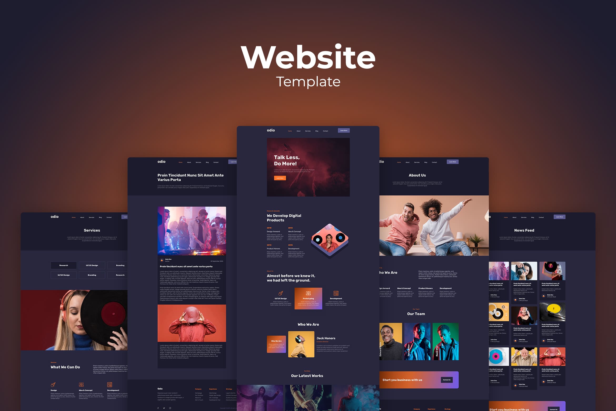
Similar setup to Udemy, Skillshare shares some courses and instructors. However, Skillshare tends to be a little cheaper. If you are its subscriber, you will get unlimited access to and variety of courses.
Courses at Skillshare vary in length, with some under an hour while others stretching over 10 hours. Don’t worry, lessons are usually broken up into digestible 5- or 10-minute clips. So it will be easy to stop and start again at your own pace. Having a professional helps you to be less stressed. However, you have to prepare some spare money for it. Therefore, it needs good preparation and thought. You need to calculate correctly.
– Interaction Design Foundation To Help you Being UI Designer
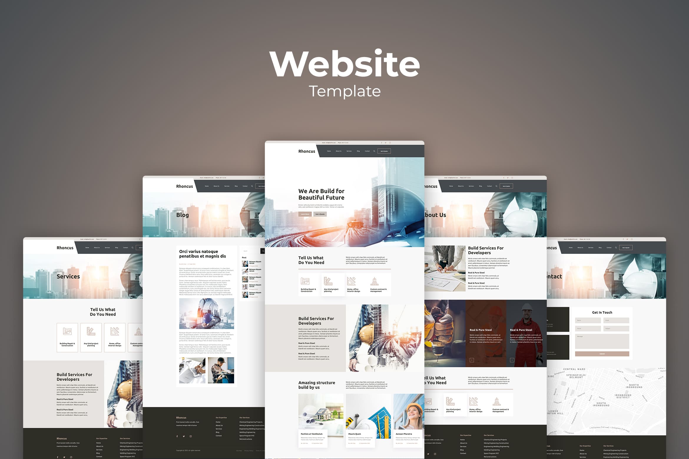
This foundation is a user experience foundation. It offers something from beginner to advanced levels. You will get regular webinars, blogs, and ebooks. With a paid membership you can access all the classes, but each one has limited enrollment so try to book early. It is just like something awful when prospective customers click on your web banner but they cannot get what they desire. Remember to keep your brand image good. Once you create something lie would influence your brand image.
– Coursera
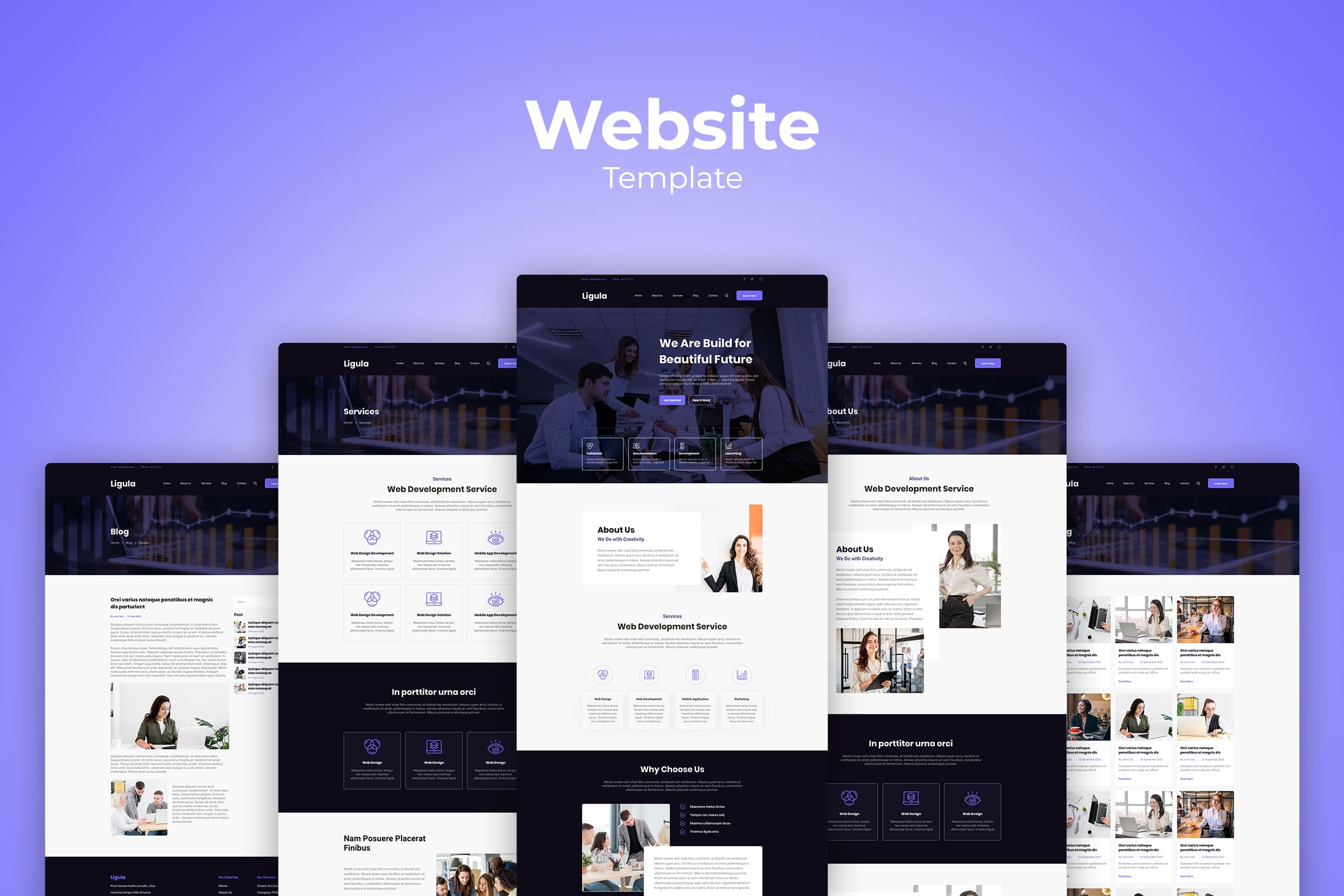
Coursera partners with over 200 universities to offer college-level classes to the general public making it becomes the leader of UI UX online learning. If you desire to get the certification or accredited degrees upon completion, choose this. Users can pay per course or subscribe for a monthly fee, or join Coursera Plus for unlimited access. There are some free classes available as well. Learners can take individual classes based on their interests, or choose a Specialization that involves a series of related classes.
The first impression comes from visual perception. To attract more prospective customers who would click your ad, make sure you notice the way to attract them. Insert only high-quality images.
Also Read : How to Personalize The Website Design Templates and The Advantages
– The Future

This is a YouTube channel dedicated to teaching people “how to make a living doing what they love,” specifically in design careers. They cover a broad range of design-related topics, including an ample selection of UX and UI design tutorials.
This channel is great for its wide range of topics and the personalities of the hosts. It’s very personable and casual, with vibes like a friend giving professional advice. But don’t let that informality fool you—they get plenty technical and delve into advanced techniques when they need to.
If you want to be a professional, it takes time. However, you still have another option than learning all by yourself.
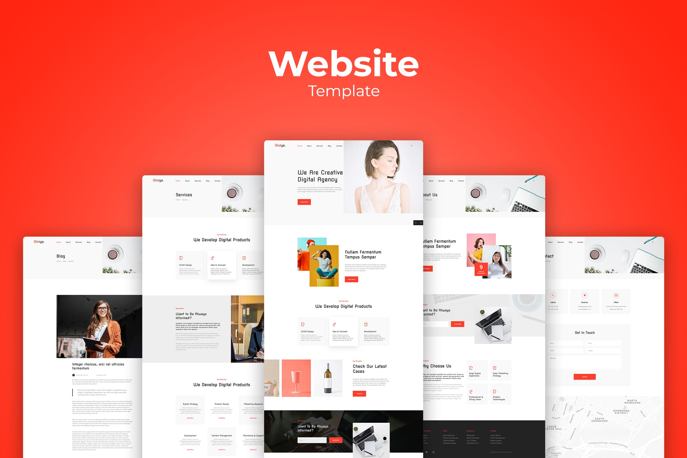
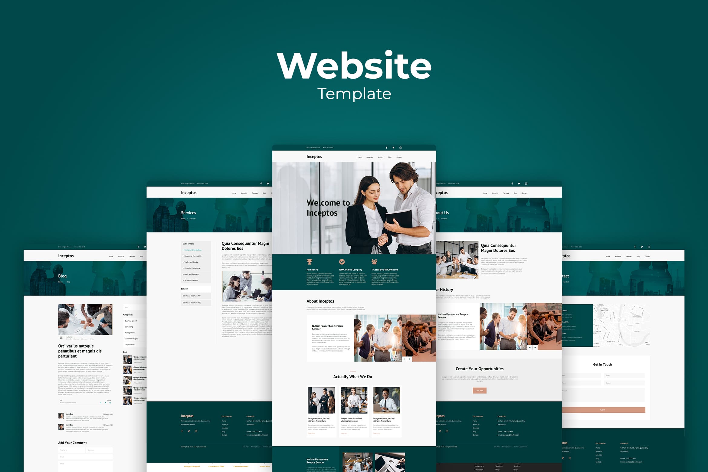
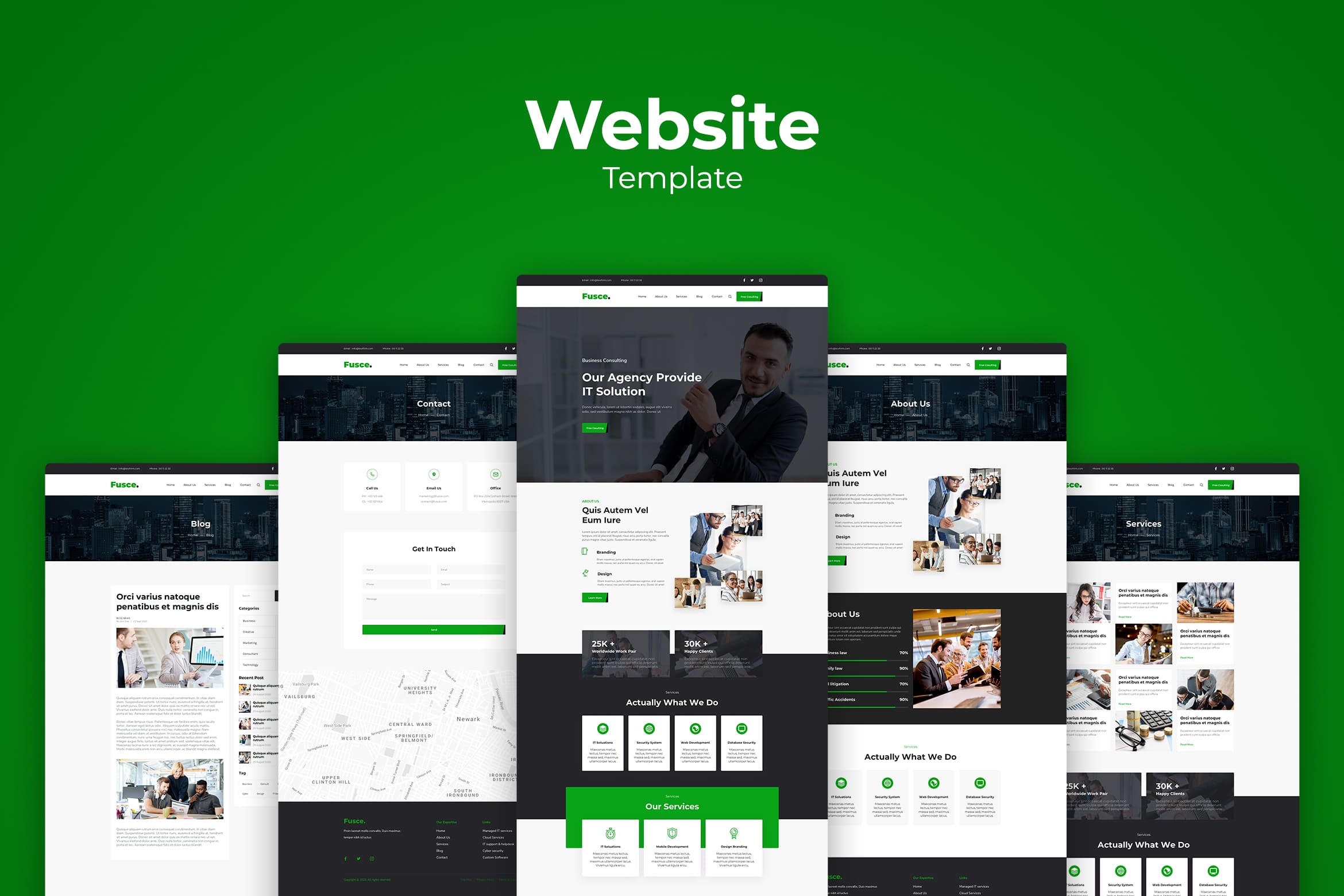
It is not a sin to have ready-to-use website design templates. Even when you want to build website commerce. You can start it now by checking the collections in UI Creative. We are here to help you on saving your time, effort, and fund.
Also Read : Website Design Templates for Beginner
You may not skip UICreative from your professional helper list. It would help you to get the great banner and sure all you have to do is just browse and click. Select the one you desire and save it for the future.


