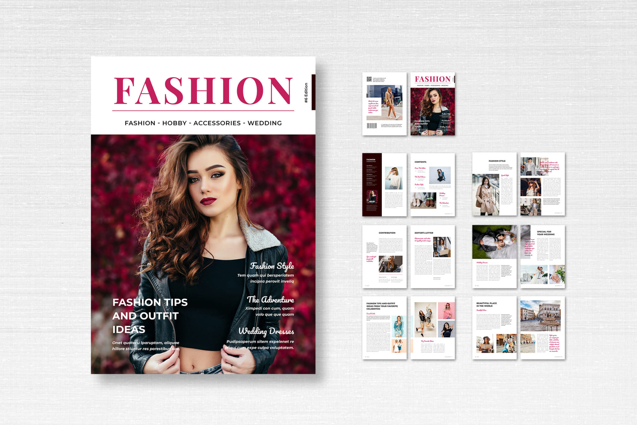
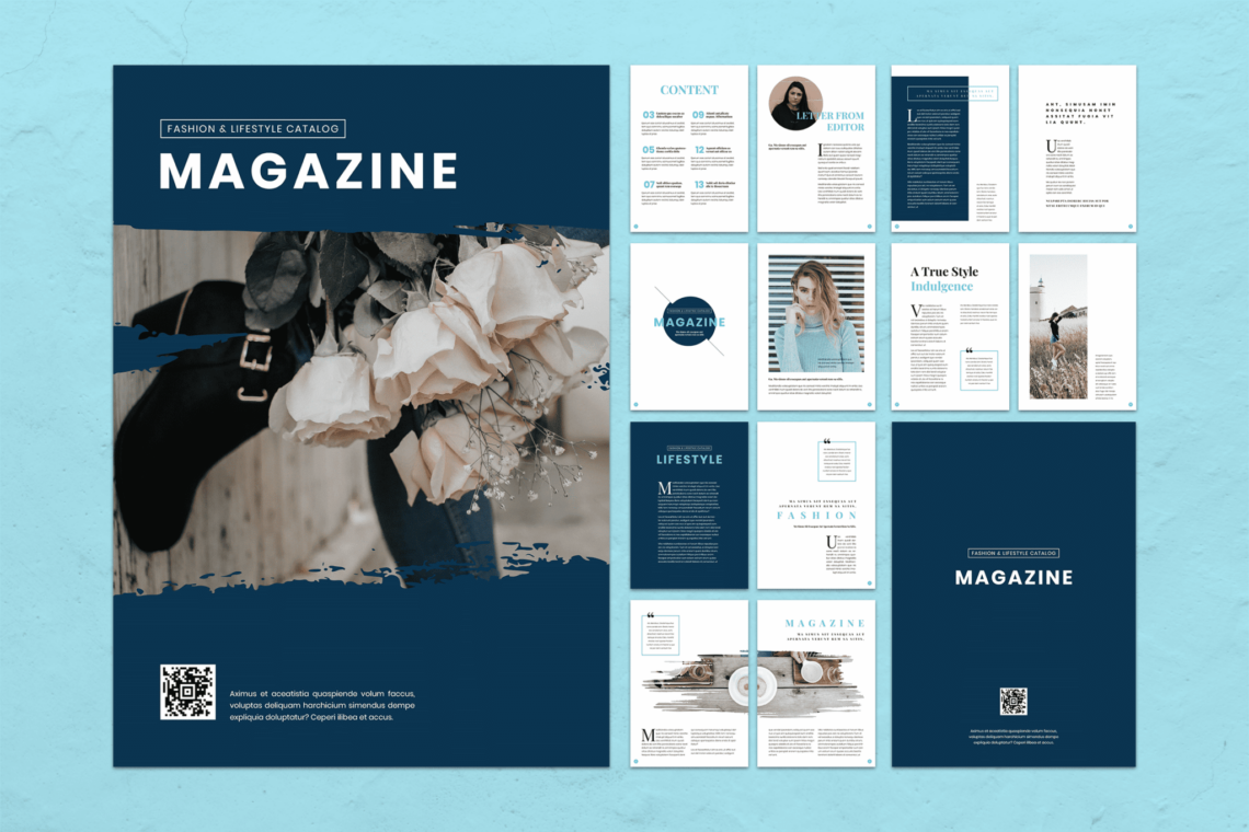
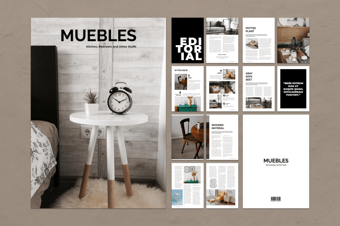
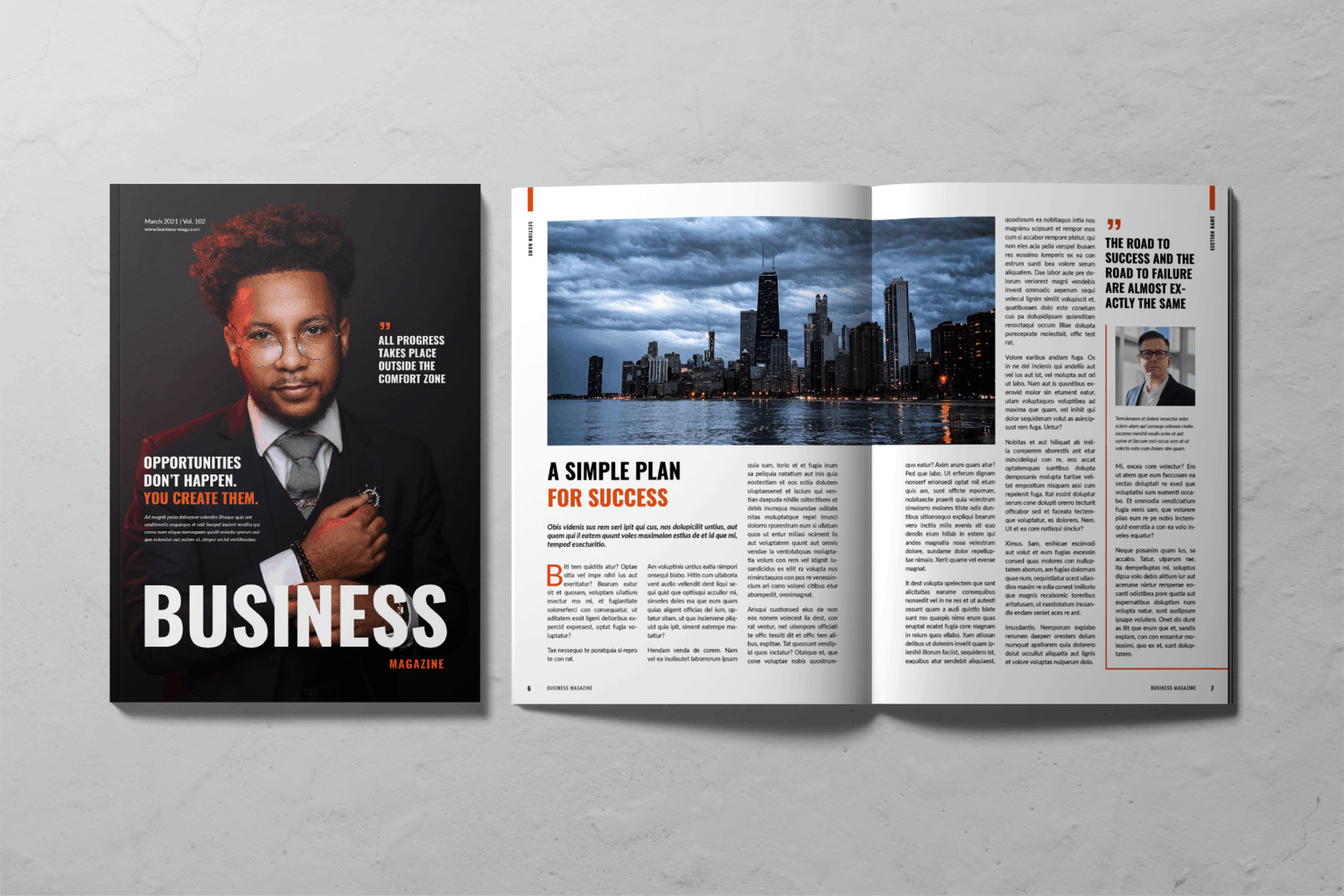
Any designer, whether just starting out or already established, may find that magazine design (best design magazine, magazine page design, online magazine design) presents a unique set of challenges. Managing a vast amount of content can be challenging while preserving an elegant and sophisticated appearance.
To help you improve the magazine design and ensure that they are as fashionable as they are educational, we have included five of the most valuable ideas and tricks below.
How to Design Magazine Layout?
1. Text should be wrapped around images in unconventional ways
Are you finding that the limits of a typical text frame leave you feeling uninspired? Text can be wrapped around images in various non-traditional ways to produce less grid-based and more free-flowing layouts. This is an excellent method for merging text and photos more seamlessly to get an overall unified effect.
If you want this look to work, look for photographs with a lot of empty white space. Photos with clear, uncomplicated outlines are easier to work with than those with intricate or nuanced contours.
2. Consider the Situation from Above
Make a significant shift in the angle at which you take your photographs to create instant interest. An aerial photograph of a sweeping city view is not only on-trend but also completely captivating; they are particularly useful for titles dealing with food and drinks, but titles dealing with travel and photojournalism will also profit from an aerial shot of a city perspective.
Try filling those gaps with odd headers and bits of body text for a style that is more varied and creative. Aerial pictures allow you to integrate typography into the photo easily.
3. Make it 3D
Make use of numerous layers of text and graphics to give your 2D layouts the appearance of depth and dimension. When you separate the subject of a photo from its background and use this tried-and-true layering formula, you can make the shot three-dimensional and make it appear to leap off the page.
Extend the Layers panel in InDesign by selecting the Window menu and clicking on Layers. Next, build a sequence of layers in the following order: Background of Photo, Text Behind, Subject of Photo, and Text in Front at the top of the stack.
Your layouts will appear instantly livelier and more energized when you use this technique, which is surprisingly straightforward. Using a square frame and the Scissors Tool in InDesign, you will be shown in this article how to give your magazine design layouts an impressive three-dimensional appearance.
4. Make some changes to your page of contents
It’s possible that someone will pick up your best design magazine off the shelf because of the cover, but the contents page is the backbone of the entire publication. The contents page is the reader’s first point of contact before they even get to the articles and features, and it is An opportunity to create a style master for the rest of the magazine page design. It is also the perfect place to exercise some creativity, as it is the reader’s first point of contact.
After all, nobody wants to read a long, boring list; to breathe some life into your contents page, incorporate visual elements such as color, intriguing typography, and an unconventional grid. Spending some time refining this vital spread is time well spent, and you won’t regret it.
5. Risk it all
The opening spread of an inside feature needs to use a large, bold type to make an impact. Pairing it with dramatic photos can establish the tone for the overall feature, as can the typeface and color you use.
Choose a sophisticated sans serif like Didot for a look reminiscent of Vogue, or go with a rounded sans serif like the one used here for a layout that’s playful, youthful, and full of vitality.
Take inspiration from the article’s subject matter while designing the typeface, and don’t be afraid to go big, bold, and loud. It’s a foolproof method of holding the attention of your readers.
Conclusions
Congratulations, the magazine design of the layout has been completed! You have designed an uncomplicated and nicely balanced spread, featuring expertly done typography and good use of the available white space.
You now have the basis for growing your design into an entire magazine design layout, and you can use this first spread as a guide to developing a consistent style across the other pages. Just go to Edit > Copy, then Edit > Paste in there. The elements you’ve developed in this spread should be placed on other spreads.
You want to create your distinctive magazine design but don’t want to waste time doing it. Make it a point to look through the extensive selection of flexible online magazine design templates on UICreative.
Also Read : 6 Tips How To Write Annual Report Template
Also Read : Tips On How To Use Instagram Post Template
Also Read : 10+ Digital Flyer Design Ideas in 2023
Also Read : 10 Simple Resume Template To Get Hired
Also Read : 7 Tips on Tattoo Business Cards Design
Also Read : 10 Tips Choosing Logo Font For Company
Also Read : 10 Steps How To Create White Paper Template
Also Read : 5 Things to Improve Your Magazine Design
Also Read : Tips on How To Make Facebook Cover Photo
Also Read : 10 Best Flyer Template For Your Events
Also Read : 12 Event Proposal Template To Growth Business
Also Read : 10 Best Script Font for Logo and Branding


