
10 Tips To Help You Create The Perfect Flyer : Flyer Design Template
in Marketing on January 25, 202210 tips to help you create the perfect flyer: Flyer design template – the right one would help you to promote and advertise your product well. Use it for nearly any purpose in all types of print marketing materials. Only a few resources you need, but flyer gives you a lot of benefits. Print hundred of them without spending a lot on paper ink and there will be no more efforts to brief any contents to your flyer.
Since flyers are designed to be visually impacted, you should check whether you already do these tips:
1. Images or Graphic in Well-Designed

Have you known about flyers? A flyer is a print advertisement on a single page or unfolded in common. It has content printed on one side only. Sometimes, it is called a leaflet if you use glossy or high-quality paper.
The aim of it is to get a potential customer to buy a product, avail of a service or promotion, come to an event, or fulfill whatever goal you have set for your marketing efforts. Flyers are still posted on community bulletin boards and given away at the mall or on the streets, which just proves how effective they are at reaching customers.
Therefore, you need to use eye-catching graphics and relevant stock photo images to build the public’s attention. Choose one big image or graphic to support your message instead of multiple small ones to prevent a cluttered design. You can also incorporate your company’s logo into your flyer design for added brand recognition. The image or graphic you use will be the main focus of your design. Therefore, it would be better to place it at the top of the page and extend it across the width of the flyer.
Also Read : 10 Effective Tips Business Flyer Design
2. Flyer Design Template Focuses on Headline
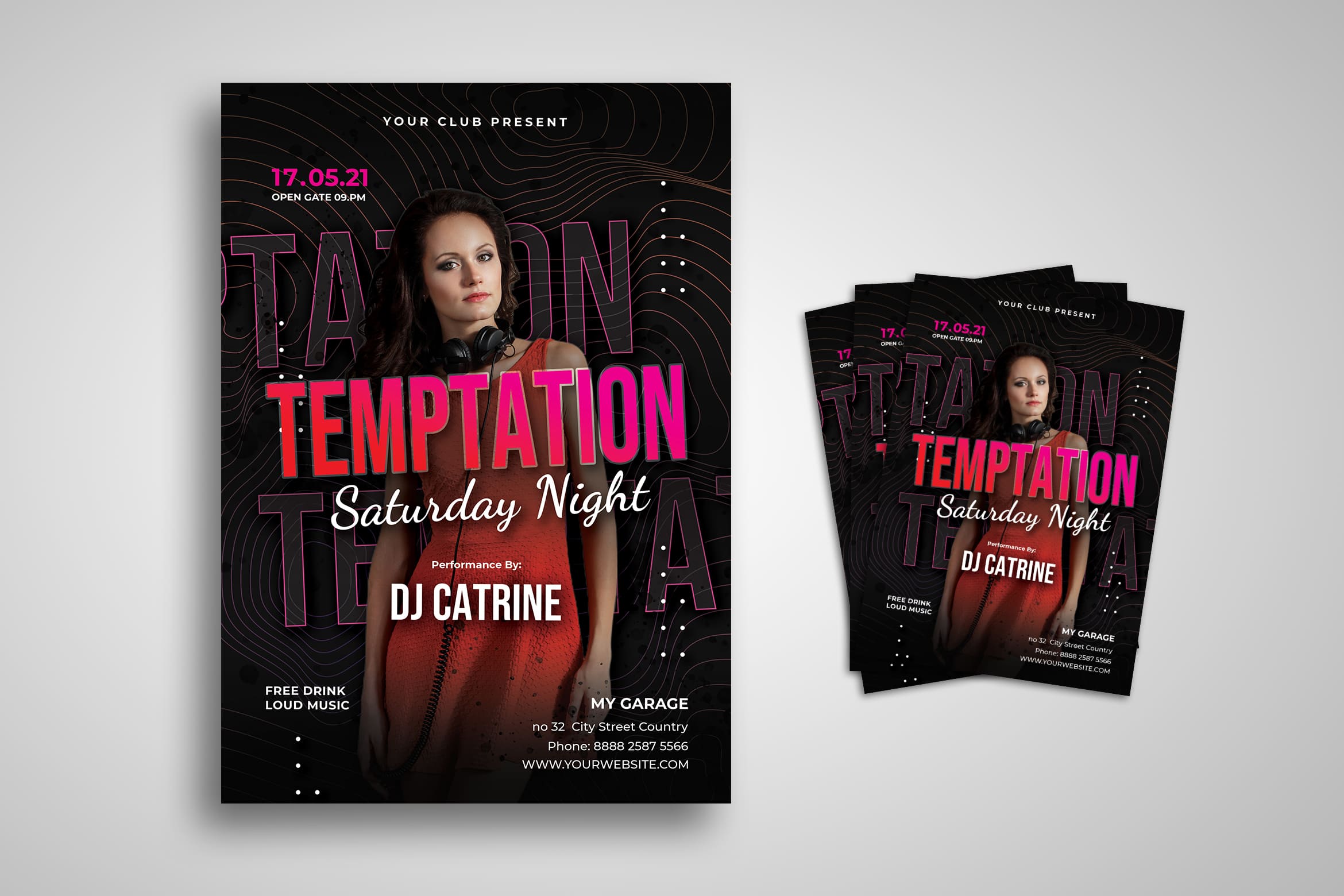
Whether graphics and images may be the first thing people see when they look at your flyer, but the headline is the first thing they read and the first thing that attracts them to read more. To make an effective headline, You can start to make up a catchy phrase or sentence using as few words as possible, like “Get 50% Off!” or “End Year Sale Has Come!”
Make sure to communicate using the language of your target audience as well. It helps you to decide on using formal or semi-formal language. Your headline should stand out from your background and the main image, so you can start by using bold text and fonts that are easy to read. The headline does not need to belong. Therefore, you should know how to make it effective.
3. Make Sure The Content is Appropriate
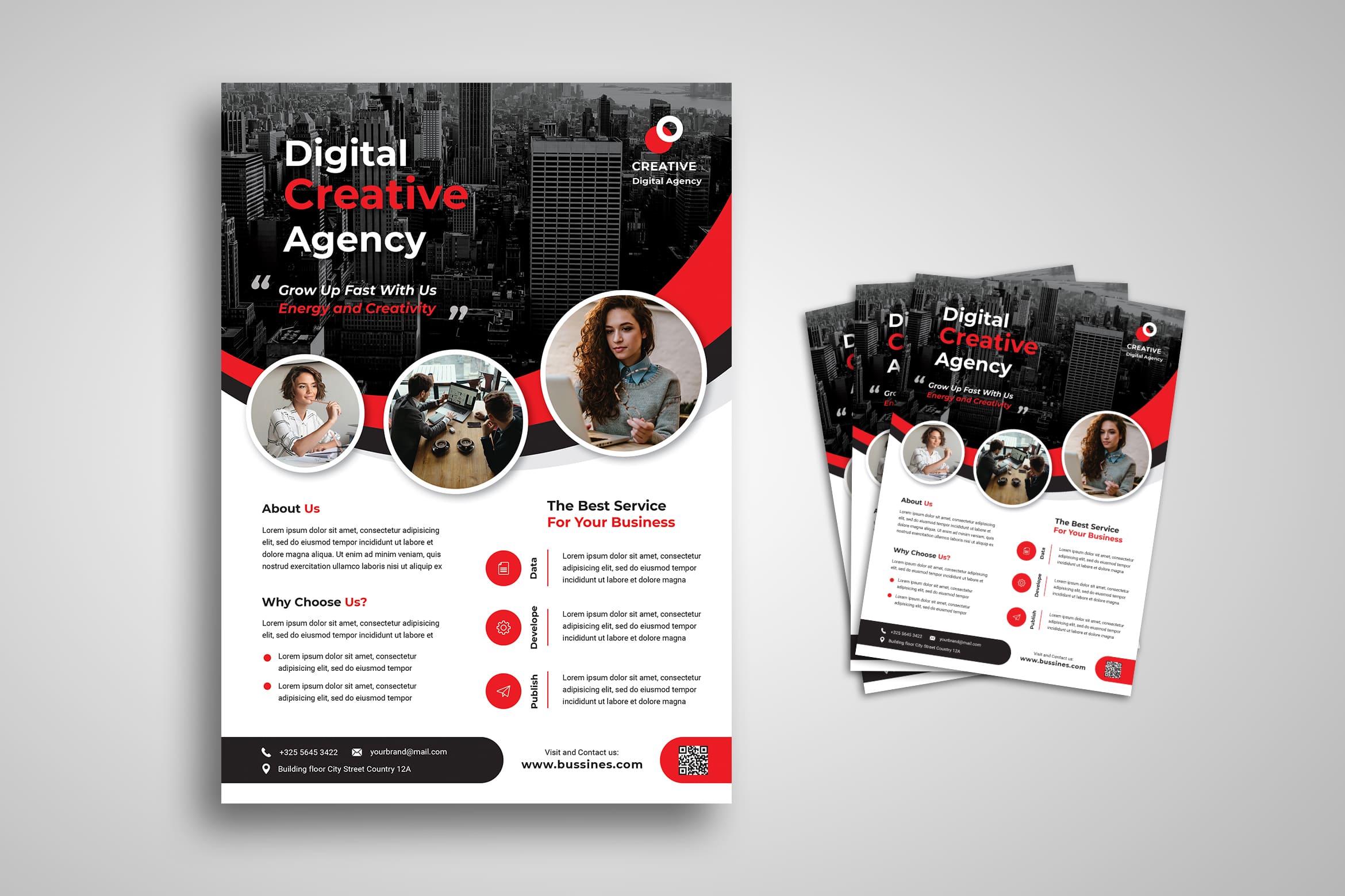
Your content is the body of your flyer. It should explain your headline in a concise way. Try to include essential information only such as event details, promo mechanics, or short product and service descriptions. In the content, there is also where your call to action comes in to urge people to buy now or visit your store or participate in your event. Use a different font from your headline and a 10-14 point font size. It helps the audience to read the content specifically.
Keep in mind that smaller text will make poor readability, while bigger text can crowd the negative space on your flyer. You need to know the size of your flyer first before making any sentence in it. Play with the “normal” color to help anyone read it and be sure with the right font type. So, the content is not only about the content itself, but also about the right size of the font, the right type of font, and the right color of it.
Also Read : 10 Tips To Help You Create The Perfect Flyer : Flyer Design Template
4. The Clear Information About Business Location and Contact Information
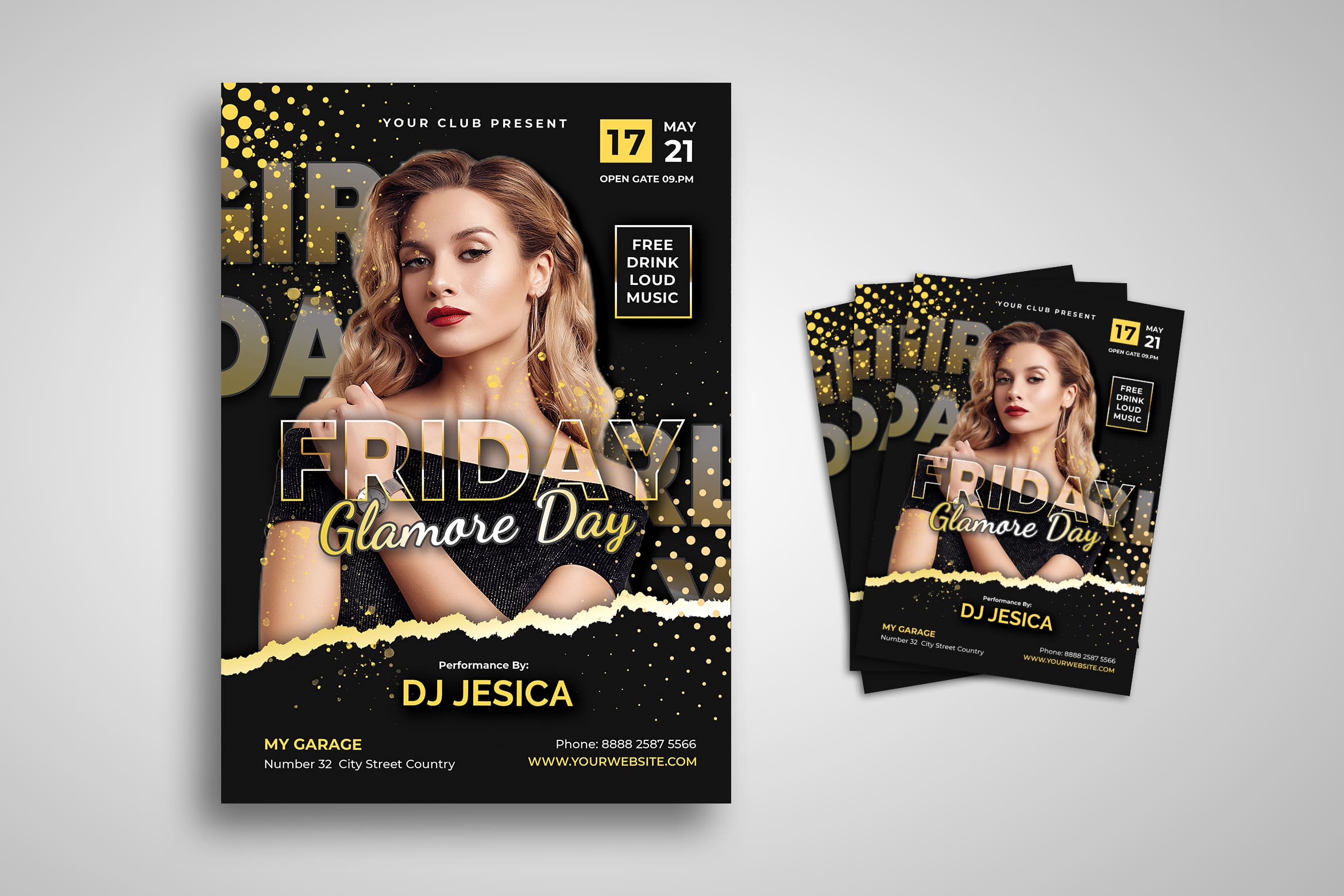
Always indicate your store or company address, website, and contact numbers. ideally at the bottom part of your flyer for easy access. This is the most important but often overlooked part of creating a flyer design. Make sure customers are able to receive the benefit that your flyer is promoting and your flyer would not fulfill its purpose.
You don’t have to share in detail. Email address is enough today. You can also input the Gmap exact location to your flyer. Everything will be easier and customers will get the right spot of your business office.
Also Read : 10 Effective Tips Fashion Flyer Design
5. Different Flyer for Different Need
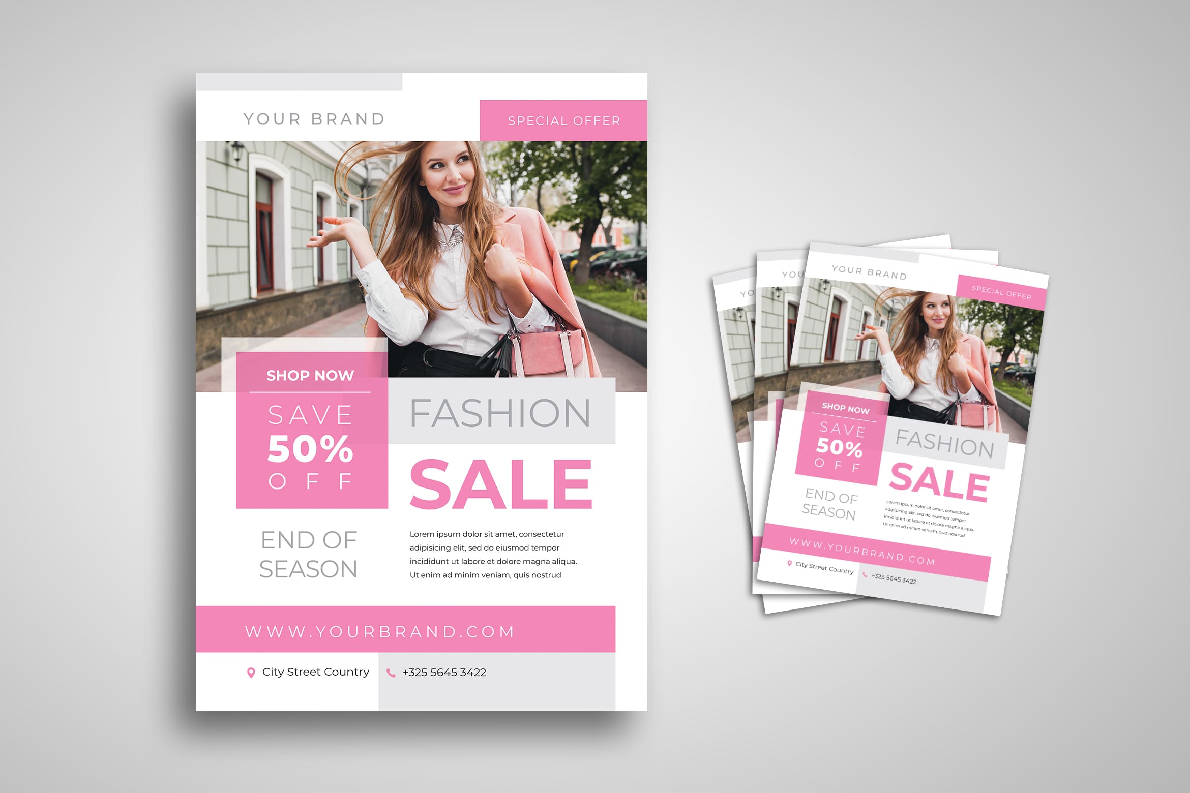
Any cause, you can use flyer. Whether it be for personal or official business needs, you can see on a flyer to successfully spread the content about what you’re promoting. Business flyers are usually filled with limited-time offers and discounts, sale announcements, and product or service advertisements.
Appetizing photos of food and beverages should take center stage in your flyer. Your restaurant menu, you can input it or at least a simplified version of it. Try also to be turned into a flyer so customers can keep it and remember to order later.
Also Read : 10 Effective Tips Marketing Flyer Design
6. Be Creative

You have time to make people interested to your company, so think about what you want them to do with yours. For example, if you sell something premium. When people look at your flyer, they need to be able to imagine the premium service that they can experience with your shop, service, or even items, so make sure to choose vibrant and highly detailed images. They have to show the kind of work that you do. You need to be extra creative in order to attract people. Styles and design elements may vary depending on the industry
The flyer has to give people the feeling of owning their dream home if you sell properties. Use high-quality, aesthetically pleasing images with a horizontal orientation for an optimal view, and go for minimalist designs and geometric shapes to give your flyer a clean, authentic, and sophisticated look. You need to print it in premium paper too if it is possible.
Also Read : 30 Best Business Flyer Templates
7. Use High-Quality Image
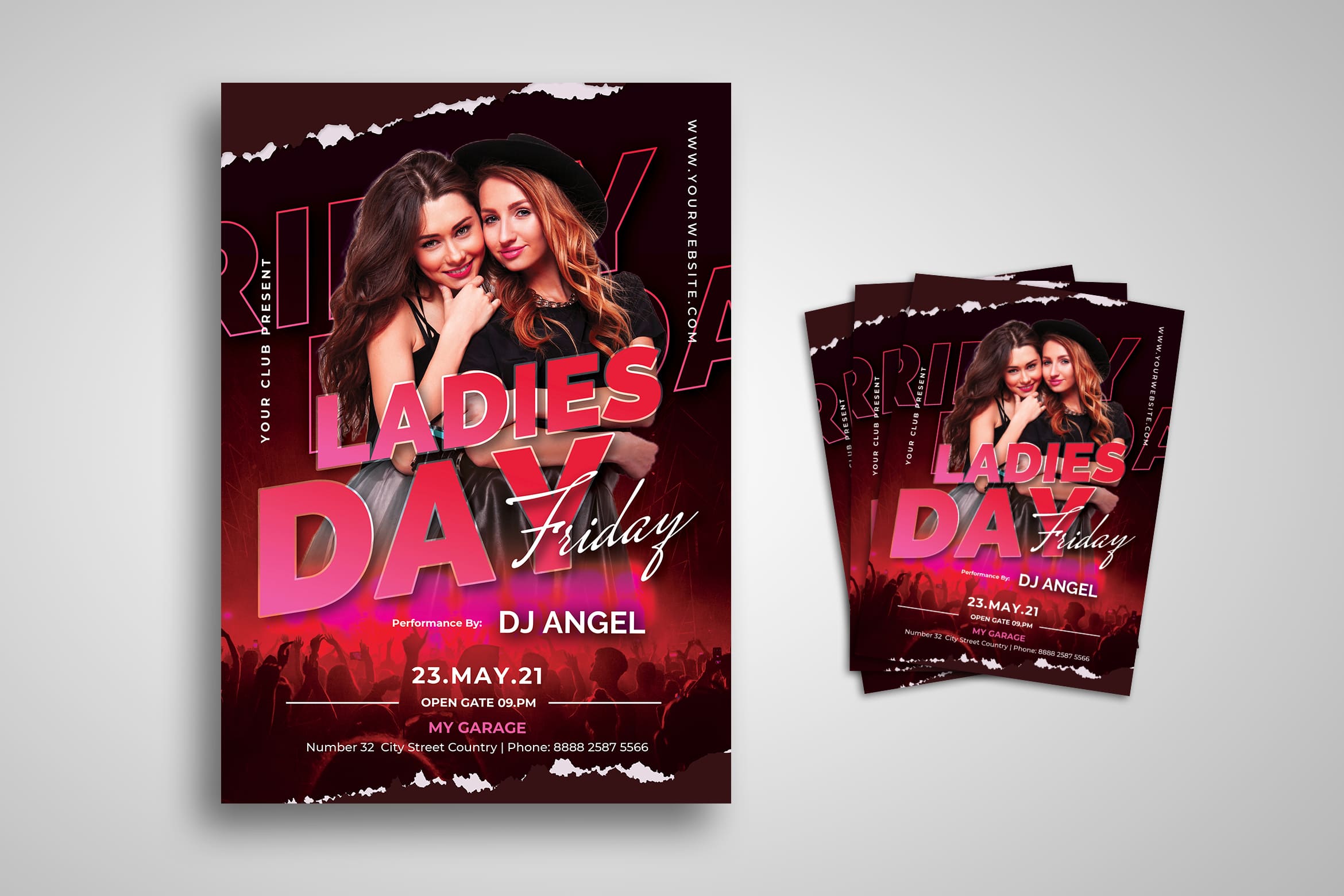
To make sure the image will not be broken after you print it, make sure it is made in a high-quality image. If it is about a landscape, a flyer for your landscaping services should have vibrant hues and shades of green. Instead of using images of your equipment or crew, show backyards and lawns instead to portray beautiful scenery in your flyer. It is different from a modern flyer design which is perfect for a clothing store. If you’re a fast-fashion brand, your flyer will need to look trendy and stylish. Choose a model wearing your clothing items who look trendy and popular today. It will get more attention than the average stock photos of clothes. Another tip is to use muted colors and a combination of serif and script fonts for an elegant design. It is for a fashion brand.
On the other hand, if you have something like a property business, using images of your cleaning crew in their working environment will look great in your flyer as that displays your expertise and gives people the impression that they can rely on a full-service experience. Choose colors that symbolize cleanliness, such as yellows, whites, greens, and blues, but make sure everything looks great in high-quality images.
8. Choose the Right Layout
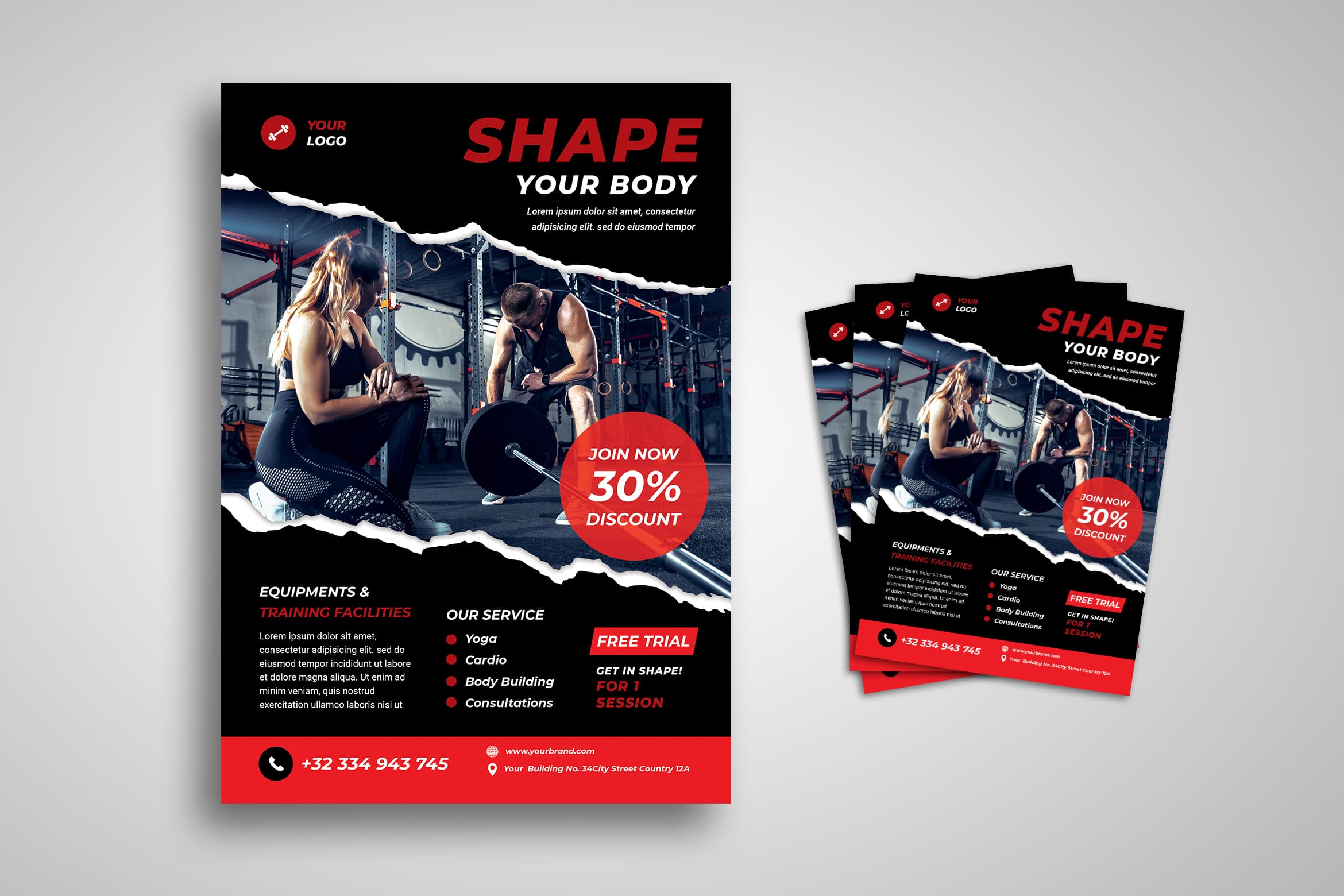
There is two types of layouts. Each of it has its own purpose. Here they are:
a. Horizontal Layout
This type of layout is usually utilized for corporate event flyers because they contain more information. Even to put the bold headline, this type of layout looks great. A flyer can also have a horizontal orientation depending on what you desire for it.
b. Montage Layout
The montage layout on the other hand is used to connect images in your flyer and provide a less crowded presentation of elements. In this template, you can observe how spaces between the images created by the montage layout. It is made the flyer more visually appealing.
Also Read : 30 Best Music Flyer Templates
9. Communicate Well

Your copy and design should be simple yet able to attract people. Do not only focus on the image, but it does not represent your goal. Flyer should also provide necessary information about your campaigns such as time and date, location, the goal for your company to share it, and the main activity involved.
The same thing applies to other types of parties. A Halloween party flyer will have an entirely different look compared to a pool party flyer. It all boils down to your target audience and the goal of your event. So, make sure in the flyer you communicate well to your targeted customers.
Also Read : 30 Best Promotion Flyer Templates
10. Knowing Your Audience
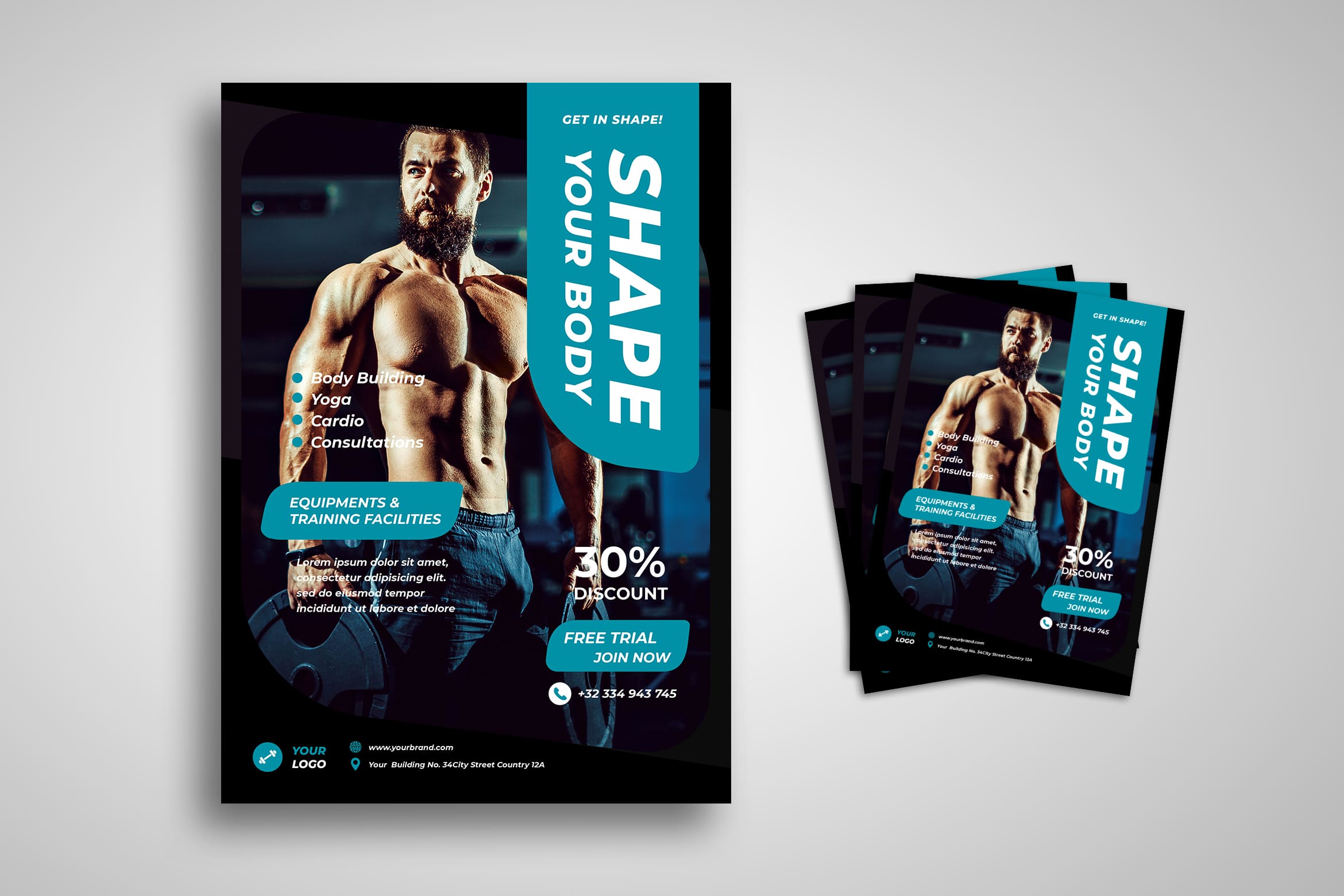
Just for an example, when it comes to birthday celebrations, there are many things you have to consider in your flyer design. You have to take think about the theme of the party, the age of the celebrant, the time of day, the season and some small things. Make sure your flyer successfully communicates all that through colors, fonts, and other important elements.
On the other hand, a grand opening flyer has to inspire interest and curiosity, which you can achieve through effective headlines and enticing visuals. So, a different target audience has different occasions to communicate and to insert images. From the flyer above, you will see the target audience of it like mostly it is for men. They need it to shape their body. Therefore, the color of it is also related to men’s main favorite color. Even the image shows the men\s body shape after joining the training.
There are some tips to make the perfect flyer design template. If you have any problem creating your won, let our company helps you. There are plenty of designs you may choose from. Make sure you know how to deal with it. You can search based on its category or select one by one until you find the most appropriate. UI Creative is here for you and ensures you get in touch with professional hands.


