
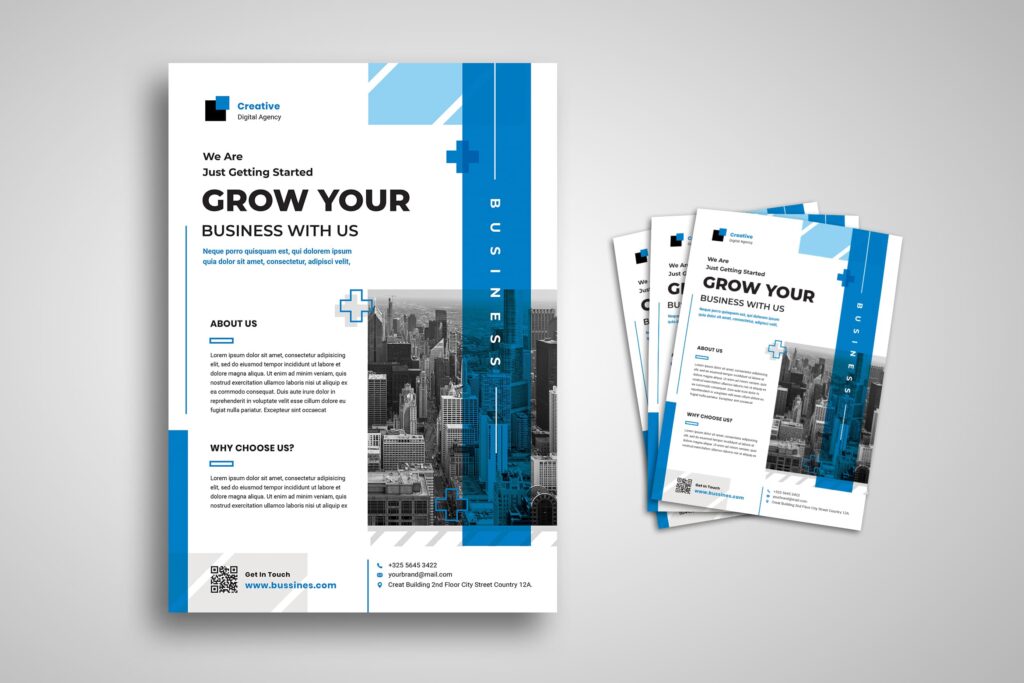
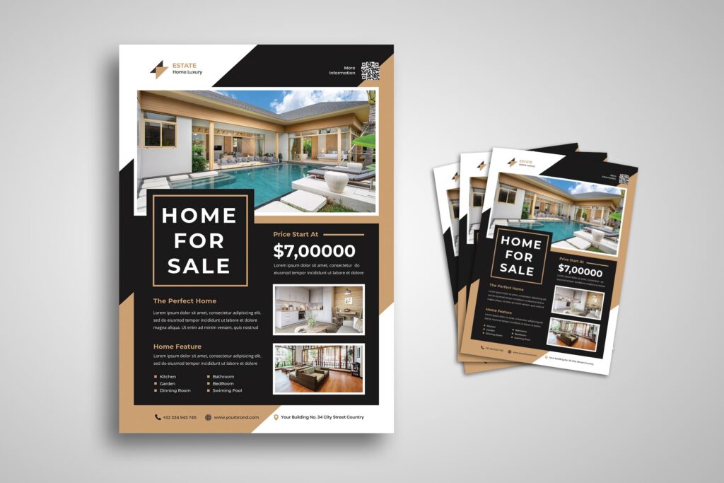
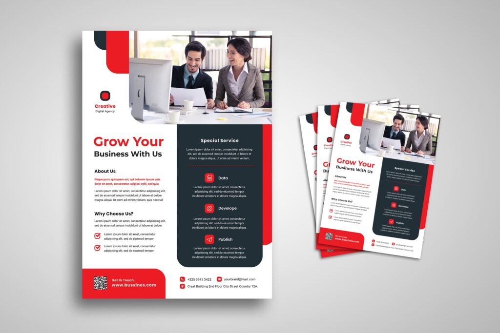
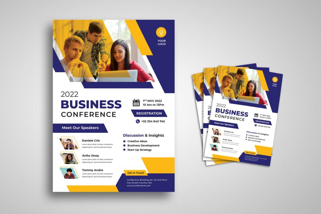
10 Effective Tips Business Flyer Design makes your marketing points raise more.
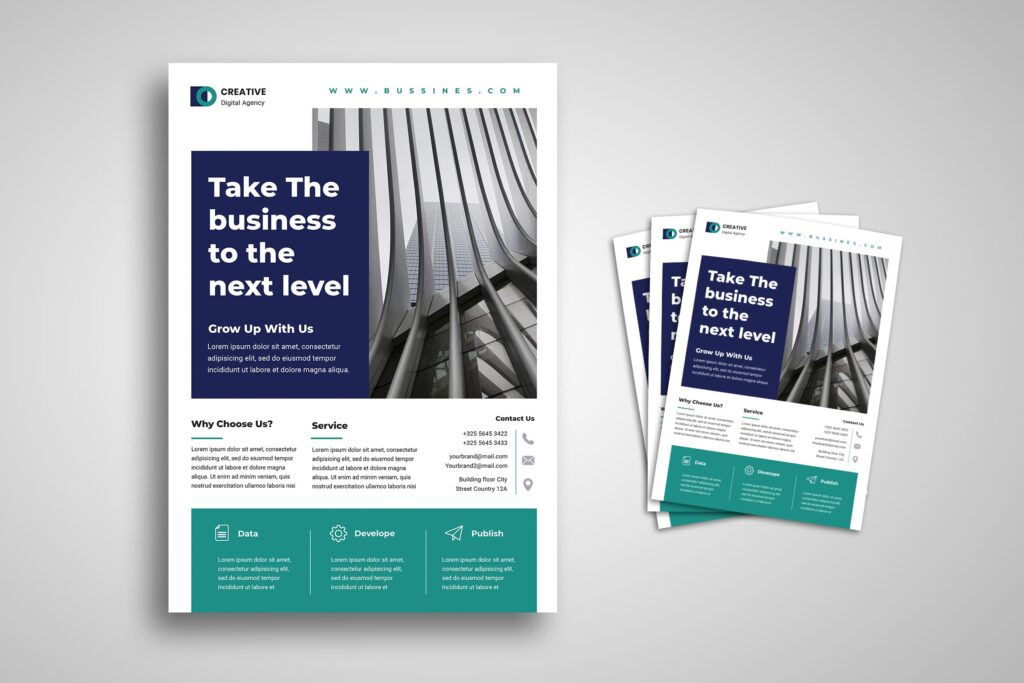
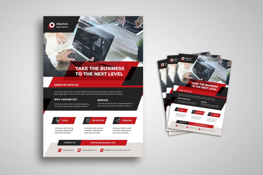
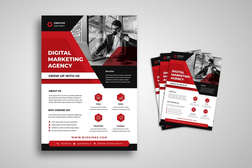
Business flyer design helps you to make a good impression on your business. Keeping on the marketing of your business may not always be an easy option for you. On the other hand, cost-effective strategies can give effect to advertise your business. Letting people know about your business is easy with flyers. Handing them the flyers will ensure that they go through the content. Option for reasonably-priced options that convey your message to the right people at the right time. Flyers have been used by business owners to communicate, with a large audience base in decades. It was one of the most preferred marketing tools in an age when there was no Internet.
1. Photoshop Touch in Business Flyer Design
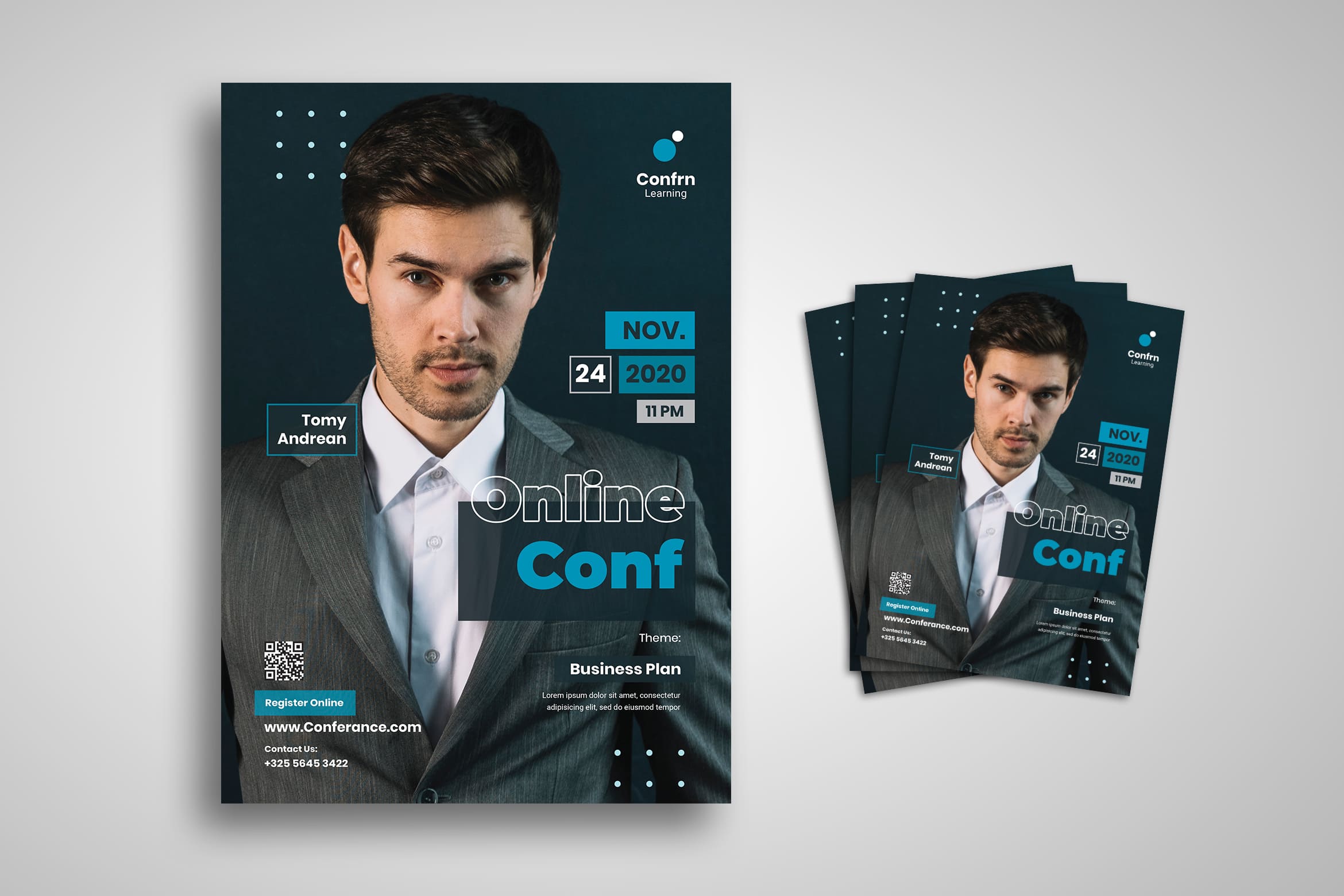
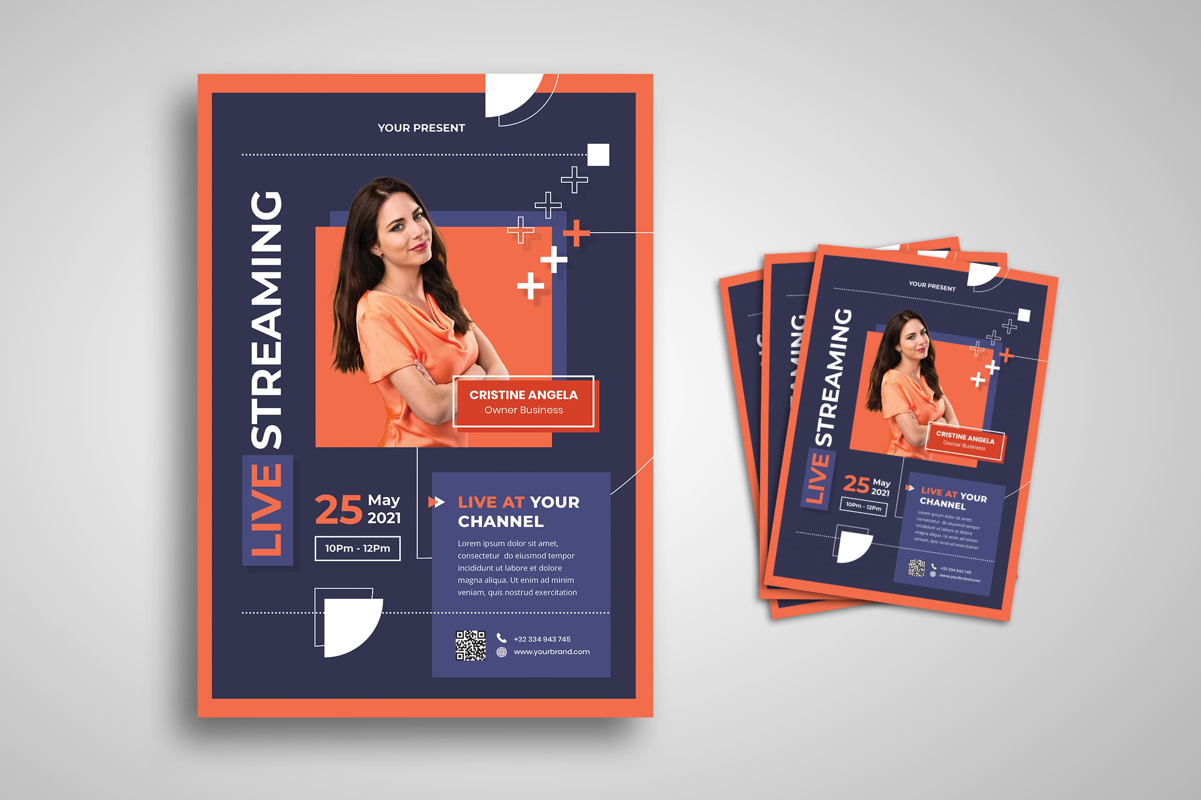
We live in a digital era but print ads still keep existing. Although today flyers and posters are used for event announcements, product promotions, and for various other purposes. When designing a flyer, you need to consider the source of the product or event which is going to promote and the target consumers’ psyche.
Let us start to use Adobe Photoshop when you have no clues of design. Open Photoshop, choose “custom” preset, and make the width 2400 and height 3500. This is the initial step to go.
Also Read : 10 Effective Tips Business Flyer Design
2. Manage the Image
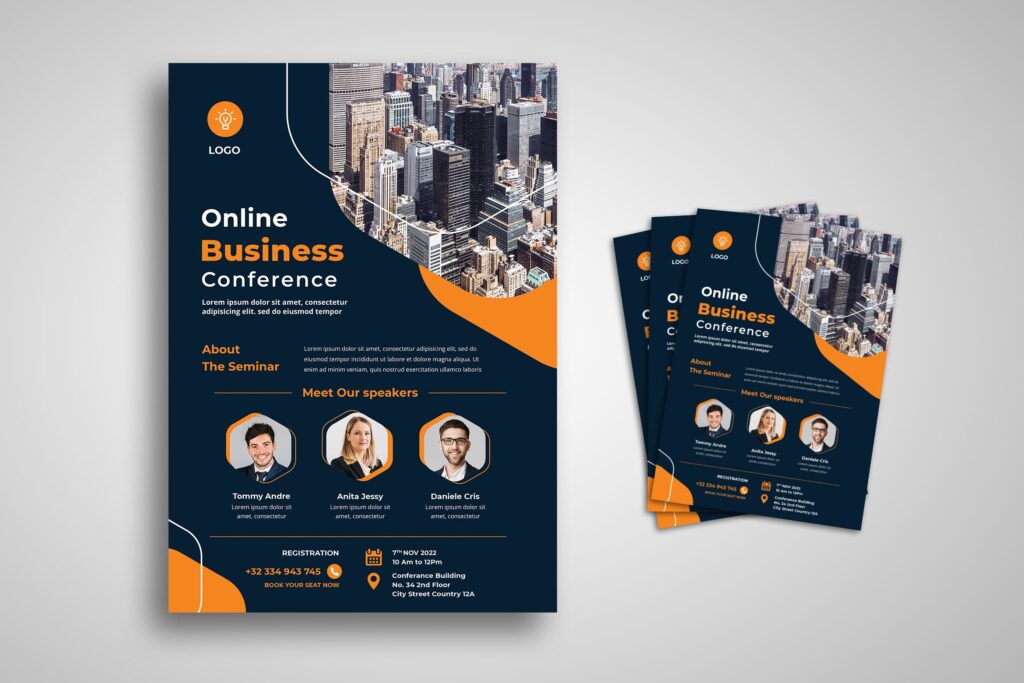
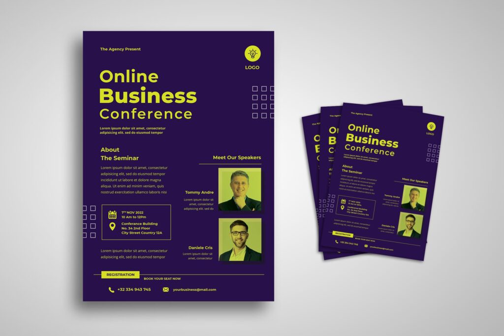
Get a high-resolution grunge texture online and You can download it. Copy and paste the image on your document. Press Ctrl+T to resize the image. Make sure it fits the entire white space of the document. Once the scaling is done, press “enter” to finalize the changes. This is the way to analyze, is your chosen image really good for flyers?
Not all the high-resolution images are great. It is because we have to print the flyers later, so they have to not be broken. Pixels cannot warranty too much.
3. Brush Brush Brush
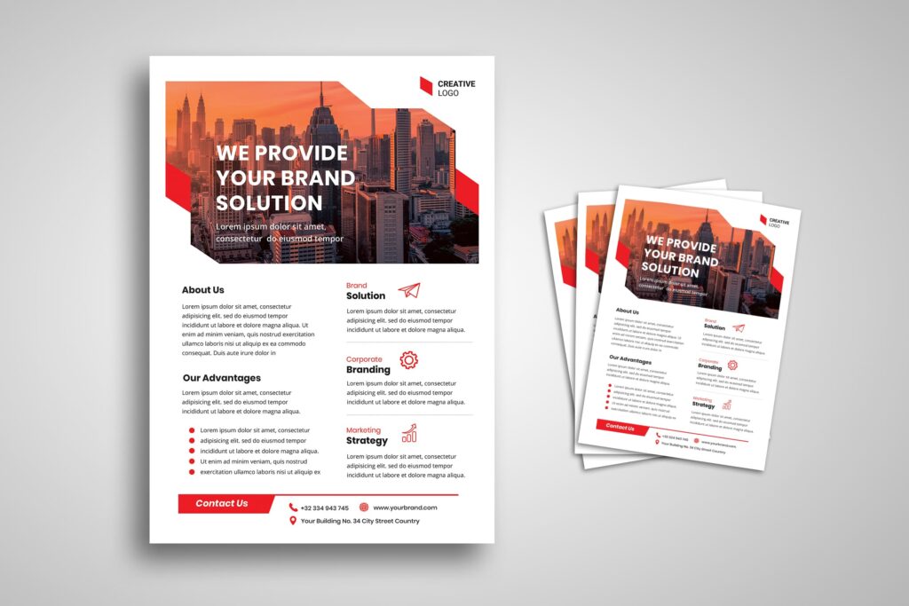
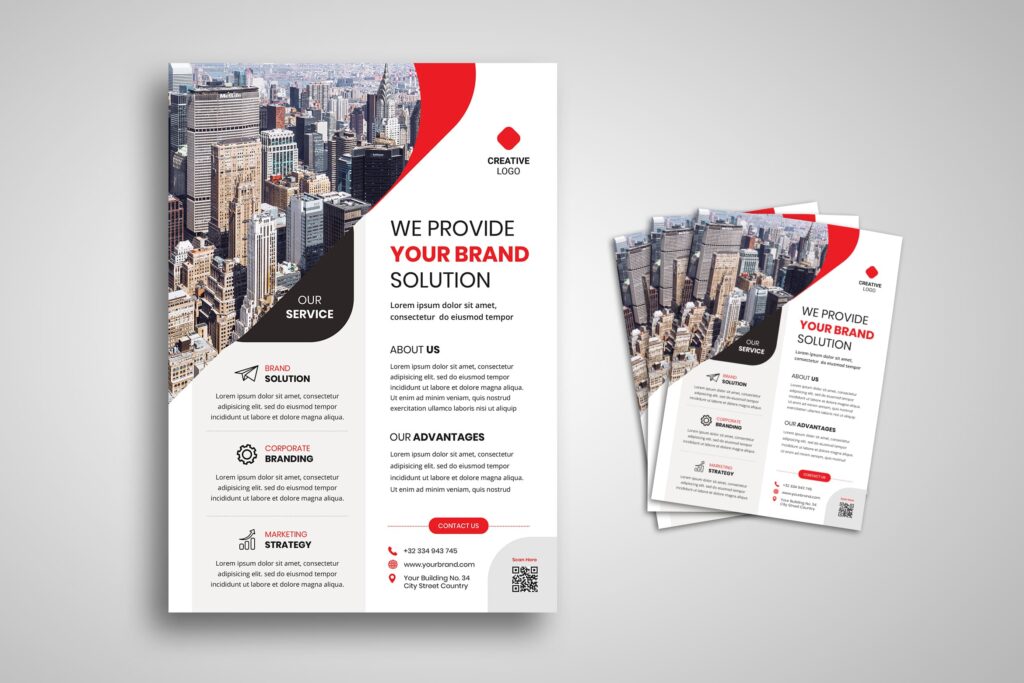
After the texture is in place, go to the brushes icon. Select a brush that will create some cool edges. For example, you can use splatter brushes or you can download and use some other not familiar brushes. Be creative in this case. You can do anything, but avoid using a standard circle brush.
Why you should brush? Well, the business content of the flyer must look professional. The brush could make it looks fabulous and poolish.
Also Read : 10 Tips To Help You Create The Perfect Flyer : Flyer Design Template
4. Make New Layer
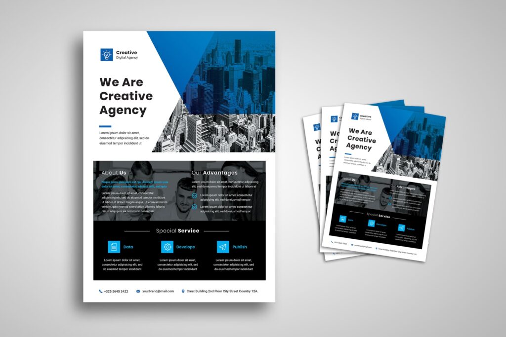
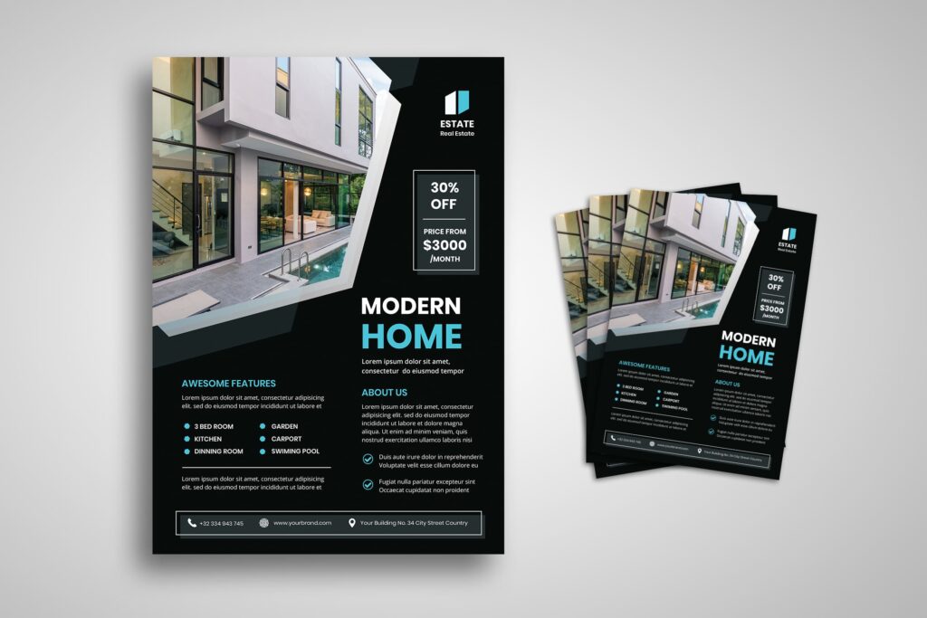
Now add #348ee1 color and change the mode of the layer to “color burn”. The final result will be an eye-soothing shade of blue. You need to make a new layer instead of only focusing on the current one. Remember the aim of business flyer design. How to make it attractive? Sure, by playing in visual theme.
5. Create Rectangular
Select the “rectangular marquee tool” from the left side toolbar or press the keyboard shortcut “M” to select the tool. After that, make three vertical thick lines using #348ee1, #34b2e1, and #37d9f6 colors, one after another. It will be a rectangular bar of three different shades of blue. Ensure if the lines are placed from left to right and darker to lighter shade. This is what we call by contrast. How is that? Do you think you still get along with this? Or do you want to finally select the instant flyer template?
Also Read : 10 Effective Tips Marketing Flyer Design
6. Concern on Layers
If you create the vertical lines in different layers, merge them first and if you create them in one layer, it’s the time to start wrapping the image. This is one of the trickiest parts of designing a flyer. To warp the image, go to edit>transform>warp. You may use your own creative ideas to give the rectangular multi-color bar a unique shape. Just remember that both ends must touch corners. When everything looks fine, go to the layer mode and change it to “subtract”. By doing this, you will be able to get vintage colors on the blue background.
7. Making A Circle
Open a new layer and draw a big white circle. Draw it in the upper right corner, it is above the rustic colors bar. Use drip or splatter brushes. You can add white drops at the bottom of the circle. The circle has to take a look as if it is dropping white color. It seems not easy, but when you try some times, you will get on it. It is great to use a mouse to help you click this and that.
Also Read : 10 Effective Tips Fashion Flyer Design
8. Magic Wand
In this step, Select the “magic wand” tool and click on the circle. Next, choose the color bar layer and press “delete”. When it has been done, hide the layer with a circle. Now you can place the date of the event inside the blank circle. Have you get confuse?
There is still an alternative for you. Grab the ready to use one!
9. Drawing to Grab Attention
It is time to drawing again! Draw two white boxes using the “marquee” tool. Make sure the smallest box is on top. You can use these boxes to put the name of the event venue. It is ok to make more than one box. Try to place the boxes at the middle of the layout to grab readers’ attention. It is not a ‘have’ to put element. You still could change it into something different than box. The main thing to concern is it has to be attractive!
Think about anything to attract readers attention. Maybe you could coloring it in contrast or making different object. Anything!
Also Read : 30 Best Business Flyer Templates
10. Do Not Leave The Support System

It is time to think about everyone that supported you. If your event is supported by sponsors, do not forget to add their logo to the layout. You can place their insignias at the bottom of the layout so that consumers will not get distracted. Since it is not the main message to deliver, there is no specific rule to place and think about its size.
Also Read : 30 Best Music Flyer Templates
The flyer would be a great tool to promote. If you desire to make it looks luxurious, print it on luxurious paper. Yes, you should print it in a great printer template, or all of your efforts are lost.
Flyers often fail to impress. It is not because they are ineffective but because people use it without having a plan. They use cheap paper which becomes the first impression to notice. They also insert as many words as possible and hope for the best results. Well, we could imagine the result. Sure, customers spend only a few seconds reading the flyer and throwing them away. If you don’t want the same result, you need to prepare a solution.
It does not matter how good your flyer is if you distribute it among the wrong type of audience. Therefore, you should distribute it among your target audience. It is for a better return on investment. You can share it in local areas and malls where your target consumers will come. For example is if you have opened an English training institute, ask your employees to stand near school and college gates to distribute the flyer among students.
Also Read : 30 Best Promotion Flyer Templates
business flyer design from us would help you to kick out time and stress. You just need to insert some words and information, print and distribute. Plenty of designs is available. Remember to keep guard the good image to others. Your company should notice the way to look professional. Whether to share it on social media, there is no problem as long as you know how to Select the suit color and font. Well, they have to be readable or your message cannot be understood. Claiming to be a professional company in business can be proven by the way you market and promote. Sure, there will be lots of budget for it. You do not have a warranty to make sure it will not end in the trash. Some points should be noticed more than just to think about the audience. How to write it also need to consider. Make sure you use normal font size, font type, and ink color. Are you ready to challenge yourself? Or do you want us to stand with you in this case?


