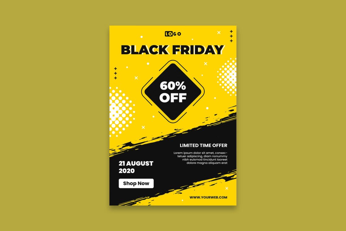
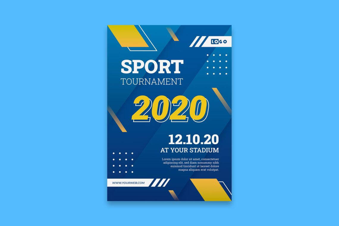
10 Tips How to Design a Poster with Eye-catching Design – Poster Template
10 Tips on How to Design a Poster with Eye-catching Design – Poster Template in this article will help you to create a stunning poster. The aim of it is to engage more customers and save your budget on marketing products and services. What could you do to make it happen?
1. Make It Attractive
The first impression when you see any poster is its appearance. Therefore, the first key point to making an eye-catching poster is by trying to make it attractive. It is time to challenge yourself to make perfect harmony in order to make an inspiring and unique design. In addition, do not skip the way to make a poster is to make an effective marketing strategy.
Make sure you achieve the intended goal for your poster by making sure your viewers listen to what you want to say. Capture their interest first and choose the right combination for the elements in the poster. They are some of them to note like images, colors, font, and shapes. However, do not leave your business logo and main color. For example, Pizza Hut has black and brown as its icon color. You also have to make sure the main color for your corporate blends well in your poster.
2. Make the Clear Message
Since you want to promote and share information through posters and it means by writing, it is better to make it straight to the point. When it comes to your poster template, make sure to put straight language. Do not go around the bush and make everyone who read it becomes confused. They have to easily read it and easy to understand your meaning.
3. Specific Audience
It is unuseful when you already create a strong message but do not know your target audience. Just like how we speak. We would use different languages to talk to children and to adults. Even girls and men have different styles of language too.
Not only language but both your message and design should show directly to your target audience. This means you need to put their interests, attitudes, lifestyles, motivations, and pain points in your poster. Trendy design and something in the first trend today would gain more attention, so keep it in your consideration.
4. Super Long Lasting Effect
A well-designed poster is a memorable poster. Besides, it will generate the right response. A great poster will also make an impact and prompt the right action from your target audience. Even the days have changed and everything goes around, your poster content and design keep memorable.
5. Consider Typography
It is important to notice the typography or font usage. It is probably the most important part of your poster since it is responsible for the successful delivery of your message. Choosing fonts with poor legibility or those with busy typefaces will make your content not properly digested.
Recheck again the typography which also contributes to the kind of impression you want to make. Script fonts might be the best option if you want stylish ones. Meanwhile, if you want to portray a more serious tone or achieve an elegant look, then serif fonts are the right choice. Well, choose the font based on need.
Ideally, you should only use up to 3 different fonts and no more in your design. The title should always have a display typeface. Serif fonts are also recommended for your body text because it has great readability. Try to make a distinguish font to make the design looks awesome.
6. Play With Color
Playing with color is something fun. You can communicate a lot of things with the simple use of colors. Just for your information, different colors symbolize different things. For example how black is usually associated with being sophisticated or mysterious, but today it is also a sign of exclusivity. Blue corresponds to cool or calming. Green means growth and peace. Red is sexy or exciting. Once you’ve decided on a base color, you can then choose a color scheme and it will be better if contrasted.
By referring to the color wheel, you can see how each color relates to one other. You can start to go for a monochromatic color scheme just if you want to work with varying shades and tints of the same color. Try a contrasting color palette as well as analogous color combinations if you want to create a new variant of color either a warm or cool color palette, as long as it makes your text pop. The main thing to consider is how to make the text readable.
7. Take A Note to Contrast
As what we have discussed before, contrast is when you place two graphic elements in opposing ways. Creating contrast is an important part of making a creative poster design. Just like how it establishes the vocal point in your design and makes certain elements stand out. An example of contrast is when you are Placing a black silhouette on a light-colored background. The negative space or white space highlights the main subject in your poster.
8. Pay Attention to Hierarchy
Hierarchy is just like how you make a priority. It is setting which elements you want the viewer to look at first. So, it is the arrangement or presentation of elements. Those come from the most important to least important which provides a direction for your eyes to move.
Imagine when you see a poster or read a book. It’s the same logic as when we read something from top to bottom. On the other hand, how we look at the biggest or most disconnected object from the whole before proceeding to the other parts. Yeah, for the simple meaning, it looks like how to make a priority.
9. Find The Right Shape
Like hierarchy, shapes also build a path that your eyes can follow. It is clearly seen while scanning the poster. Shapes can help you give emphasis to the most important details in your design. You can put the title inside a large rectangle or maybe use a triangle and put the headline at the tip. Innovate to create moods with shapes. For example, strong, sharp edges can feel stiff. On the other hand, circles and curves can appear laid back.
10. Minimalist Design
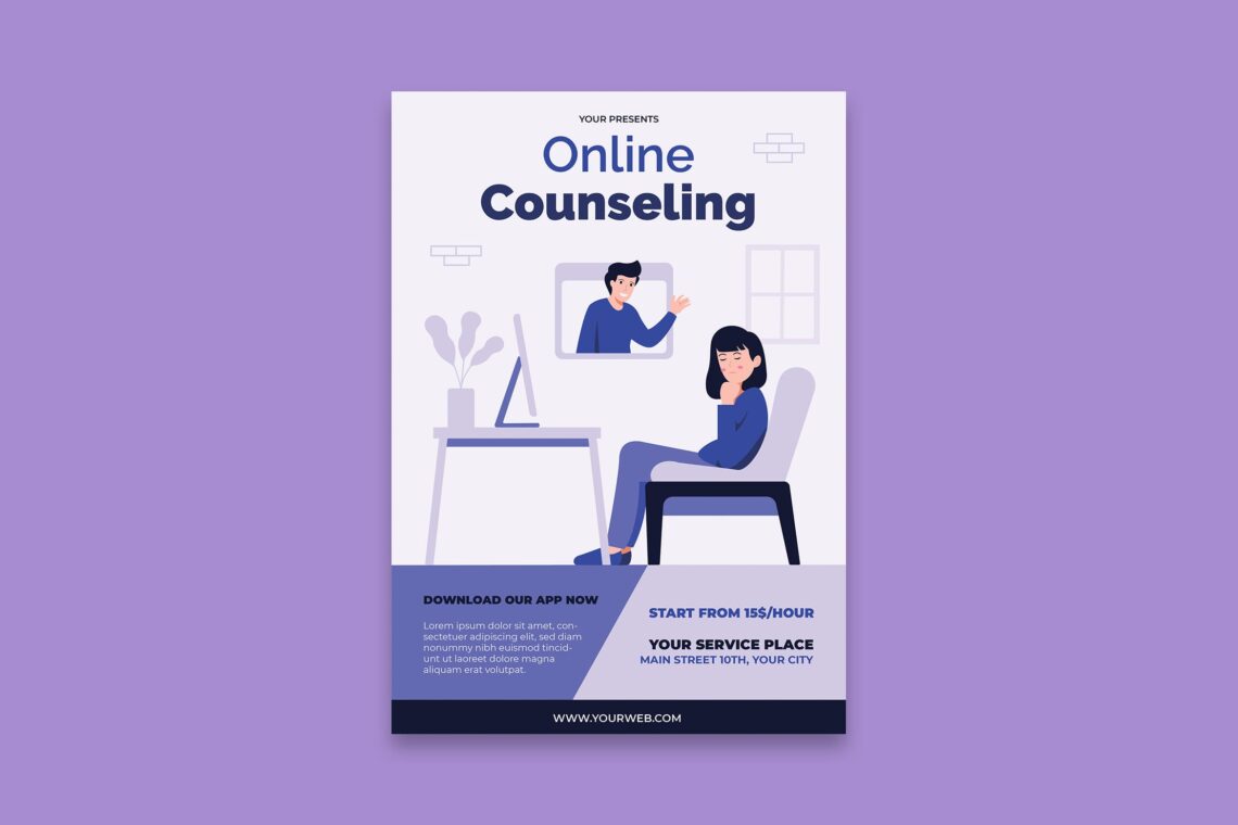
How many pages do you think you want to make as a poster? Campaign posters are designed to spread awareness about a certain cause, and that is the point. Most posters of this type address health, social, or environmental concerns and are meant to influence change and have a direct message. They usually have minimalist designs. The priority of them is to inform the public and the audience.
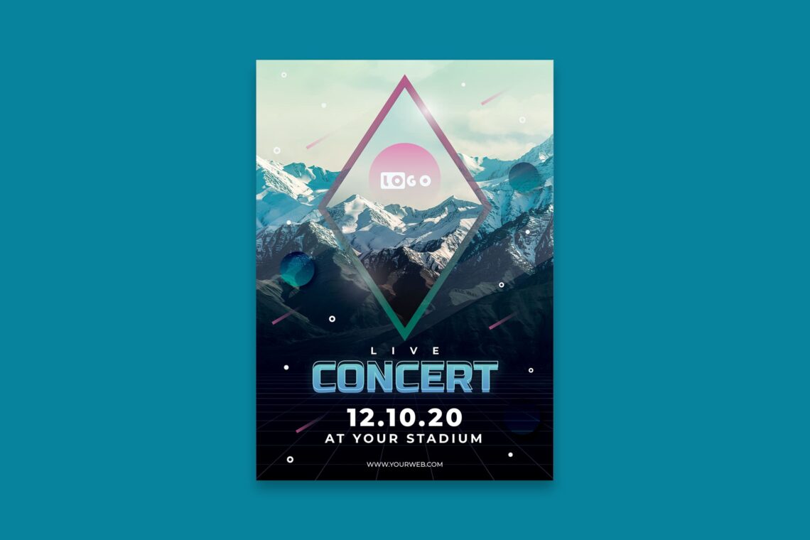
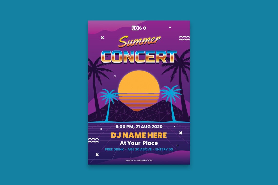
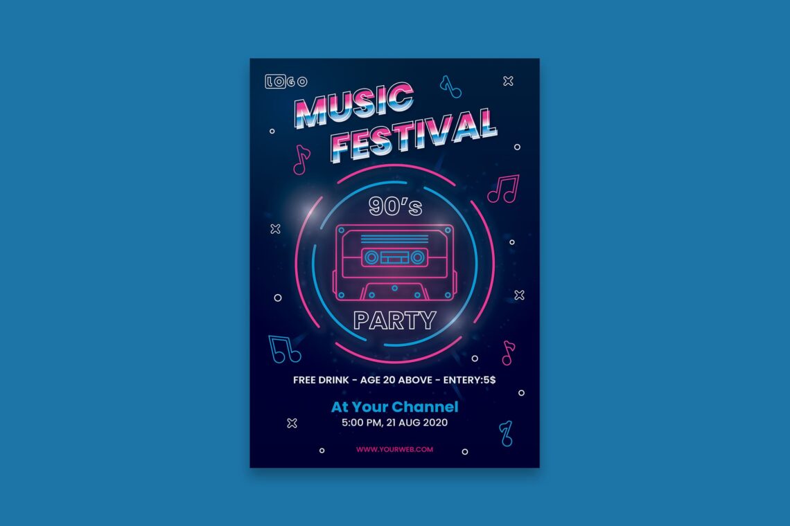
Movie posters or show posters usually display the most creative designs. They are using special effects, eye-catching images, and illustrations. They are also bold and bright colors. There will be a different strategy for announcing parties, concerts, tours, competitions, and workshops. It is also different from conferences which use an event poster.
Since events are one-time happenings, event posters should grab attention immediately and create a sense of urgency. Just like campaign posters, an educational poster spreads awareness about a certain topic. However, discussing it in great detail will be better in a semi-infographic format.
This is additional information for you who want to create an eye-catching poster Start to decide the layout you desire to use. Why layout is important?
The layout or formatting will affect the flow of your design. It is better to make the balance. Therefore, choosing a good layout style will add to the overall effectiveness of your poster.
Type of Layouts are:
Mondrian Layout
The Mondrian layout is dividing spaces into vertical or horizontal rectangles and squares The aim is to create multiple frames and portray different scenarios in one design. This layout could work best with a portrait orientation. It makes it perfect for posters.
Symmetrical Layout
The elements “mirror each other” are applied here. They are laid out equally on either side of the vertical axis. Therefore, this layout is recommended if you want a more static look. Do not try to combine it to another layout type.
Asymmetrical Layout
In an asymmetrical layout, balance is created by positioning elements in unequal structures and positions. Putting a large object on one side and a small object on the opposite side.
The big type layouts put emphasis on text, so you do not need to use big and bold fonts. Already confuse about it?
If you are not used to designing posters, you will spend a lot of time doing it. However, welcome to the digital era where all your need is ready everywhere inside your house. All you have to do is connect to the internet and find the UICreative website. Browse, purchase, and edit with your own message. Even if you have a day dateline, nothing should be worried about.