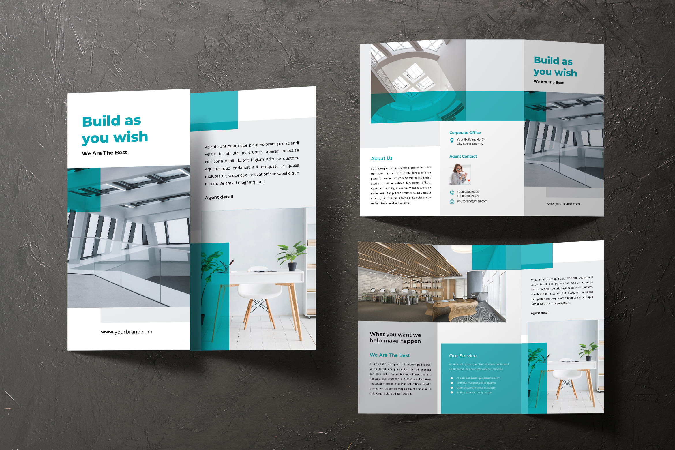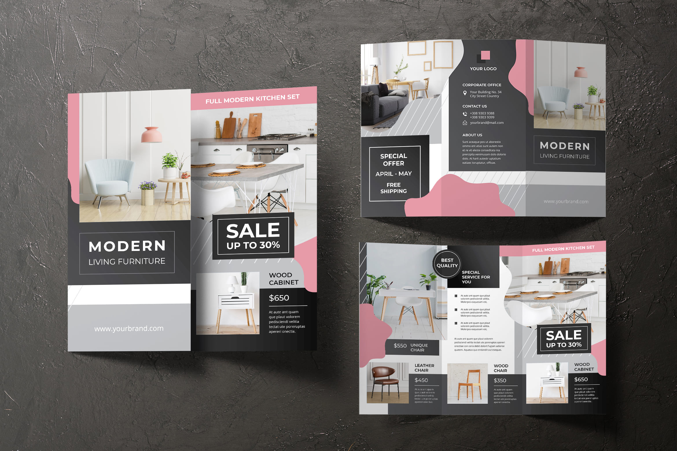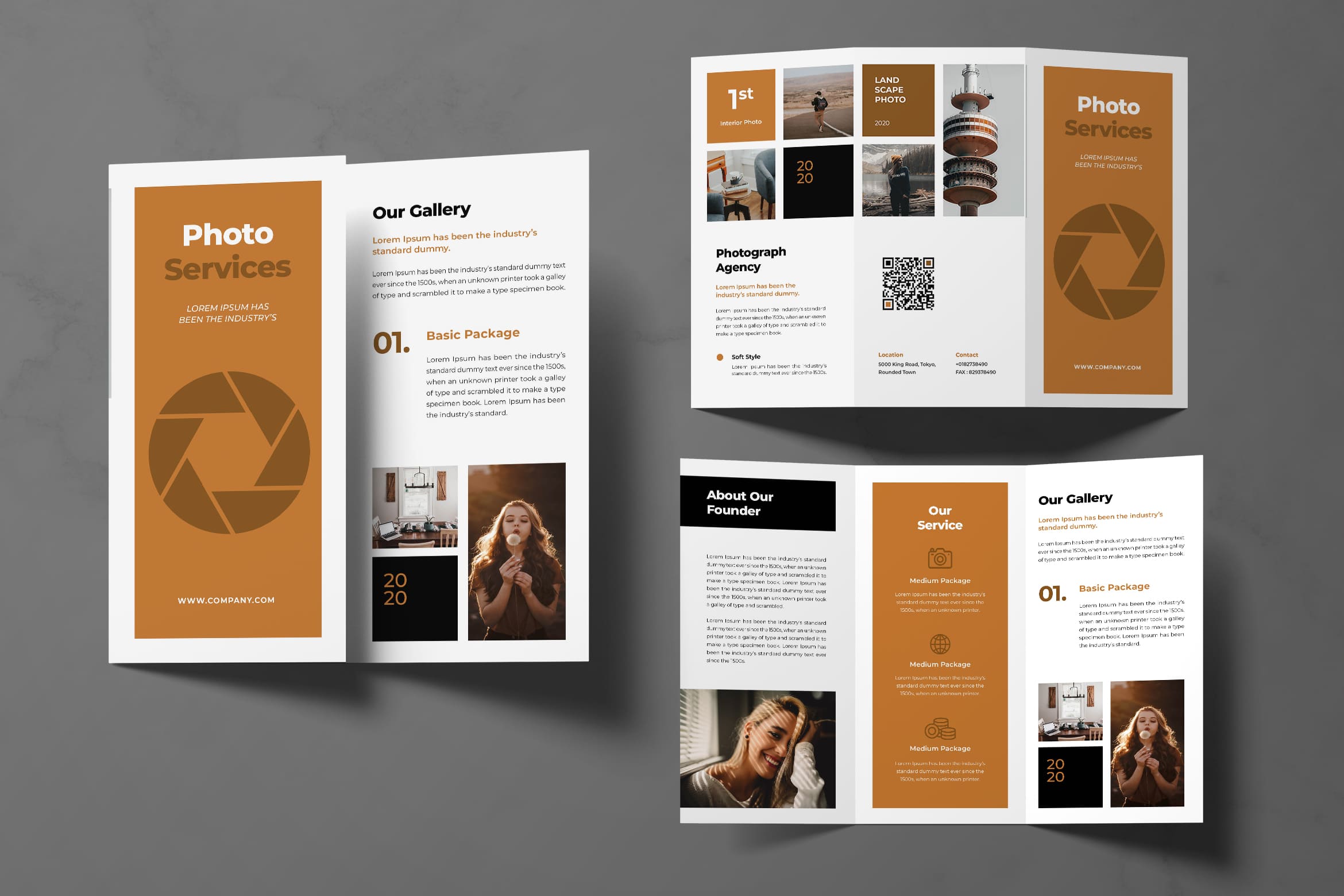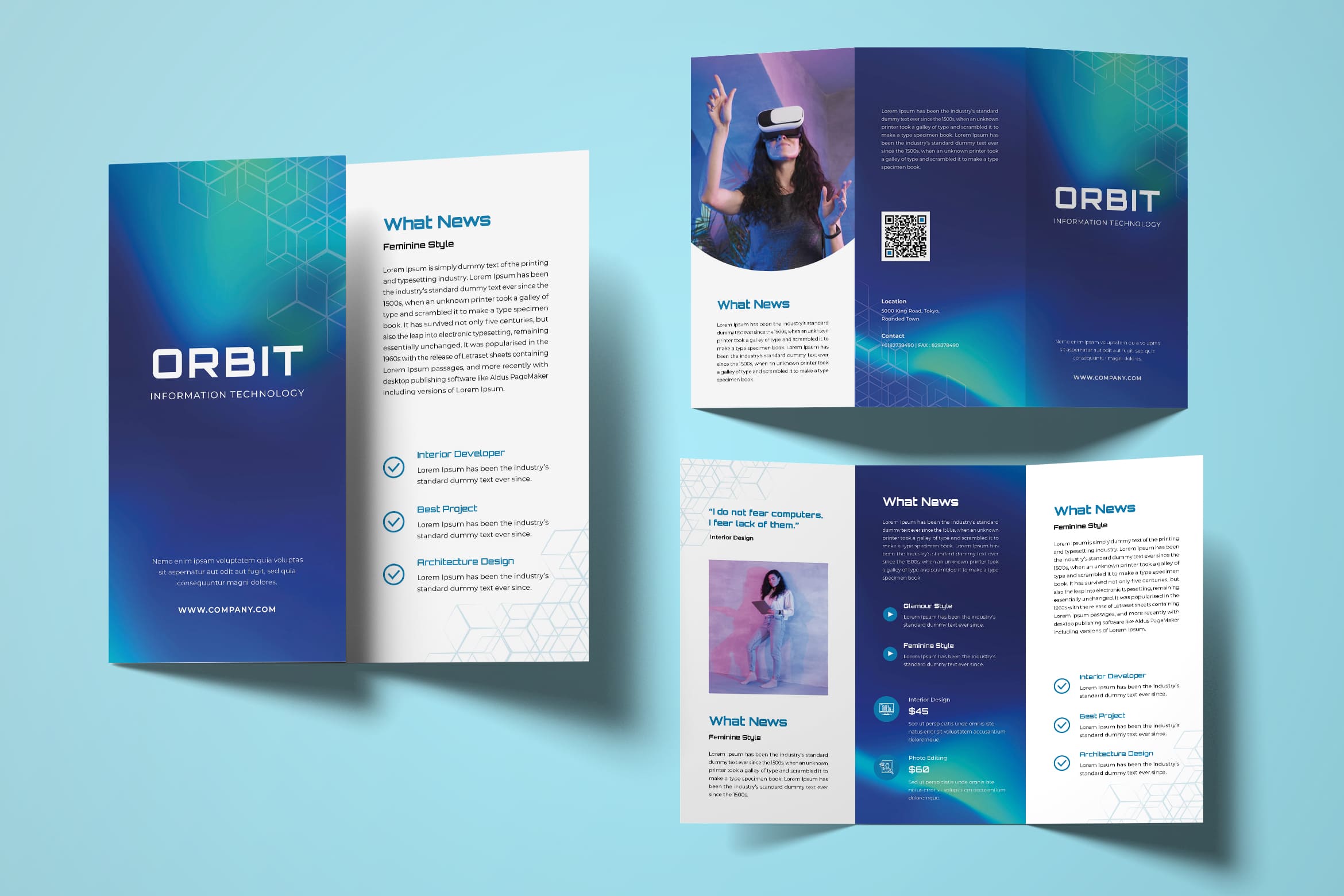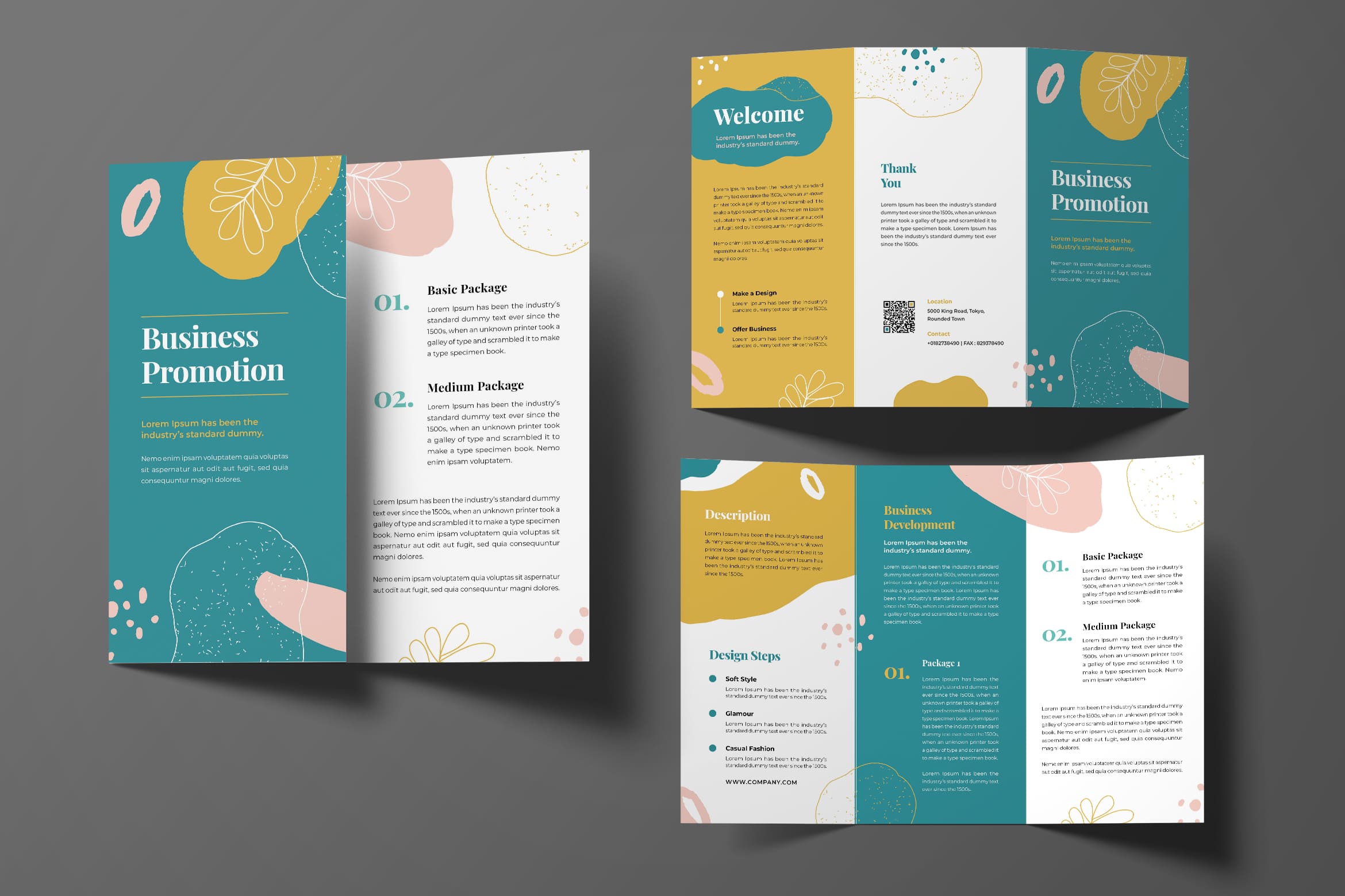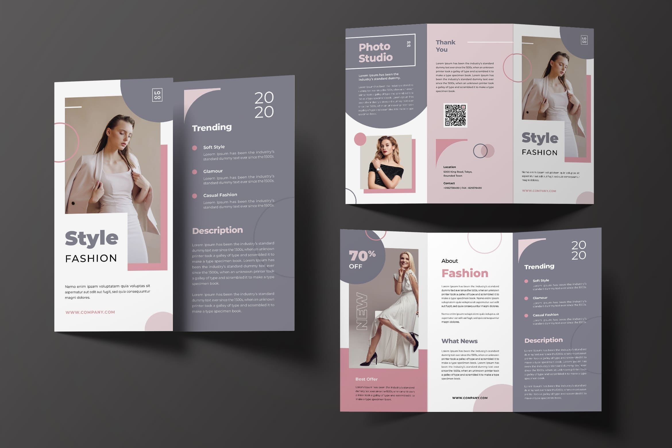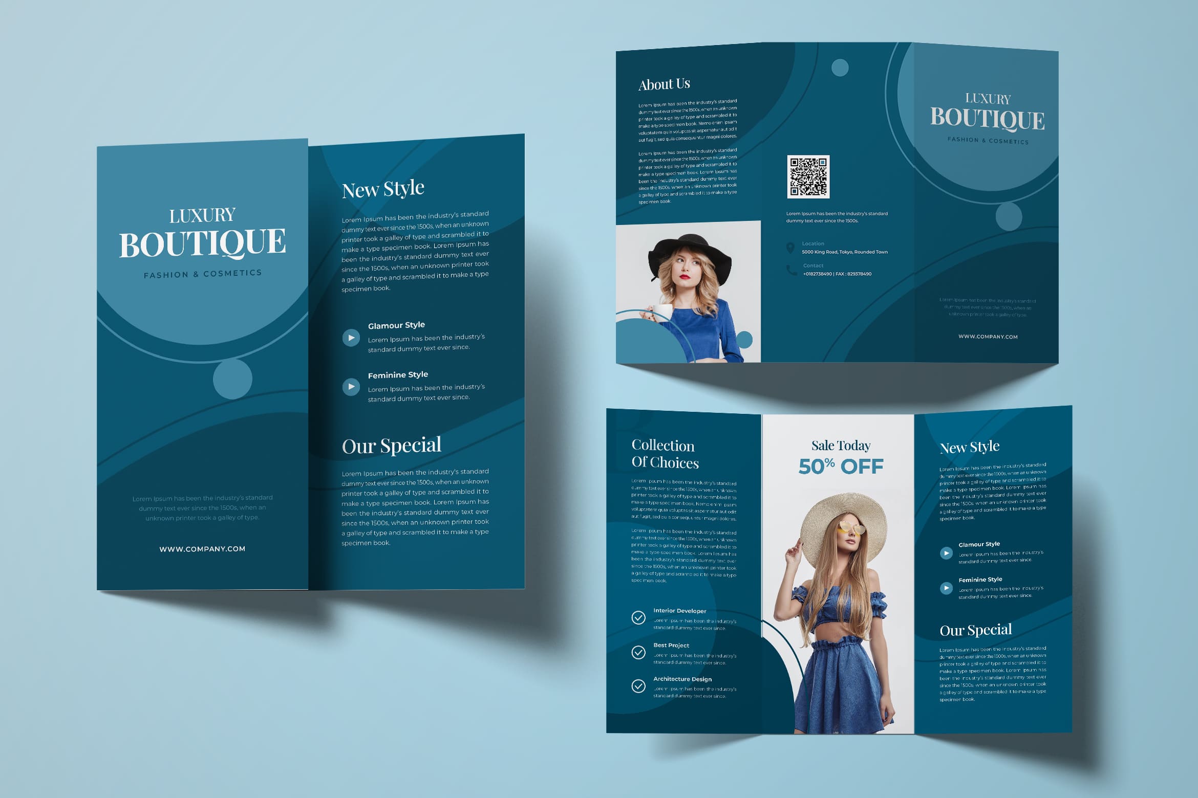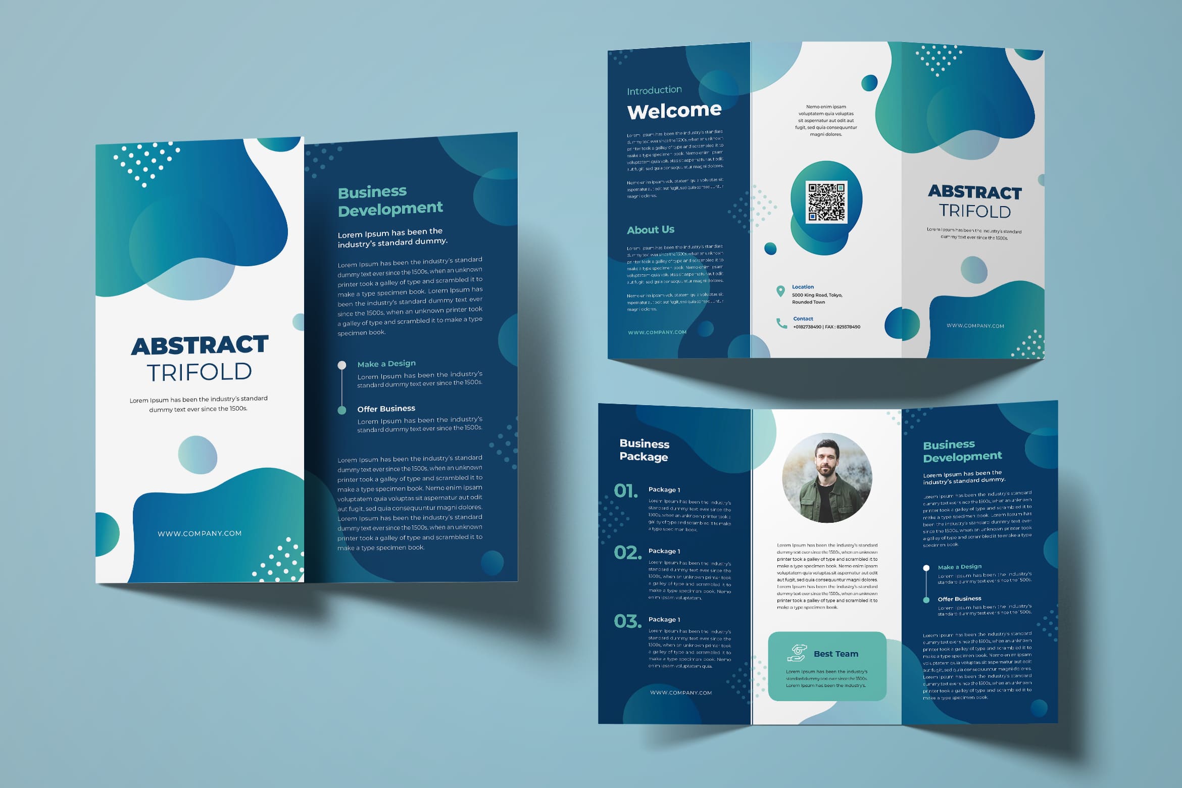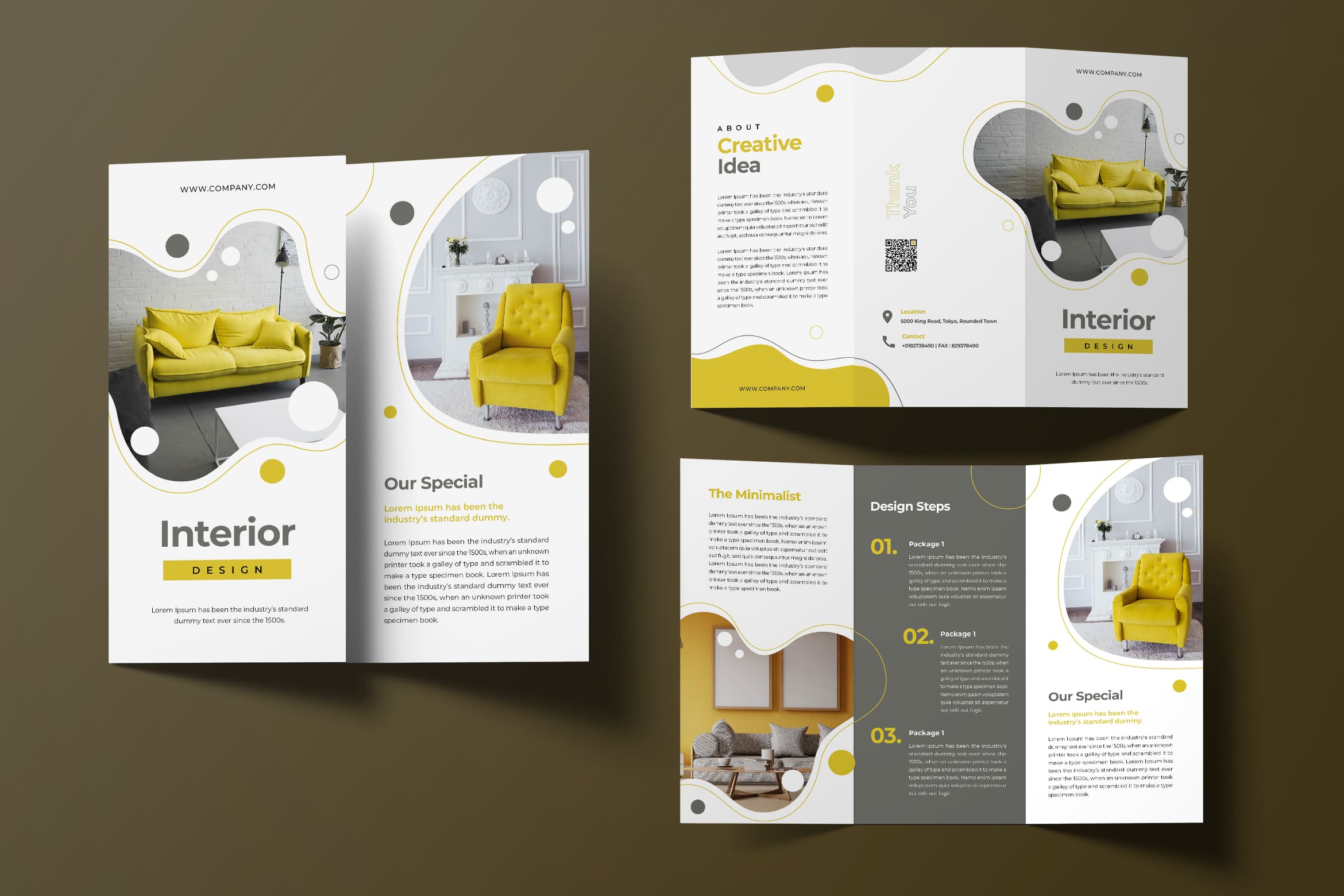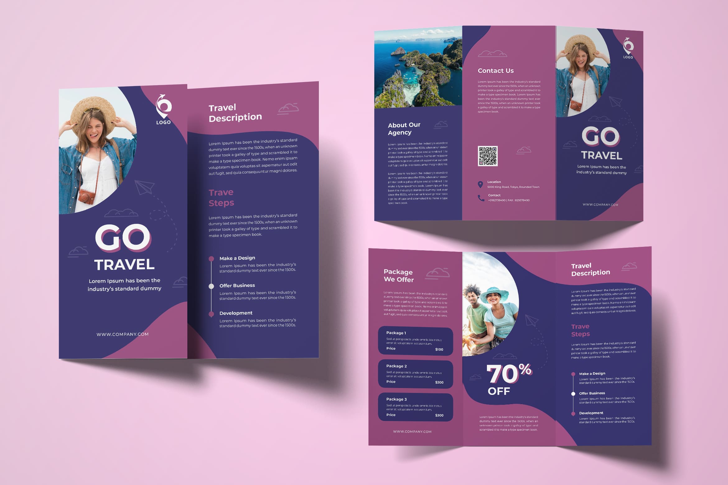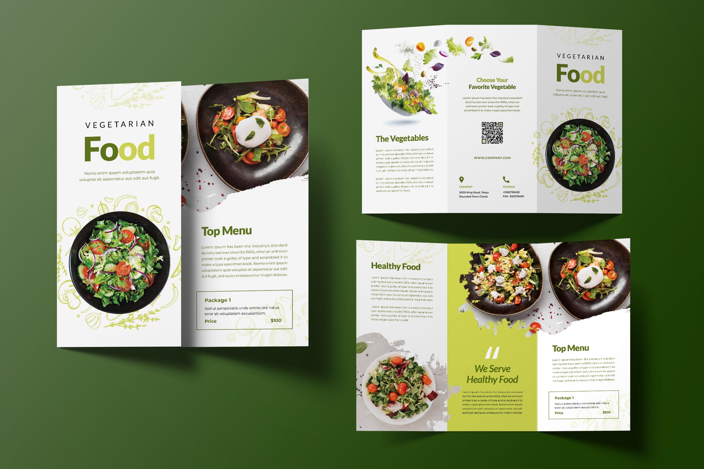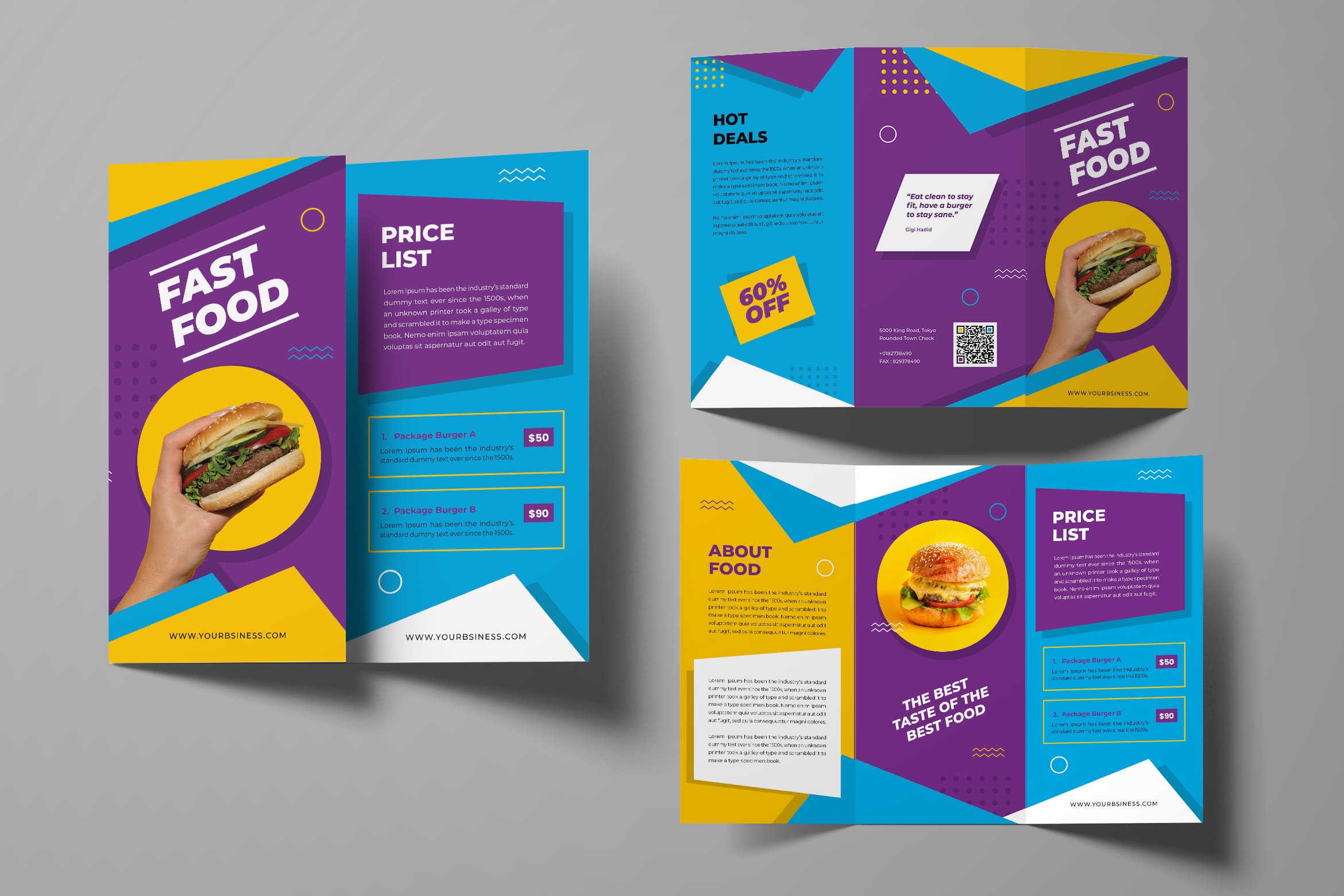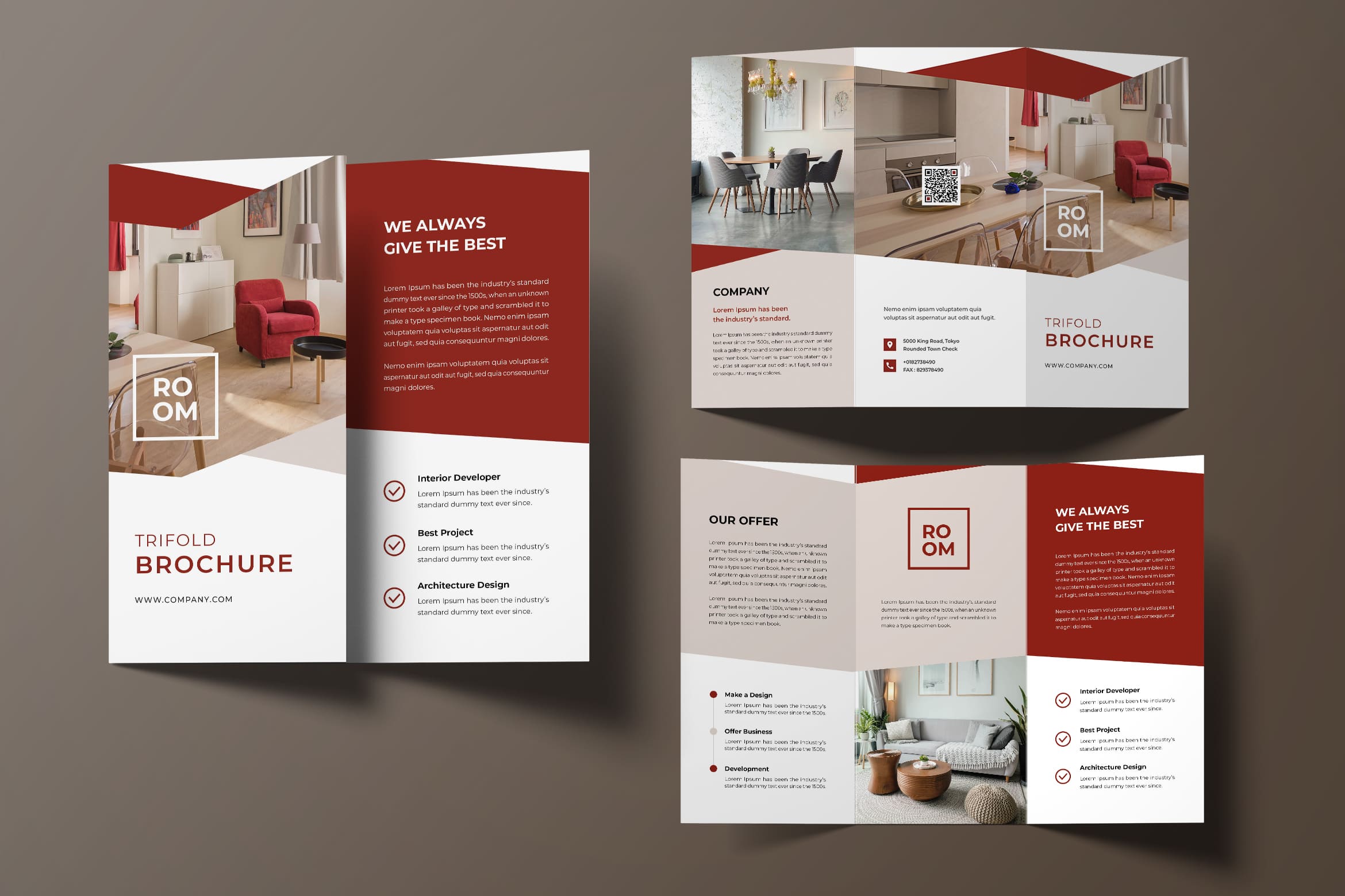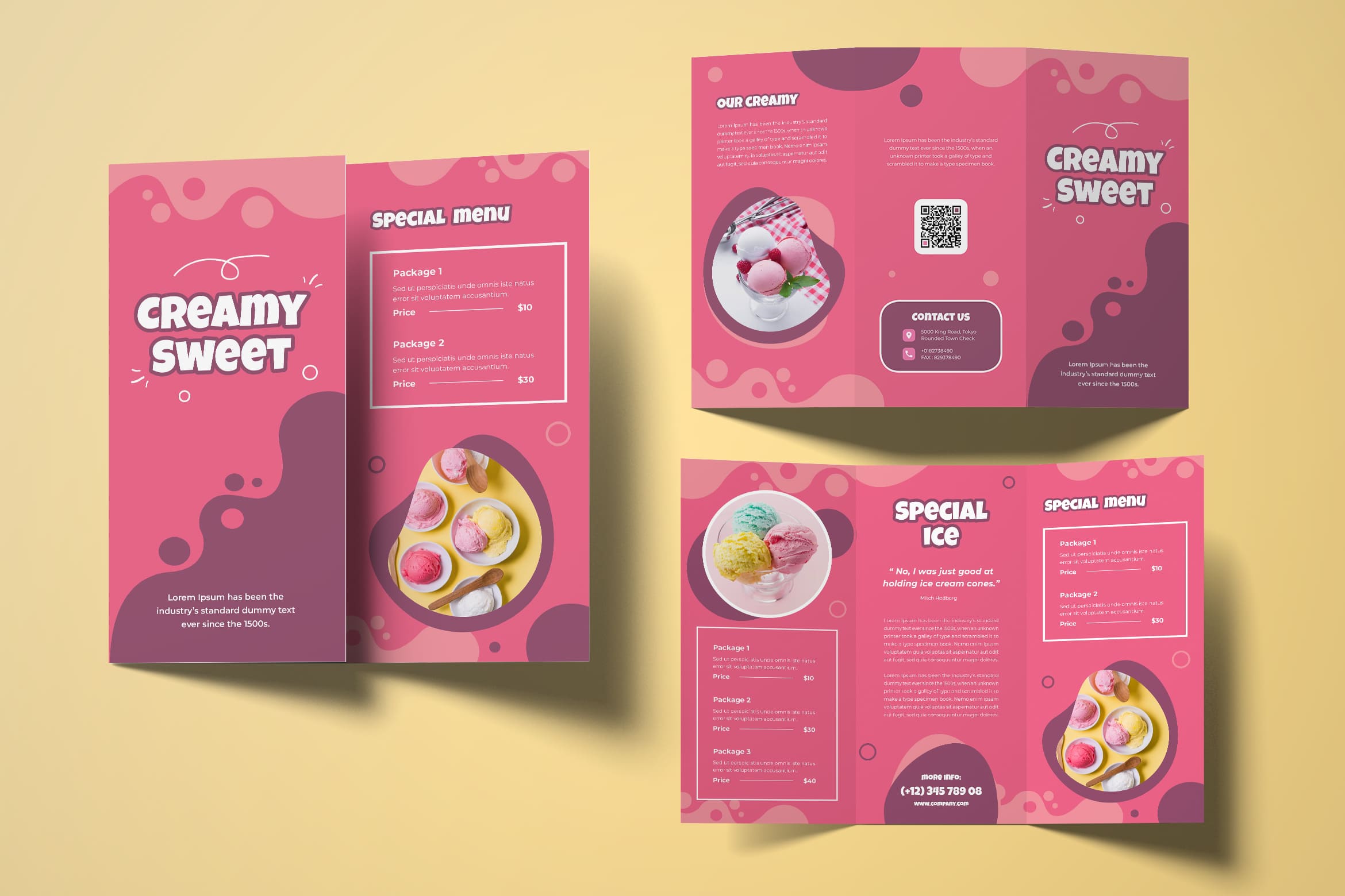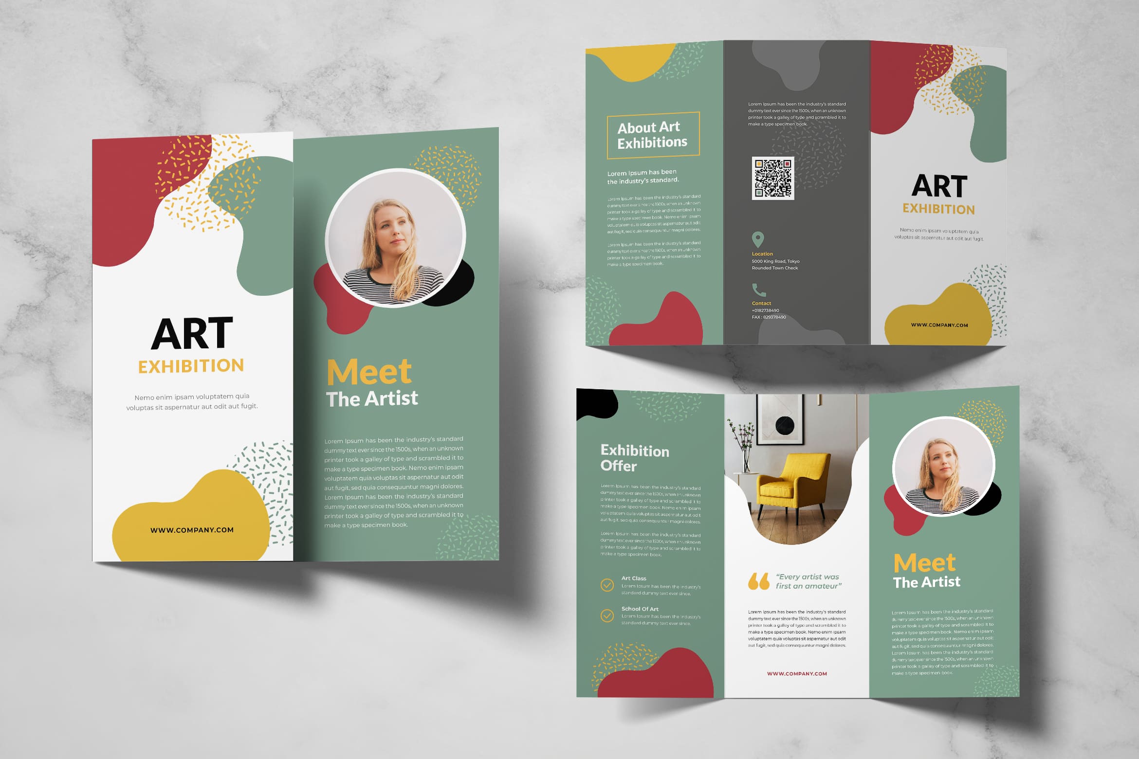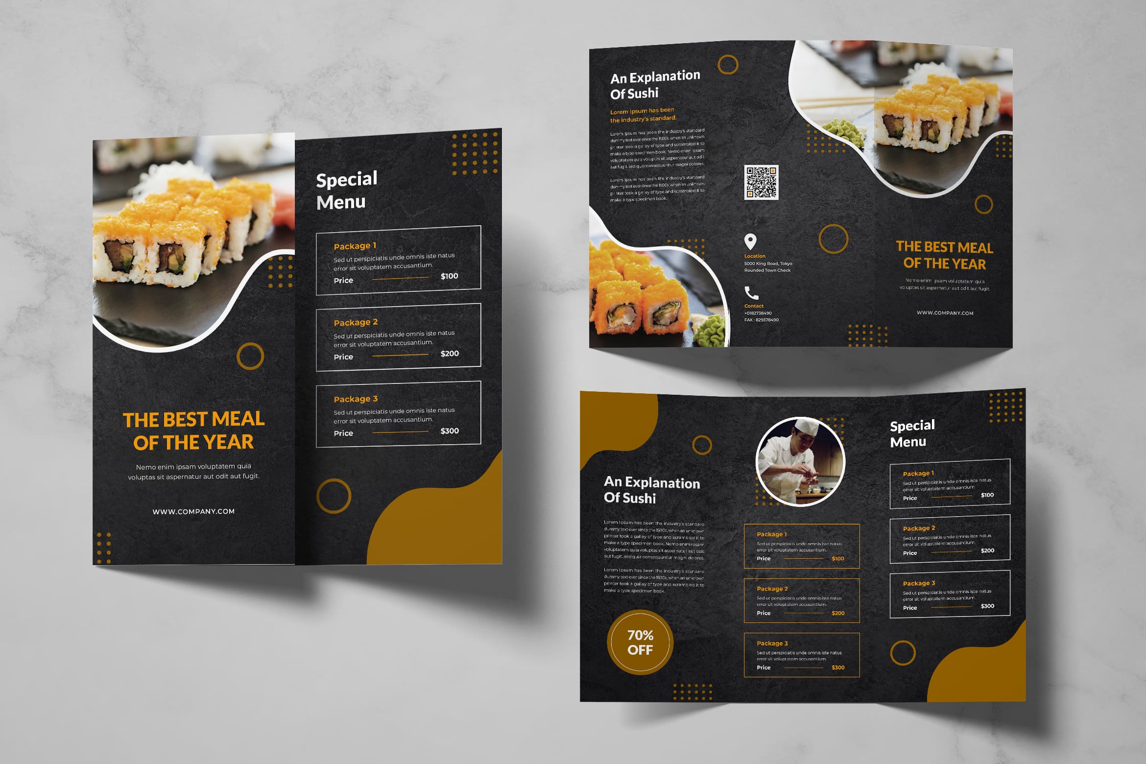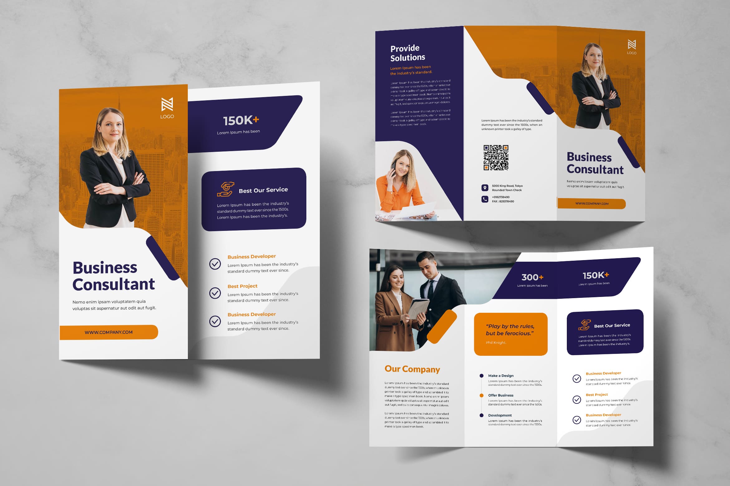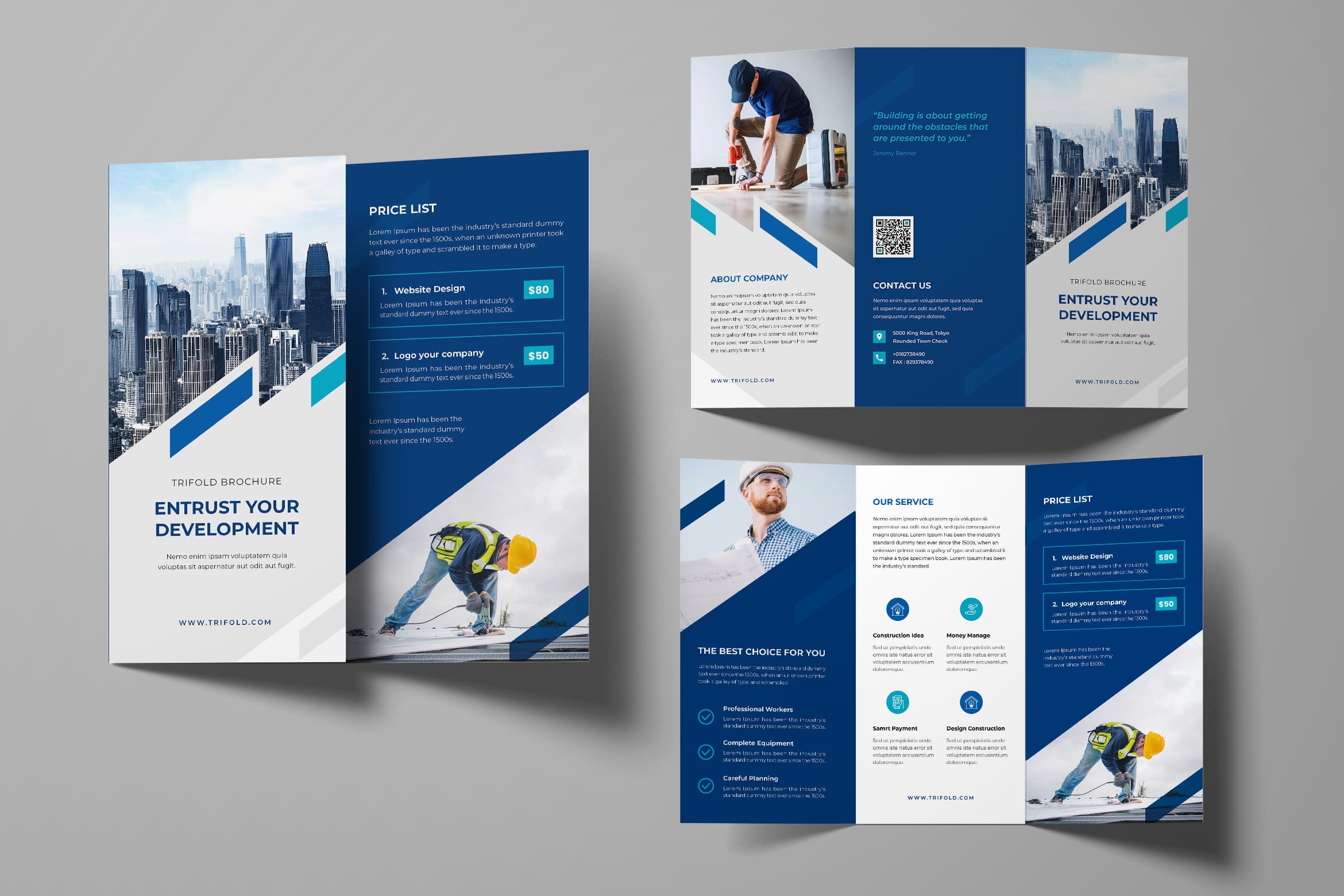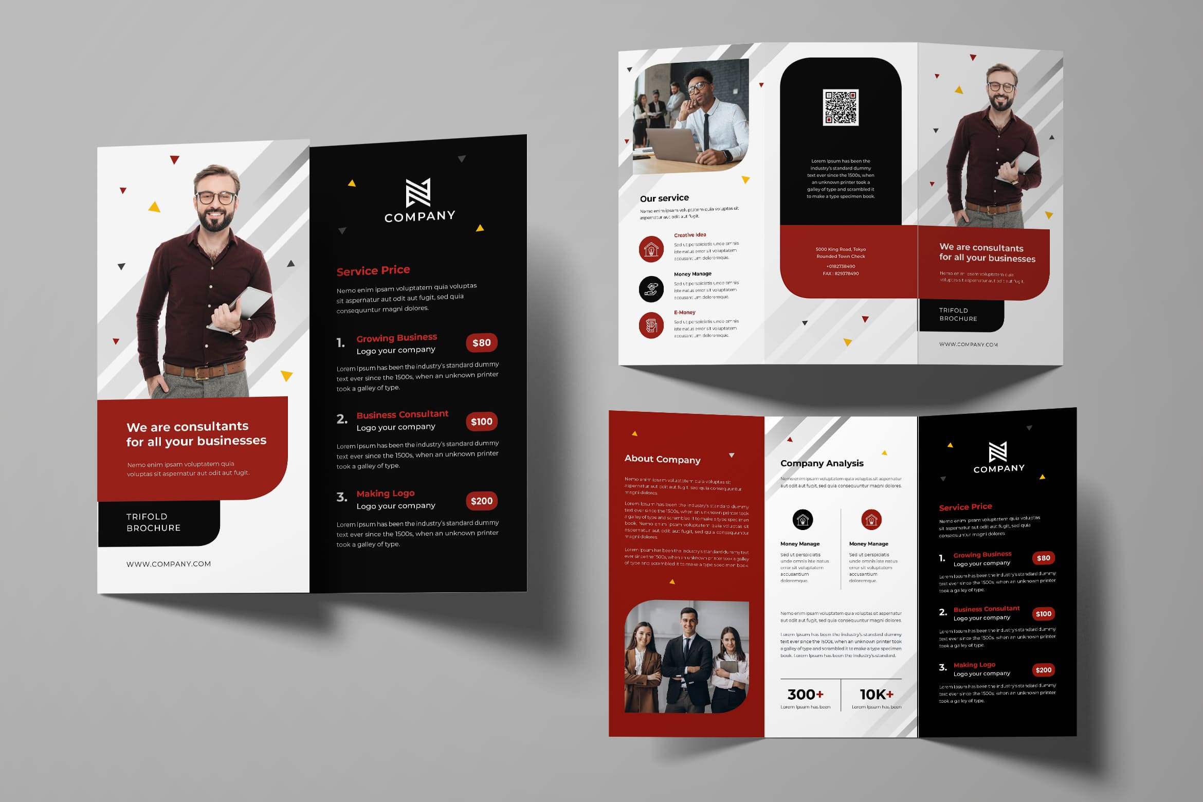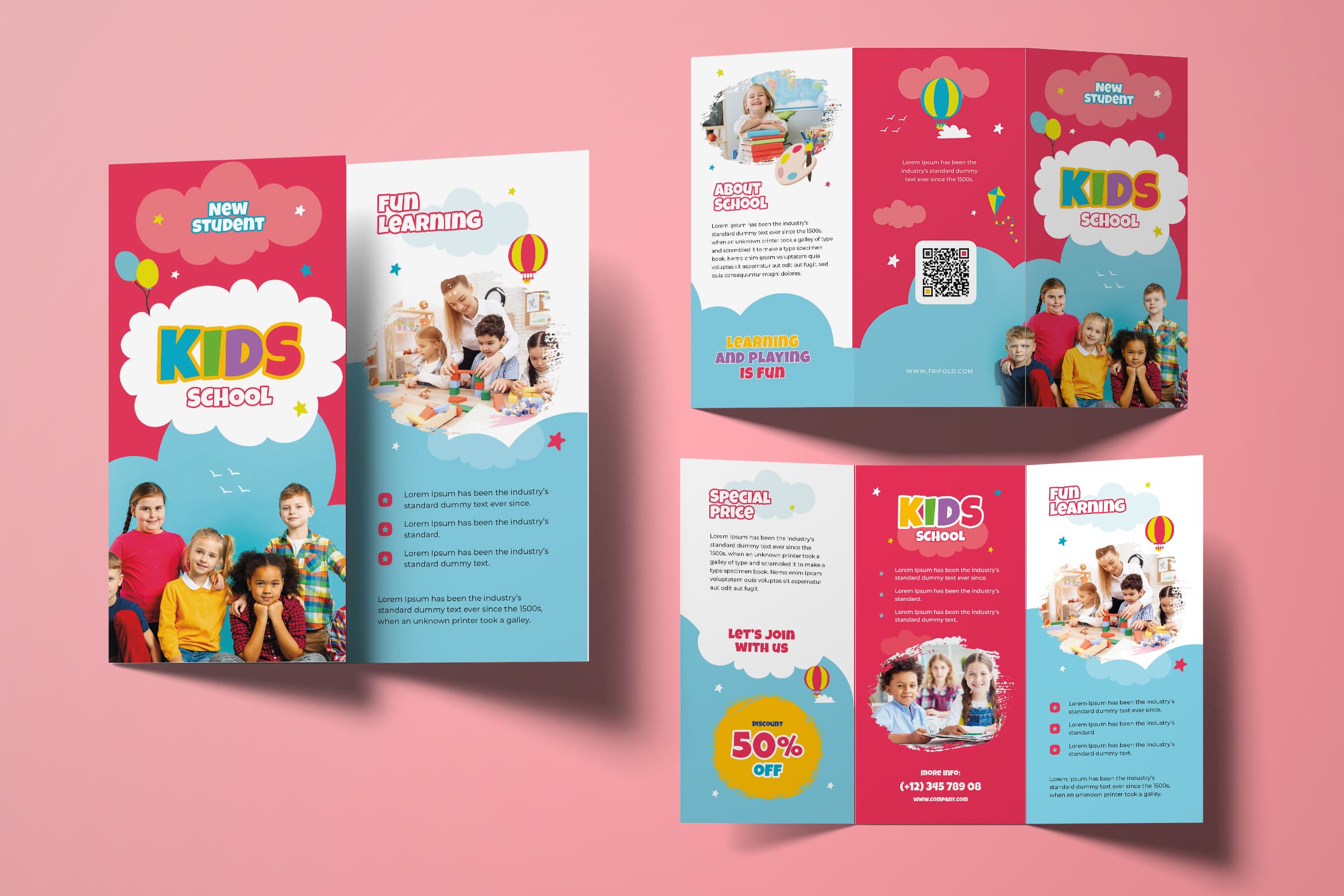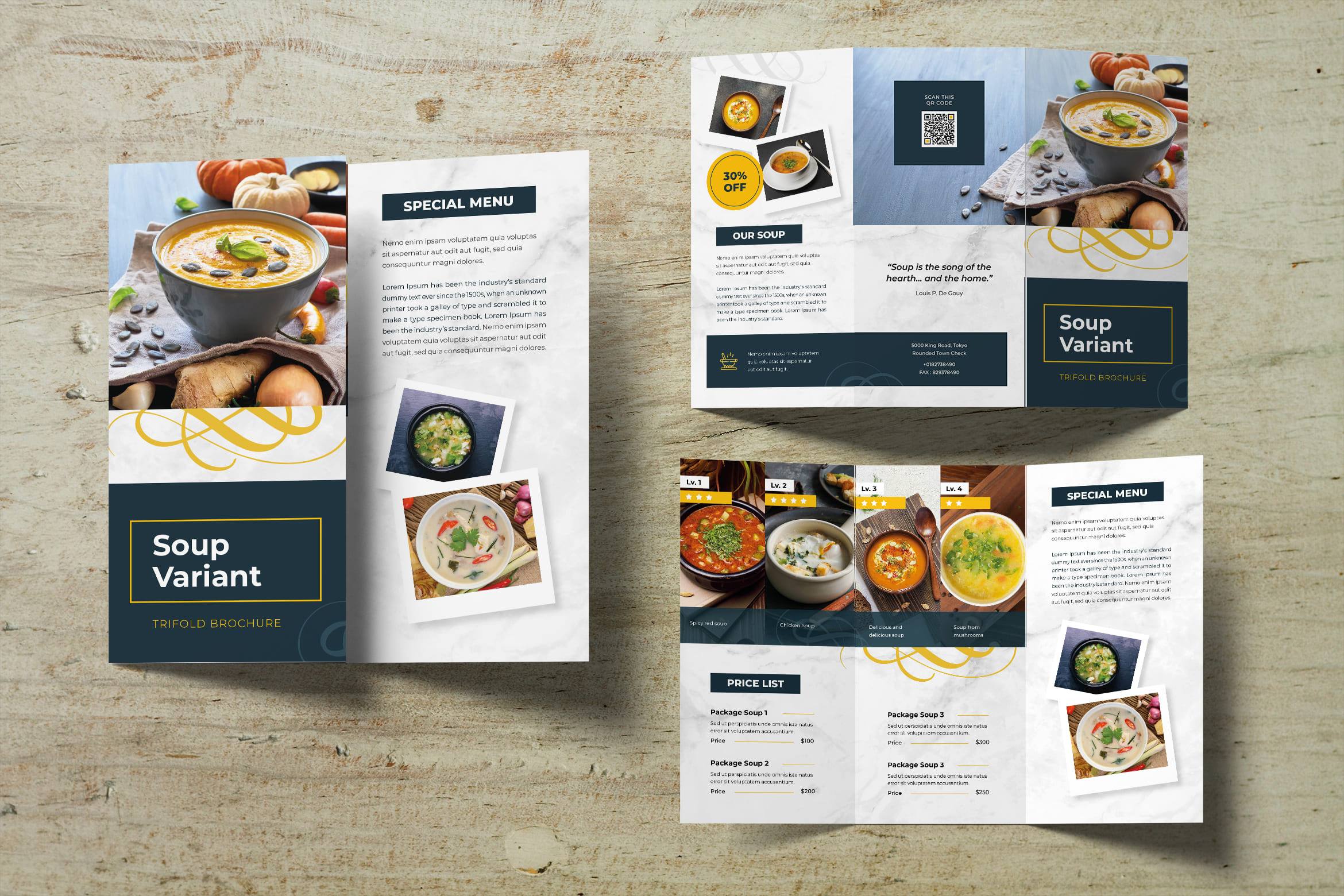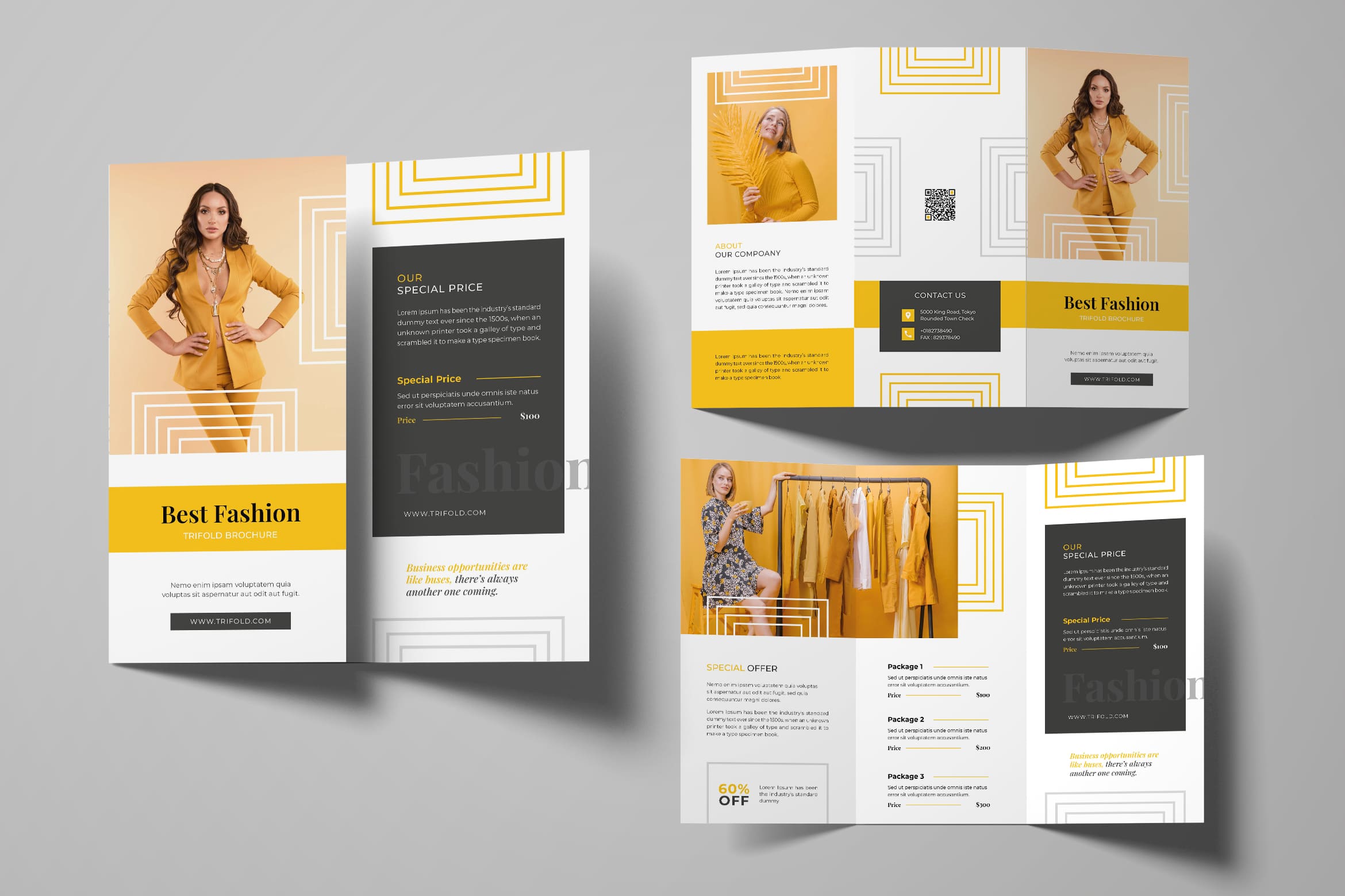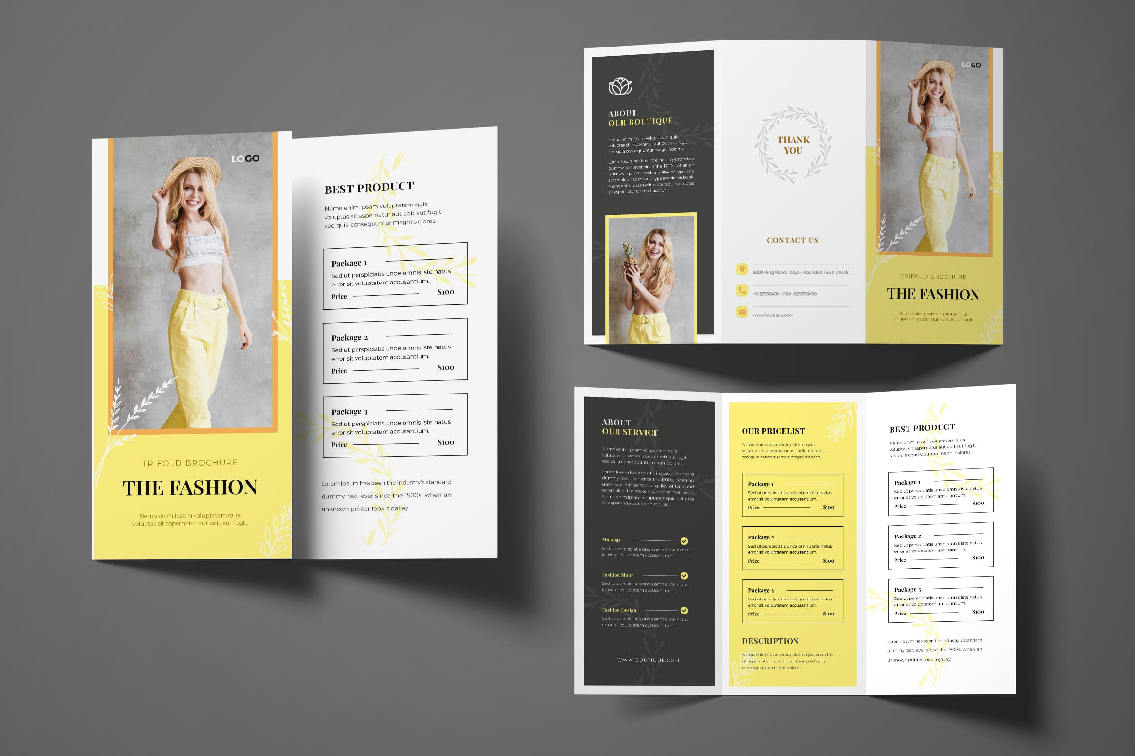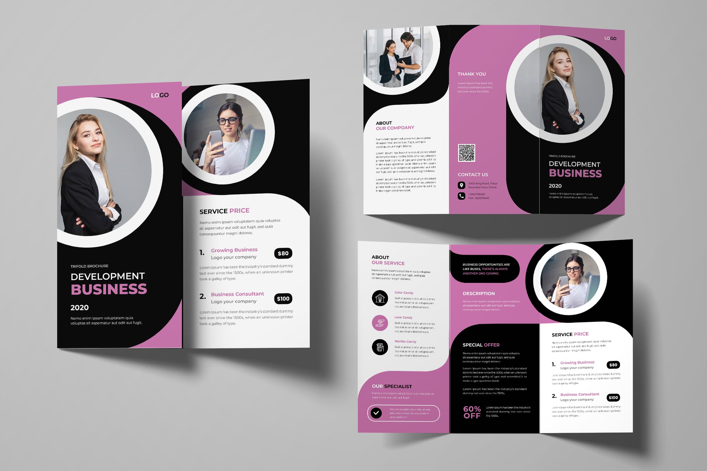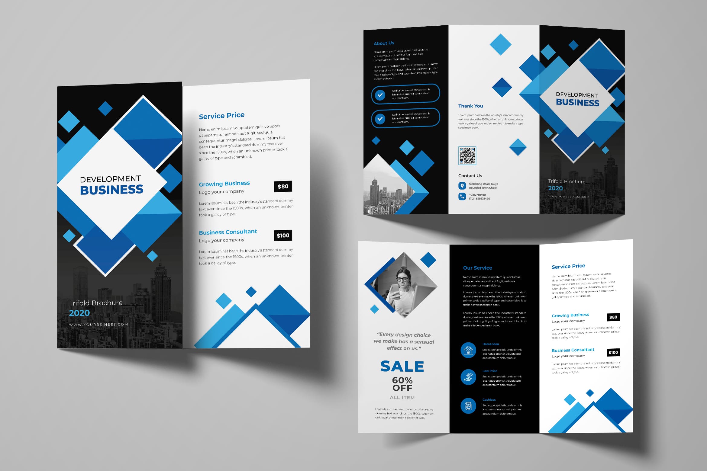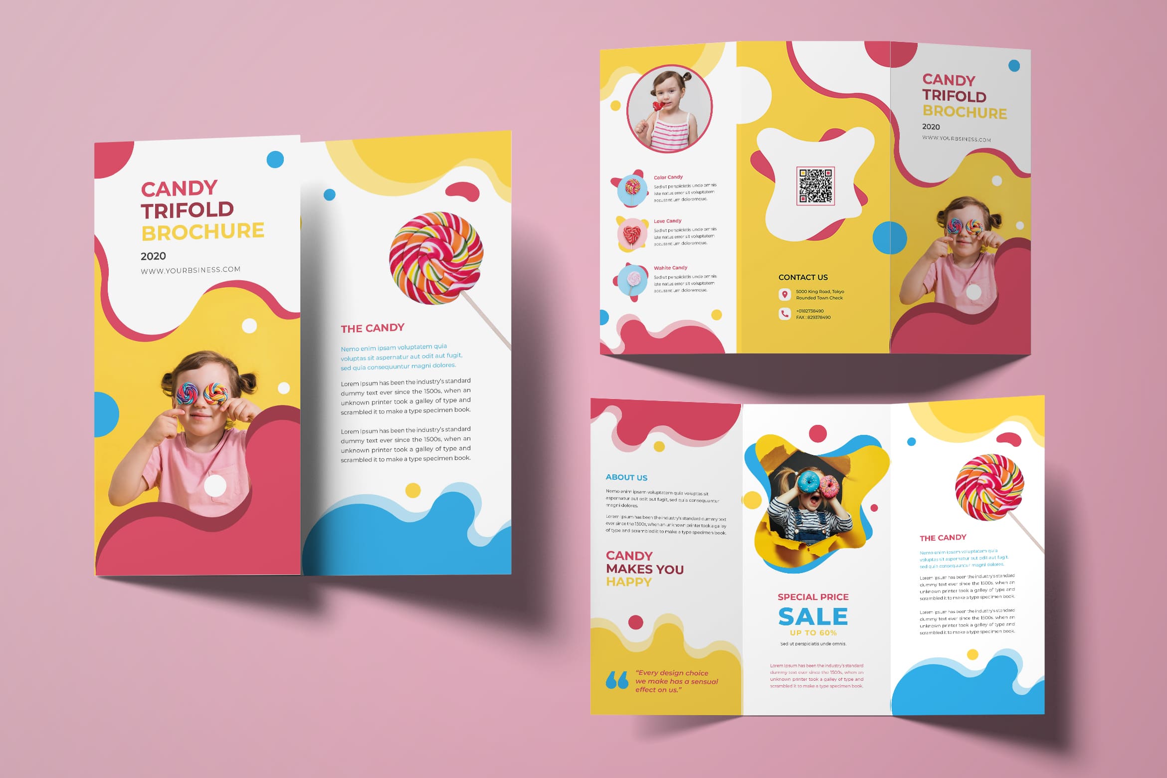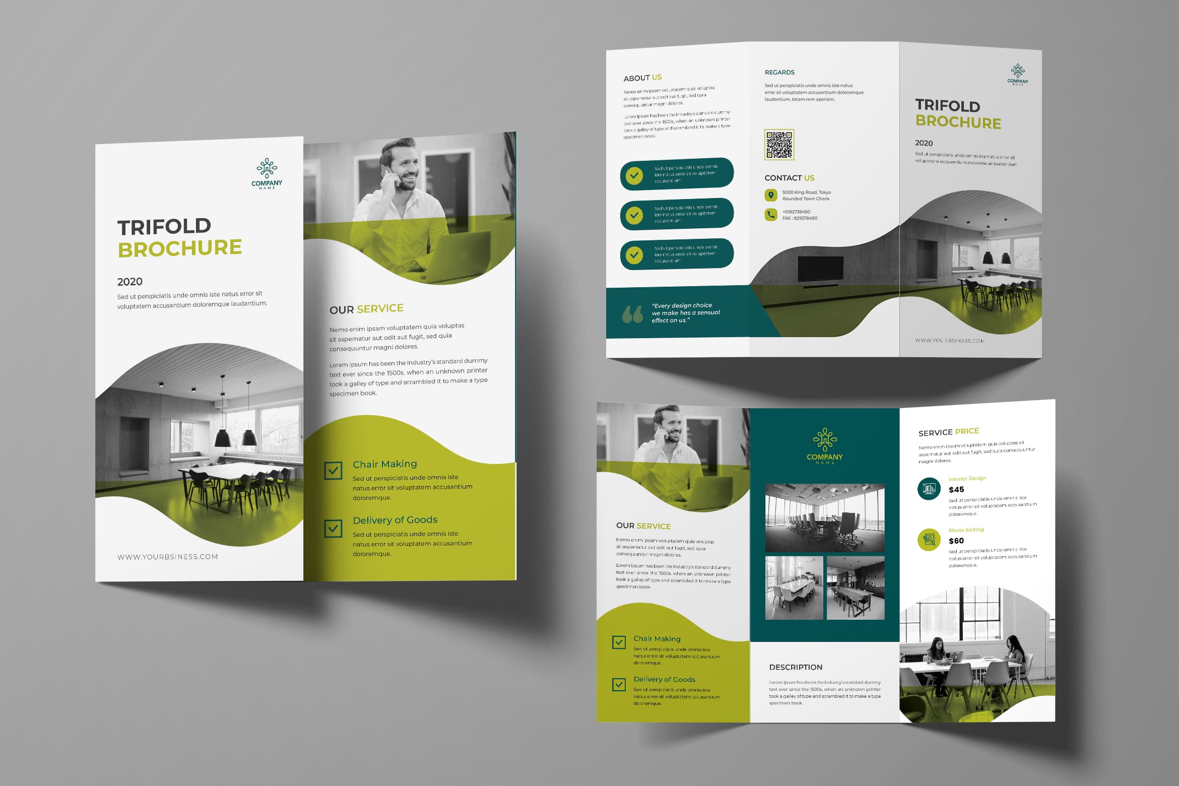
Trifold Brochure design is an important aspect to gain great impression. Brochure allows you to express artistic skill of you and how you twist the words. Call to action becomes important beside high resolution images. To make it effective, follow these steps.
1. Simple
Sorry to limit your bunch of words, but the space is limit too. Continuing the function of brochure, it should be well oriented. Since the space is limited and the paper size also in one sheet, you should do the filtration. What would you like to do with it? What is the most information to share?
2. Brochure Design Template Function
Trifold Brochure Design is not a novel. It needs to Hide a simple thing from the normal eye and keeping it as a surprise for the viewers. It often adds to the functionality of the marketing tool.
Try your best on doing it. You need to show off your creativity on it.
Also Read : 30 Best Trifold Brochure Design for Business
3. Be Creative
This is a time to show yourself. Show the character and identity of your products and company. If you think that a brochure is strictly all about a bound back and an attachment at the center, you are wrong. It can have an accordion shape, gate-shape or any other shape whether you want to make it asymmetric, you win!
4. Be Brave to Play Color
When you think safe color is great, it means you loss your creativity. You may think that a riot of color may not be perfect for your marketing tool. In that case you must know that the color combination depends largely on the topic and the business. Whatever it is, do not skip your basic company main color.
5. Graphics Used
No matter how you try to deliver message in a brochure, graphic would help you to make it clearer. You do not have to talk around the bush. You also do not need to use many spaces. Talk with graphic and everything will be great.
6. Shape and Shape
Activate the shape that you want. There is no rule to be a gorgeous standard. Brochure is about your creativity and symbol of company. You want to draw a shape? Well done, try on it.It is a marketing tool and you are supposed to grab attention, with as much charm as possible. It is better to make sure that the brochure designers use their full-fledged creativity and innovativeness in crafting your brochure.
Also Read : Triflod Brochure Tips and Ideas
7. Make It In Texture
This is not too bad to apply if you have more budget. Making texture means you should prepare special paper and special printer. If you let professional handle it all, maybe everything seems fine. The edge and color which look warm is important. However, back again to consider your buyers perspective.
8. Material is number one
Think about the things you want to promote. If you have a core business, you need to use recyclable stuff to give an earthy look in your marketing tool. You may add patches of green to the cover page. They make the brochure quite an eye-candy along to your target audiences.
9. Size
Previously, we think about size in last. However, it is always not the last thing. It has over when size did create an impact on the mind of the receiver. It is more important today. To help package looks fabulous, size becomes matter. In a similar manner, an expert at a brochure design company in India would tell you that a sizeable brochure could build an impression. It is proper to a small-sized brochure is not only easy to carry, but also great to store. A person can keep it in his or pocket or wallet owing to its size.
Also Read : 15 Tips Effective Trifold Brochure Design
10. Innovation
Straight font sometimes will not appeal the customers. If this is the case, you really have to innovate. Challenge yourself to do it.
11. Consider the display case
Arrange the brochure to display. If it has to be displayed in a box, they should make an impact. The same theme needs to maintain, so the box completes the brochure.
12. The cuts
Die cuts make everything look interesting. They have this unique capability to make people think twice before tossing away the brochure. It build curious because it makes customers feel that there is something inside. They need to be checked out. Die cuts is preparation to surprise people.
13. Changes are okay
Trifold Brochure design gives Different styles could be a fresh look with eagerness and interest. A new design idea can be interesting and it makes the young generation can easily be enticed to it. People are no more entangled in the era of practising the same old designs to make sure that they can make an impact. We live in competitive era. It means something new can be more refreshing than the old one.
14. Choose accent ages
This is a page of accents and you do not need to insert images in it. But, it is important to note that accent ages can work as die cuts acting as the veil that covers the thing, which lies beneath.
15. A case is important too!
Well, a case is a protection for the brochure inside. But it can also make the marketing tool look personal and warm, especially look high class. We would help you with that.
Nobody would pay attention to the story and history of your company. Therefore, you should make sure that the brochure will give them a view about the things they will enjoy. It could be by availing of the service or purchasing the product from you. For example, no one buys a laptop just to type or sending email. Some buy it to post pictures on their social media and thoughts on social media while some just want to purchase online. As a result, the laptop companies do not focus on calls anymore in their brochures. They show all the keyboard quality anymore, but possible things that can be done with a laptop, starting from edit photos on different platforms to getting adequate data allowance each month and meetinh online. So, before you sit down to write a copy for your sales brochure, make a rough list of all the things that your product will offer. The flashy benefits will attract the attention of the customers and they would be very interest to buy your product.
It seems like you need to understand your potential customers and their mindset. Why they want and things to urge them to buy your product? What is the benefits of your product will do for them? What could be the probable problems that can be solved by your product or service and would ease out the worries of the customers? Maybe you have no idea about it, so ask around to people and get an idea about their want and desires to your product. It is very important to talk to your salespeople and your customers to make a short interview. Their answers will be useful for you to get a clear description of how would you set up or design your brochure and sell it effectively.
No one would care how big your company is. They would know what you sell. Therefore, do not put your company building image as a cover of your brochure. Customers just need what you will give to them and how it gives them solution.
Use the space wisely to sell the products, and convince the customers in the most enticing way. Consult with anyone who has expertise in this field and design the cover of the sales brochure accordingly. Remember that sometimes first impression can indeed be the last impression. If the customer gets pissed off at a glance by looking at the flyer, chances are that he might not even proceed to go through it further. Instead, use images that will trigger a sense of interest in your customer. Be sure to use clear images and be professional in the outlook.
Trifold Brochure design should be create based on economical strata of your clients. Teenagers do not care too much about the package and how you wrap the brochure. They just want to know the content of your brochure. Select the professional design from us if you think you have no choice to do. Hiring professional spends lots of money than buy the ready to use design and organize as you desire. You only have to understand a bit about coreldraw. Afterall editing will be as a piece of cake. You can visit our main website to get more collections from us. It is time to make everything Sellable. Raise high profits after you follow these tips.


