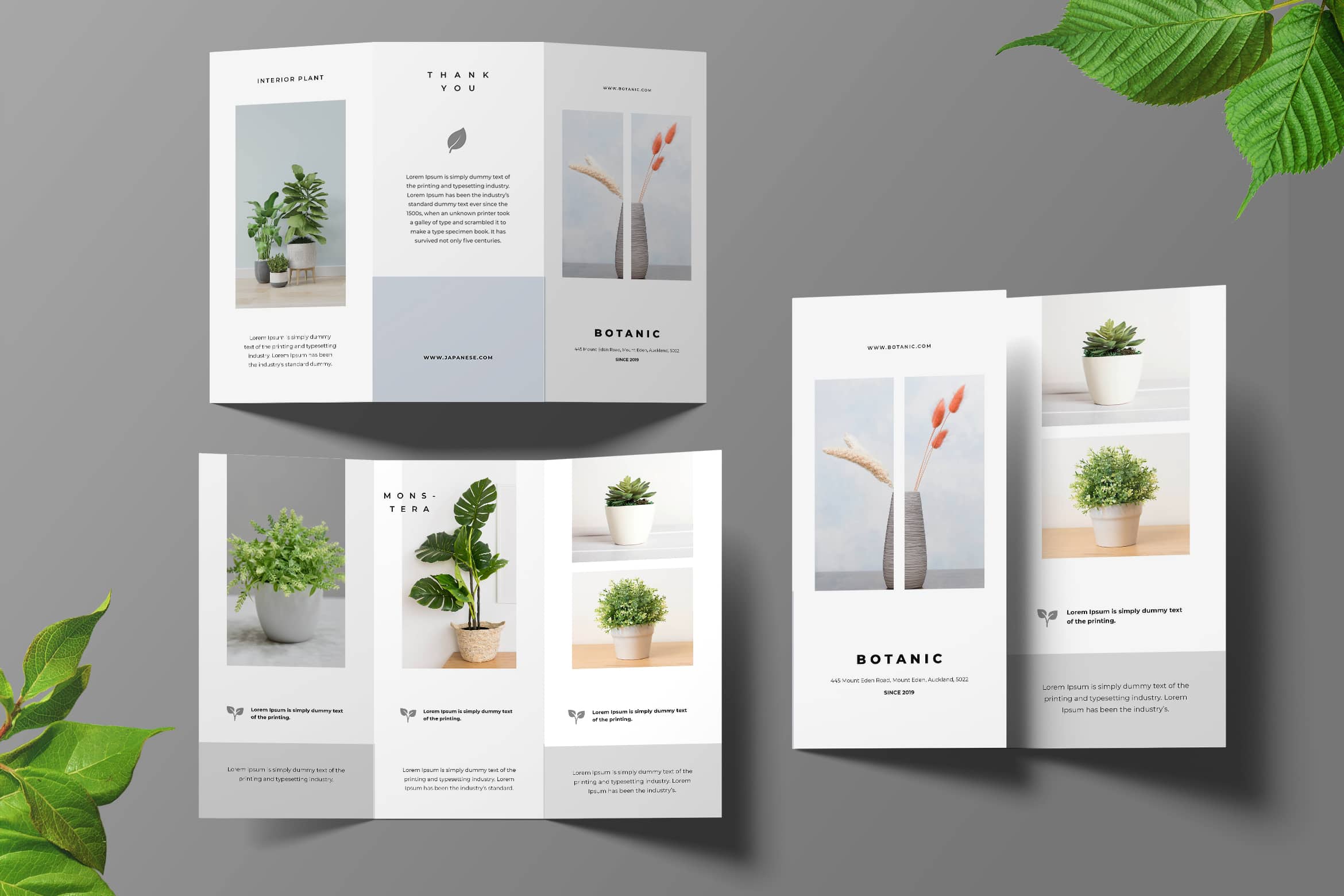
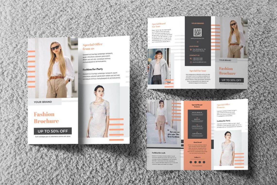
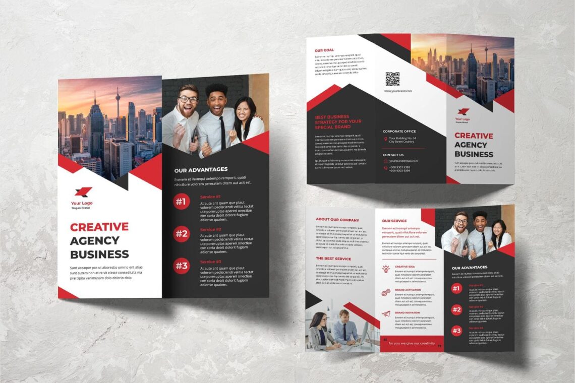
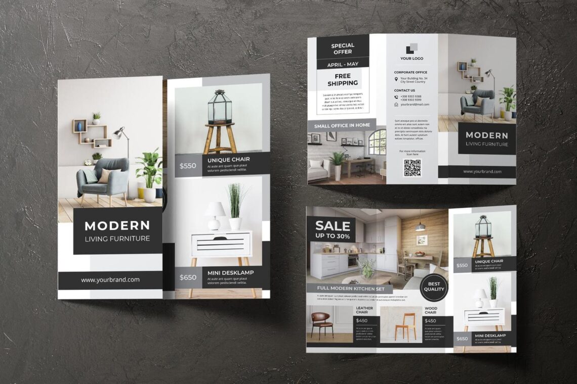
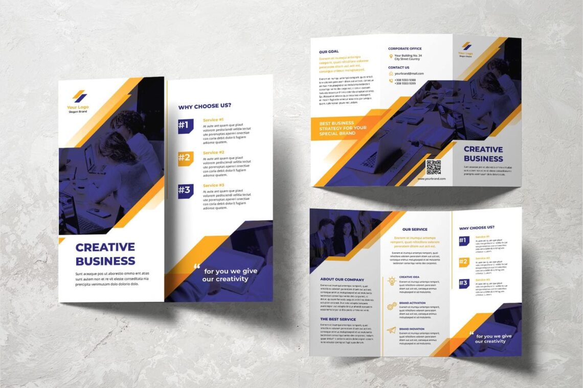
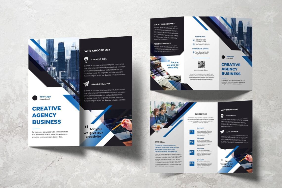
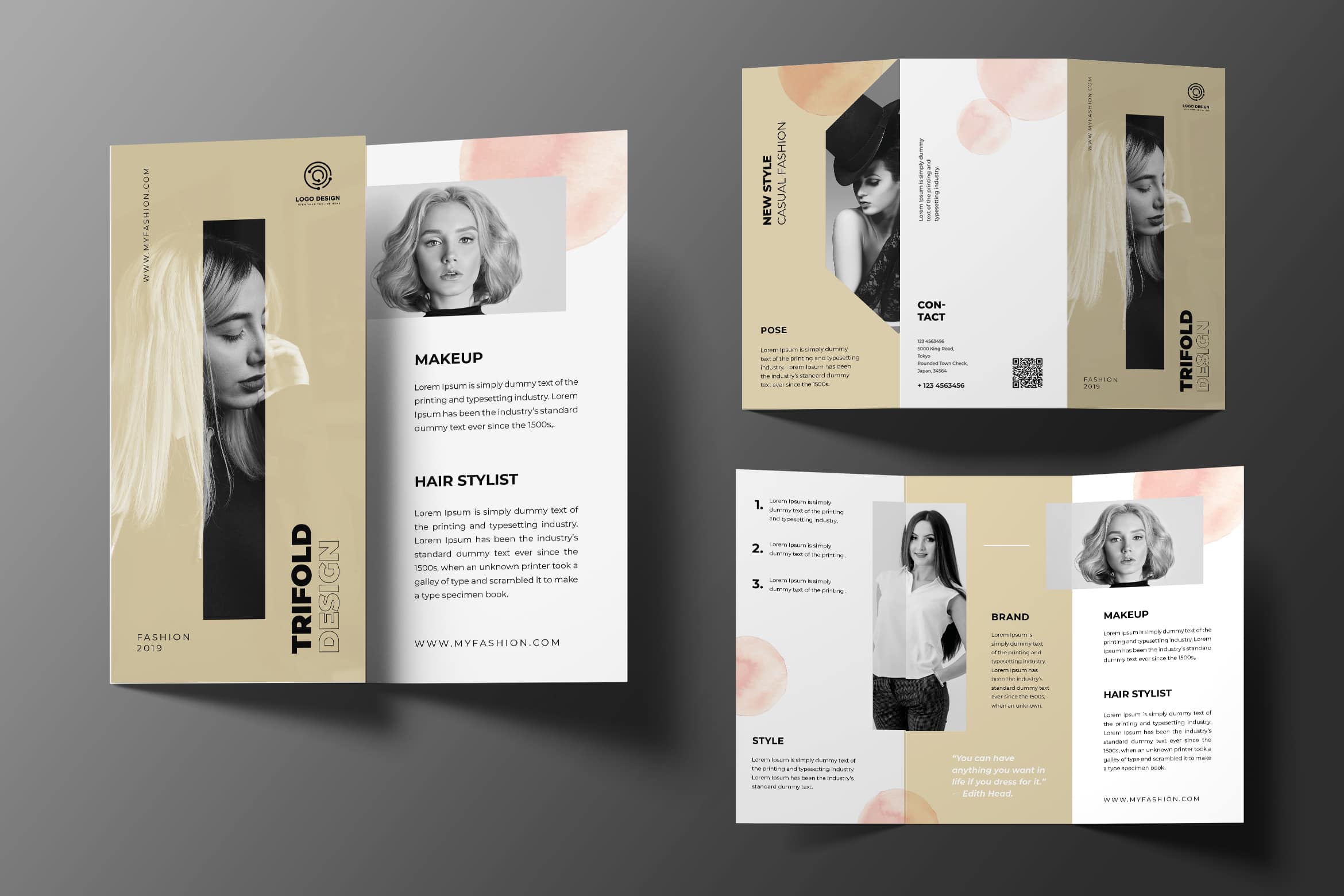
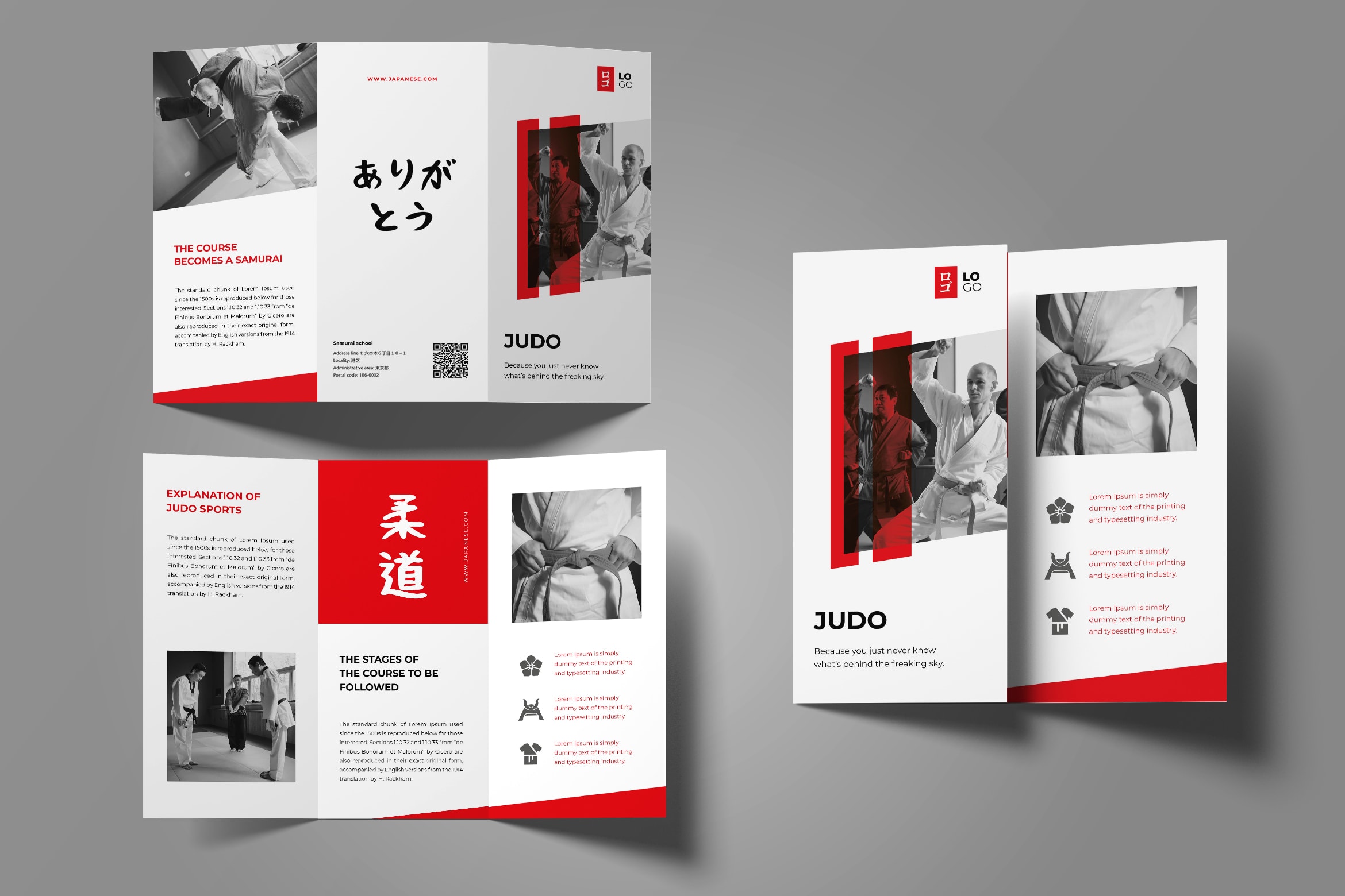
Trifold brochure template is a key point to have successful marketing. Therefore, you should know how to make it attractive and efficient. Remember to bring your business story and make an impressive introduction. Having trifold brochure to promote, inform, and market your products and services are quite classic. However, this is the fast, effective, and efficient way to gain public attention. Once you could find the right design, it helps you to gain more profits. Even they are not going to buy your products now, they could be your prospective clients in the future. Call to action should be in good content to make a huge impact. Note these tips and practice!
1. Have a Bright Template
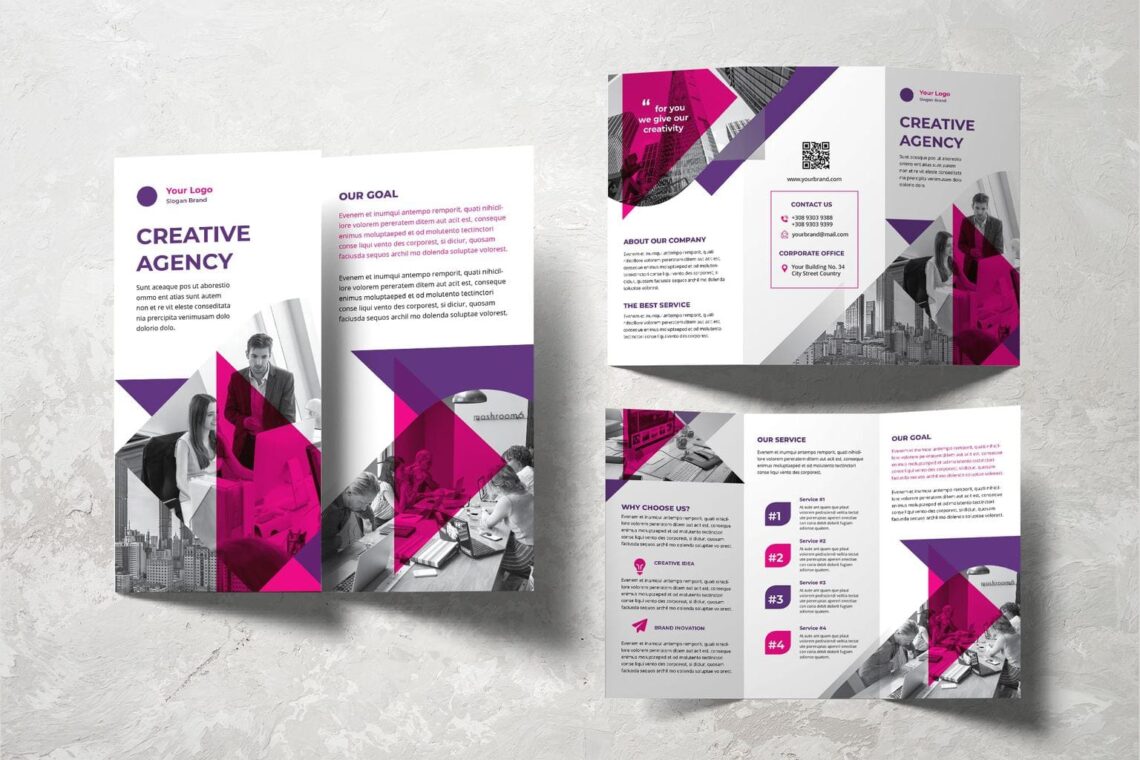
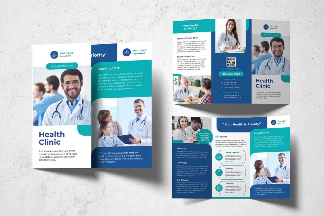
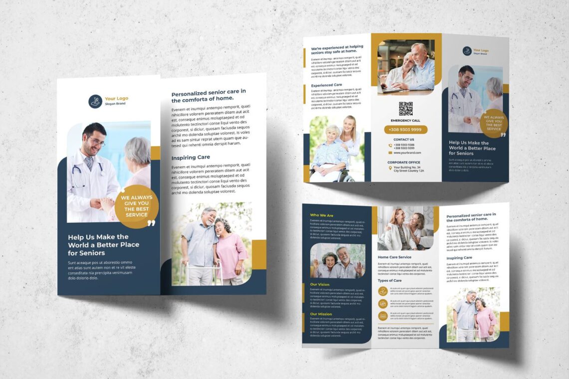
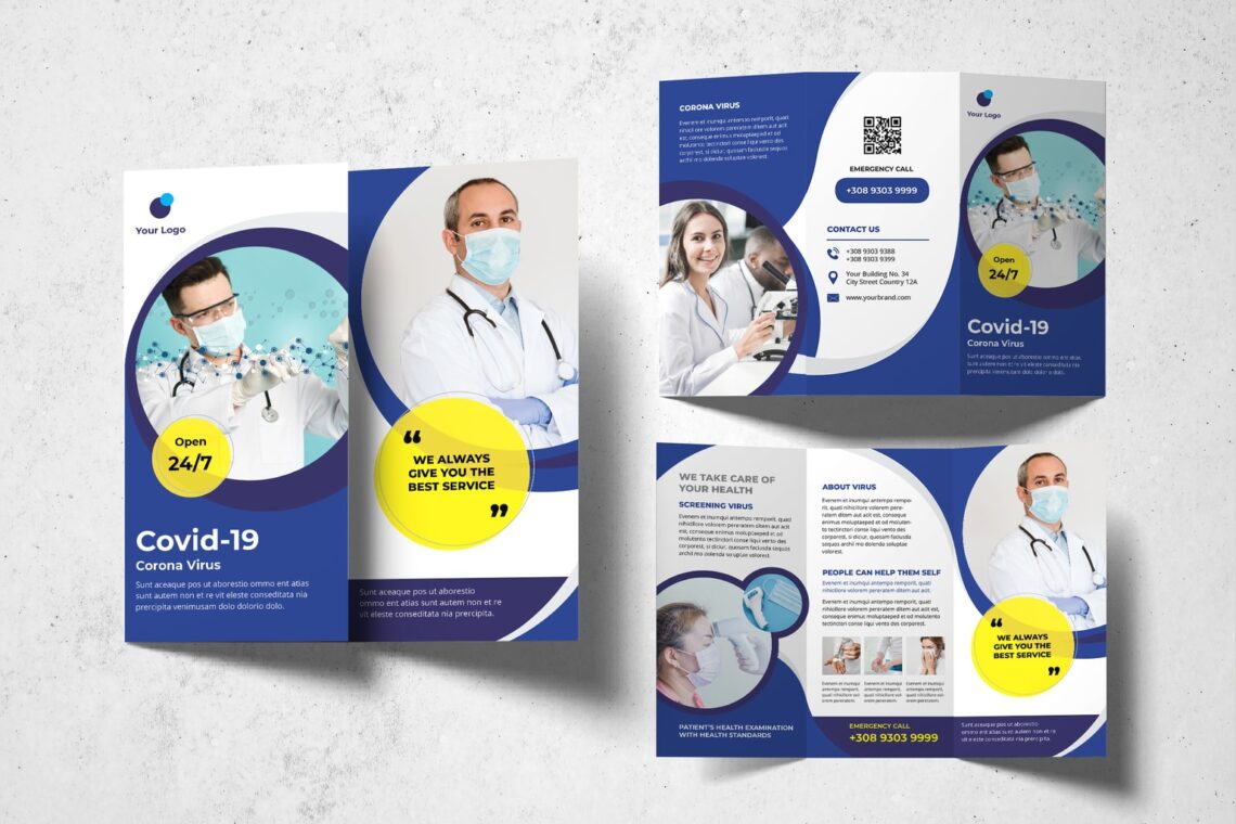
If you want to make it notice by readers, design it by using a single bright. Even if you want to use your brand color, go ahead! However, try to use the brightest option. Bright color is not only attractive but also eye catching and build a desire to read and see. It helps everyone looks at your brochure. What to have in a brochure? You only have three pages to create everything that could persuade people to use your service. Prepare your logo and design. Content to fill in the brochure also should be managed well. Including the choice the font style and size. Headline should be prepare to attract people to read the brochure.
2. Concern Color Panels
Make a contrast to influence the main content of your brochure. Make sure you know how to deal with it. If you are not ready or confident, try black as the background and white as the color of content. Before you want to print it, make sure you notice these things:
Images
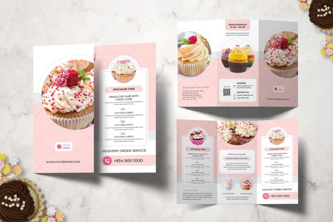
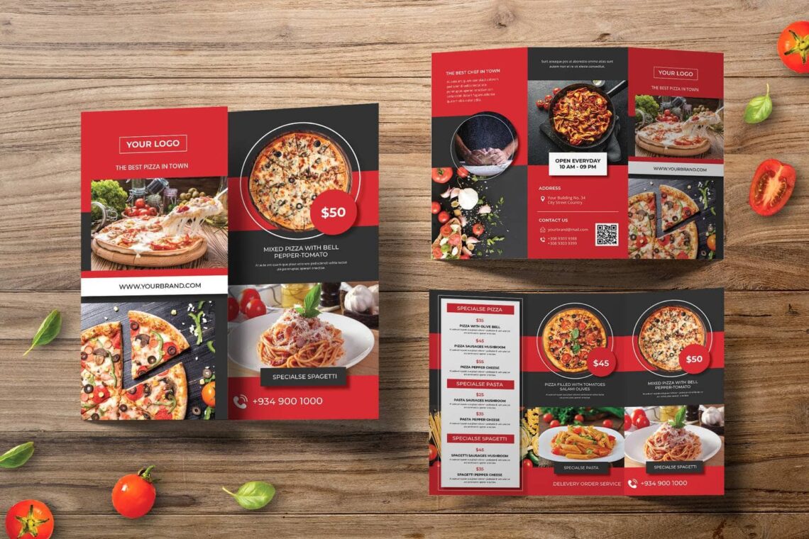
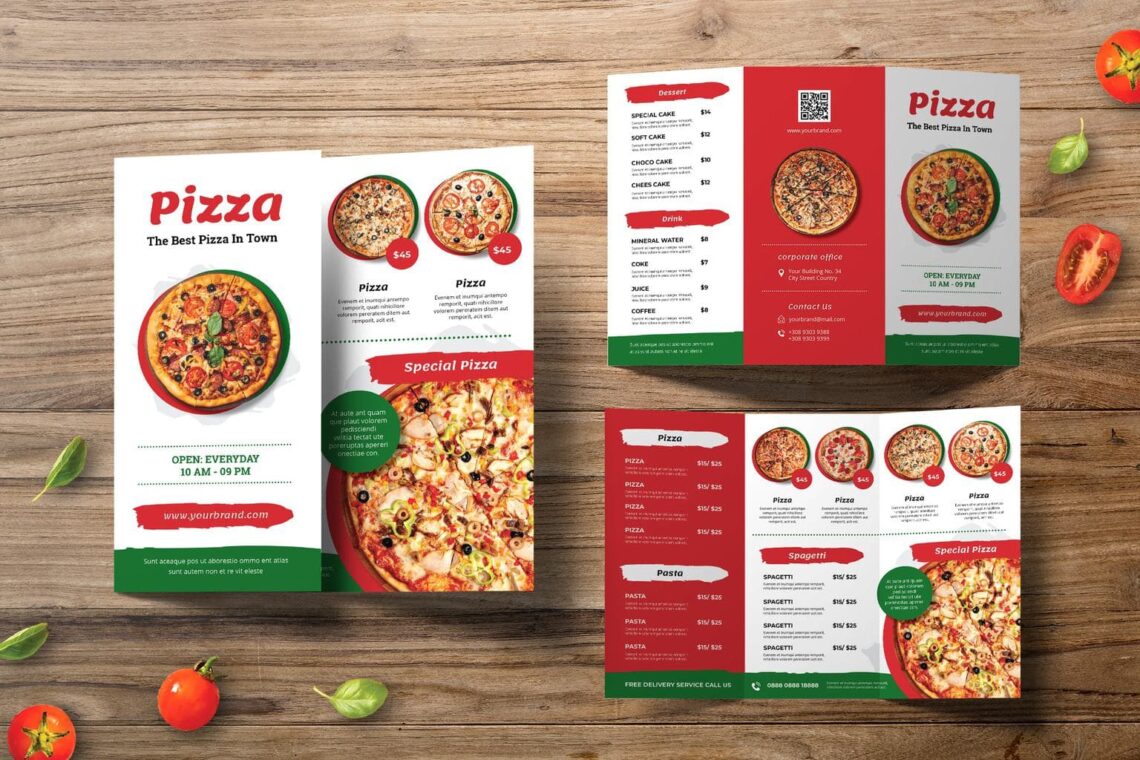
You need to select the high resolution of image, but make sure it keeps good when you print. It should show your product very well. Check again because it has to be in high quality.
Logo
If you have no logo yet, let UI Creative helps you with it. You need a high resolution too for you logo.
Text
What to fill in the text body? First, the intro. It contains the company profile in short words. Only focus on one or two messages. Second, product and service info. Prepare the whole things you need to promote about your product and service. Make it in categories, so people who read it can be easily to understand. The third is contact details. Customers will contact you if they are interesting to your service and products. Therefore, try to make them easily to find your contact.
3. Try to Make Horizontal Style
When trifold always come with vertical style, it is your turn o try horizontal style. It makes you know how to deal with the layout. It is better to draw the layout first and insert the content to ensure what you could do with it. The first step is grab your format. We have plenty options to choose. Bi-fold, tri-fold, or z-fold. Whatever it is, make sure it fills enough information. For example is when you want to give detail information, trifold would be better to choose because it has more spaces for you. Whereas if you want to include large prominent imagery, a bi-fold might give you more space.To help you decide, take a piece of paper, fold it. Make it like bifold or trifold format and make your own suggestion of it especially about the layout. You can have a chance to imagine the layout will be.
Also Read : 30 Best Trifold Brochure Design for Business
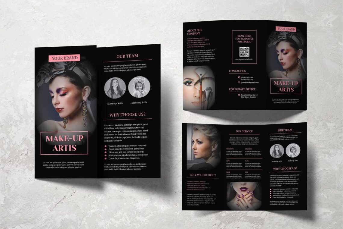
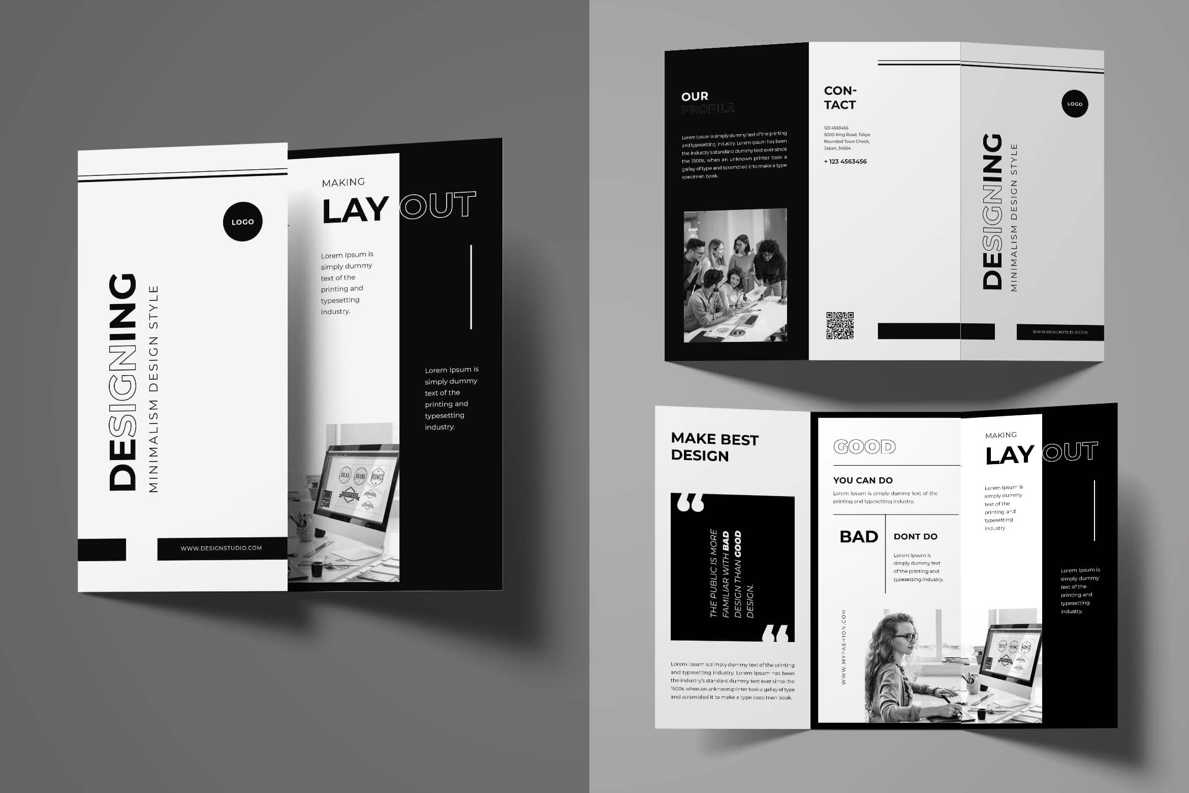
4. Play With Black and White
make a classic and timeless effect. Depends on the paper you choose, it influences the result of black and white style in your brochure. select the design template. You can select it from professional or use UI Creative collection for it. Choose the color that similar to your logo. Start to fill the template with content. Edit as you desire. You need headings to break up the text. It is ideally only contain with one or two fonts style. Therefore, it would be easy to read. Move things around and try different options before you deal with it.
5. Funky Texture
You may have an average design, but you can make it more attractive by using funky texture in the paper. you need to select the paper. Everything will be finished after you stick the paper and print. You are going to use it once or more. If you will use more than once, you should find glossy for give the vibrant and large photos, if you put the large photo.
6. Make a Spread
It is your time to make something different in your layout. Play with color and graphic and make it more adorable as it could. Now, it comes to the challenging moment of making brochure. It comes to how to design it. You may use professional designers, but you can get the ready to use brochure file and edit it as you need. The editing process usually not complicated because you can do it in Adobe. Even to make a content in it, you should have well preparation. How to make a brochure?
brochures reduce the need for more expensive marketing media. Making a brochure requires careful planning. All text and images on the brochure need to be tailored to appeal to readers. Once your brochure is finished, print it and distribute it to promote your cause.
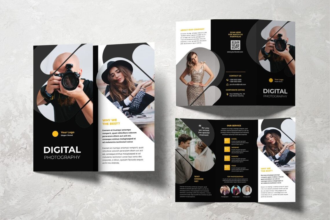
7. Fun Shapes
You may use another thing than photograph. Make a shape and build a pattern. It would influence the readers visual skill also navigate the content. Brochure is not always monotonous. You can play its background and layout color. Even to use only black and white, as long as you could find the suit paper like magazine paper, it looks elegant, modern, and worth. At least you could be relax and wait the response of your effort. Before making the good one, you should notice your target. Let us discuss more about it below.
8. How About the Grid?
Is there too may contents in your brochure? Try to use grid. You should make sure the content works well and fit with layout. Therefore, you need grid to make it keeps proportional in its place. Begin on select your audience, you need to know how to attract them. For adults, they do not want cartoon or 2D pictures in a brochure or rainbow color for the main color. Even the language to use, you cannot use formal words for children because they are not used to use it. Even image to choose and layout design must be different between adults and children. For example if you want to make a zoo brochure for children like you want to promote a zoo program, you need to put cool images of animals. On the other hand, for conference which is for adults, you only need title and date in the front page. The rest page would be a description of event like speakers, profile photo of them, and their credentials.
Also Read : Triflod Brochure Tips and Ideas
9. Select Beautiful Photography
Always try to put the beautiful photography only. Each image needs special attention. How you crop each of it and how each of it blends well in the brochure after print. Considering to resize the image because it influences the space. On the other hand, if you want to use it as a background, make sure it will not disturb the content readability. Continue to set the goal of the brochure. Ask yourself why you’re making the brochure and what you need your target audience to know. All brochures are a call to action. The goal is to get the audience to do something, whether that’s attending an event, buying a product, or learning something new.
10. Being Type – Centric
It is only for you who have no photograph in your brochure. be mindful of what content you choose to set at different sizes. If you are designing a brochure for someone else, ask them what they want the brochure to accomplish. Understanding their vision allows you to customize the brochure to fit their cause. Except if you order in UI Creative, you have a chance to edit as your desire.

11. Use Large Design
You do not have to only put small contents and element. You are able to have oversized and combine it to a regular size. If you want to use oversized content, ensure to highlight it. Select your format means about the brochure fold, you will think twice on the common use like a classic trifold design. It is not expensive and fit in envelopes. To find the best one, you could try to view some of them. When you think you need a solution, you can make it into 4 to 6 panels. Others have 2 front flaps that open like a gate. Many of these alternative formats are better for open spread presentations than mailing purposes.
12. There is no Doubt of Single Color
Too many colors will make a headache. You can try to have single color and play it well on the trifold. It would create something cold monochromatic style. As long as you know the proportional side of it. You may use graphic to create brochure. Programs like Adobe InDesign or Photoshop have lots of different tools and layouts that will help you turn that template into the perfect brochure. For a free option, use a program like Microsoft Word or Adobe Spark.Do not only focus on one program because many design programs can be used. put some text and image boxes in automatically, find the instant template to purchase or borrow.
13. Overlaying
You do not have to be strict and make everything in symmetric style. Therefore, whether you want to insert asymmetrical image, it is yours. Make sure you know how to place it in right spot. Then, everything would become gorgeous. Next, we will discuss about the content. You need a call to action on the front page. It is important to recall readers’ attention. The front page is what most readers see first, and it needs to show them what the brochure is about. The call to action is usually the brochure’s title, which you write in big letters at the top of the page. Then, include a relevant image, like a logo or picture, underneath it for visual appeal and additional information. It is not always difficult.
Also Read : 15 Tips Effective Trifold Brochure Design
14. Photography Tools
You need to filter and make an interesting photo treatments. It is to make it more interesting. Today, there are lots of photo treatments you may choose. Make the title succinct and pair it with a striking image. For instance, an art museum brochure might have the museum’s name in big letters, followed by the museum’s most impressive piece of art. Many times, an image serves as the call to action. For example, if your brochure is about home repair services, you can put the company’s name and logo at the top of the page, then an image of a beautiful home interior at the bottom. Readers will understand what you are selling.If it is about food, you can write a title like “Do you want to stay healthy?” and place an image with healthy food in a plate.
15. Make it Modern
Today too many applications would help you creating modern design. Explore more sophisticated elements and practice! Pick out vibrant words to create memorable descriptions. To advertise a new energy source, mention the sleek product that illuminates rooms for a fraction of the cost, for instance.
Manage your tone to your audience. If you are advertising consultation services to businesses, using industry jargon like “Our services increase consultant productivity by 25% on average” is good enough. Most of the times, brochures are for wider audiences and need to be simplified.When you are promoting skin care, you can insert the words of ‘It has been used since 60 century for ancients to keep their beauty’.
16. Playing with Large Type
It is coming to the bold era and everything lovely. Give careful consideration to the content decide to set in large type, as you’re ultimately highlighting it. Progress and direction come from triangle. Our eyes automatically move up the triangle or in the direction of an acute angle. You can use them in creating improvised pointers that draw attention to the key information. Call to action as the headline could be followed by triangle. Polygons like hexagons, pentagons, and others will help your website looks more attractive, modern, and as a symbol of cooperative. It is better than use normal rectangular or square. Try inserting text inside these shapes or cutting out your images as geometric shapes, or use them as the pieces of a large composition, or use them to organize the information. You can even break these shapes into smaller shape-pieces to create a kind of progression.
17. Insert Illustration
Not all of photography image or vectors are good to input. Therefore, play with illustration. Try to set up the mood. Make it clean and smooth, especially if you already make the rough paper for your brochure. In psychology, square and rectangular symbolize trust and stability. They are indispensable when you need to focus the visitor’s attention on the company’s reliability. They are the basis of any design, blocks, and various website design elements.
18. Collaborate with Icon
Depends on your brochure aim and brand category, you may insert icons to limit words and content.
19. If you Have to Crop, Do It Wisely
Playing with photograph means you need to consider its size and appearance. Therefore, try to crop it wisely whenever you have to fit it with another content and image.
20. Integrating Panel is Necessary
When the brochure would be folded or open, make sure you know how to make it nice to look. Therefore, try to think about the good panel. Integrate them into something great to see.

Are you ready to make your own trifold brochure template?


