Browse the best one for your business and here we would like to inform you our 20 best. Brochure Design Template influences your impression. It is better to get the suitable one than the most popular design. Do you have problem to market your business? How to make people notice your corporate? UI Creative will help you to save energy and effort on it. Digital Agency needs something creative and here they are:
1. Digital Marketing & SEO

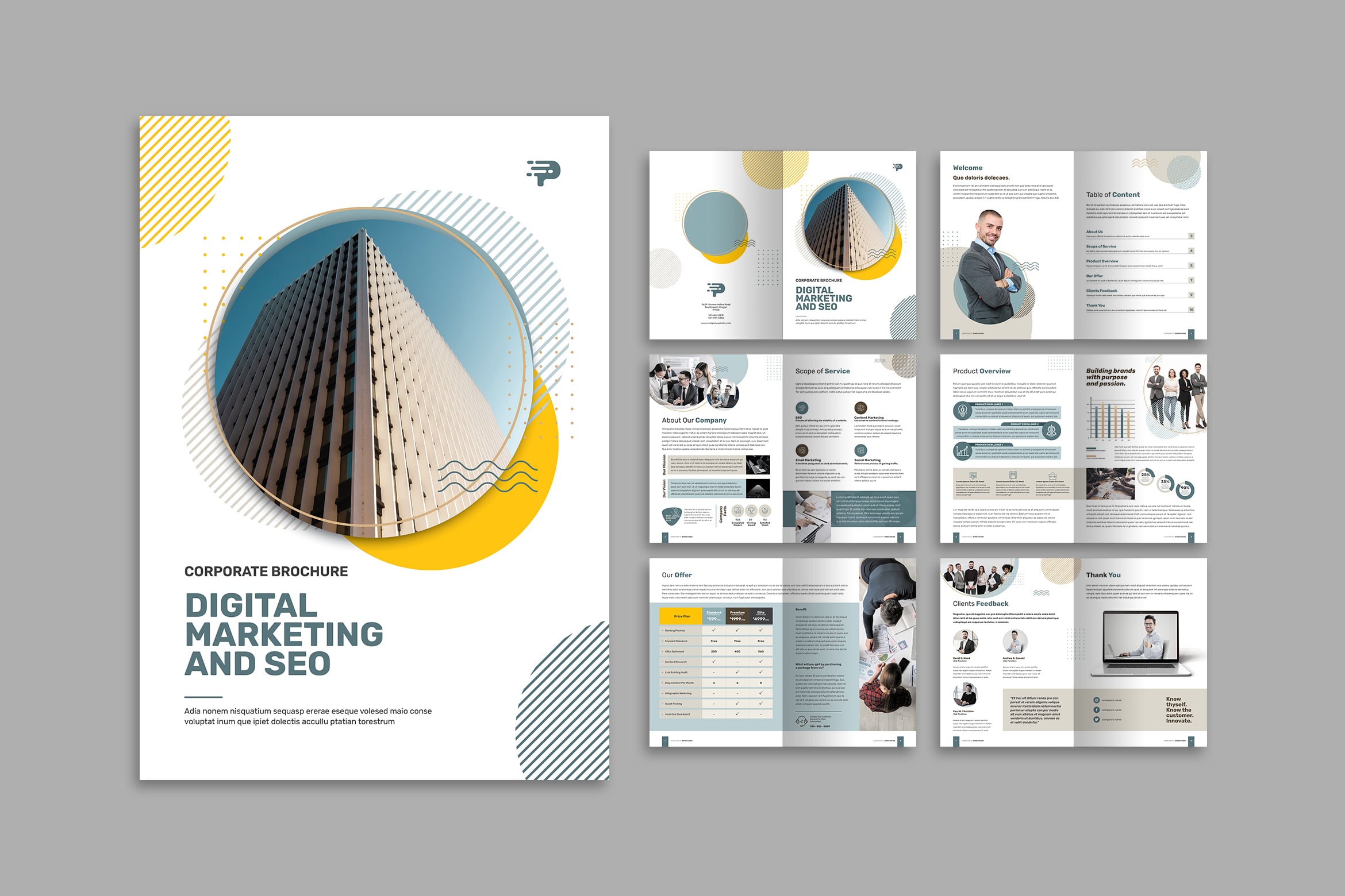
Digital marketing & SEO 11 is an example of modern corporate brochure. It has elegant design contained geometric shape. You could find the clear layout which editable for you. However, no matter what area of your business, grab high quality image to show in the cover. Edit it by image tools and see how many people would grab your brochure wherever you put it on.

Brochures are the the best choice to say about business. To make a connection to your customers, it is better to create story in it. This brochure design is suitable for you who love simple concept. No mater your brand main color, trying to have something new is better. White is the save color for everything. It suits well to combine to any color. It is your turn to make it more eye catching. Start from attractive cover. Choosing the powerful font design would make readers curious about the content of your brochure. At least it will not end in the trash.
3. Digital Marketing & SEO
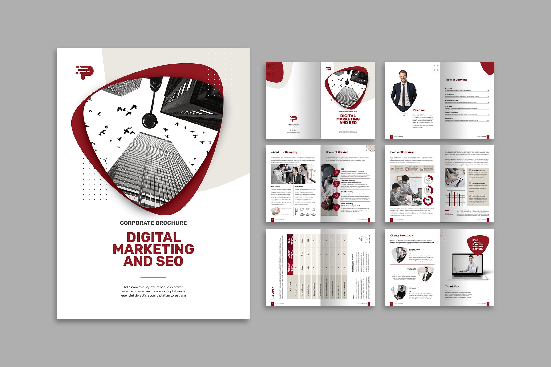
Brochure comes in many purposes. It is not only to introduce your corporate to public, but also to promote your product and services. Therefore, before you print a brochure, make sure the design is suit to your customers target. This template, for example, is suitable for young but mature clients. The design, layout, and content would attract young prospective customers to read and contact your corporate. they will start to curious and ask. It is better to insert your corporate social media account in it.
If you see the detail in this template, you will notice how it reflects the creative skill in it. Your corporate looks professional because you have professional touch in brochure design. Combining line in line, geometric shape, and abstract style make it too fabulous to skip. You may make it more clear by applying the contrast color in it. Be brave to play with color!
4. Digital Marketing & SEO
It is good to have a brochure in print. When it comes to work, it gives you a reward how your effort makes a result. Display first, so you will know how people reaction toward it. Put them in a business place or make them trade show. Remember that brochure is a way of marketing materials.
Now, it comes to the challenging moment of making brochure. It comes to how to design it. You may use professional designers, but you can get the ready to use brochure file and edit it as you need. The editing process usually not complicated because you can do it in Adobe. Even to make a content in it, you should have well preparation. How to make a brochure?
Brochures reduce the need for more expensive marketing media. Making a brochure requires careful planning. All text and images on the brochure need to be tailored to appeal to readers. Once your brochure is finished, print it and distribute it to promote your cause.
5. Marketing & SEO
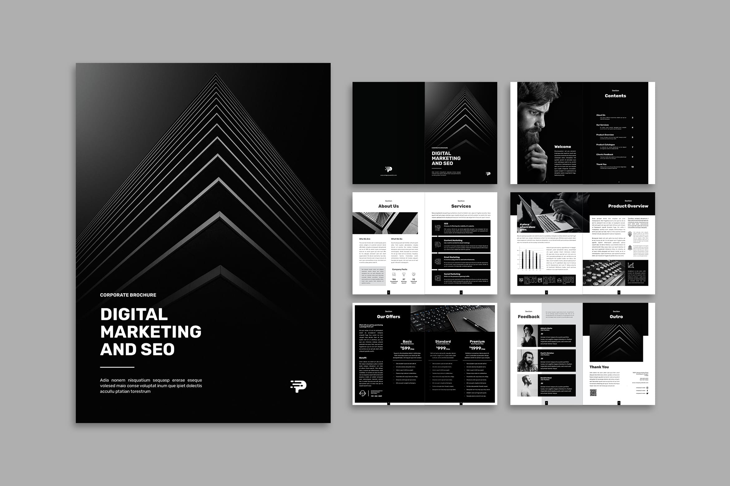
Brochure is not always monotonous. You can play its background and layout color. Even to use only black and white, as long as you could find the suit paper like magazine paper, it looks elegant, modern, and worth. At least you could be relax and wait the response of your effort. Before making the good one, you should notice your target. Let us discuss more about it below.
6. Digital Marketing & SEO
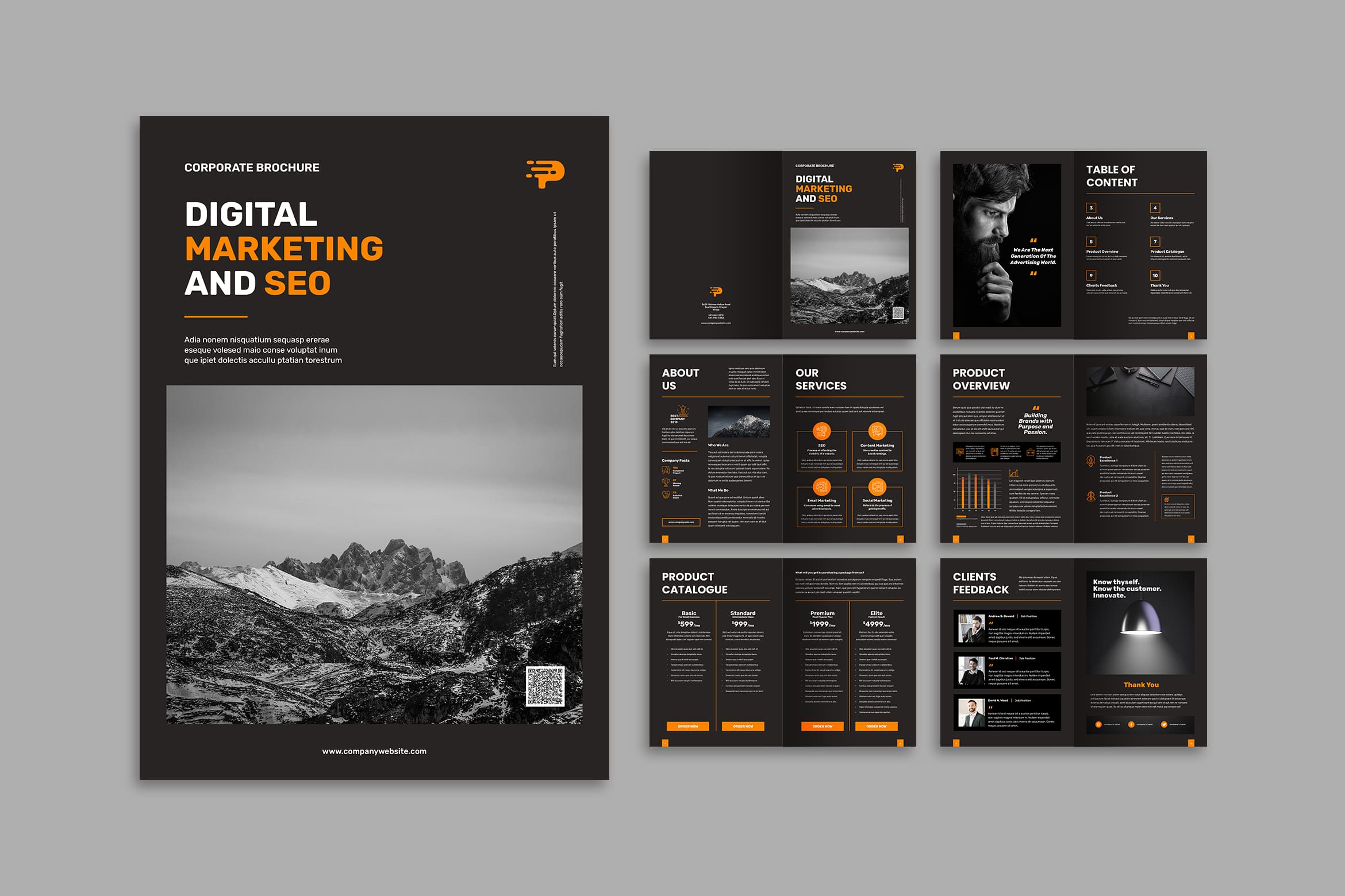
Begin on select your audience, you need to know how to attract them. For adults, they do not want cartoon or 2D pictures in a brochure or rainbow color for the main color. Even the language to use, you cannot use formal words for children because they are not used to use it. Even image to choose and layout design must be different between adults and children. For example if you want to make a zoo brochure for children like ou want to promote a zoo program, you need to put cool images of animals. On the other hand, for conference which is for adults, you only ned title and date in the front page. The rest page would be a description of event like speakers, profile photo of them, and their credentials.
7. Digital Marketing & SEO
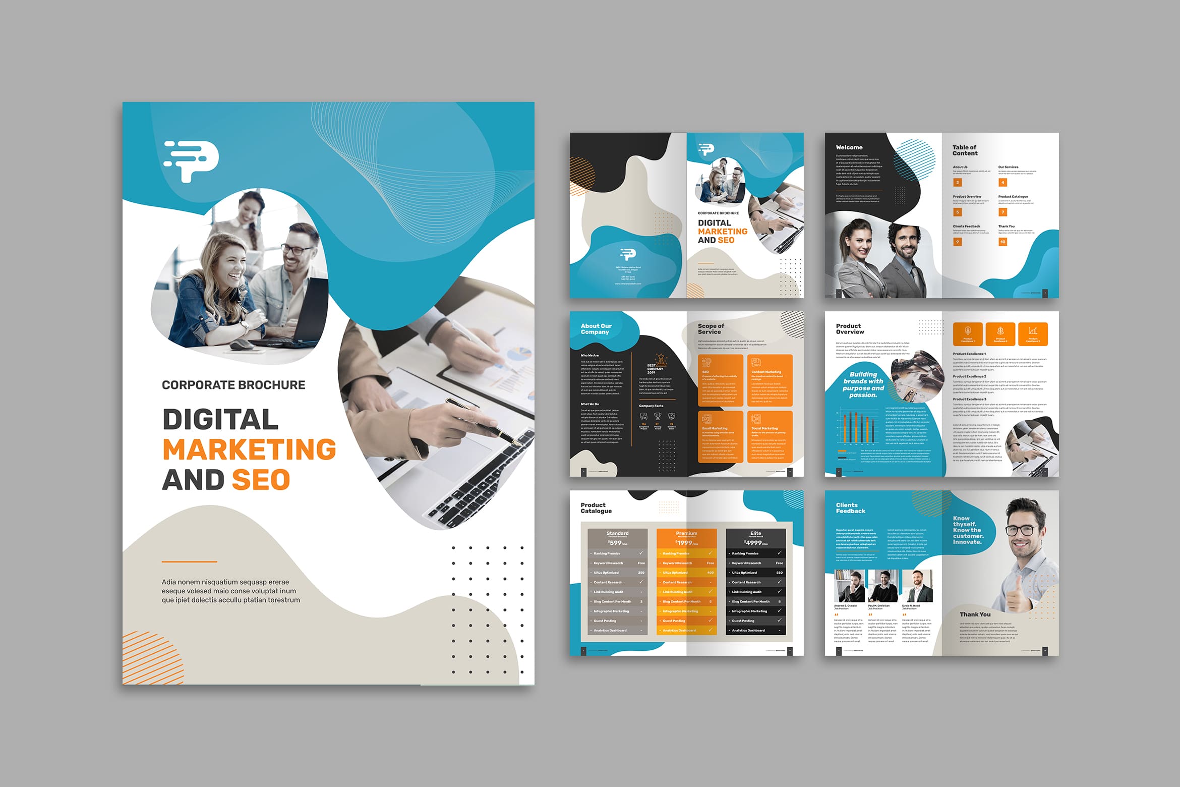
Continue to set the goal of the brochure. Ask yourself why you’re making the brochure and what you need your target audience to know. All brochures are a call to action. The goal is to get the audience to do something, whether that’s attending an event, buying a product, or learning something new. This is the way to attract more prospective customers to come. Remember that the color you have chosen will have an impat to someone’s perception.
8. Corporate Brochure
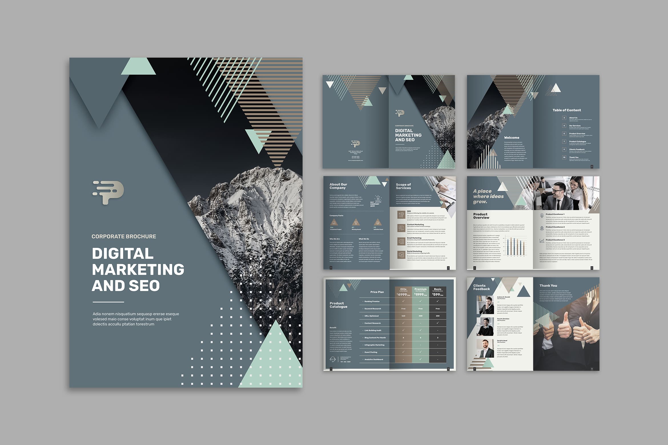
This template would explore your professionalism. Elegant, luxury, and modern design come from it. You just have to insert contrast color to blend well in it. The difficult thing you would have is when inserting image. You should crop it well to make it fit great to the space. To make it more awesome, try to print it in magazine paper. Choose the right thickness and you will see how this brochure becomes the most attractive brochure to pick. People would unrealized to grab yours. Even they do not need your service, at least they could spread it to someone they know. It will not end in the trash since no one would like to throw it away.
9. Digital Media Agency
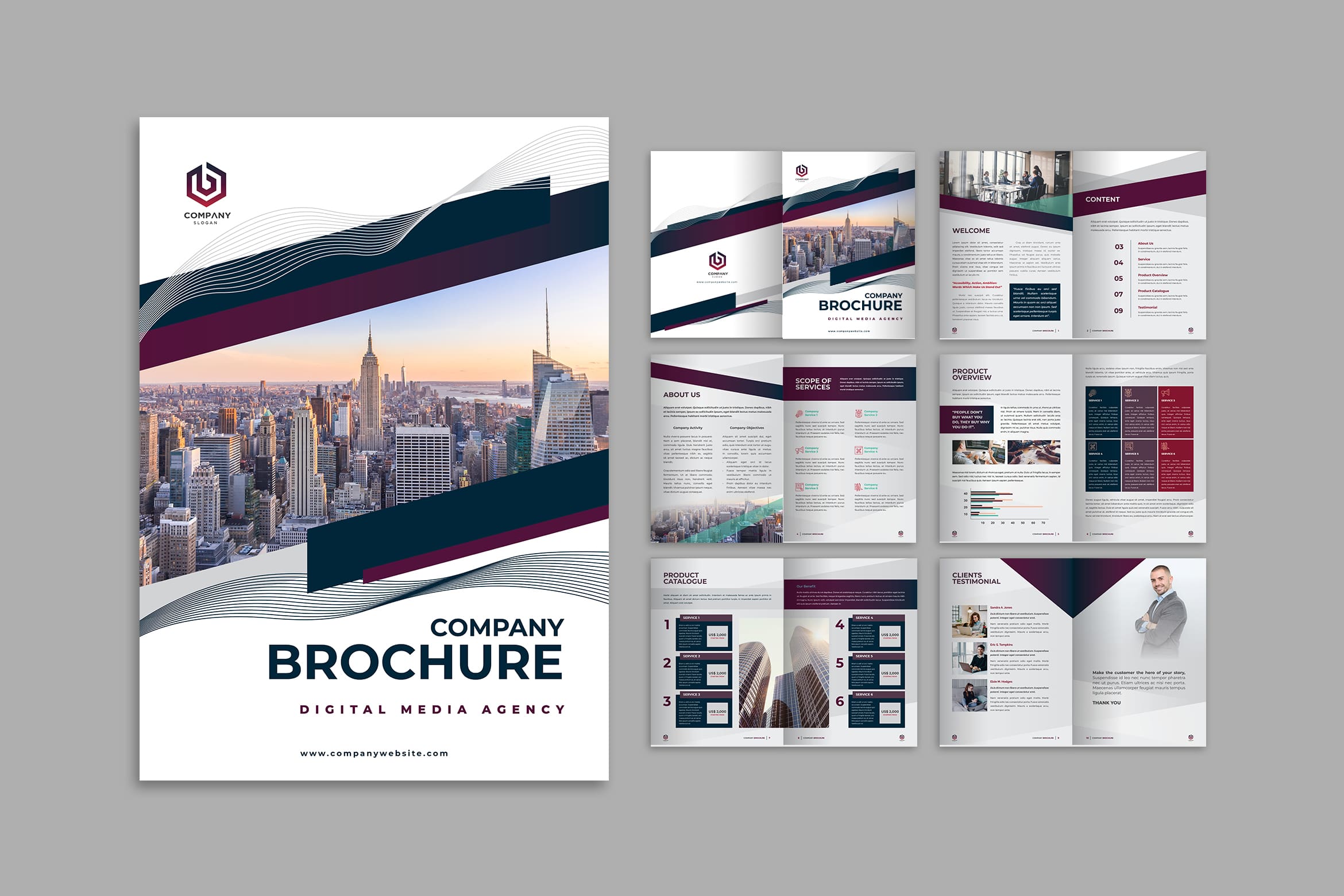
Select your format means about the brochure fold, you will think twice on the common use like a classic trifold design. It is not expensive and fit in envelopes. To find the best one, you could try to view some of them. Depends on how you would share this brochure. It is better to make a layout first in a paper before you apply it in the right template.
When you think you need a solution, you can make it into 4 to 6 panels. Others have 2 front flaps that open like a gate. Many of these alternative formats are better for open spread presentations than mailing purposes.
10. Brochure – Digital Media Agency
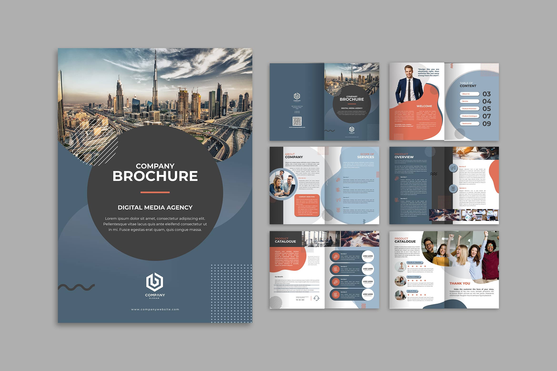
You may use graphic to create brochure. Programs like Adobe InDesign or Photoshop have lots of different tools and layouts that will help you turn that template into the perfect brochure. For a free option, use a program like Microsoft Word or Adobe Spark.Do not only focus on one program because many design programs can be used. put some text and image boxes in automatically, find the instant template to purchase or borrow.
11. Company Brochure

Next, we will discuss about the content. You need a call to action on the front page. It is important to recall readers’ attention. The front page is what most readers see first, and it needs to show them what the brochure is about. The call to action is usually the brochure’s title, which you write in big letters at the top of the page. Then, include a relevant image, like a logo or picture, underneath it for visual appeal and additional information. It is not always difficult.
12. Digital Media Agency
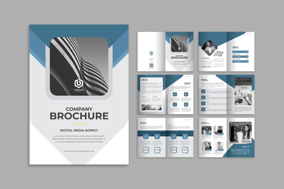
Make the title succinct and pair it with a striking image. For instance, an art museum brochure might have the museum’s name in big letters, followed by the museum’s most impressive piece of art.
Many times, an image serves as the call to action. For example, if your brochure is about home repair services, you can put the company’s name and logo at the top of the page, then an image of a beautiful home interior at the bottom. Readers will understand what you are selling.If it is about food, you can write a title like “Do you want to stay healthy?” and place an image with healthy food in a plate.
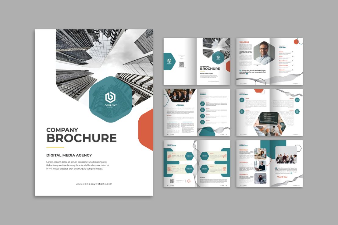
13. Digital Media Agency

Put the simple words and the aim of the brochure. All of them should be in simple words. Evote the middle pages of the brochure to telling the reader what they need to know. Remember that the brochure is an advertisement, so it needs to be as straightforward as possible. List important details about the product, service, business, or event the reader needs to know about. Avoid industry jargon unless it is relevant to your audience.
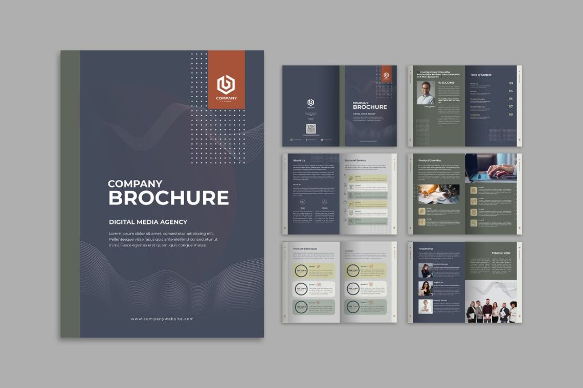
14. Digital Media Agency
Pick out vibrant words to create memorable descriptions. To advertise a new energy source, mention the sleek product that illuminates rooms for a fraction of the cost, for instance.
Manage your tone to your audience. If you are advertising consultation services to businesses, using industry jargon like “Our services increase consultant productivity by 25% on average” is good enough. Most of the times, brochures are for wider audiences and need to be simplified.When you are promoting skin care, you can insert the words of ‘It has been used since 60 century for ancients to keep their beauty’.
15. Digital Media Agency
It is important to building people trust. You can include clients testimonials. Take a few and short quotes. Edit its grammar and spelling mistakes. Put them in the back of page. Do not skip the name of customers. Before you do that, make sure you already get customers’ permission. The testimonials offer a description of the prduct, service, event, but you need to customize this section. An example of a good testimonial quote for a pest removal service is, “I’m so glad for the quick response time. It was the middle of the night and that is very worth for me!”
16. Company Brochure
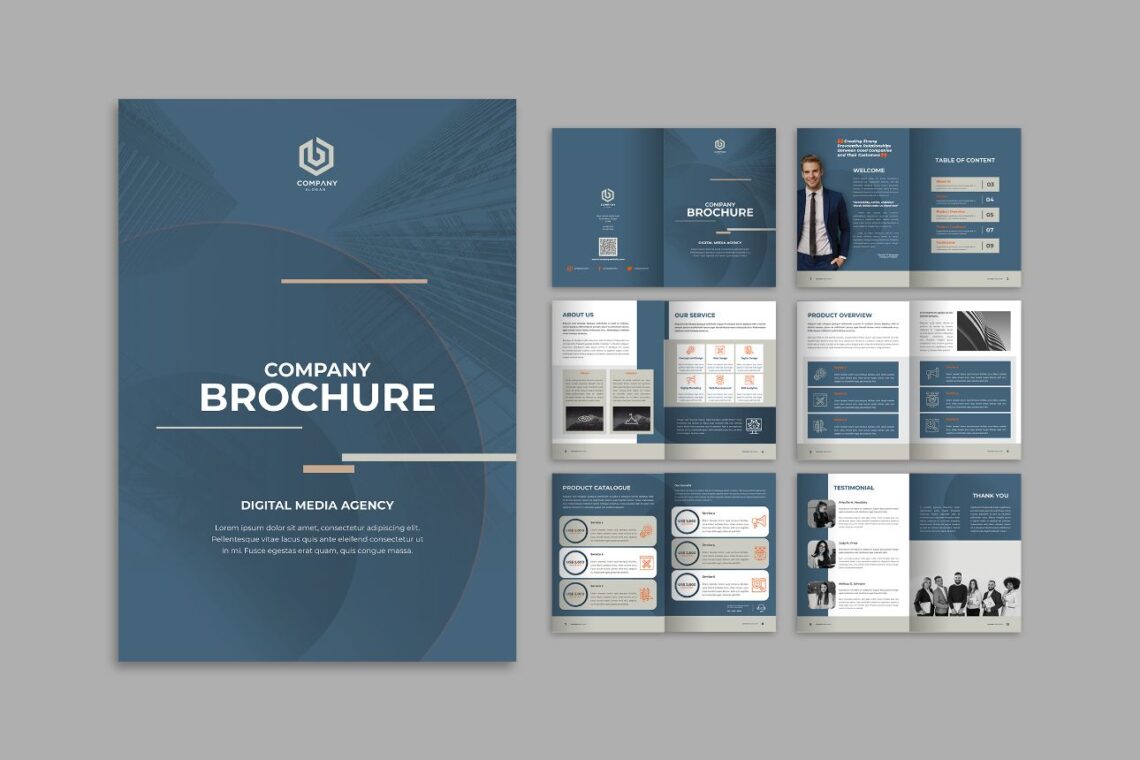
Now, how to place the image? You need to spread relevant images to the brochure’s interior pages. Illustrate important text and divide up long paragraphs. Most images go above or below a box of text. Sometimes, putting them between text is an effective way to make a page look more dynamic. The most important thing is they are relate each other. For example when you want to promote a hotel. Make sure you input relevant image like room and amenities of the hotel. Remember any background images you choose. They add visual weight to a brochure and may clash against pictures placed on top of them.
You do not need an image to accompany every block of text. Be prepared to cut out some of the images you have collected. If they are not adding to the brochure’s design, remove them.
17. Digital Media Agency

Pixelated, blurry images will defeat the purpose of a quality brochure. Gather enough images to spread throughout the brochure, approximately 1 per page. Images are the attracting media. Brochures advertising products often feature customers using the product. A picture of a smiling customer using a vacuum cleaner in a pristine home, for instance, suggests that the product is high-quality. Therefore, it is great to insert image that spread happy mood for readers. Illustration could be good to persuade readers decision, especially if they are decision makers in their family. Stock images are okay to use, but make sure they are high-quality and suit your brochure. Search online to find databases filled with free images.
Also Read : 10 Tips Professional Brochure Gain More Customer
18. Digital Media Agency
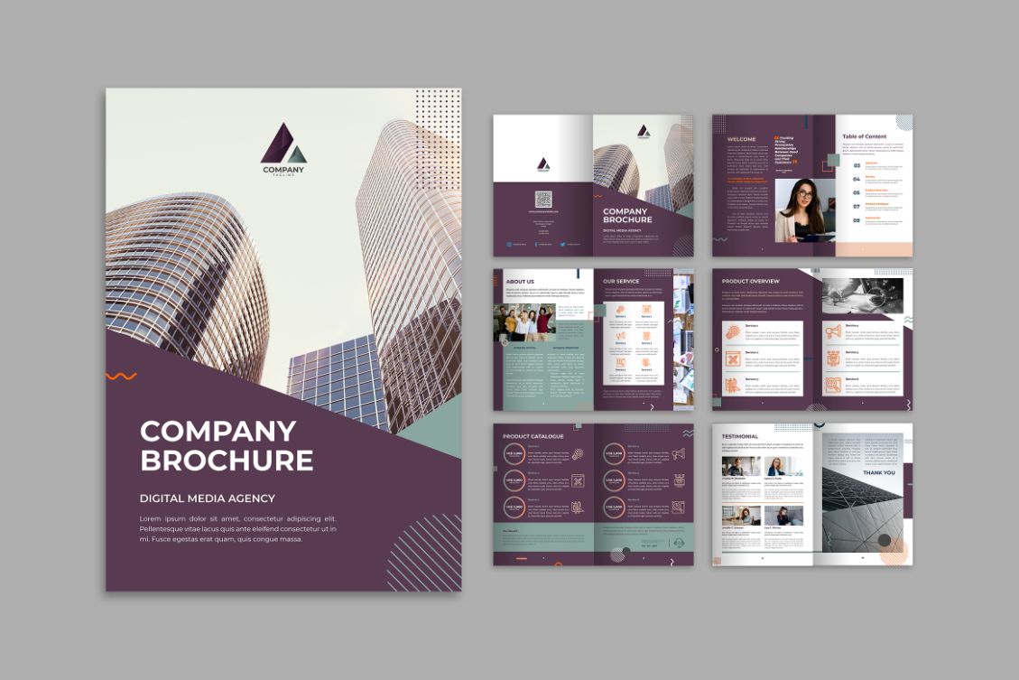
19. Multipurpose Company 2 – Brochure Design
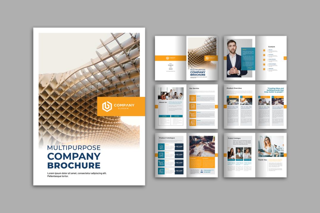
20. Digital Media Agency – Brochure Design Templates
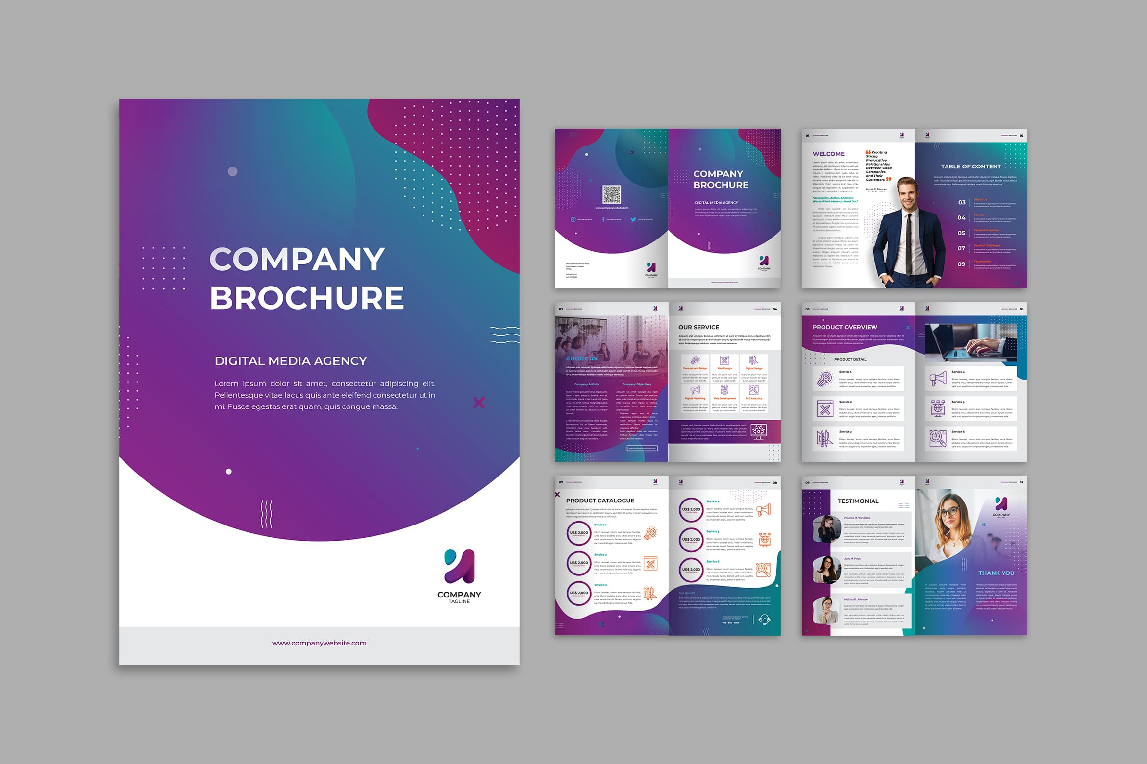
Select your brochure design templates and start to edit it as you desire. Remember that image and its quality influence public first impression to your corporate. When you already have a high quality image, insert it well. Crop it in proportional style and size, so it looks well. You should understand the printer quality. The end of your brochure is here. Whether you have found the right template and design it well, when it comes out not well in printer, you lost the chance to be a professional corporate.
You can also check our product!
special restaurant company profile | digital marketing agency company profile | car repair company profile | company brochure | business development service web banner | modern marketing company profile | marketing agency company profile | technology agency company profile | interior design brochure | finance business company profile | bag collection catalog | product design brochure | digital marketing seo brochure | invoice green white theme | modern home design ig carousel | fashion business company profile | employee management admin dashboard | business card founder company profile | digital business company profile | company news business magazine
You can also check our categories product!
company profile print template | web element background | web element admin dashboard | web banner web element | social media | mobile ui kit | handwriting | anual report print template | sans serif font | fonts


