
10 Tips Professional Brochure Gain more Customer will boost your customers amount.
Brochure design is an important aspect to attract more customers. Whether you want to print it or not, make sure you make the interesting one. It is good to know the points to make it fabulous. You can start to consider your brand and logo. The majority color of brand should influence the color of brochure. Take a note and pencil. Make a sketch.
1. Brochure Design Template Contains Credibility
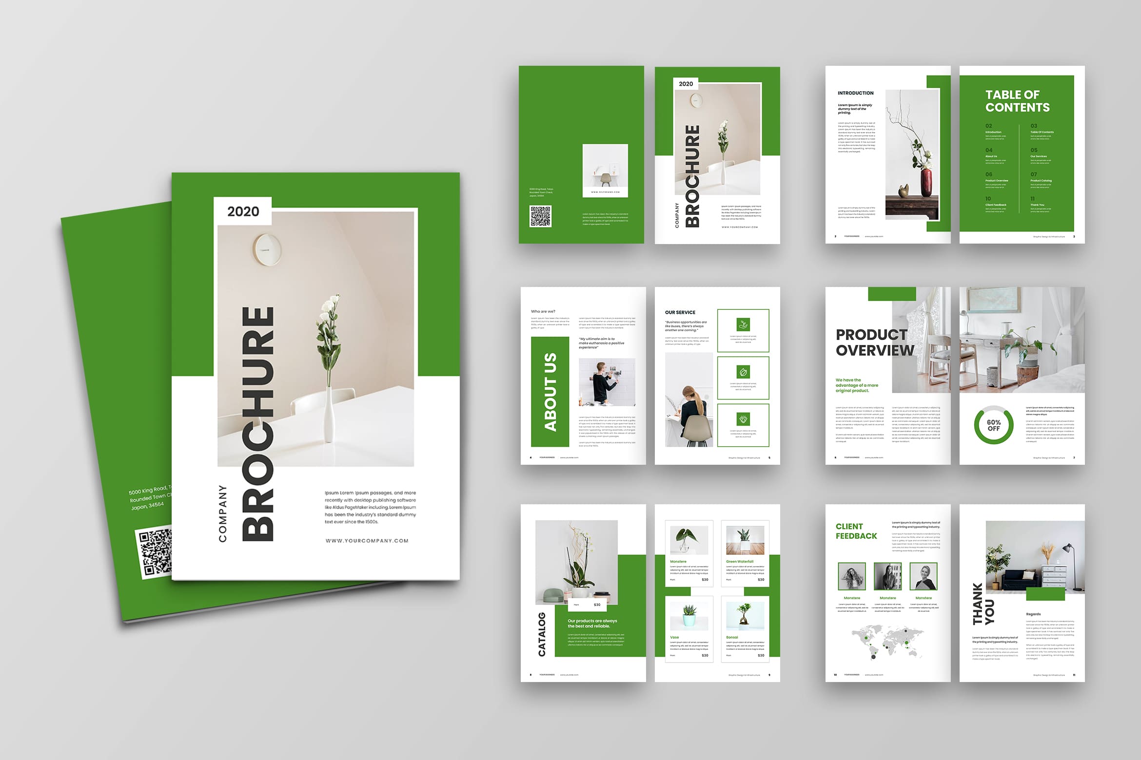
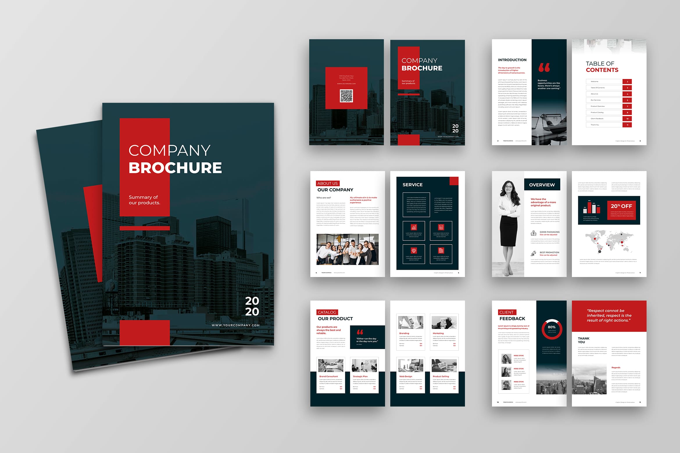
The main focus of audience is your information. Therefore, make sure what you have written on it is credible. It is also about your brand reputation. Try to build the good first impression like preparing the material in good quality and more.
2. Efficient Design
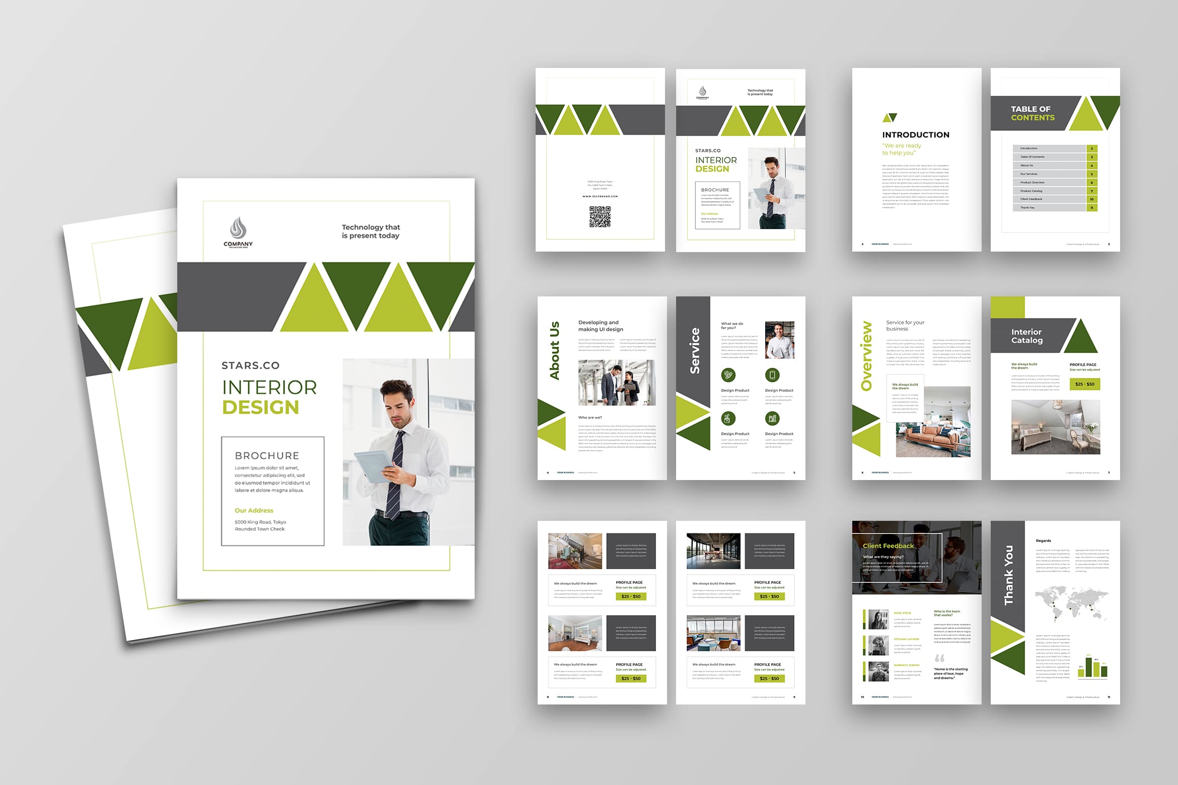
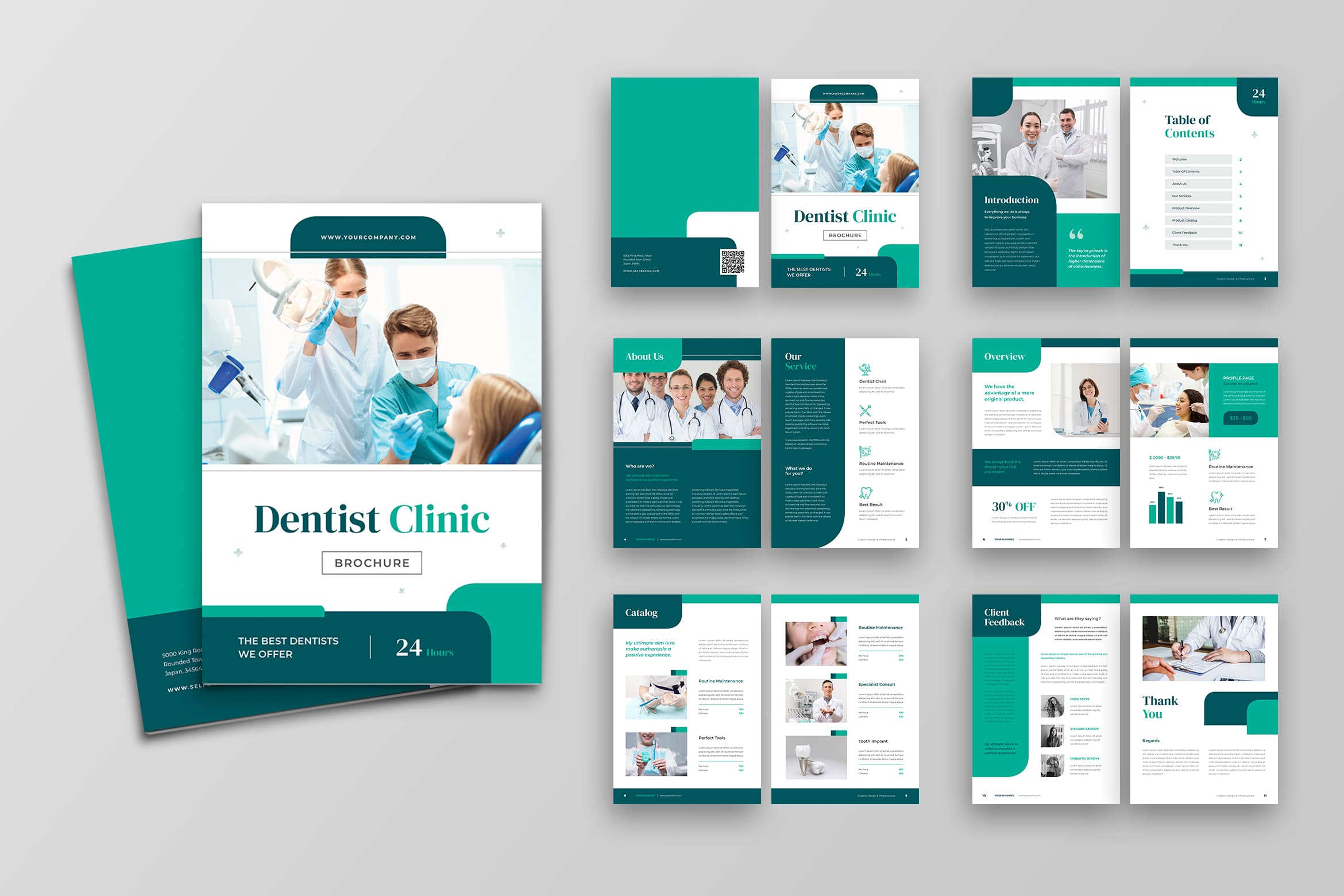
It is time to know the benefit of brochure. Since audiences could read it whenever they have leisure time, it is good to their psychology. You also do not have to spend much money to sale your product because you get the right prospective clients. You can put the brochures in public areas. You should know the map point of your customers. If your target is students, stand up in their school gates and spread the brochure. Make a short list of place to share and note it after it finished.
3. Check the Audiences Need
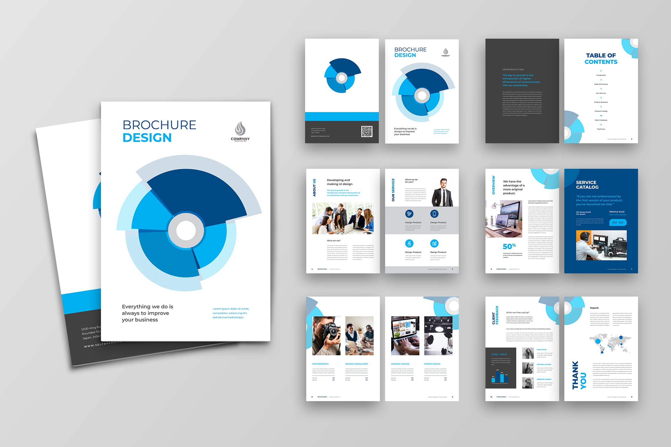
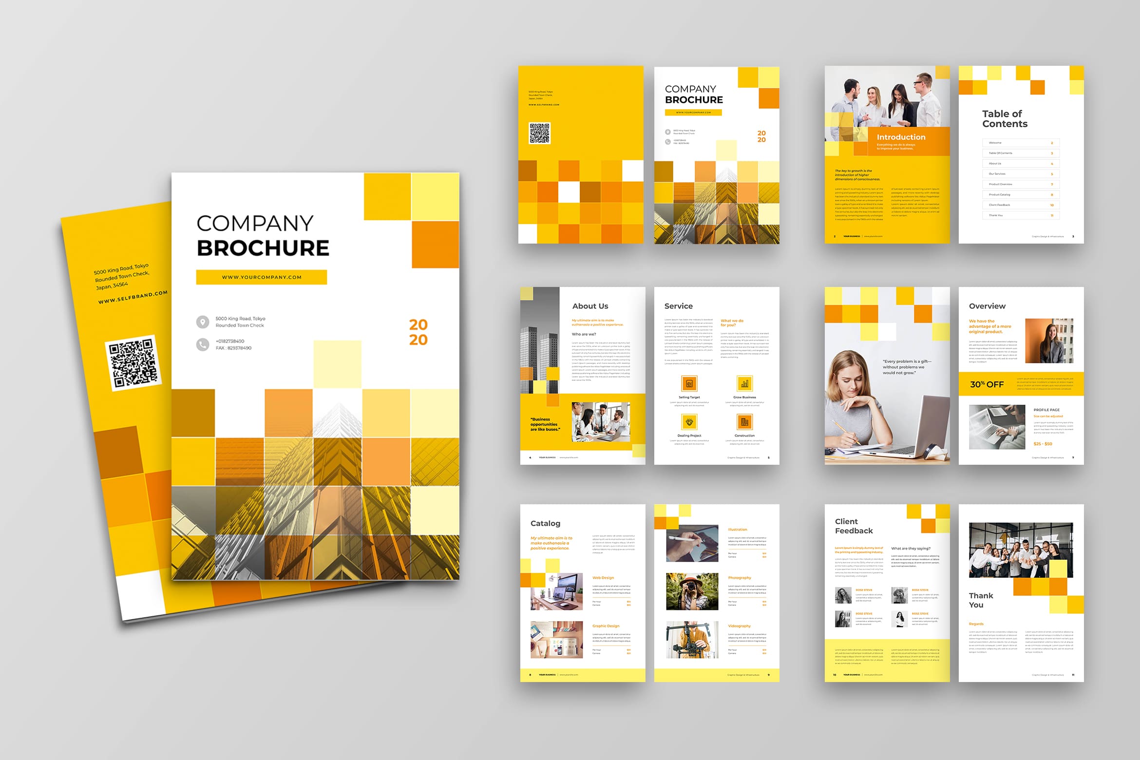
You become a fortune teller in this point. You should understand what they need although you never meet them. Therefore, make a research first. Design a brochure that suits to their favorite design, for example for children, they like light color of paper and in glossy type. You also cannot promote in social media because they usually do not have it yet. However, in some points, you need to consider their parent thought because they are the decision makers.
The information to put inside the brochure also should be real. It gives what they need and do not tell a story about your company history. They do not need it. If you want to promote a product discount, let it happens to the brochure. Visualize the products more than your company brand space.
4. Make Them Desire to Look More
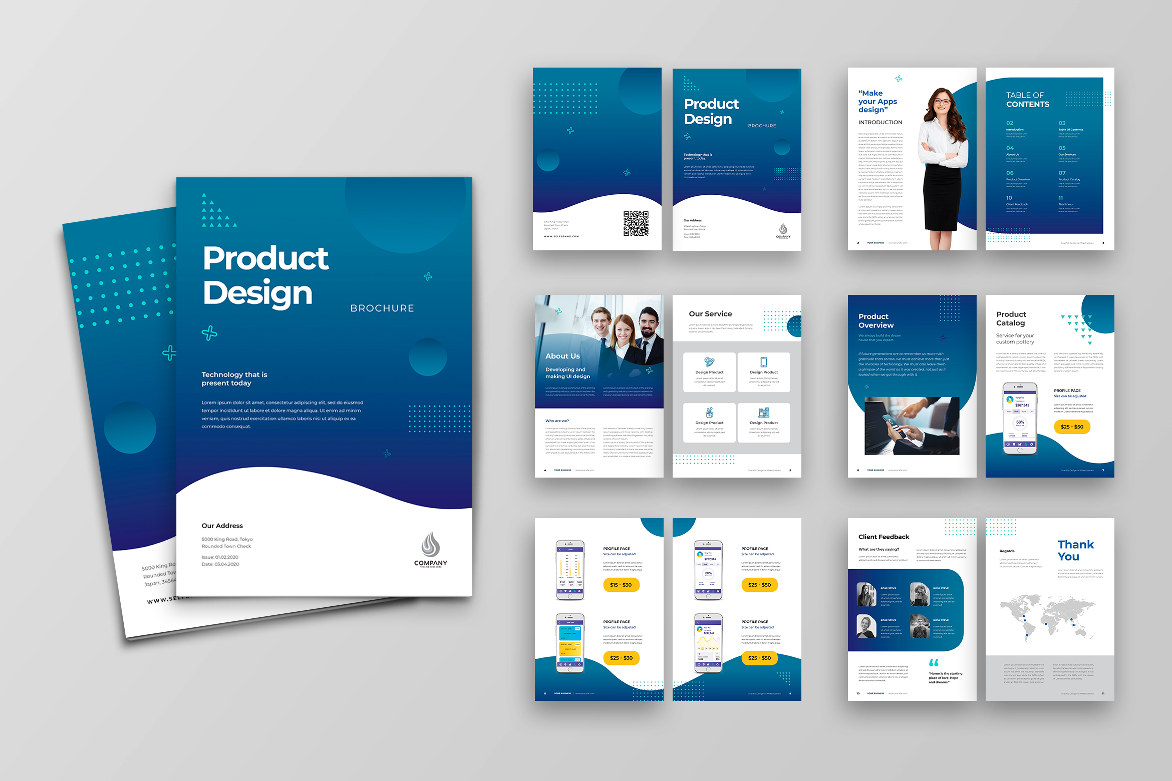
You can make an attractive cover page, so people would motivate to see more of he content. It does not has to be a complicated design, you can have a high resolution image of your product there or a Call to Action sentence.
5. Content of Page
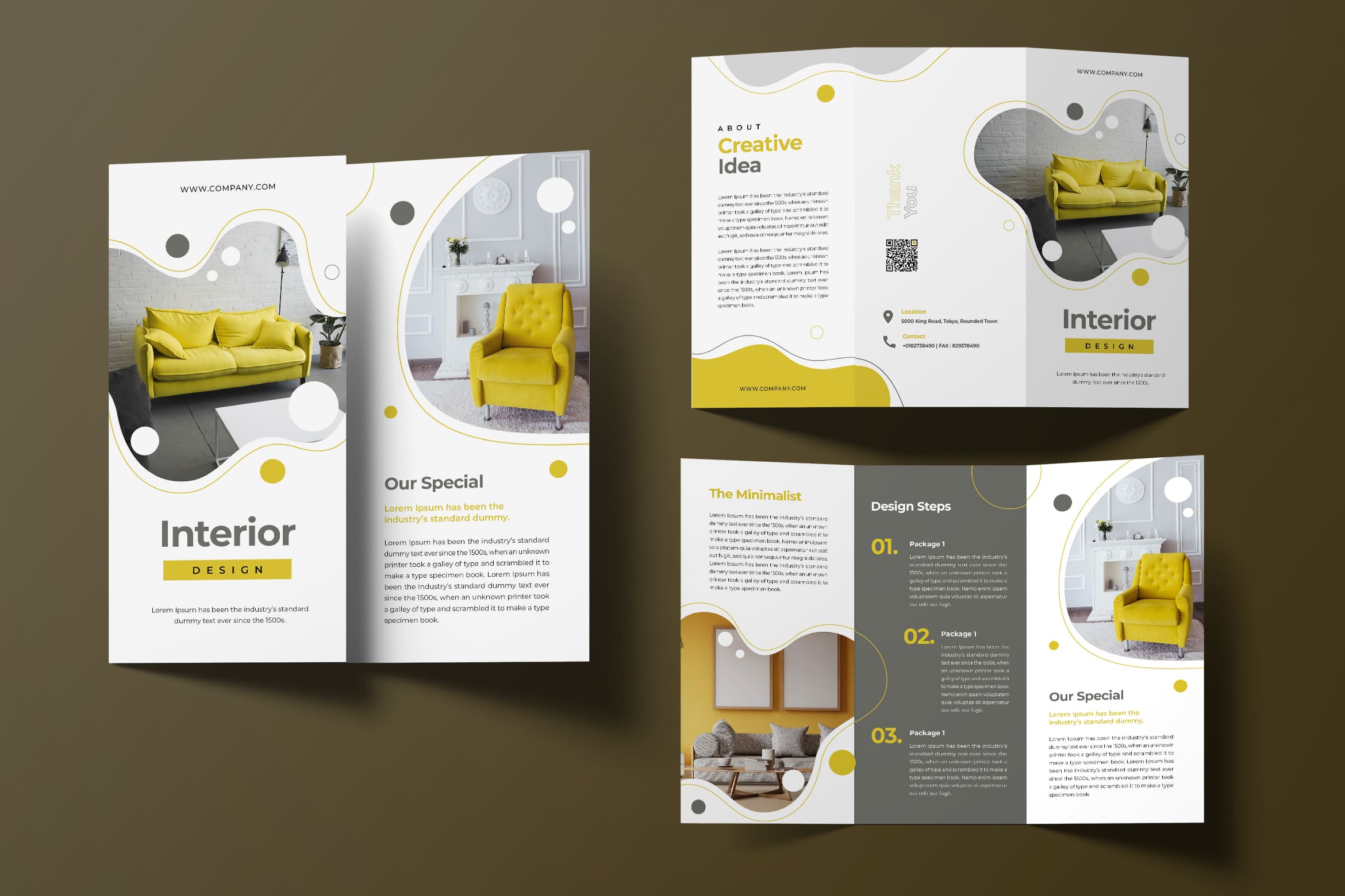
Well, for professional brochure design. there should be table of content to help the busy audience to go to the direct page they desire. You do not have to make it complicated, just in case when you want to make it digital. The TOC must be made in bold and must be separated from the rest of the content so that readers can directly go to their preferred section in case they are in a time crunch.
6. Be Creative and Describe the Product Well
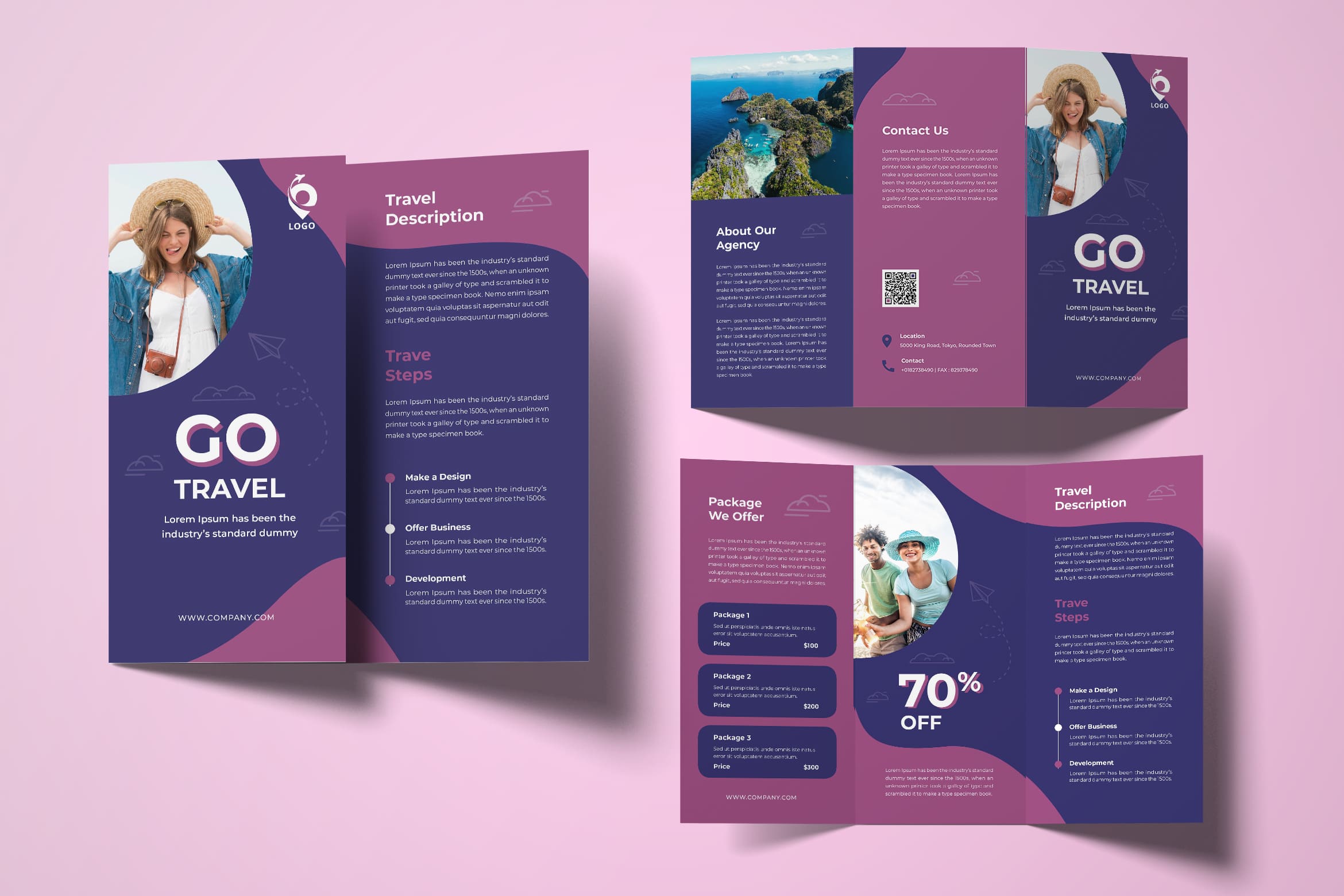
It must be tiring to make a story telling of your product, but this is an effective way to make your brochure read well. Audiences would like to save your brochure if they think it is useful. You should put some efforts in it. Make a creative shape of brochure and bring everything as a unique touch would be memorable for audiences.
7. You Need a Software
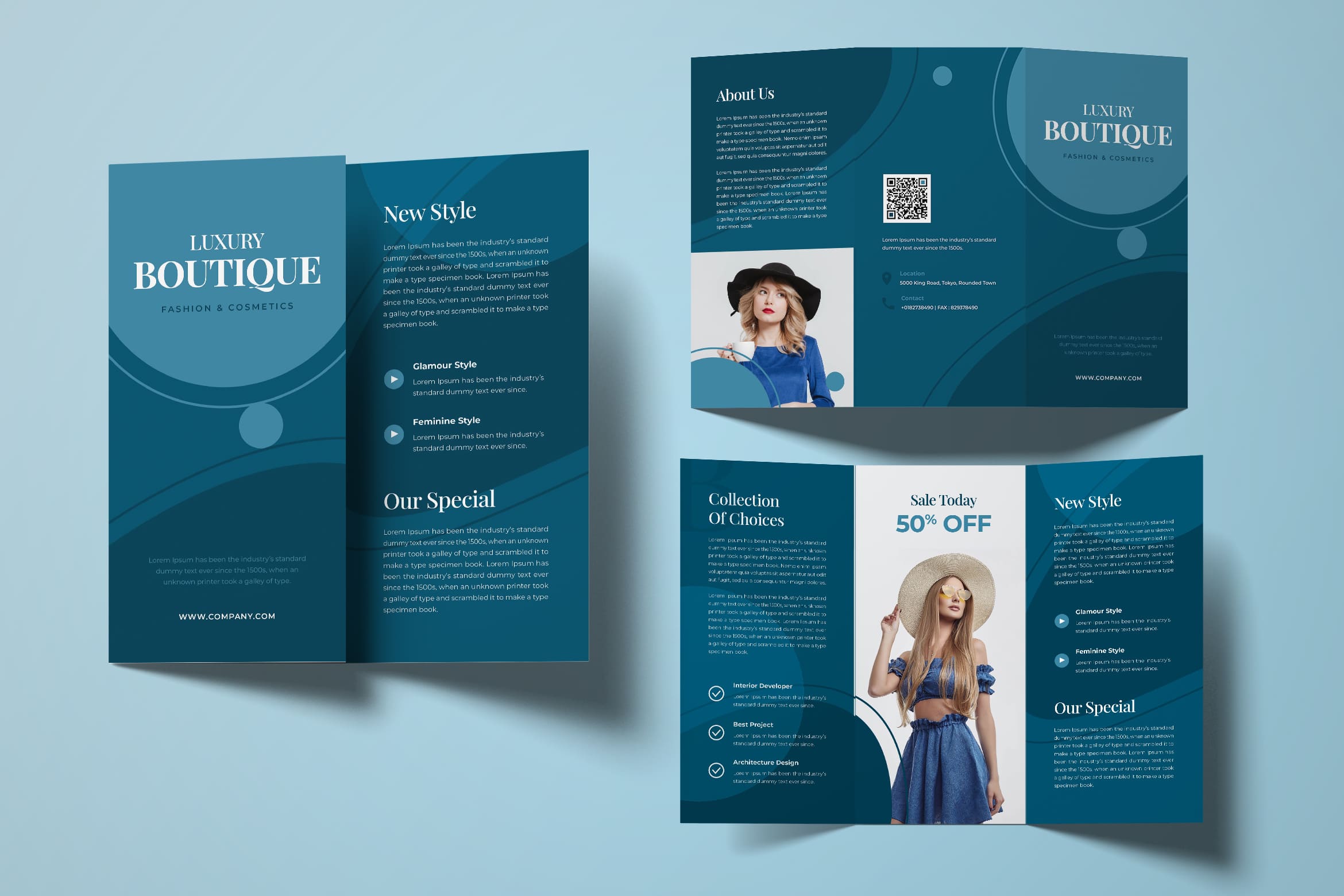
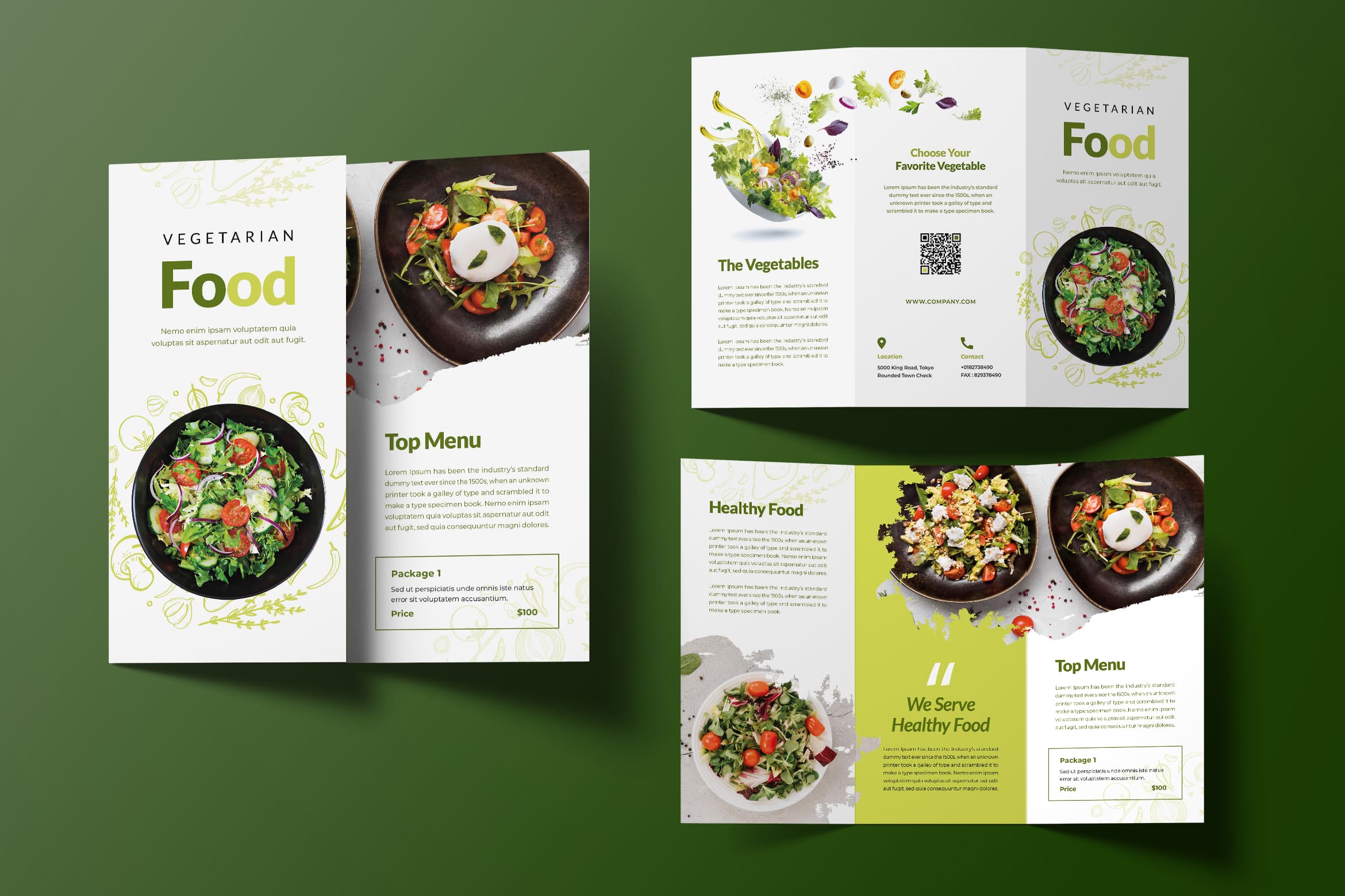
Just maybe if you get confuse and have no experience in designing, you need a software to help you. This is a simple step to make you look professional although you are not the professional one. On the other hand, buy the ready to use design template is a good choice for you, Enjoy to learn something new with software free that you could search from search engine.
8. End Users
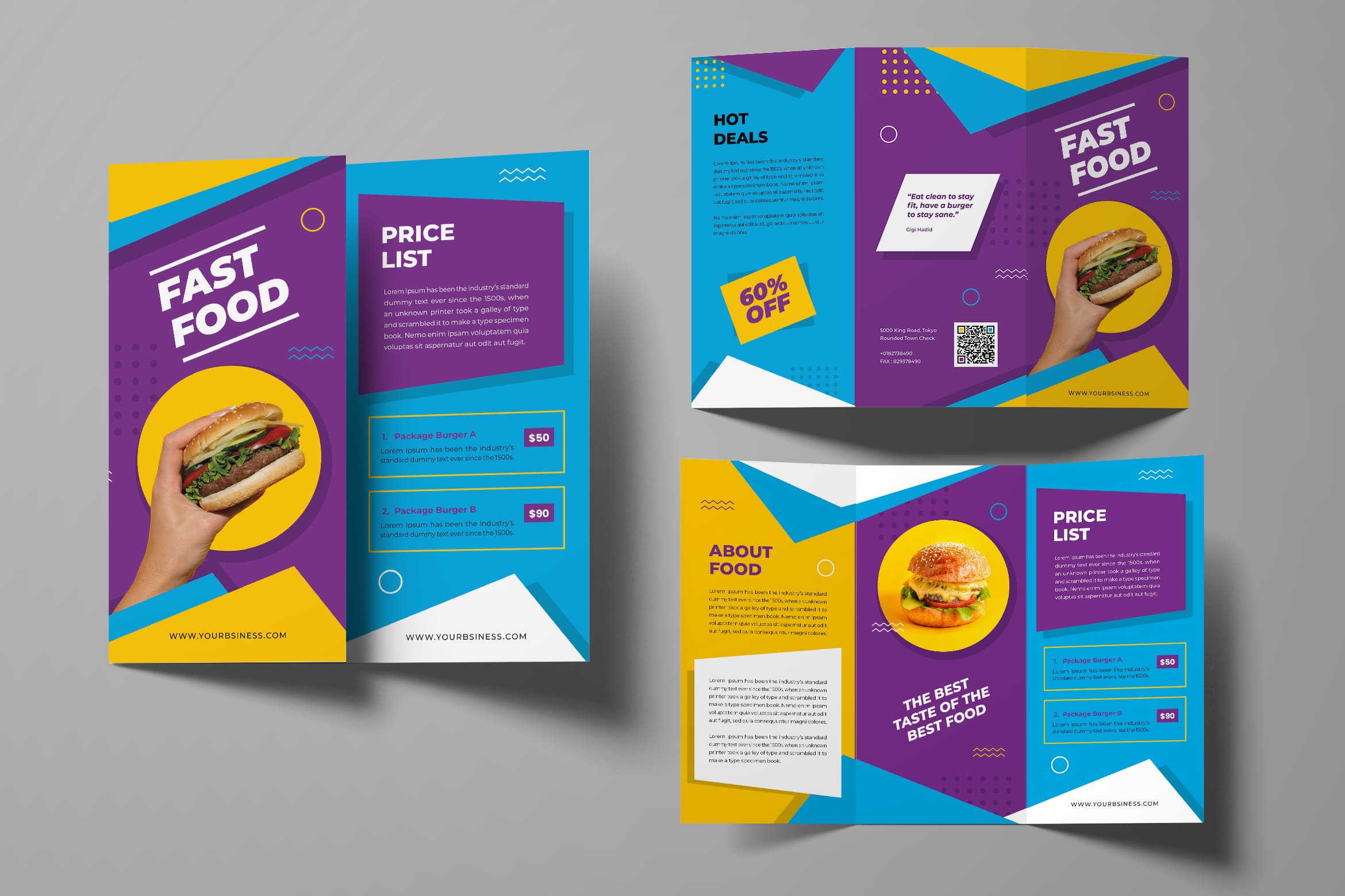
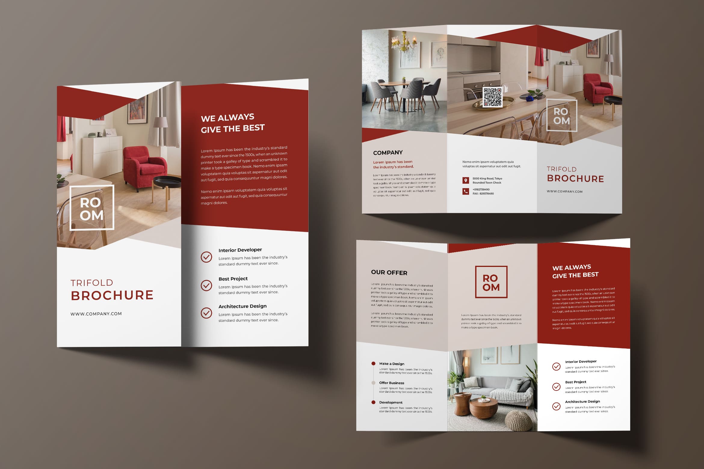
When getting started with the design work, always take into account what will be the reaction of the end users when they glance through the brochure. You are the brochure designer and you have the flexibility and license to apply your creativity for making the brochure design project a super success. However you cannot divert from the possible response of the niche audience. Keep in your mind that the brochure is ultimately for them so, design for them.
9. Choose Font Wisely
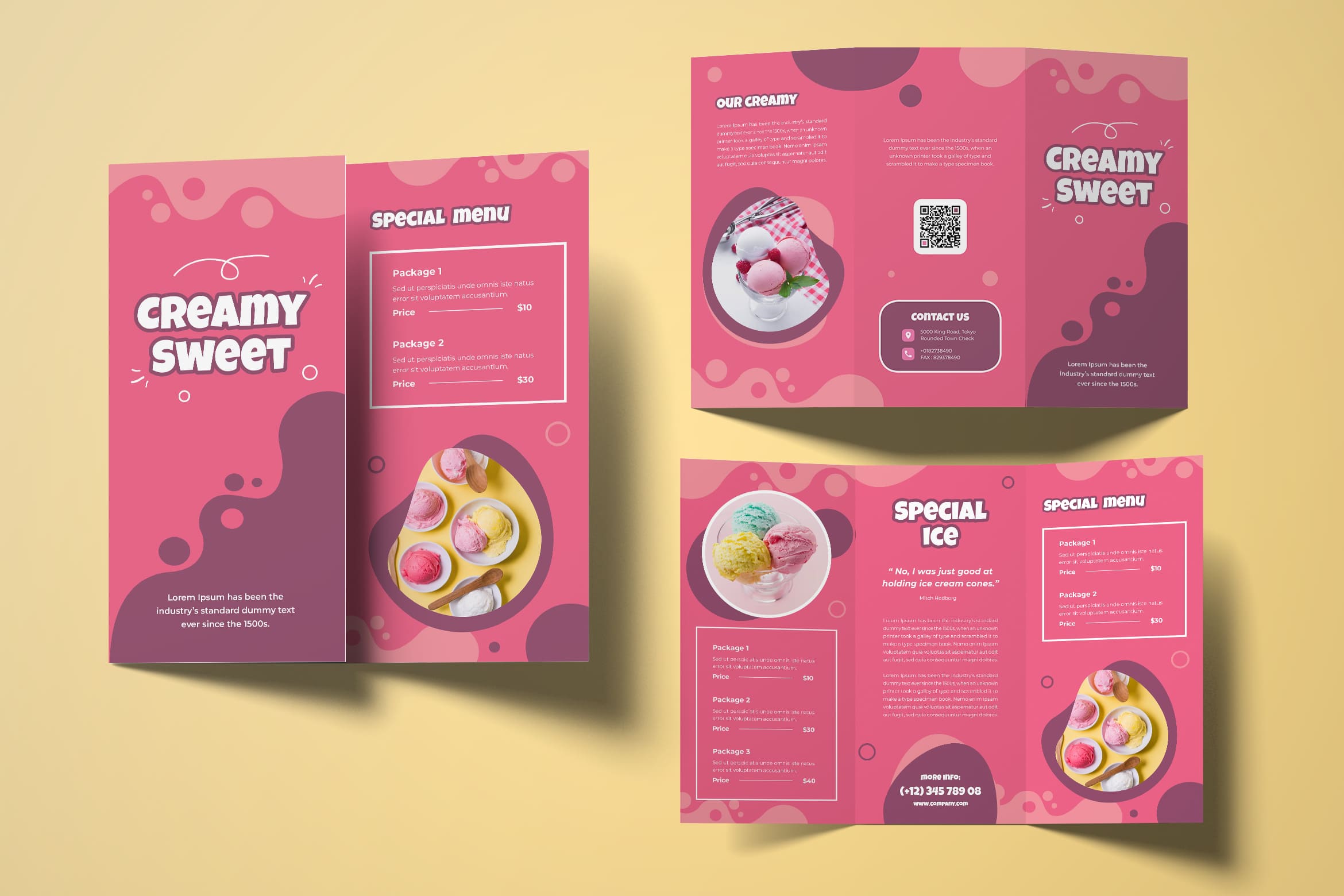
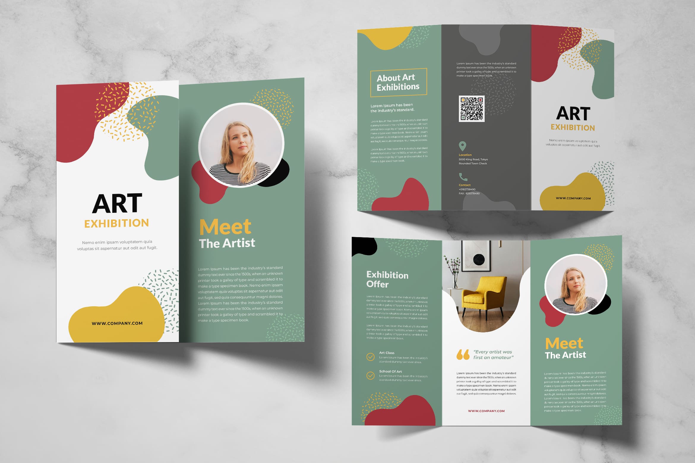
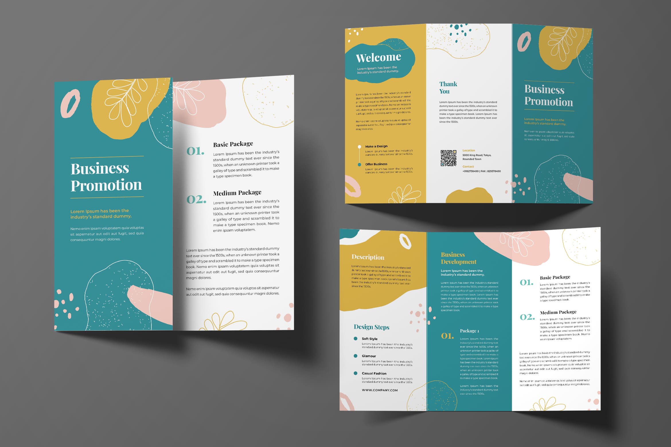
Your aim in preparing trifold brochure is to make it read by audiences. In this case, you should know they ways to make it readable. One thing to consider is the fonts. Therefore, you may use beautiful fonts, but make sure it still readable. You also cannot use more than two font types. It just make everything complicated. Once you use a font for highlight, there would be a different font style for the content. However, do not use more than them.
Also Read : 20 Best Brochure Design for Digital Agency
10. Only Use Good Quality Images
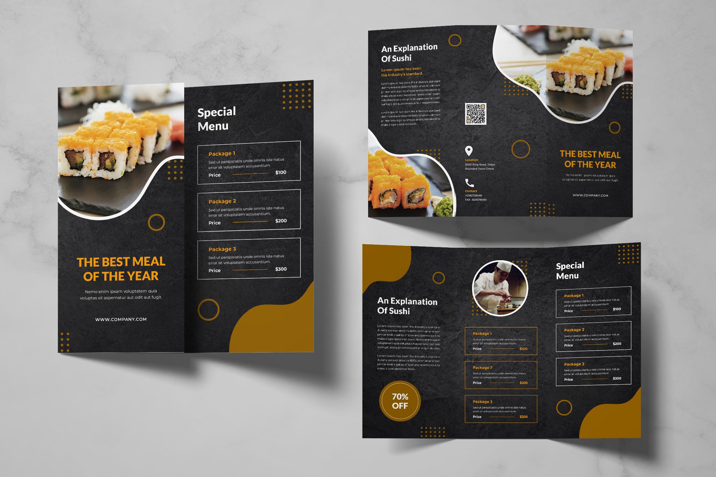
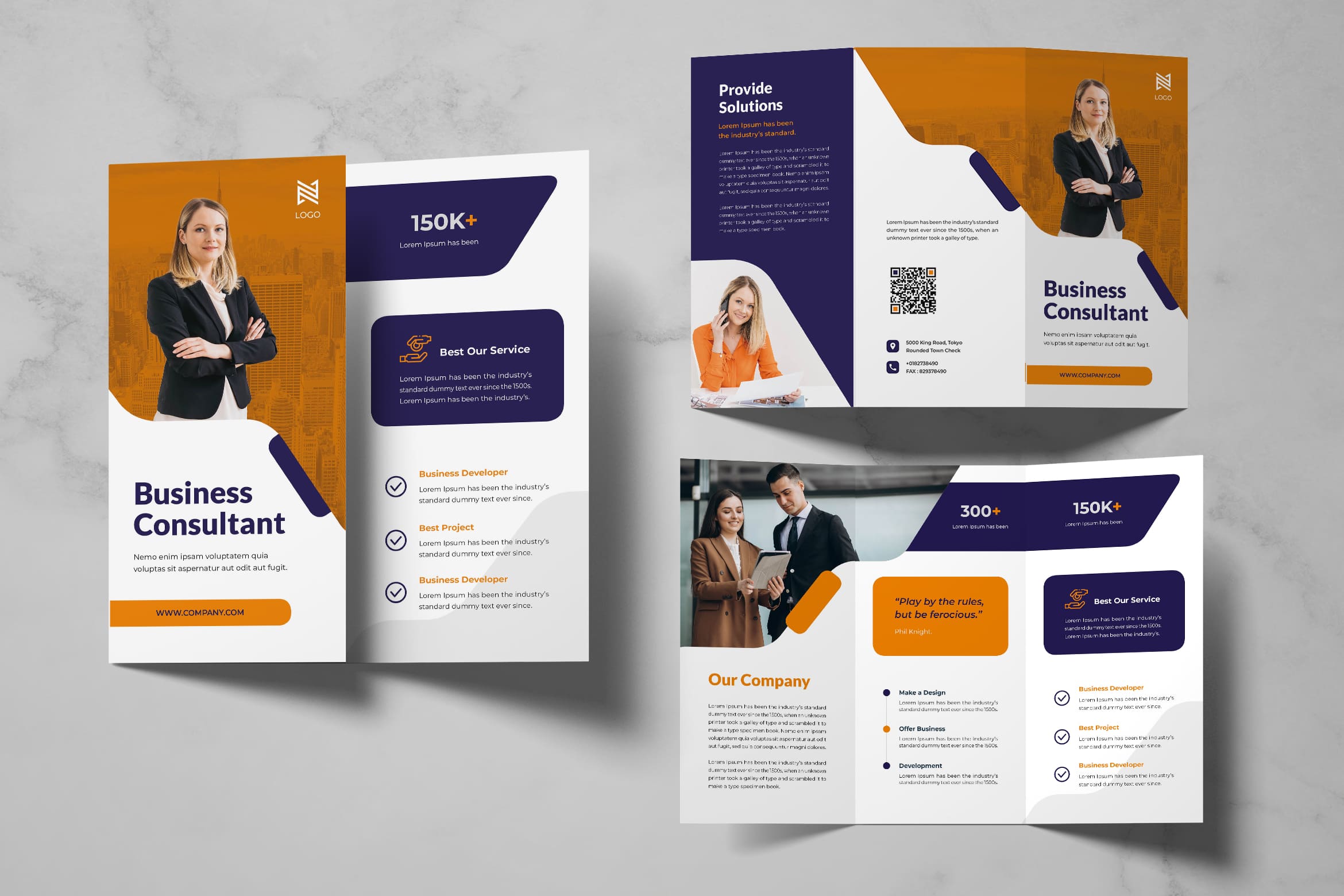
The good quality images would be the stunning visual attention for readers. Images could tell more than words. Therefore, you need to insert the good one and make sure you know how to print them well or everything seems blur. You can start to choose and select. After all, try to insert them in right place of template and layout. The paper size and free space would be very helpful for you to arrange place by space and spot by spot of marketing strategy in brochure.
Remember to use a good quality of paper, especially if your clients target is in higher strata of economy. You cannot make it same as teenager design of brochure. Your professionality can be seen on how you treat your consumers.


