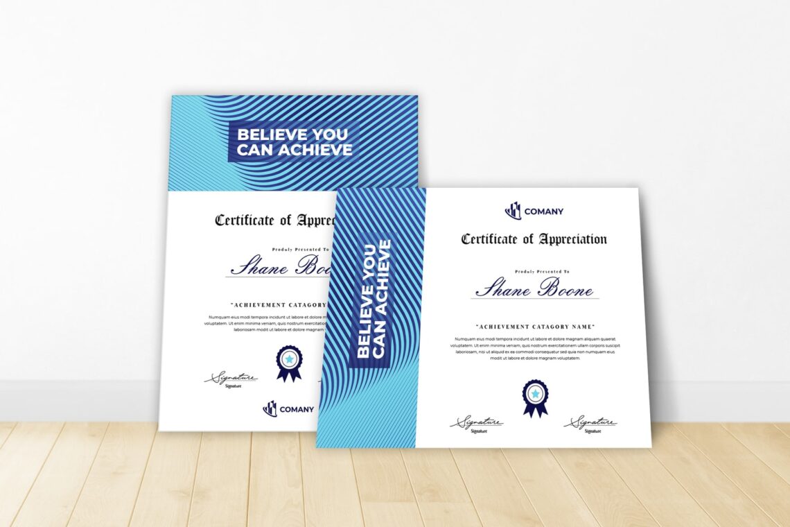
20 Modern Certificate Design Templates : Awards, Gifts, & Diplomas for 2021
in Inspiration on February 25, 202120 Modern Certificate Design Templates : Awards, Gifts, & Diplomas for 2021. For any moment, you need to have reward for audiences. Select the modern certificate design templates to gain much attention.
Red or White Theme – certificate design templates
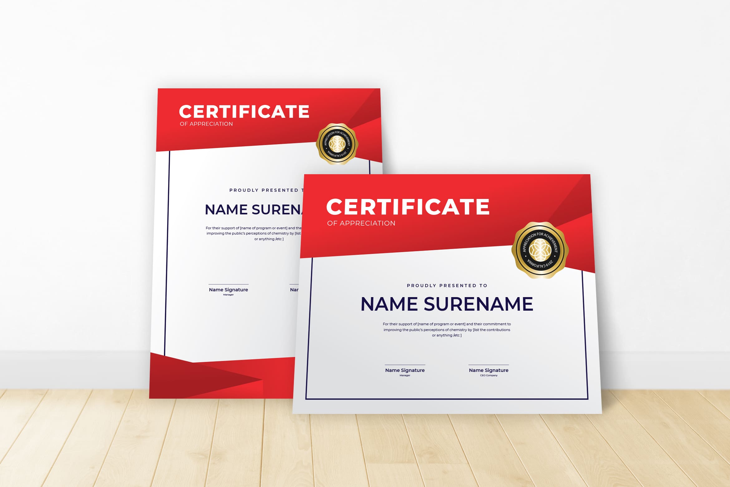
Build the fresh color in 2021. Maybe you need something different as educators and teachers. The highest honors come from certificate. No matter how old the students are, it indicates their hardwork. Therefore, it should be made in effective way and full of prode.
The first step is you can use Canva to make it. It is an online graphic design program. If you are too busy to try, it is better to find the ready to print certificate like what UI Creative offers you. Canva is an easy to use drag and drop program with thousands of free pre-made templates, graphics, fonts and elements for your promotional needs.
Champion Themes
Before you start to choose a certificate, it is good to know persons that you would like to give a certificate. What did they do so they could get certificates? Do not miss the date or timeline like period of award. Original mark, design element, or seal might be need to make your award look different.
You should also consider what make it different when you print it out? It is better for you to know the difference between certificate and award.
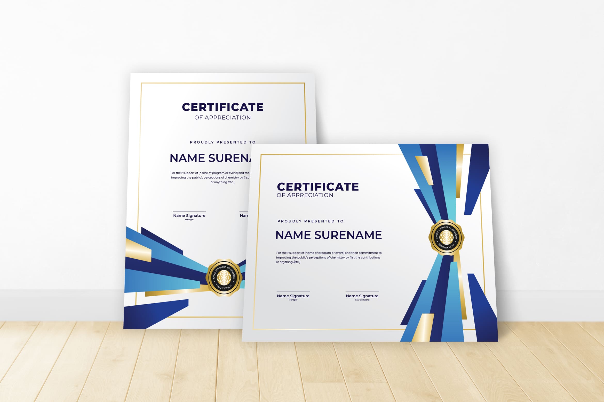
Blue Theme

Certificate needs signature like who is giving the award? Place of certificate and name of it honoree.
Special shape or form to represent achievement. (There is a reason that many bowling trophies come with a bowler on top.)
Think about use. Is it an element that is designer to sit on a shelf, hang in a case or be used in some other way?
Color. With physical printing of awards, color is an important factor and can make your award stand out. Link it to branding for maximum impact.
Feel of importance. Just like with a printed certificate, the award should feel important. Physical items should come with a good weight and be made from good materials.
Uniqueness of design from year to year. Consider a design tweak each year to make each award specific or select a physical design and do not alter it. Either option can add a certain feel and finesse to your award.Physical award is totally different content to certificate.
Red & White Frame
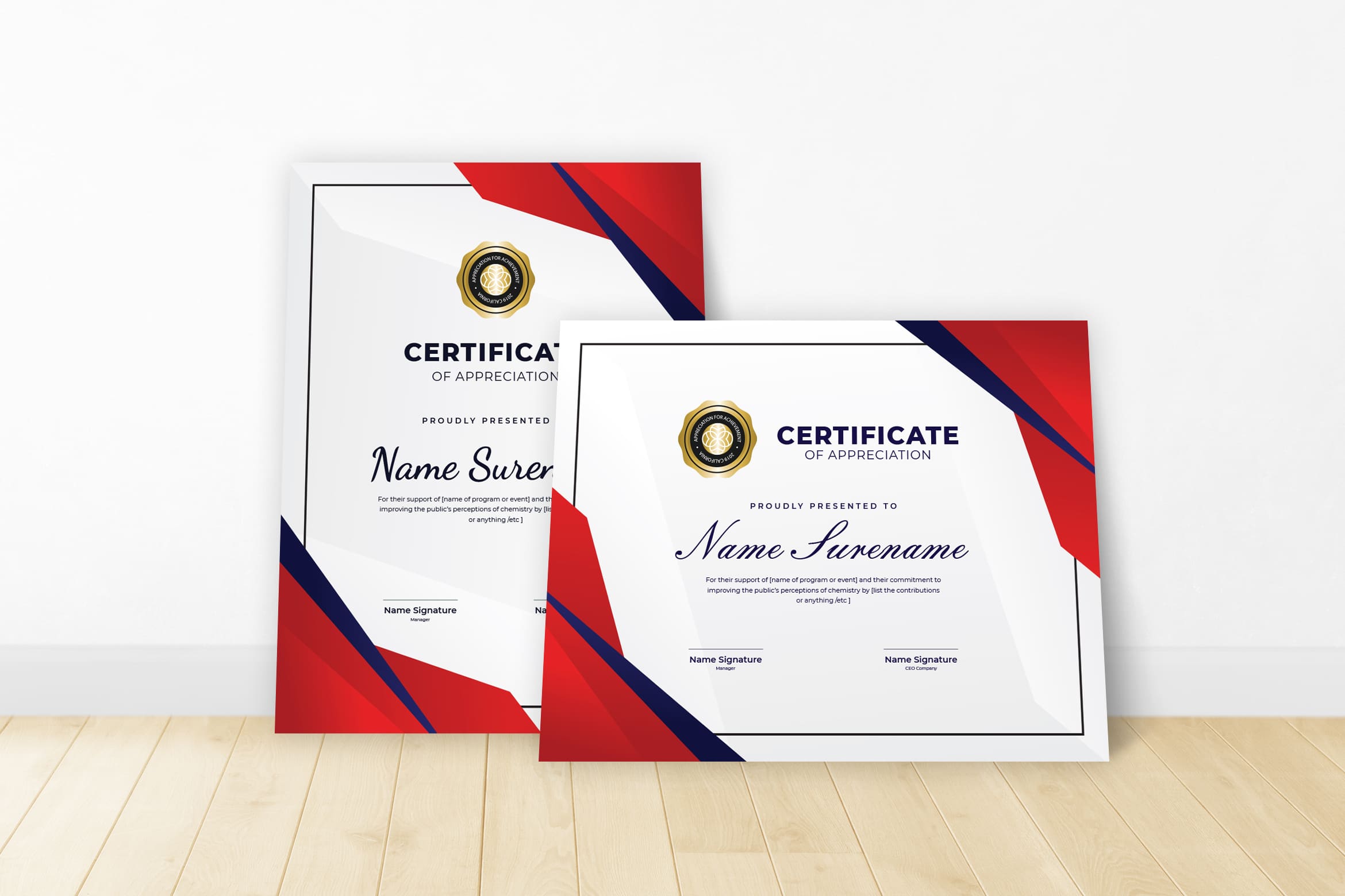
The next thing to consider is the design of certificate. Awards and certificate might same on its design, but the tone might be different. The award certificate need the tone and feeling of the group that presented it. Think about these things:
It is serious or fun event?
It is formal or casual?
It is organized or chaotic?
Is it simple or ornate?
Is it classic or creative?
You can make a typefaces after you know how to answer them all. The old style might be the suitable choose for old fashion event or big awards. In addition, you need to consider the material to use to print it.
Minimalist Theme
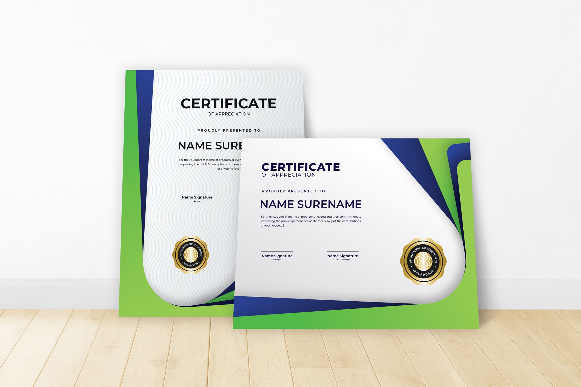
This theme is suitable for children and teenager or anything related to the sports event. Whenever you need to find the quick design, just browse this design and edit as your desire. Even its border and frame are simple enough. However, it keeps bring a formal and great attention for the winner. To be a reward for conference audiences also look formal. The stamp on he right side is already great to make it attractive and luxurious. Make sure you make it neat, clean, and clear by choosing te perfect place to print.
‘Green Light Theme
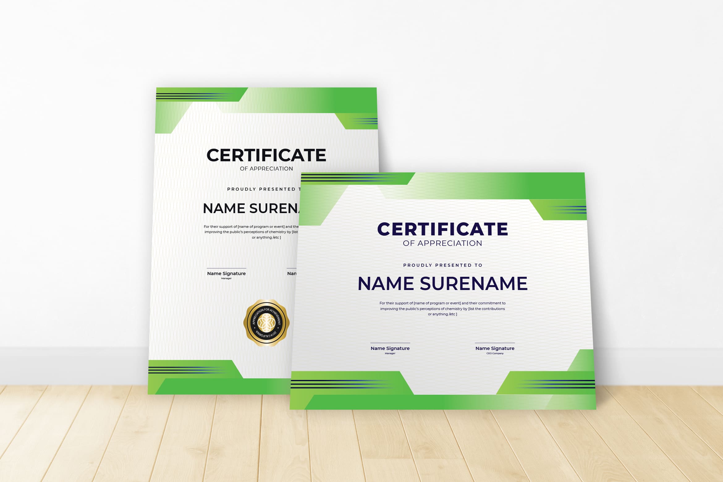
Printing and production is something designers often think about during the process of creating elements for a project, but it is not always the top consideration. However, when designing and award or certificate, it is often the first thing to think about.
Certificates are often printed on a stock or color of paper that is not what is used for other projects. The paper may limit things like design because of color or print capability. Often certificates contain very little color ( for formal and simply printed). The heavy stock with emboss will look good too. The technique both embossing or folling is new, but you can consult first before you print.
Awards should contain unique flair. It could be anything, but pay attention in its quality.
The whole idea behind an award or certificate is to make a memory. The design elements you choose from detailed elements or embellishments to production can set the tone for how an honor feels to the person receiving it. Design choices can make the honor seem important and distinguished .Why many universities use serif and old-style typefaces on diplomas is because they anticipate to fun and creative.
Blue Stripe

Find the template that easy to edit.
You can easily format the text within the design so that it matches your brand colors or font. To do this, select a text element, when you do so you will see that new options appear in the toolbar above. Using these you can do things like change the color, change the font, change the size, center the text, and access other useful formatting tools.
Remember, you can also edit the text appearance of the attributes so hat when the populate with the relevant information it will appear in the size and style that you want. Some of your recipients or courses may have very long names and risk running outside of their text box and overlapping other information on your certificate
Dark Blue Theme
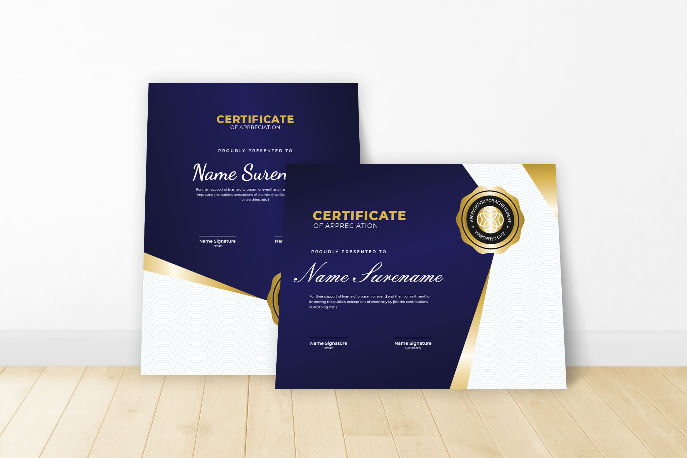
You may decide half way through that you would prefer your design to be a different orientation, or might be you realized that it should be in US-Letter size, not A4. There is no problem on it.
You can manage everything as your desire. Juts make sure it looks great after print. Even the long participant name should be not your problem. You could play on font size. You also could resize the font later. If you want your certificates to look particularly spectacular when printed, make sure to check the ‘Enable HQ PDF for printing’. Different business needs different size.
Blue Triangles
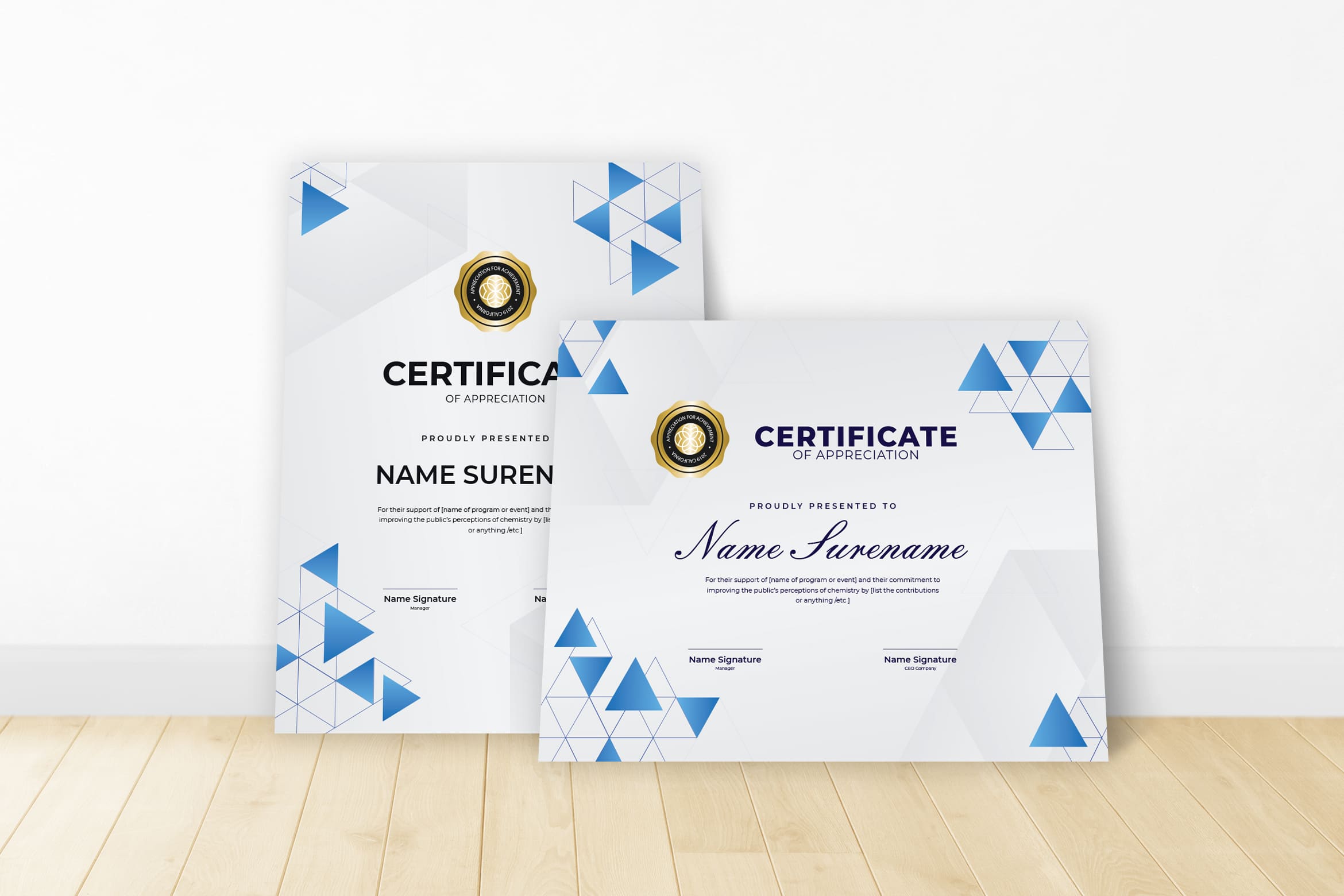
Add a name for your certificate design in the box at the top of the page then, when you’re happy with how it looks, hit ‘Save and Close’. It looks good for designing award like drawing competition or something with computer event. You can get it in affordable cost as long as you purchase it in UI Creative. Do not miss your logo, name of event, date, and signature. Even to share it on digital, it is better to insert the real signature. Therefore, when participants want to print it, they will see the originality and professional side of your event.
Abstract Triangle Design
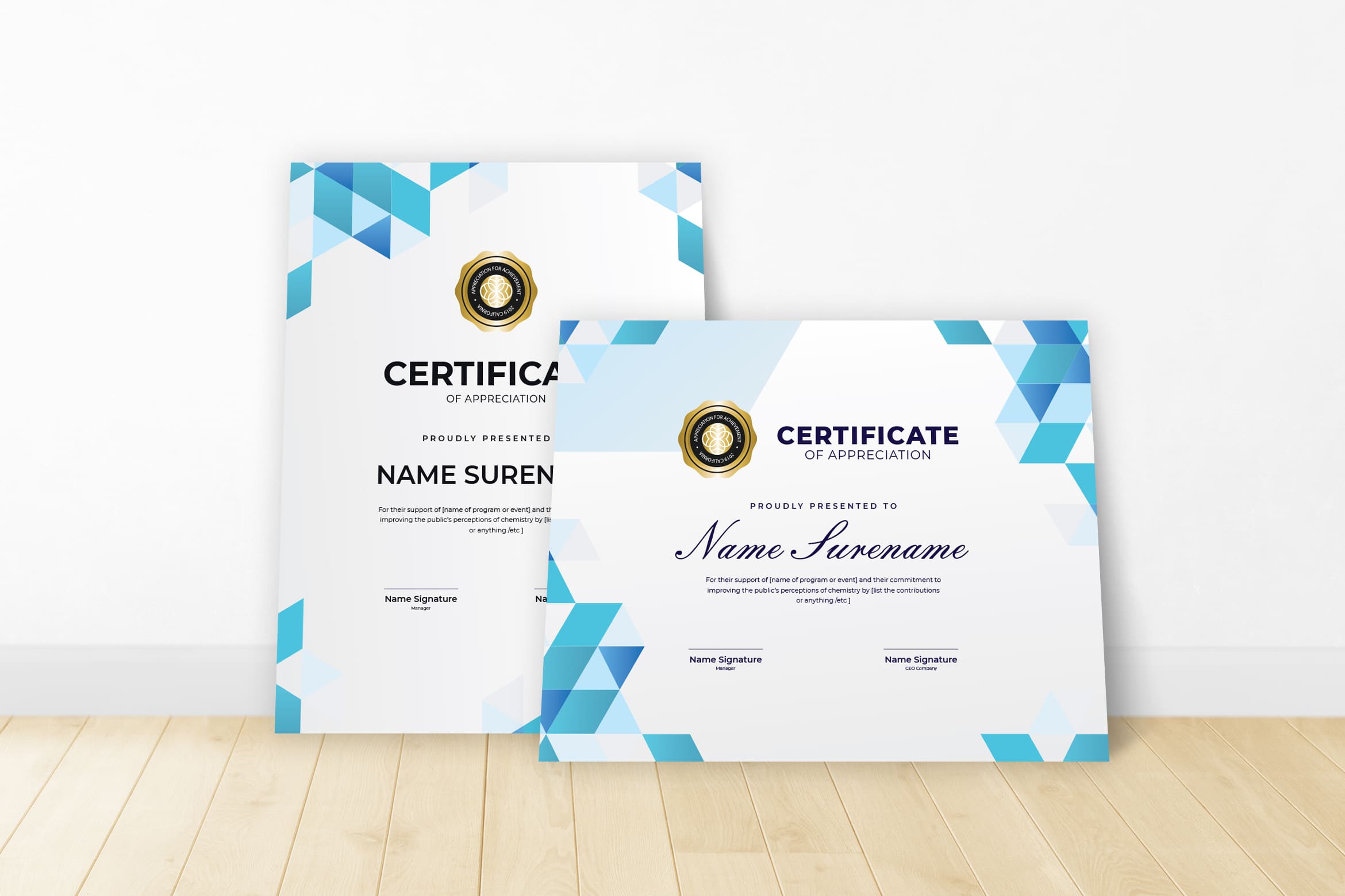
Making certificate for participants and award are a bit different in style. You are better to check its format and size first before edit a certificate. It doe not matter when you need to cut the sides. However, if you do not want to put extra energy in it, format it well in A4. Even the digital certificate need your touch to make it great.
Blue Elegant
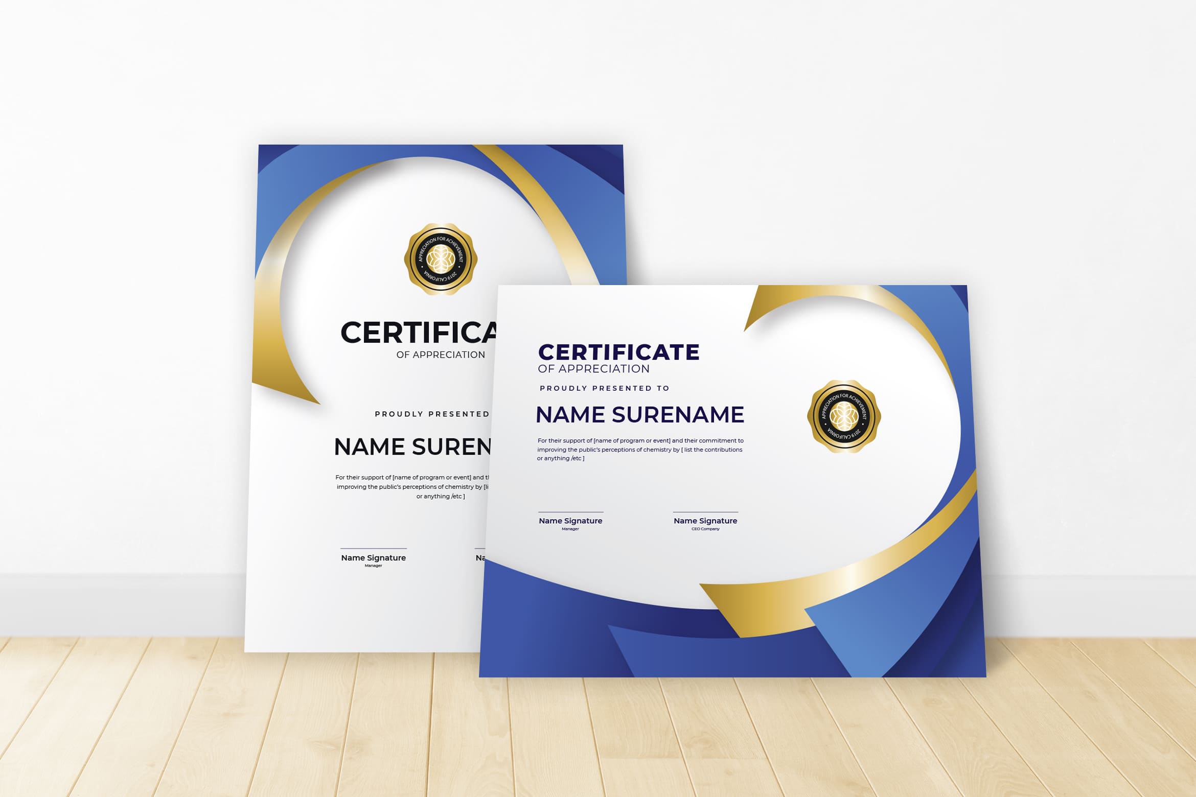
Some events ask for glorious and clean appearance of certificate. The logo of the company or institute who holds the events would be placed well in any side of certificate. Portrait or landscape, you make decision for it.
Glorious Theme
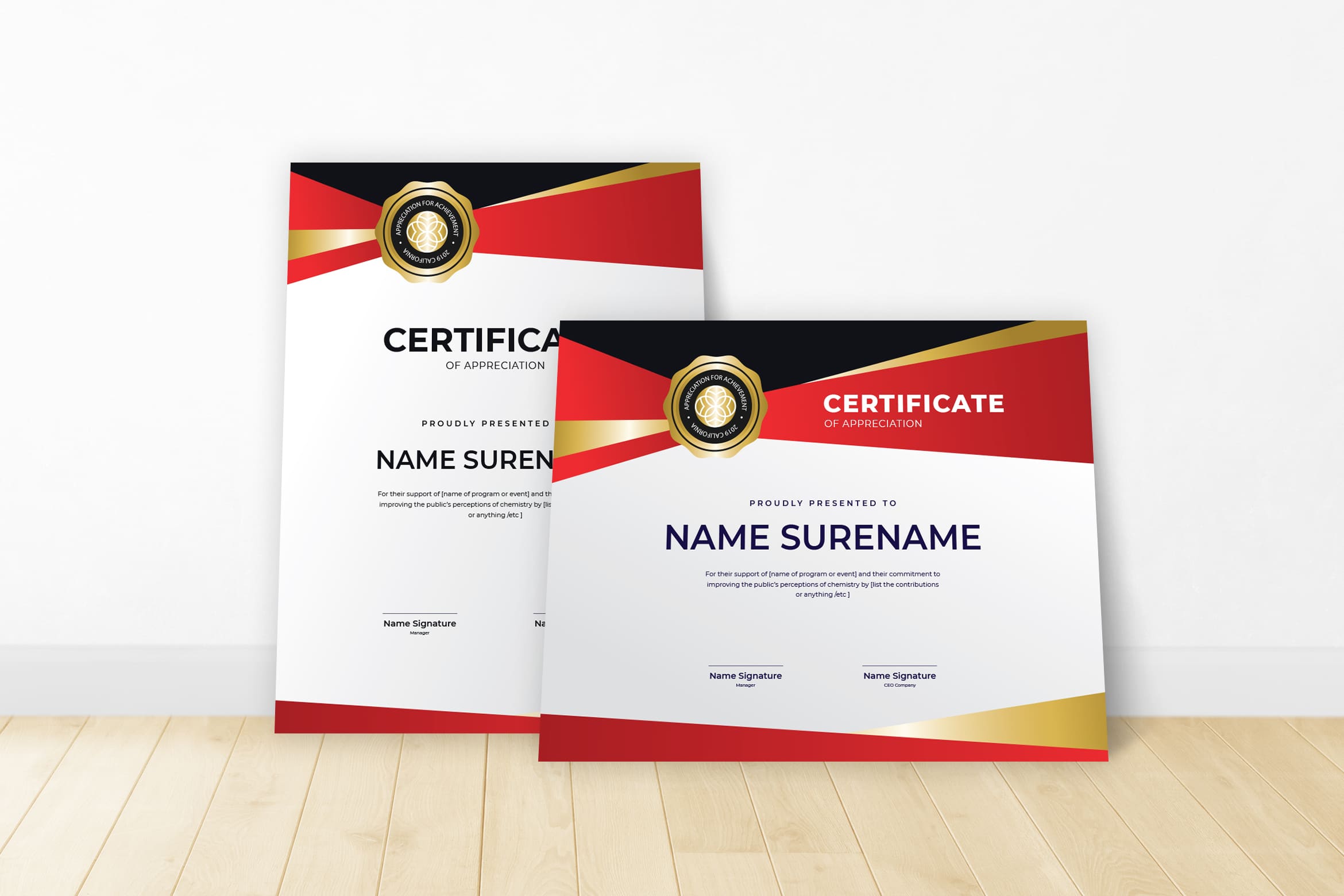
The certificate design can be less color when it comes to academic award. It will different if you want to give certificates for coloring competition for children. You need colorful design in many layouts just like zoo templates. It should be in A4 style or F4, but do not ask participants to print by themselves.
Blue Envelopment Theme

That is the different between certificate event. For awards, there should be more deluxe components and elements. The head name or leader of event needs to present in the paper.
Unique Triangle Color
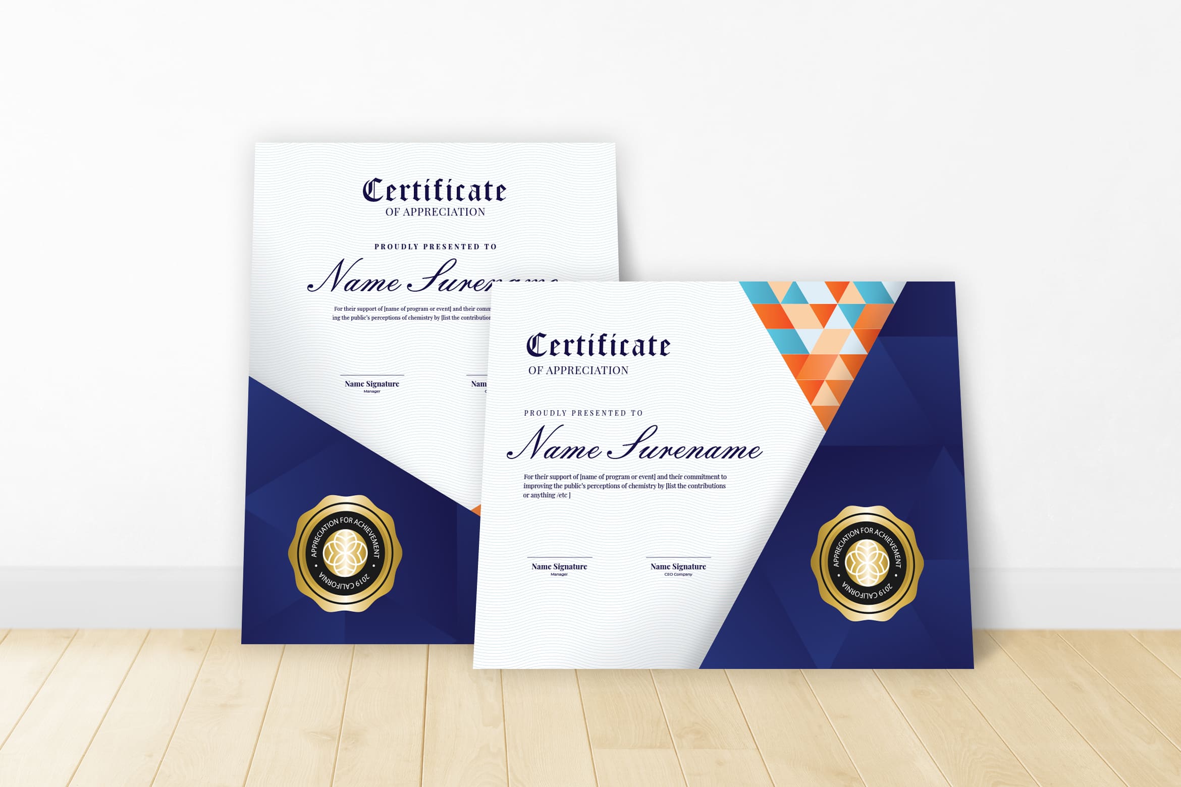
Certificates can be good in design and color or not if they could mix well when they are printed. Therefore, the common basic color of certificate and award is white. Glossy ink in exclusive font bonds well in white paper. Having more than one font style is normal for an honour. Let us say about Minova Corsyva font. It looks great to use on participants or the name of certificate.
Blue Line Frame
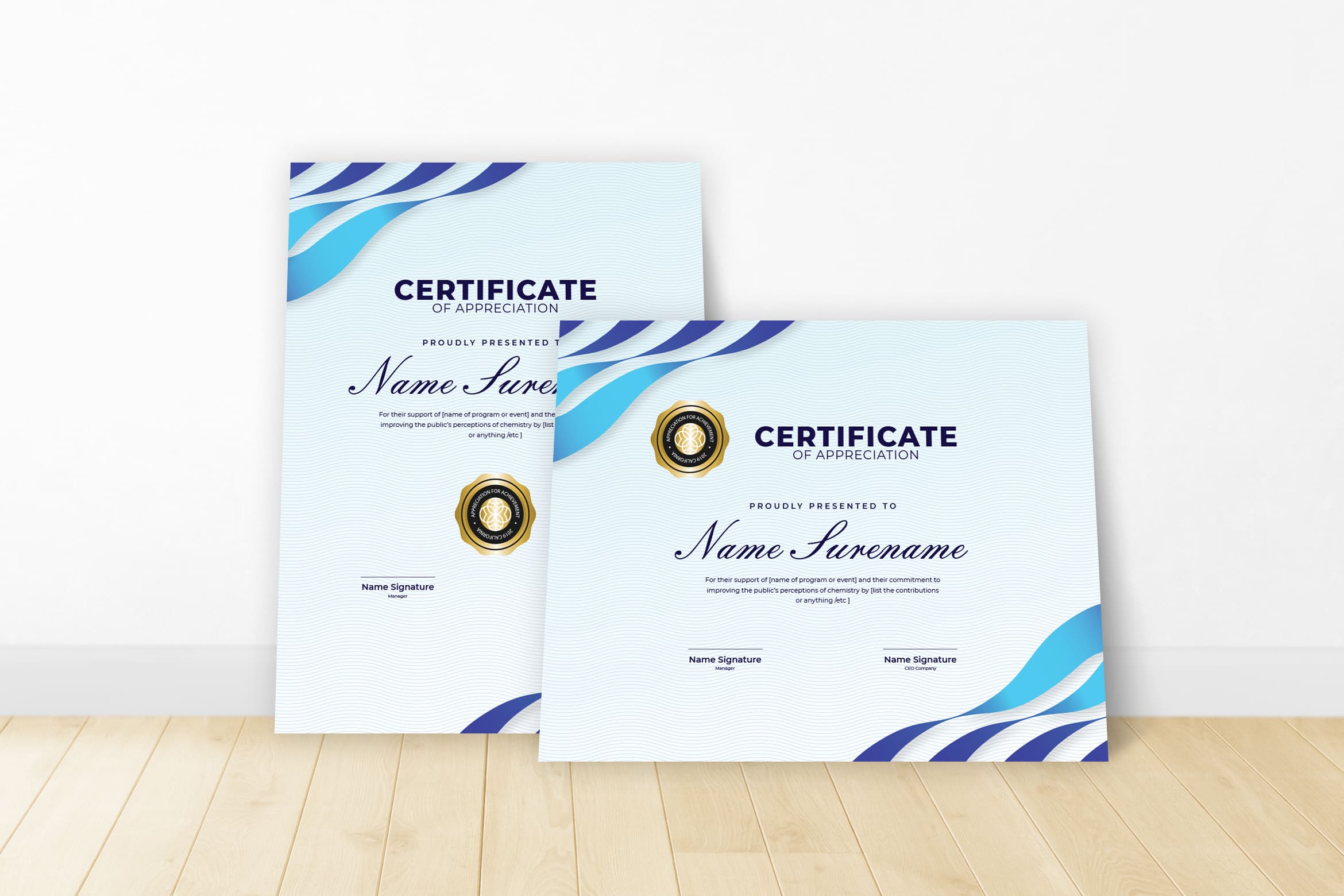
Hologram could make certificate more exclusive. This is what you cannot skip for exclusive conference. Participants want something different. It comes from certificate they get. At least the design should be eye catching and you know how to play with font size and font design.
Blue Hexagon Theme
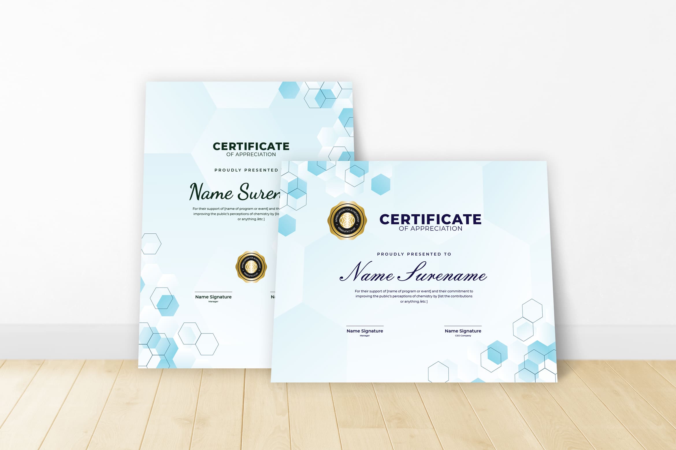
San serif or handwriting style looks artistic for naming certificate. You may use Arial or Times New Romance for the whole words in certificate except the name. The curve in the edge of letter gives new appearance for everyone who loves it.
Simple Blue
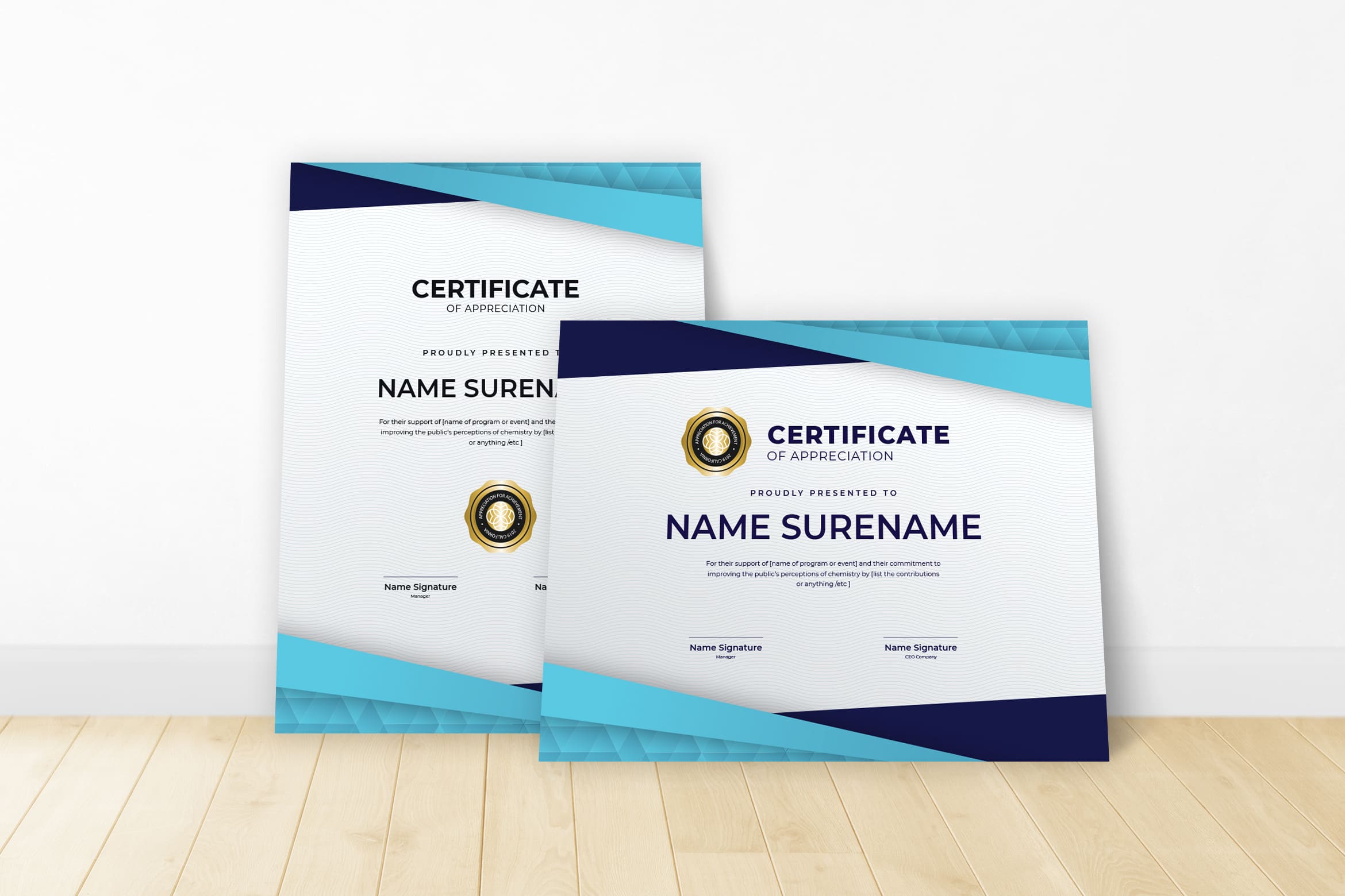
Today, digital certificate or popular with e-certificate is in the blank condition. The recipients could fill as they desire. Commonly, it happens for competition where all participants get certificate. Event holder will not write down one by one participant name. However, for conference or training, the event holder will likely write one by one participant’s name on certificate. It different from a real competition or task book where the printed certificate is still in blank.
Spirit of Champion Theme
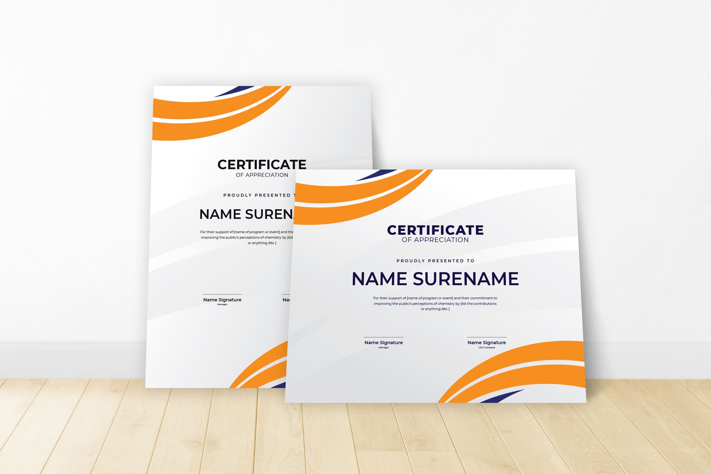
Circle Color Theme
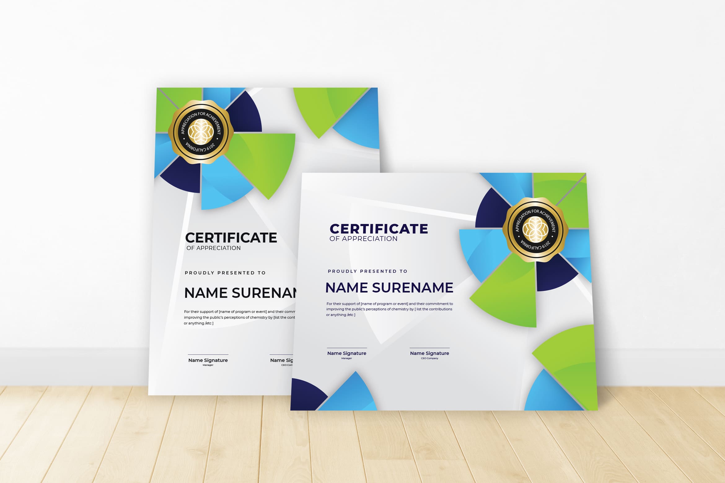
It is stuck to dig more design especially for non formal event. Randomly you may select one of plenty collections from UI Creative. Even to purchase it quickly fast. You also may use it for the next event. Is there any better than it?
Blue Circle Theme
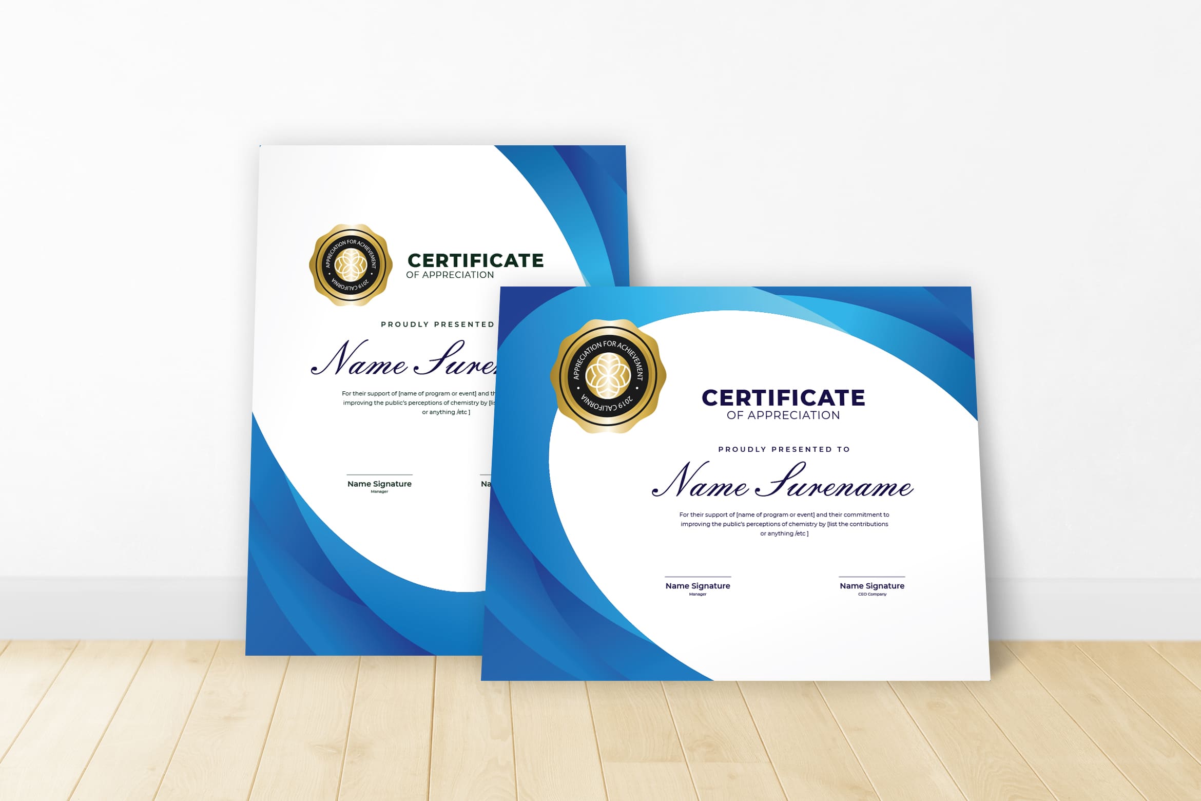
It is time to purchase your favorite certificate design templates.


