20 Creative Certificate Design Templates : Awards, Gifts, & Diplomas for 2021
in Inspiration on April 6, 202120 Creative Certificate Design Templates : Awards, Gifts, & Diplomas for 2021. Do you need a reward for your students and best employee? We have plenty options of Certificate Design Templates. Browse your need and edit as you require.
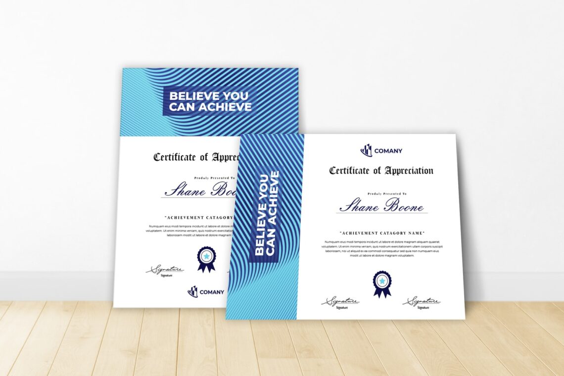
1. Blue Ocean Design – Certificate Design Templates

What to concern when you want to make certificate? The template, design, font, color, and content. You need at least two kind of fonts for the name, title, and content. Do not skip your logo like event name, company or organization logo, and more. It is no problem to have colorful template in romantic frame, but think about the content of event. If it is for poetry participants, the design is suitable. However, for formal conference, it would be too attractive.
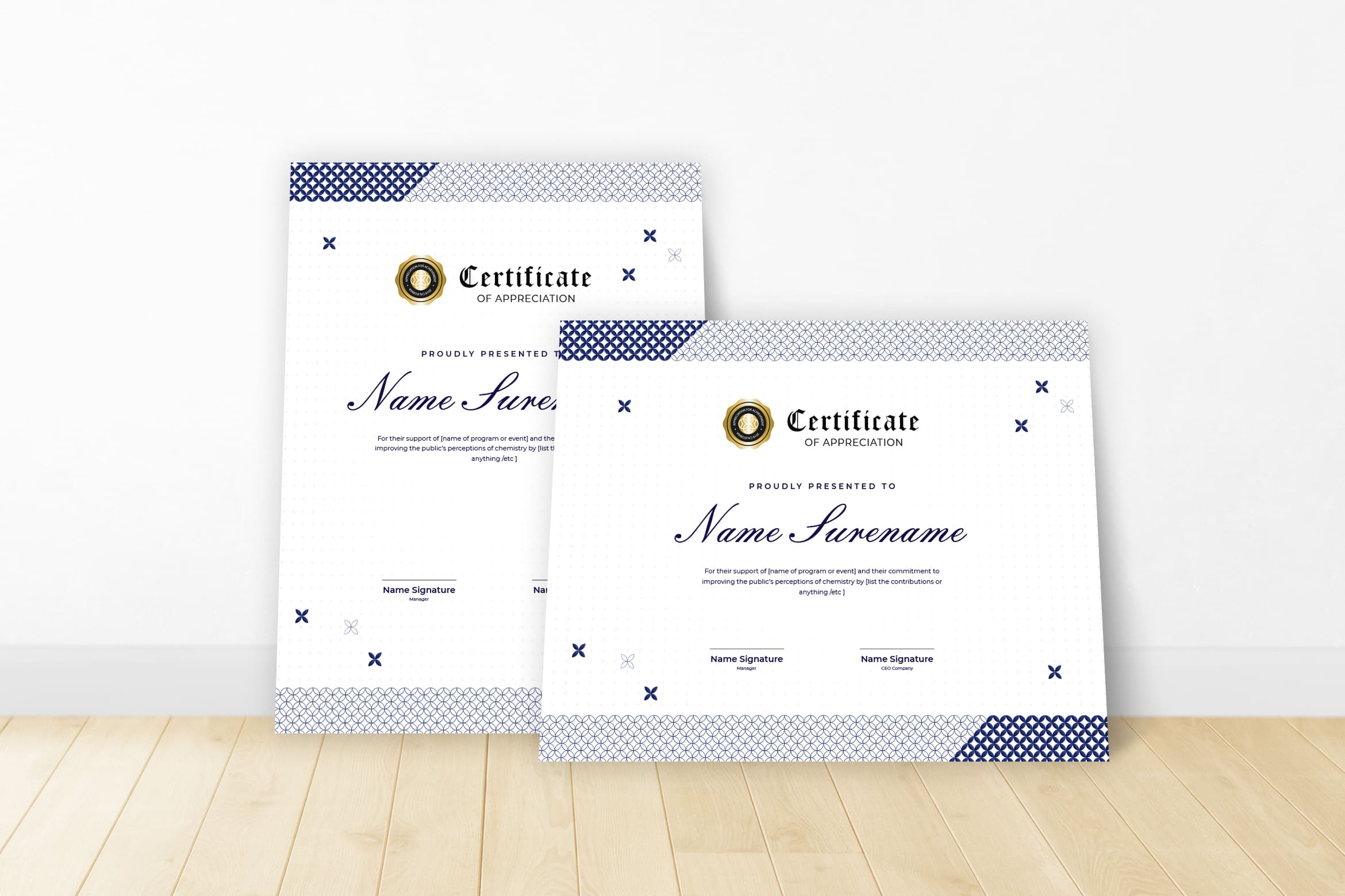
2. Aesthetic Modern Design

This is an aesthetic design template. It looks modern, clean, and clear. The font is readable. Even the color option for the name and content look match to the frame. You may use it in non formal event like drawing competition, artistic competition, or for musical participants. Take a look for it before you print. It should be look elegant like this when it comes to printer machine. Select the good paper and ink, so the quality will be keep good.
3. Full Color Design

Children need something fascinating like this. The three color combinations make it more colorful. In addition, the design frame and color also cheerful. For kids event, you may add some elements on it. Make it fancy with handbrush or san serif font type would be fascinating. It comes to two layout. Whether you want to make it portrait or landscape, it is up to you. You only could print it in A4 paper size. Therefore, this is a great time to play with this design.
4. Extraordinary Design

Making comic or design graphic competition look suitable to have this certificate design. It can be used for participants and winners. Select handwritten font to type the name and you do not have to print it. If it is done online, give them e-certificate. All you have to concern now is about putting the logo. Ensure the size of the font are not too large and make everything not look proportional.
5. Digital Art

For academic and formal meeting which need professional skill to do it, this kind of certificate template looks suitable. You will see the elegant side of it. The color also look good and proportional layout. Having bold font type make this certificate looks more clear and clean. You should know how to insert elements on it without make it less in its quality. Now, it is time to measure the right and left side. You need to put the name in straight middle. Even to put signature and another content, think about to make it looks great.
6. Cheerful Design

Cheerful design with bullets in the side make it too fancy. You may use it for non formal event. Since no more spaces left here, you nee to think the way to insert more elements or your logo. It has to be in small size. Do you want to put geometric? Geometric shape is a combination between more than one shape to be 3D style. Websites look good to have it as their frame, background, borders, in order to make an attractive website and decorative one.
7. Funky Design

The image of hand drawing pattern like triangles and more in this design is quite annoying. However, it supports mathematics championship for students. As the theme of the event, this certificate design looks great and support the event theme. You may change the color into your institution main color. If you do not know how to do it, open your Adobe and try. The file is yours once you purchase it from UI Creative.
8. Thematic Design

Swimming competition whether for teenagers or kids look great with this kind of certificate. As the award or for participants, you are better to pick this design. Enjoying edit it with some illustration design like adding the wave of water and more. It is eye catching already when you make it in landscape. Do not hire professional or wasting time in complicated moment. By visiting UI Creative main website, you could kick your worry.
9. Minimalist Border Design

Simple, eye catching, perfect! This is what we could see from this design. This certificate looks suitable for women academy. They who have participated in women event need to have this elegant certificate. Having it as the best make up artist or as the winner of fashion show will be good. Even it is only consist of one color, navy blue, but the background in white could have meaningful story. All you have to do is insert it in nice font and it will be extremely perfect!
10. Blue Side

Before you want to print it, make sure you notice these things:
Images
You need to select the high resolution of image, but make sure it keeps good when you print. It should show your product very well. Check again because it has to be in high quality.
Logo
If you have no logo yet, let UI Creative helps you with it. You need a high resolution too for you logo.
Text
What to fill in the text body? First, the intro. It contains the company profile in short words. Only focus on one or two messages.
11. Core Blue Theme

You can play its background and layout color. Even to use only black and white, as long as you could find the suit paper like magazine paper, it looks elegant, modern, and worth. At least you could be relax and wait the response of your effort. Before making the good one, you should notice your target. Let us discuss more about it below.
12. Cyan Blue Theme

13. Black & Purple Theme

Do you want to make something as elements?
14. Natural Color Theme

Before you start to choose a certificate, it is good to know persons that you would like to give a certificate. What did they do so they could get certificates? Do not miss the date or timeline like period of award. Original mark, design element, or seal might be need to make your award look different.
You should also consider what make it different when you print it out? It is better for you to know the difference between certificate and award. Certificate needs signature like who is giving the award? Place of certificate and name of it honoree. Think about use. Is it an element that is designer to sit on a shelf, hang in a case or be used in some other way?
Color. With physical printing of awards, color is an important factor and can make your award stand out. Link it to branding for maximum impact.
Feel of importance. Just like with a printed certificate, the award should feel important. Physical items should come with a good weight and be made from good materials.
Uniqueness of design from year to year. Consider a design tweak each year to make each award specific or select a physical design and do not alter it. Either option can add a certain feel and finesse to your award.Physical award is totally different content to certificate.
15. Unique Shape Line

The next thing to consider is the design of certificate. Awards and certificate might same on its design, but the tone might be different. The award certificate need the tone and feeling of the group that presented it. Think about these things:
It is serious or fun event?
It is formal or casual?
It is organized or chaotic?
Is it simple or ornate?
Is it classic or creative?
You can make a typefaces after you know how to answer them all. The old style might be the suitable choose for old fashion event or big awards. In addition, you need to consider the material to use to print it.
16. Purple Maze

This theme is suitable for children and teenager or anything related to the sports event. Whenever you need to find the quick design, just browse this design and edit as your desire. Even its border and frame are simple enough. However, it keeps bring a formal and great attention for the winner. To be a reward for conference audiences also look formal. The stamp on he right side is already great to make it attractive and luxurious. Make sure you make it neat, clean, and clear by choosing the perfect place to print.
17. Simple Purple

Printing and production is something designers often think about during the process of creating elements for a project, but it is not always the top consideration. However, when designing and award or certificate, it is often the first thing to think about.
Certificates are often printed on a stock or color of paper that is not what is used for other projects. The paper may limit things like design because of color or print capability. Often certificates contain very little color ( for formal and simply printed). The heavy stock with emboss will look good too. The technique both embossing or folling is new, but you can consult first before you print.
Awards should contain unique flair. It could be anything, but pay attention in its quality.
The whole idea behind an award or certificate is to make a memory. The design elements you choose from detailed elements or embellishments to production can set the tone for how an honor feels to the person receiving it. Design choices can make the honor seem important and distinguished .Why many universities use serif and old-style typefaces on diplomas is because they anticipate to fun and creative.
18. Royal Theme

19. Shining Theme

20. Simple Magnificent – Certificate Design Templates

Those are Certificate Design Templates You might Choose. Which one is yours?


