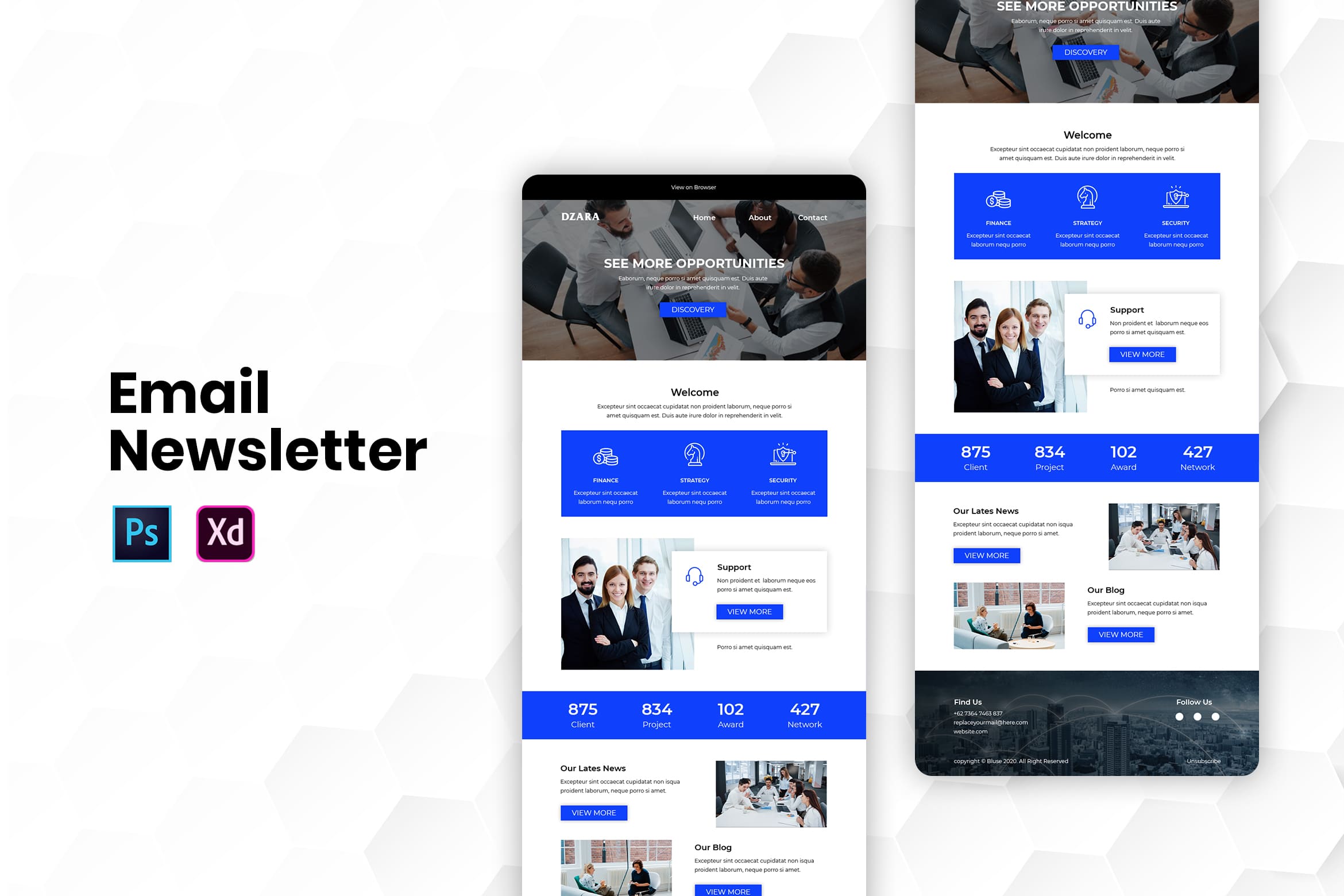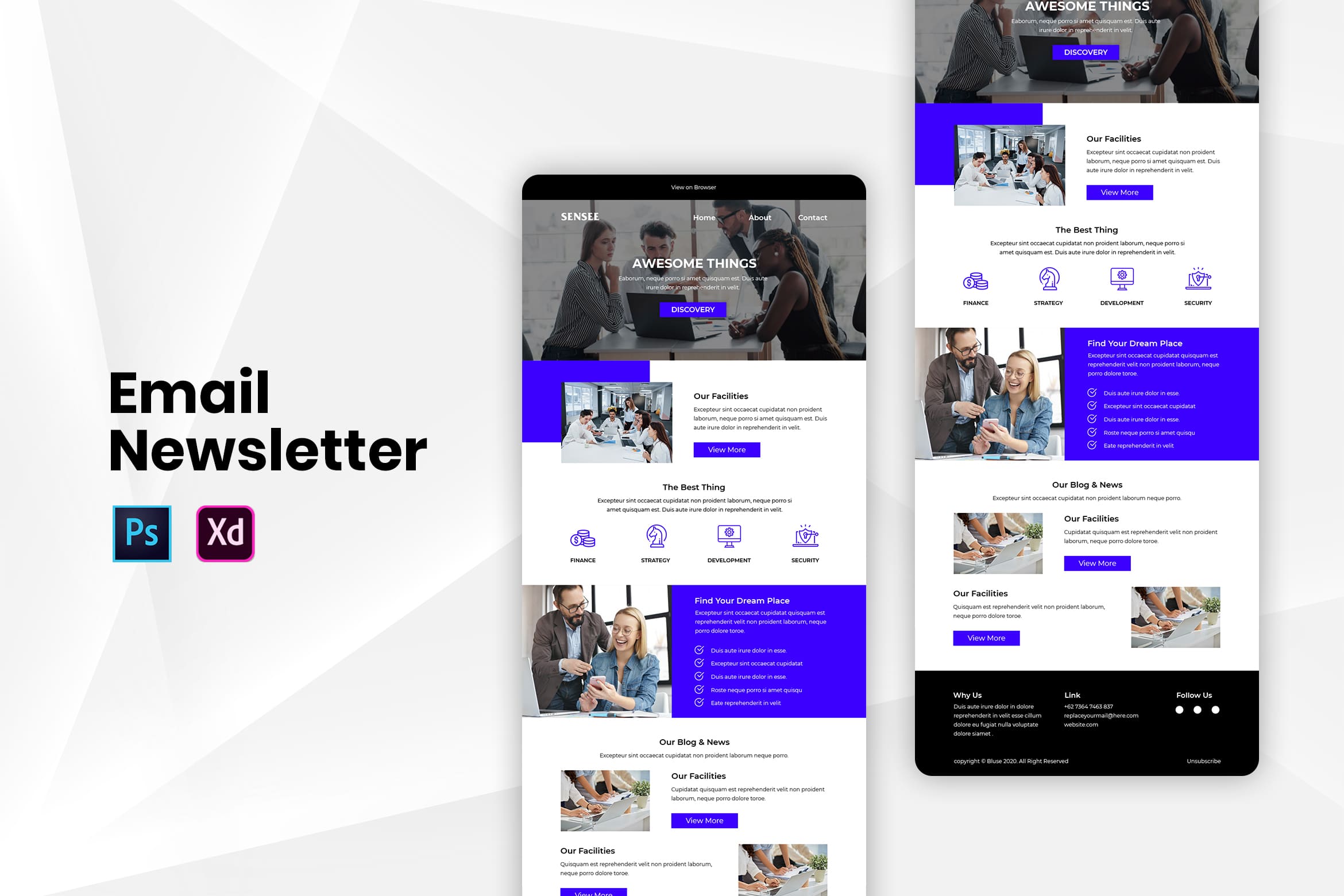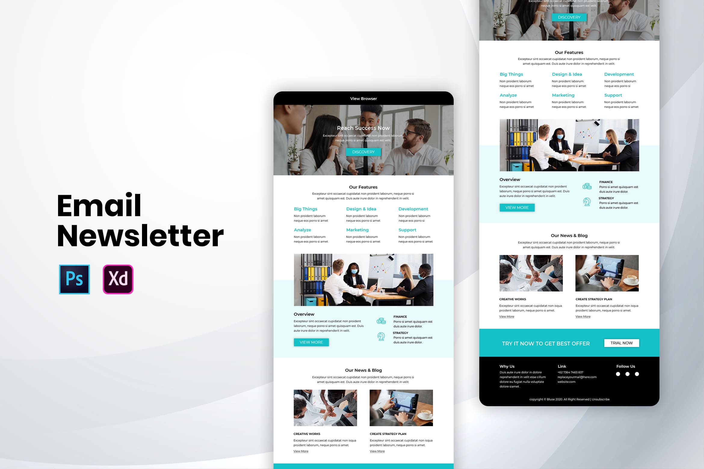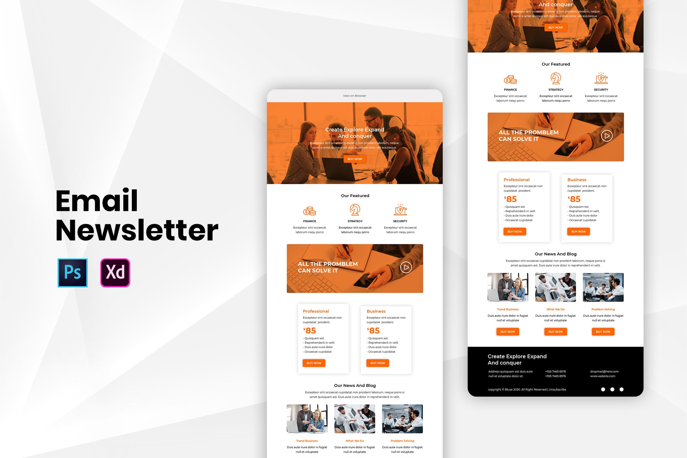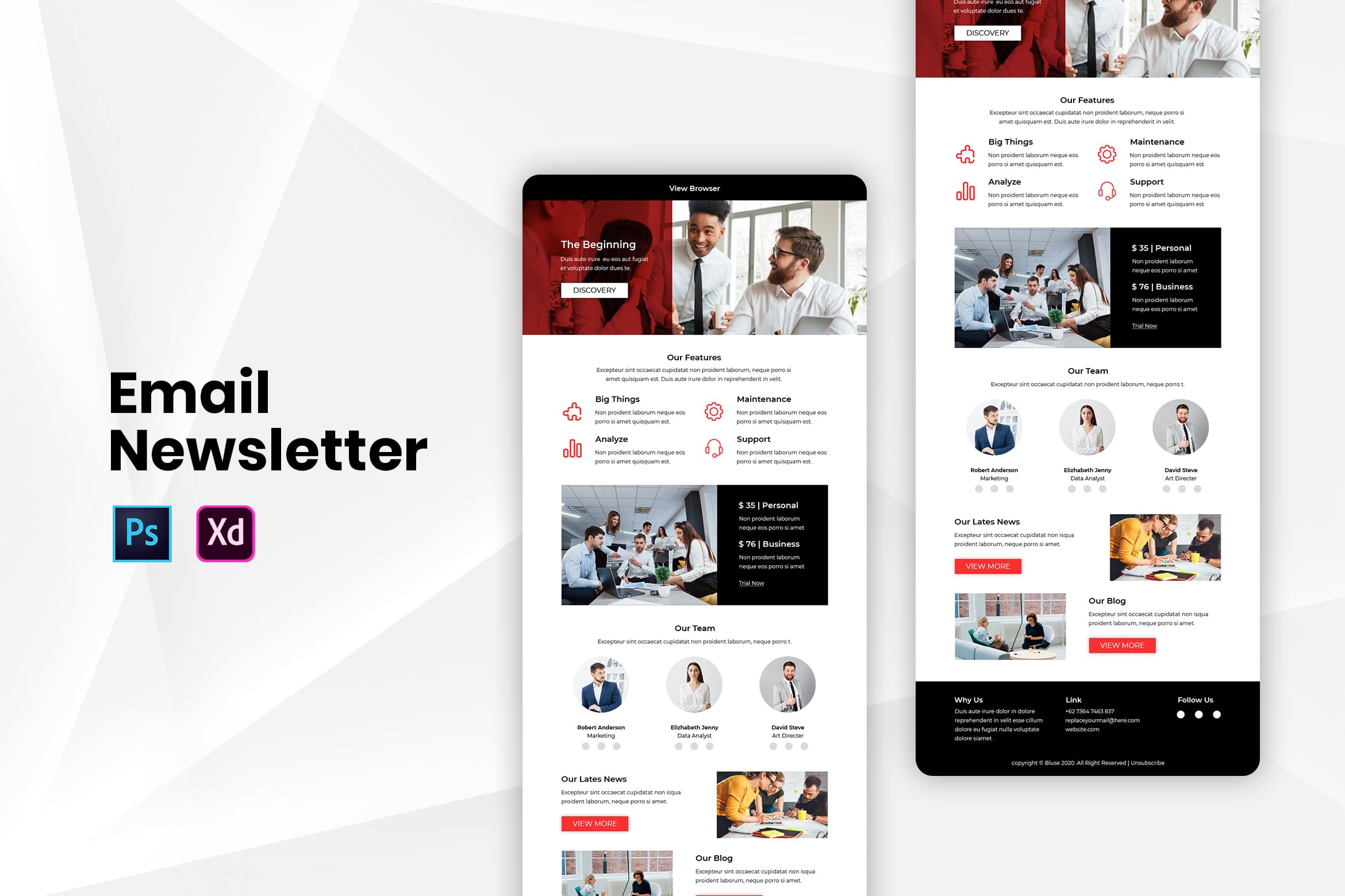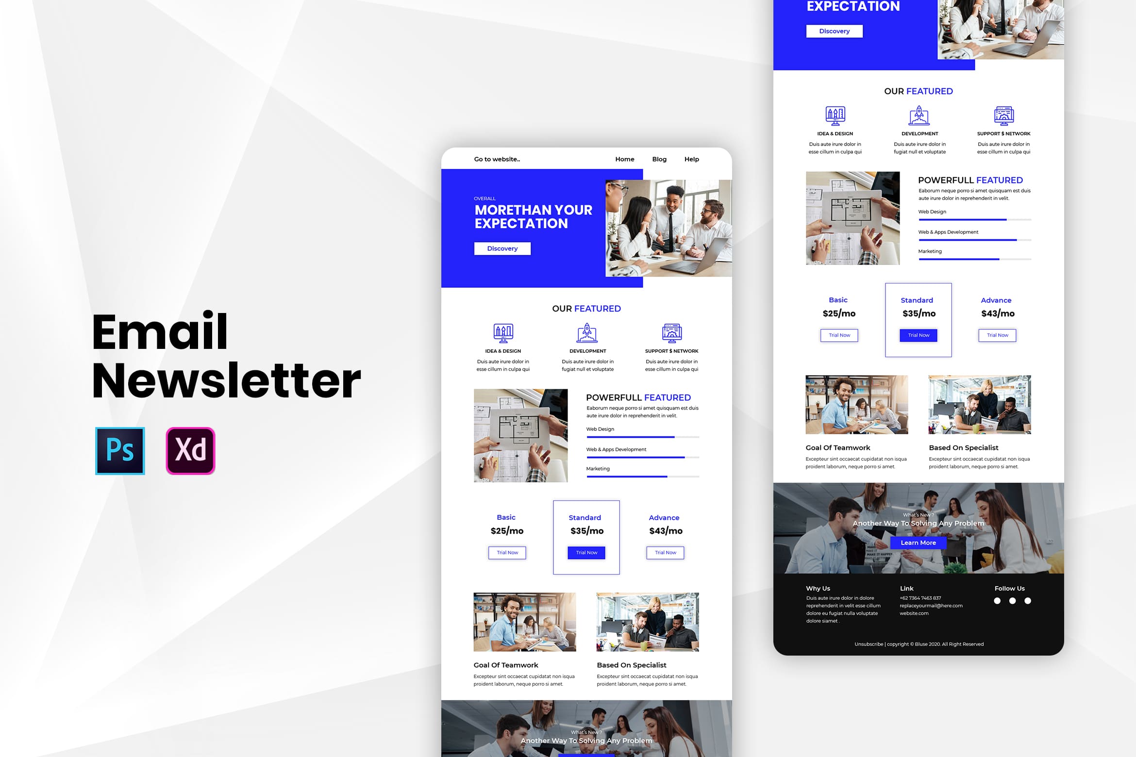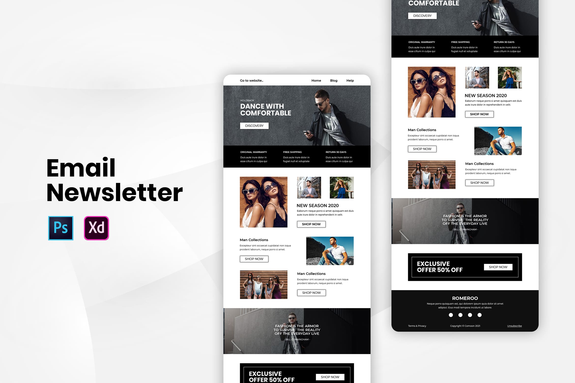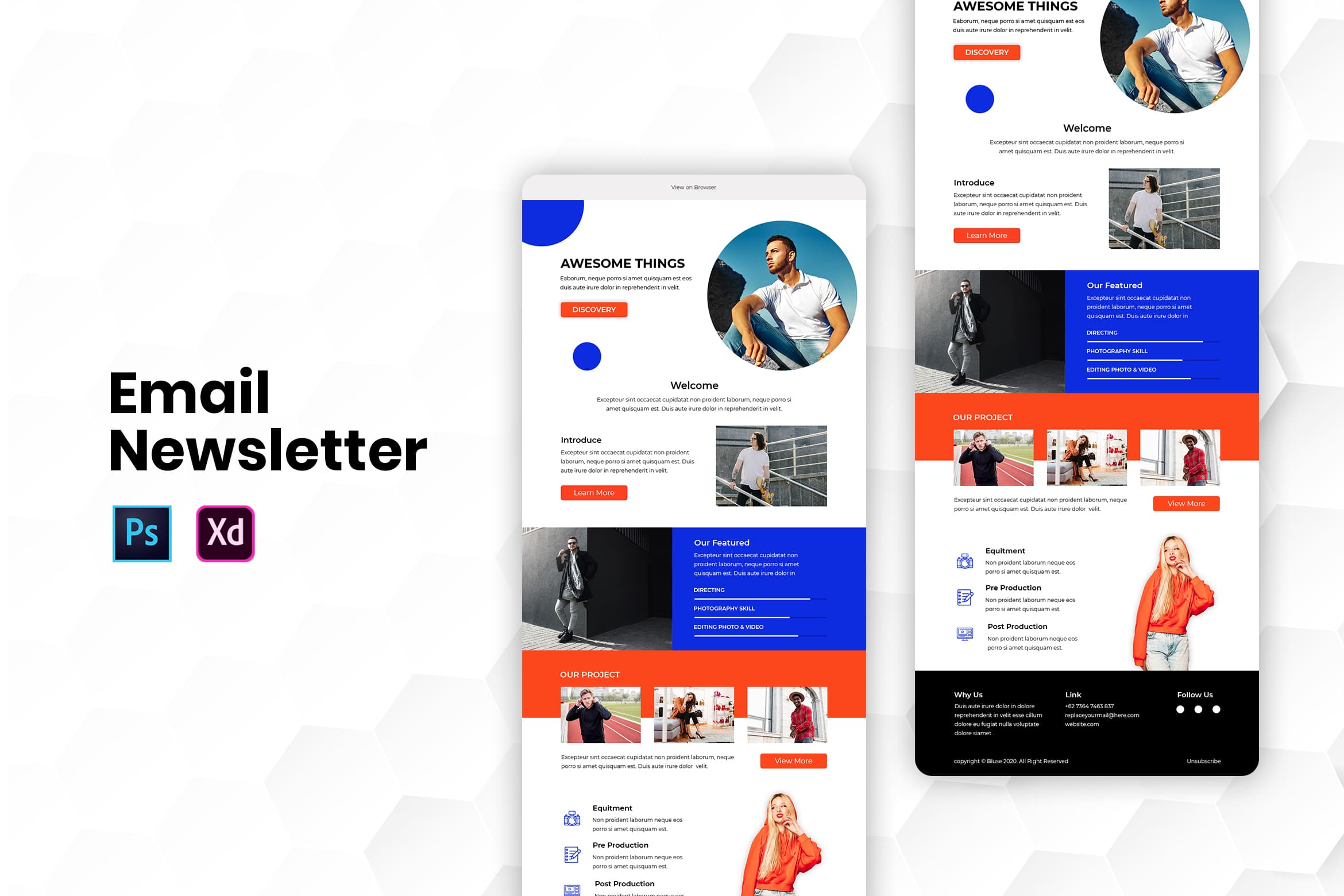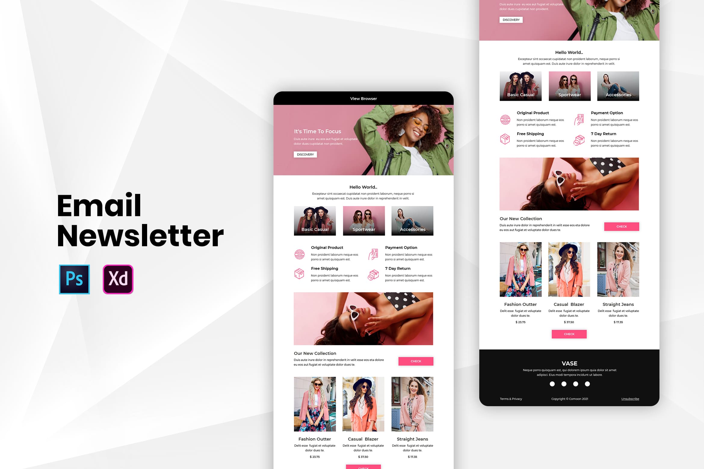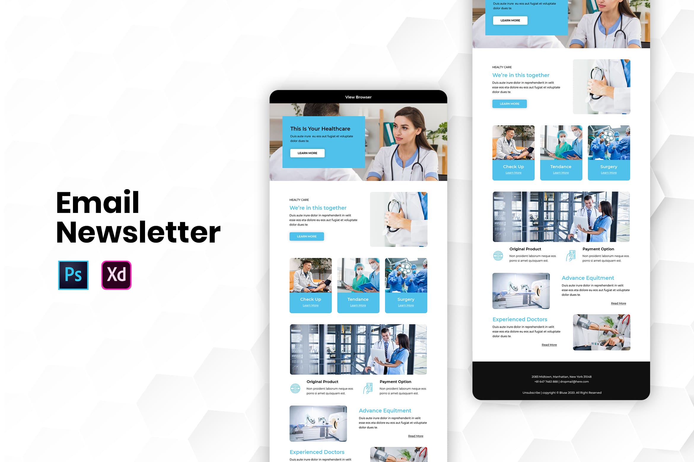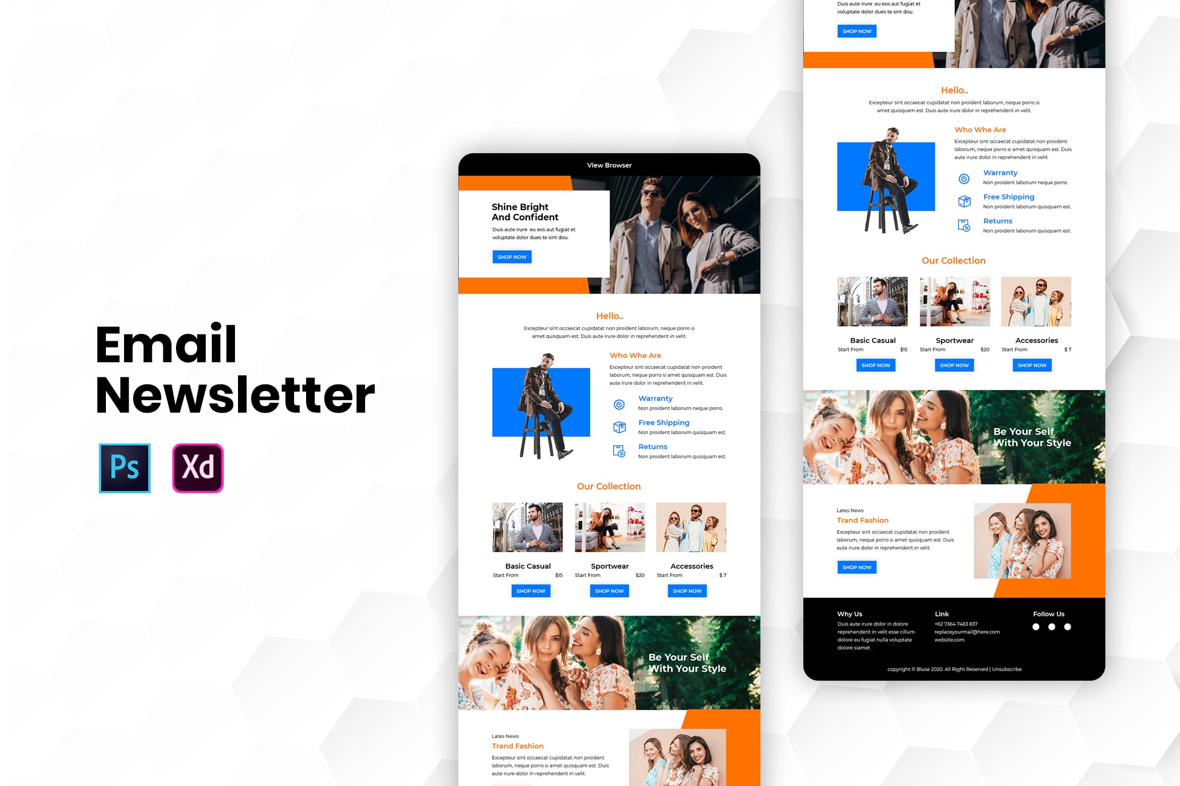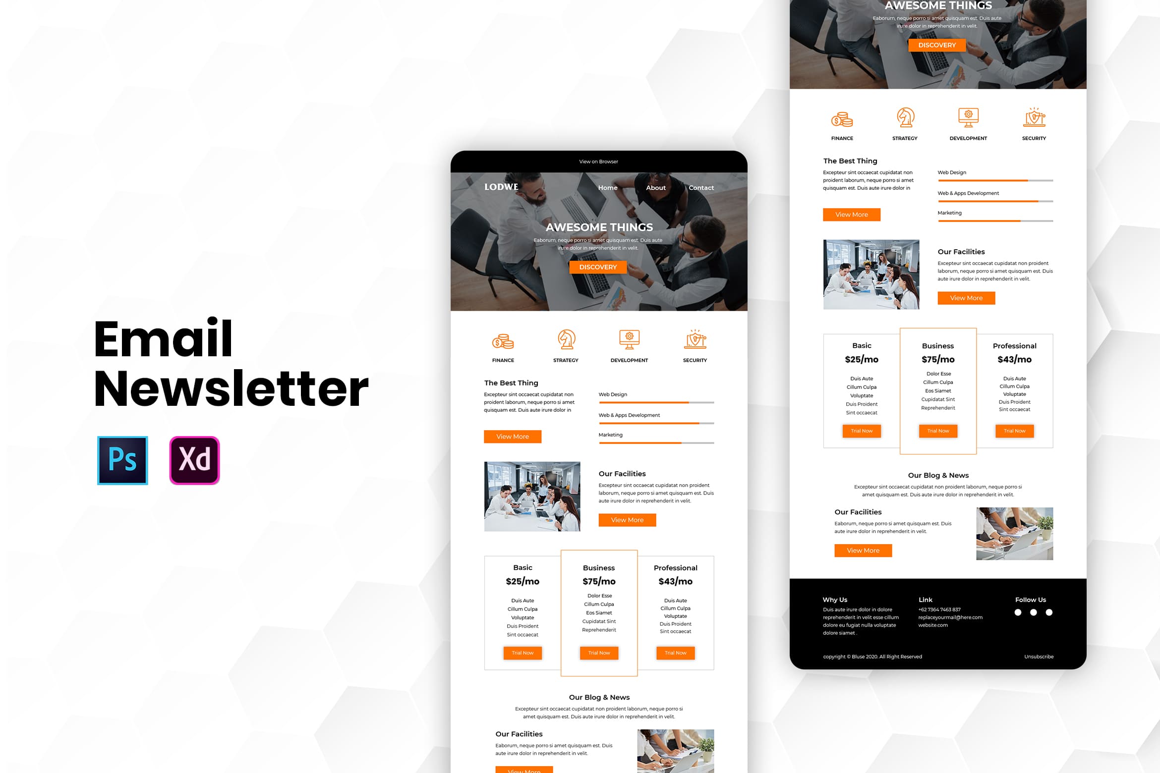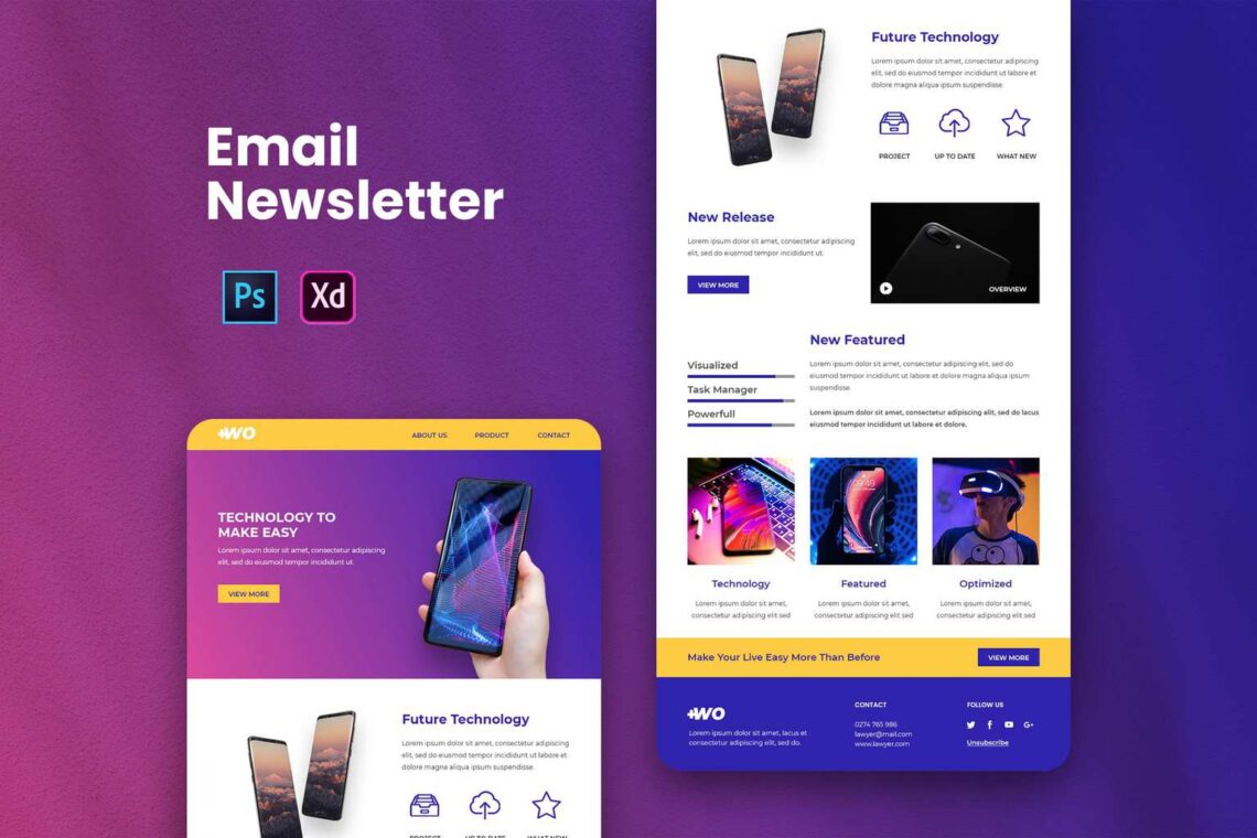
20 Email newsletter design tips and ideas will help you to keep engaged with your customers. Make sure they will not unsubscribe you after you follow these ideas. Promoting your business and gaining popularity. What to have in email newsletter design? font and images, sender name, branding, fonts, images, and color.
1. Make an Interesting Subject Line Email Newsletter design
Most of the customers feel that your email is spam. Therefore, the subject line should be clear. Make a variety of subject lines. It is to anticipate the bored feelings from customers. In addition, you could add emoji and make it mobile-friendly. Therefore, customers could access it anywhere and at any time. Sometimes customers would directly delete your email once they cannot open it on their mobile.
2. Use the Interesting Sender Name
It is better to not only use your brand name as a sender. Put the real name of your contributor and add ‘from your brand’. Build intimate communication with your customers by having known your customers’ names. Mention one by one of their name and you can use a system to help you with it.
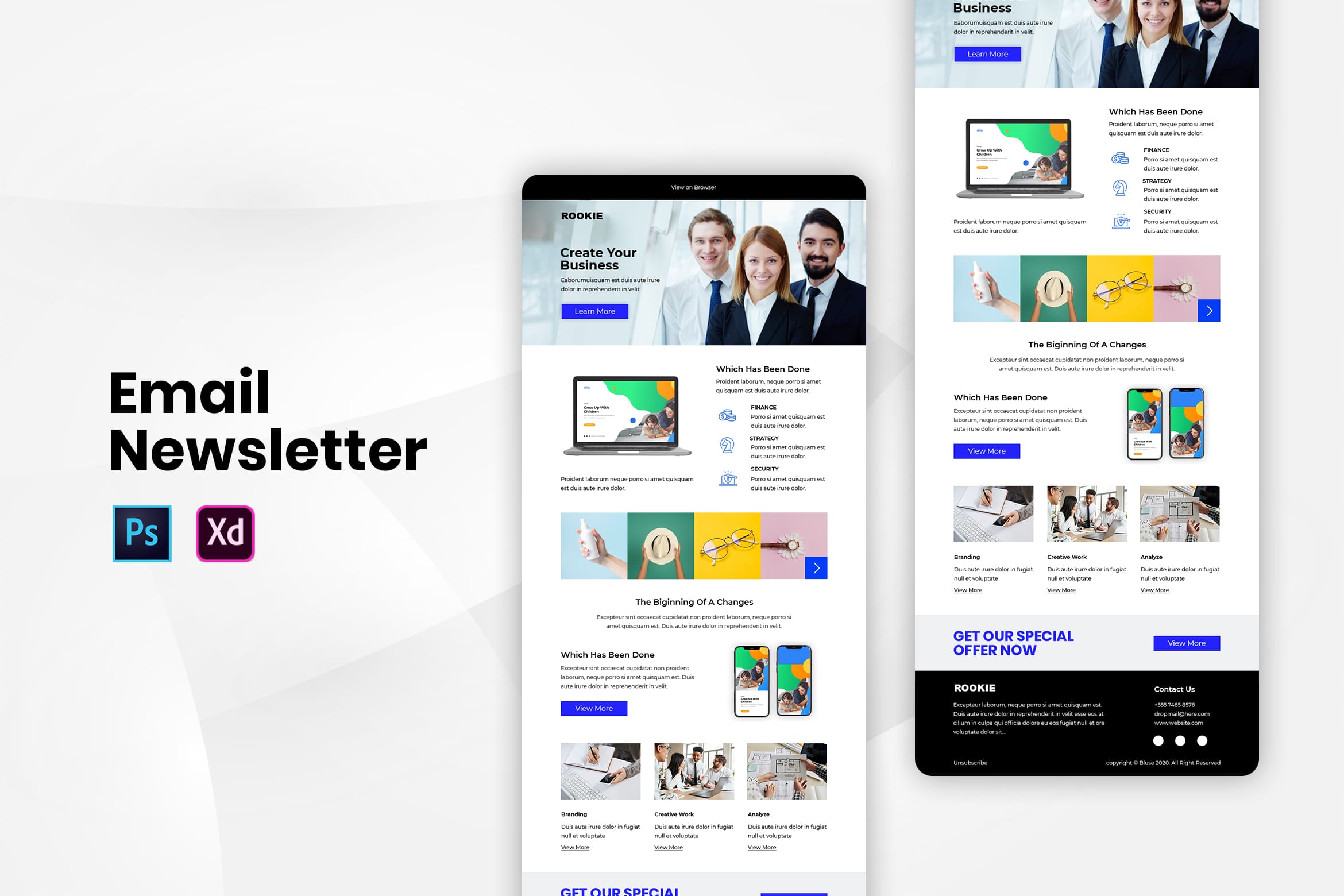
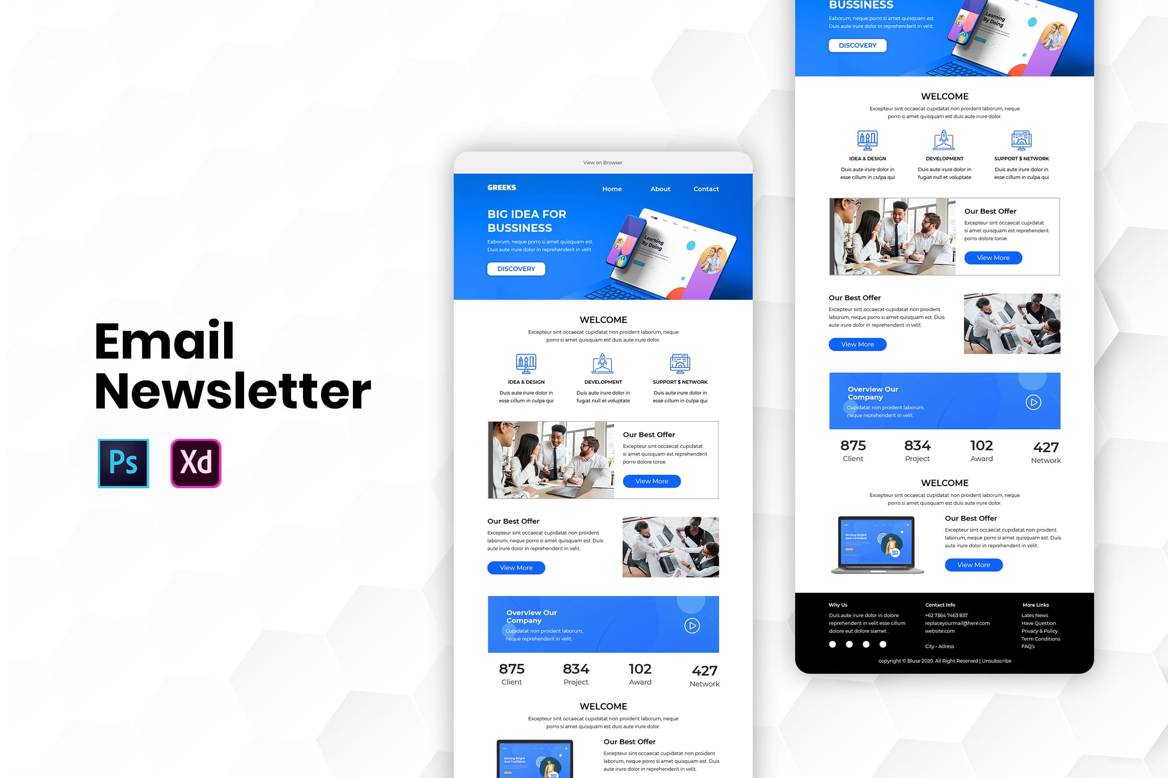
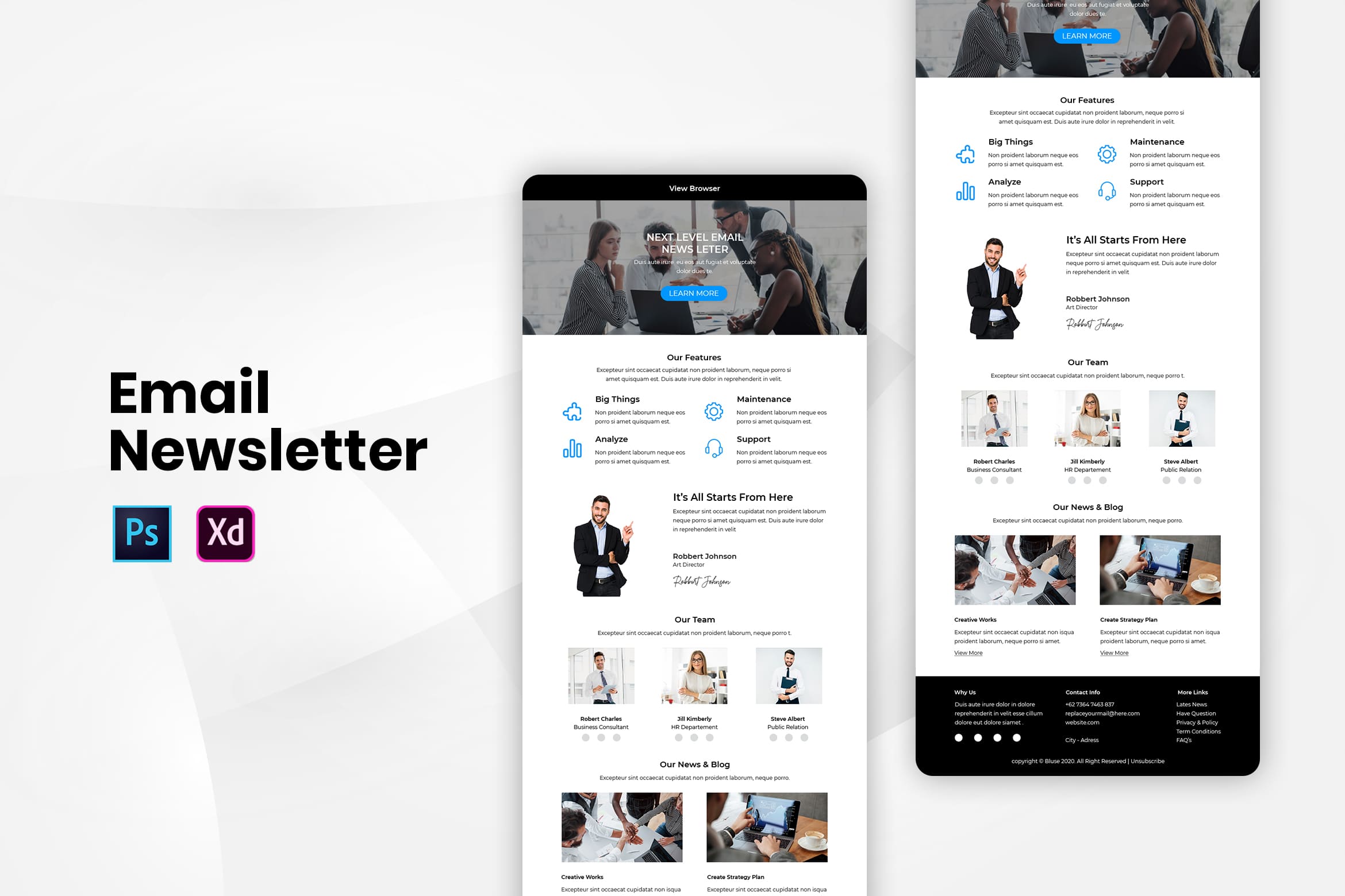
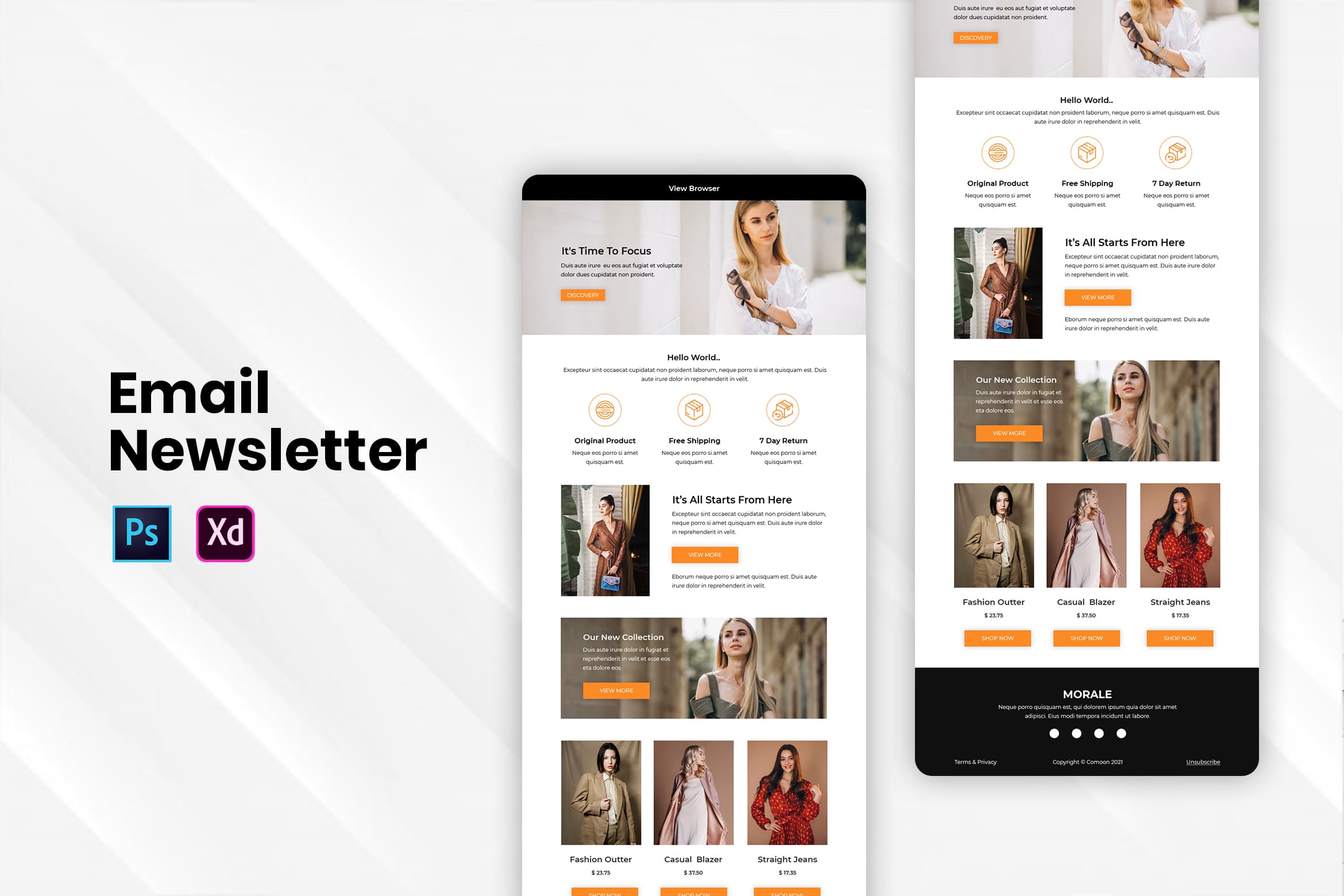
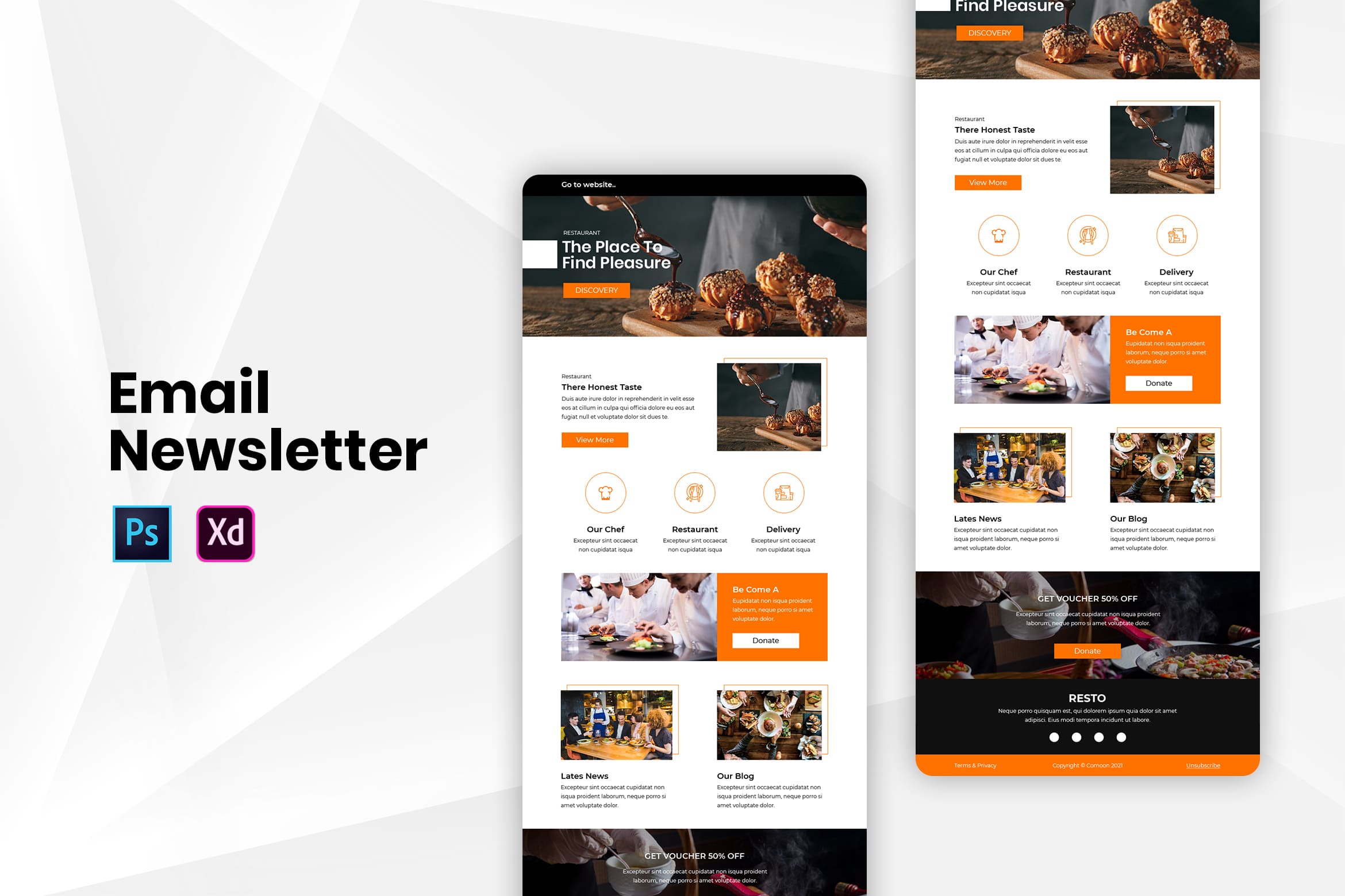
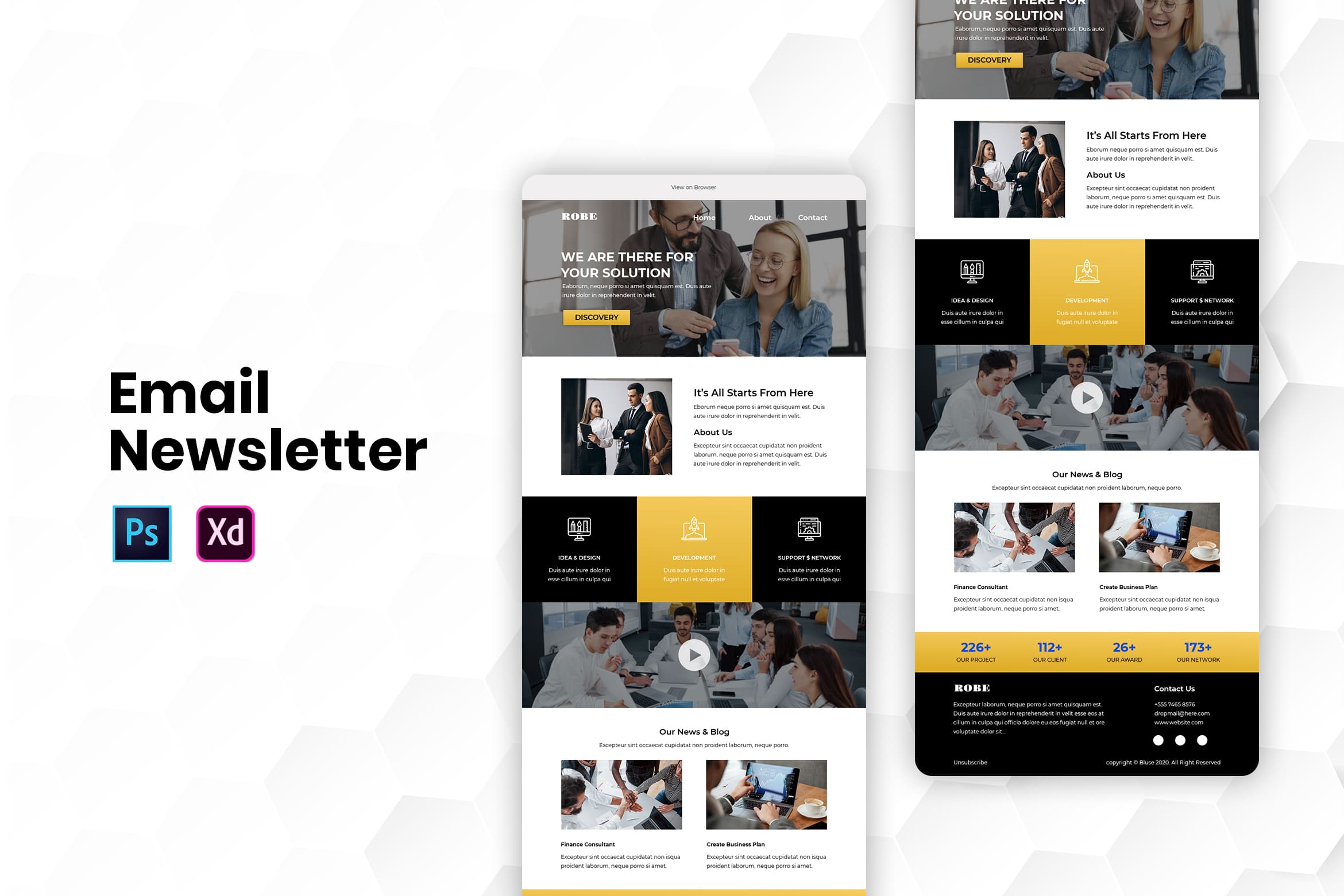
3. Finding the Suitable Email Newsletter Design Templates
It is not difficult today to find ready-to-use email newsletter design templates. You can find it from UICreative.net which is editable and easy to organize. Not only do you have to consider the color, but also the layout and content. Even to change it by the season, you could that as long as you keep stay tune on UI Creative collections. If you need a mobile-friendly email newsletter, pick the one from our company.
4. Brand your email with your logo or color
To help you look professional, this is what you could do. Make sure to put your company logo, similar color to your company brand, and more that help customers to identify you. Some customers prefer consistency, but some of them are not. They need refreshment from your email. Therefore, you should play a tactic on it.
5. Use Only Website Safe Font
Make sure it is readable and stick to the website. What it means is you should make it simple and not too many letters. Put the headline and body text in it. You could bold or italic it in an important point.
6. Select the Suitable Image if You Have to Insert it
Not all email newsletter needs an image. Therefore, before you insert an image, make sure the newsletter is good enough without it. Adding image sometimes make customers should wait a bit longer to display your whole email content. It is better for you to pick a related image and choose a similar background color to your newsletter background color. Therefore, it would be fascinating without damaging the real content.
Also Read : 20 Top Email Newsletter Design
7. Finding the Perfect Color
Color is necessary to influence readers’ moods. Therefore, you need to find an eye-catching color and place it in right place. For example, is you could place it in the headline or in the body. Put them in boxes and make the contrasting touch will be better.
Also Read : How Utilize The Best Anti-Mainstream Email Newsletter Templates
8. Simple Words and Short
It is not like you want to tell a story in an email. Try to make it simple and use an attractive and pointed headline. In addition, it is time to you to manage the content into something clear. Do not be too promotional and only share your best content.
- Boost brand awareness
- Adding links to email newsletters creates the potential for additional revenue opportunities
- Advertise a product, service, or sale at a lower cost than printing and distributing traditional newsletters
- Position your business as an authority in your niche through informative, long-form content
- Communicate more information than brief social media dispatches allow
- Speak to your subscribers. You do not have to be online or available when the newsletter goes out
9. Scannable
Do not ever think that the whole people would read your email from the top to the toe. It means you need to make it scannable by using a clear headline and image. People, especially your loyal customers do not need to spend much time on reading it. They get what you want to share and the aim of the newsletter.
10. Make it Accessible
Not all people or your customers are used to reading email newsletters. For those who disabled to understand the content, you should prepare the tools. Make it readable and hearable. It is your time to handle this problem. If your newsletter isn’t mobile-friendly, there is a good chance it will never be read. It’s important to utilize buttons instead of links for improved touch screen click-ability. Because it is harder for users to click a link with their thumbs, recipients may be frustrated if they constantly have to zoom in to follow the call-to-action.
11. Recheck again whether your background image is really necessary or not.
Just leave it out if you do not need it. It is good when you could analyze how much you need an image for the background because it makes the email take a long time to load. Even if subscribers look forward to your newsletters, they may be too busy to read it all at once. You don’t have to reinvent the wheel with each send. Each month you should send your top-performing blog content to your newsletter subscribers because we know not everyone has opted into all of our lists. This also means we acknowledge that our weekly subscribers might miss a weekly blog email and will click on it later.
12. Rebuild the Mood With Color.
It is great if you could share a good vibe for everyone who receives your email. Immediately make a connection with new subscribers while your brand is still fresh in their minds and stick to the commitment. If you wait too long to send a newsletter, you risk being irrelevant, and this can impact the long-term viability of your list. Design elements that complement your brand aesthetic. Your newsletter is an extension of your brand. So, the choice of graphics, fonts, and white space in the newsletter should also be in keeping with your brand aesthetic. Even if your brand aesthetic is zany and fun, you want to keep images to a minimum and leave enough white space in the newsletter to keep it readable and free of clutter.
Also Read : 20 Email Newsletter Design Tips and Ideas
13. Make the Text Short.
Your aim is to make customers engaged with your content. It is better to use only maximum of 200 words for it. First, lead with a great headline. You need to share the best content and avoid being too promotional. Whatever type of content you choose, it should be timely and relevant on some level to your business niche. The tone with which you communicate to your subscribers should also be in keeping with the brand voice you use in other marketing communications.
14. Remember that Newsletter is to Build Brand Loyalty and Credibility Beyond Subscribers.
Consistent content engagement is important. You need to know how many people would click your newsletter. Email newsletters are a principal marketing tool to maintain a relationship with people who are interested in following your business. To that end, an email newsletter can serve several purposes, including to:
- Communicate a sale or discount on products or services
- Communicate upcoming business events
- Share important business news
- Send greetings
- Request feedback
- Share new or updated products or services
- Express appreciation
15. Original Copy Should be Included.
Email newsletters can also be a stand-alone resource for subscribers to get valuable information related to your product or business without having to leave the inbox. The primary goal of a newsletter is to build a following and credibility for your brand. So, you should use it as a separate editorial channel that provides unique value beyond just directing traffic to your site. Readers don’t want to see another list of links in their inbox every month.
You do not have to tell a story sometimes.
You can ask subscribers for a journey to go with a mix of text, images, and other media equipment. email newsletters do not size themselves when you send them to subscribers. But because everyone opens their email on their device and email service of choice, how are you supposed to know what size or resolution they should be? How about 600 px? How about the height? The email body is 30 px. Email clients with sensitive spam filters might take notice as well. As a general rule, try not to make your email recipients scroll for more than a second before reaching the end of it.
16. Hierarchy of Calls
You should understand that an email newsletter is like a digital newspaper. The main story should be headline and CTA or calls to action must be considered very well. Engage the readers to keep reading your newspaper till the end. Making your calls to action easy to find gives your subscribers multiple opportunities to connect. And let’s face it: everyone likes free stuff. If you’re a publishing or media company, it might be an offer to gain early or exclusive access to new featured content. If you’re in lead generation, you can provide a link to your latest downloadable content at the top of the newsletter. Whether it is an eBook, cheat sheet, email series, video, blog content or coupon or discount code, your newsletter template design should be an invitation for subscribers to click on what the subscriber finds most valuable.
Also Read : How Utilize The Best Anti-Mainstream Email Newsletter Templates
17. Using Image for Engagement
Breaking up letters and making them more pleasing. The simple clean design and well-organized one could attract them to keep on reading it. Visual clutter is important but does not use too many links. It is because people do not like to open too many tabs on their mobile or desktop and it means your newsletter would end in spam. However you like to gather content is up to you, but great places to look for content are your company’s blog, social media accounts, lead-generation content, internal newsletters, and training documents.
18. Consistency Brand
If you already found a template, use it more than once. Using different layouts sometimes makes recipients get annoyed and unsubscribe yours. Once you have a goal for your newsletter, you will find content for it. Depending on how early you set your newsletter’s goal and how often you plan on sending this newsletter, you could be able to actively or passively find content in the time between two email sends.
Also Read : 20 Top Email Newsletter Design
19. Again, Place the Easy to Read Font and Color.
You may use creative color for your brand but balance it with neutral color around. Therefore, they would not look like a mess. Among various lighting conditions, it is better to make your email readable. Make sure you have got an idea of how your newsletter will look before writing a copy. That way, you will know exactly how much space you have to promote a piece of content. There are few things more frustrating than trying to squeeze copy into too tight a space.
20. Keep to Promote Engagement.
Motivate your subscribers could engage easily if you provide a promotion. Ask them to connect on social media platforms. The donation can be an effective way for the nonprofit newsletter. Allow subscribers to keep connecting on your social media. It great to build up your business organically.
Those are the Email newsletter design ideas to follow. We hope you could make your best email newsletter now and gain more loyal customers.
A good subject line determines whether or not your newsletter will be delivered, read, clicked, ignored, or marked as spam. Nothing is more engaging than your most valuable content being shared by your subscribers. Including forwarding links and social media sharing options within the body of your newsletter encourages subscribers to share things with their network. Keep noticing its development on your traffic.
Intuitive Unsubscribe option. You want your subscribers to read your newsletter because they want to, and not because they are being held captive. So, keep the “Unsubscribe” option in plain view. We cannot ask someone to keep loyal. Therefore, give them the free action to unsubscribe. I hope you want them to keep loyal, but it looks like you respect their choice.


