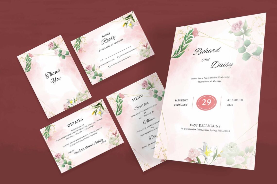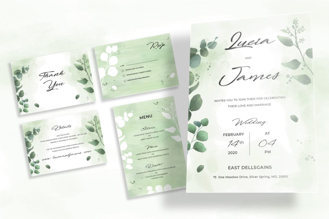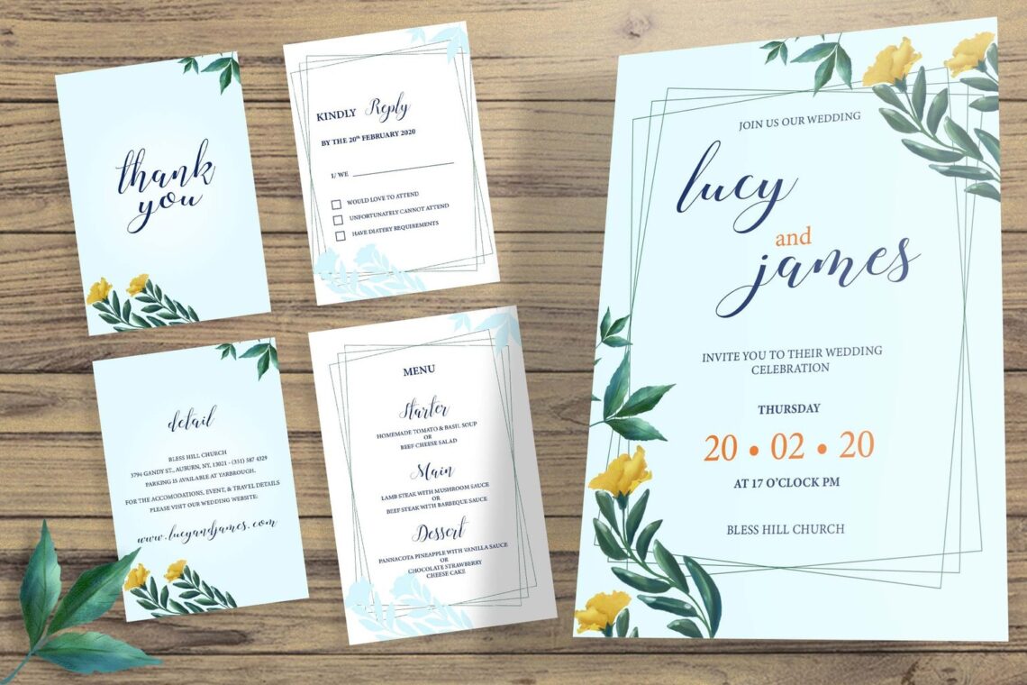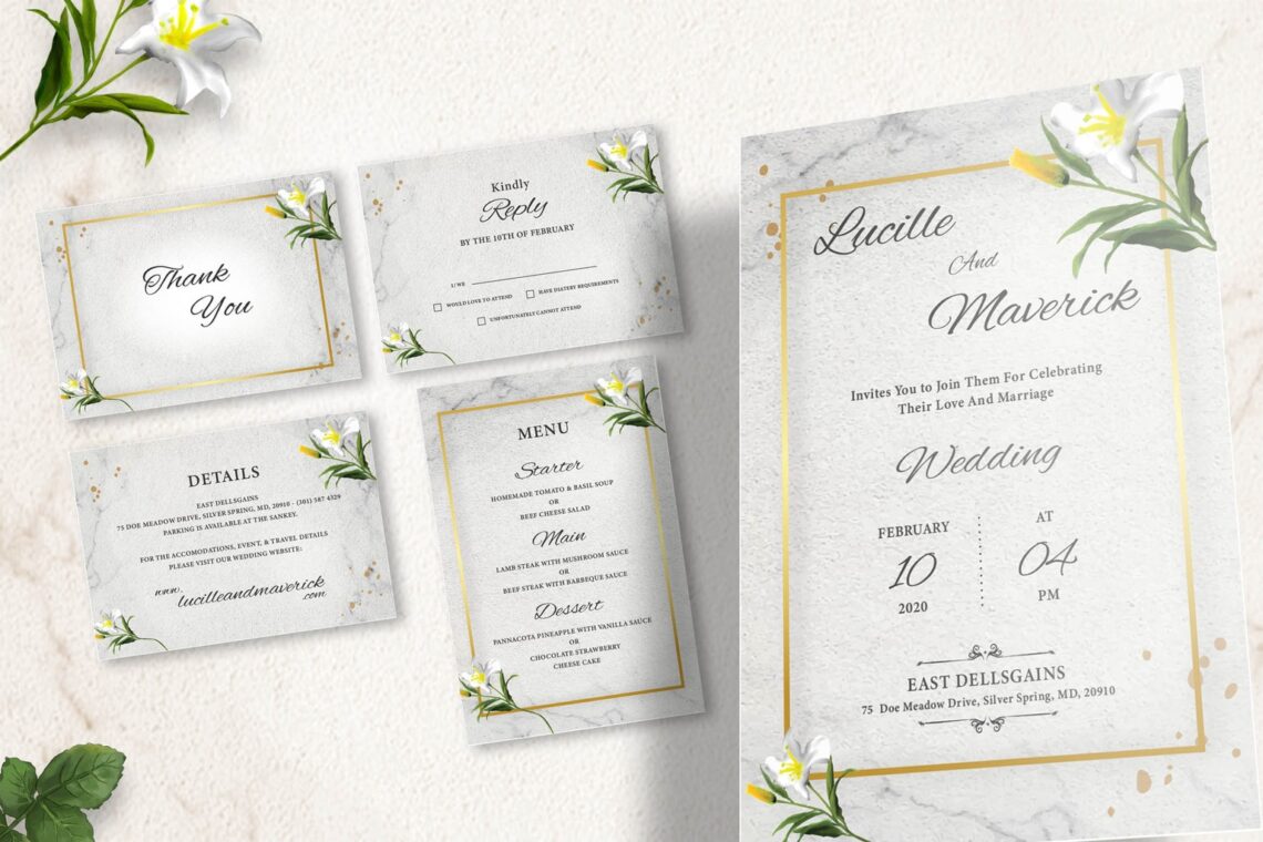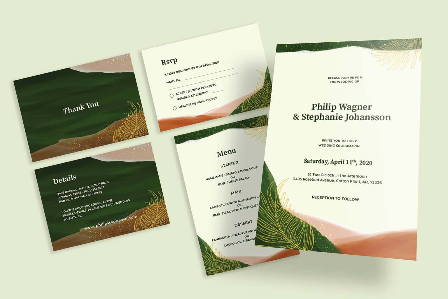
Wedding invitation should be an amazing and memorable item. It could be a different task depends on the wedding theme. Wedding invitation design might be a card or digital, but keep it in professional style. Trim your money by make your own design is a good idea. However, it does not always work well. For beginner, you should put extra effort on designing.
Here are 15 tips to create amazing wedding invitation design. It is simple to use by beginner of designer.
1. Select the Right Font
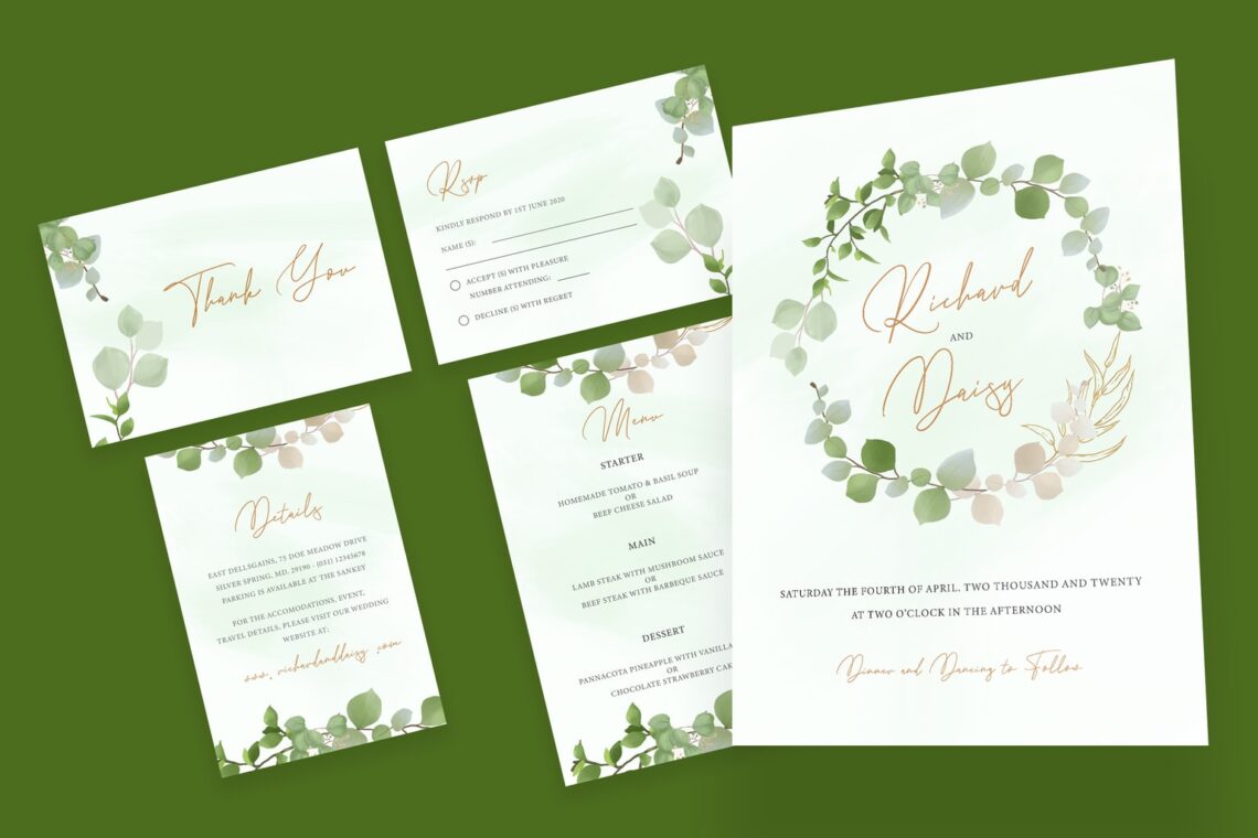
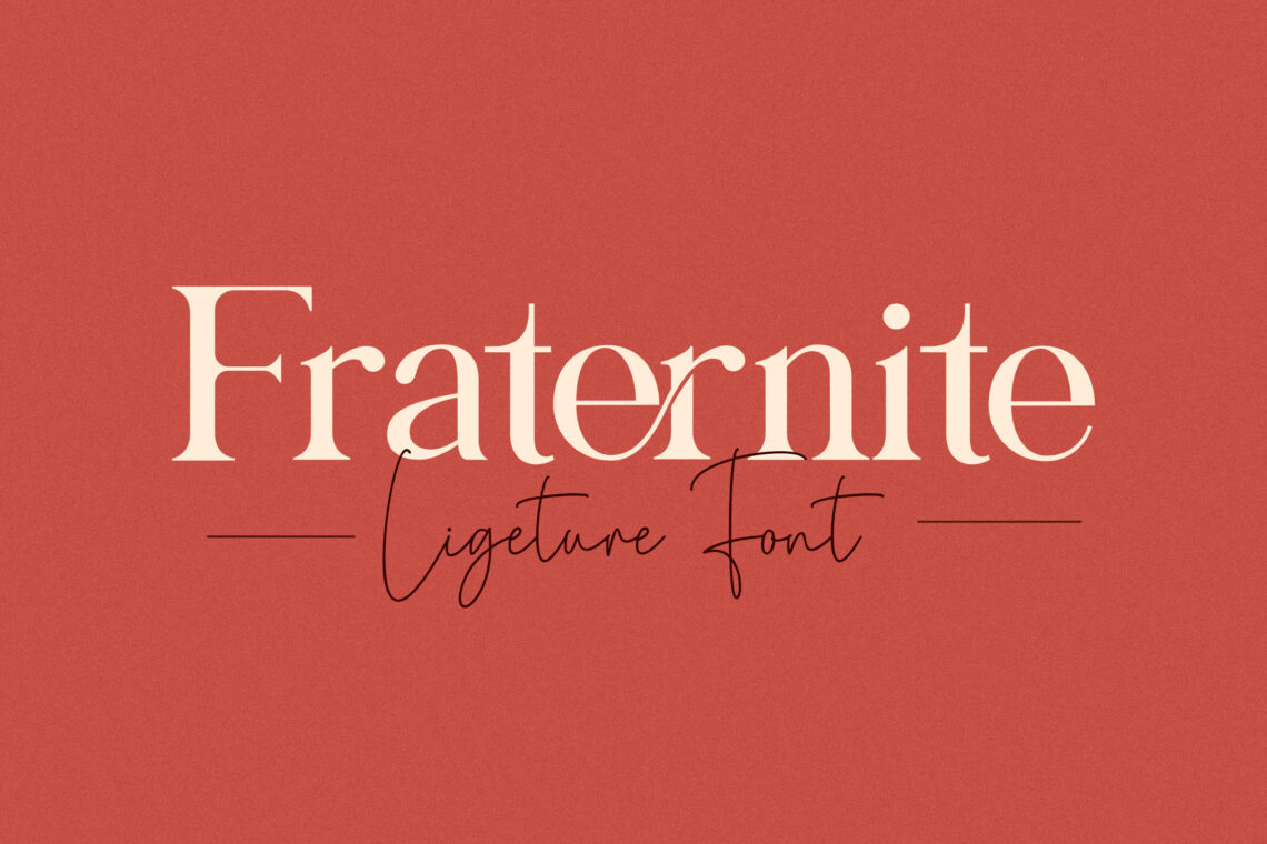
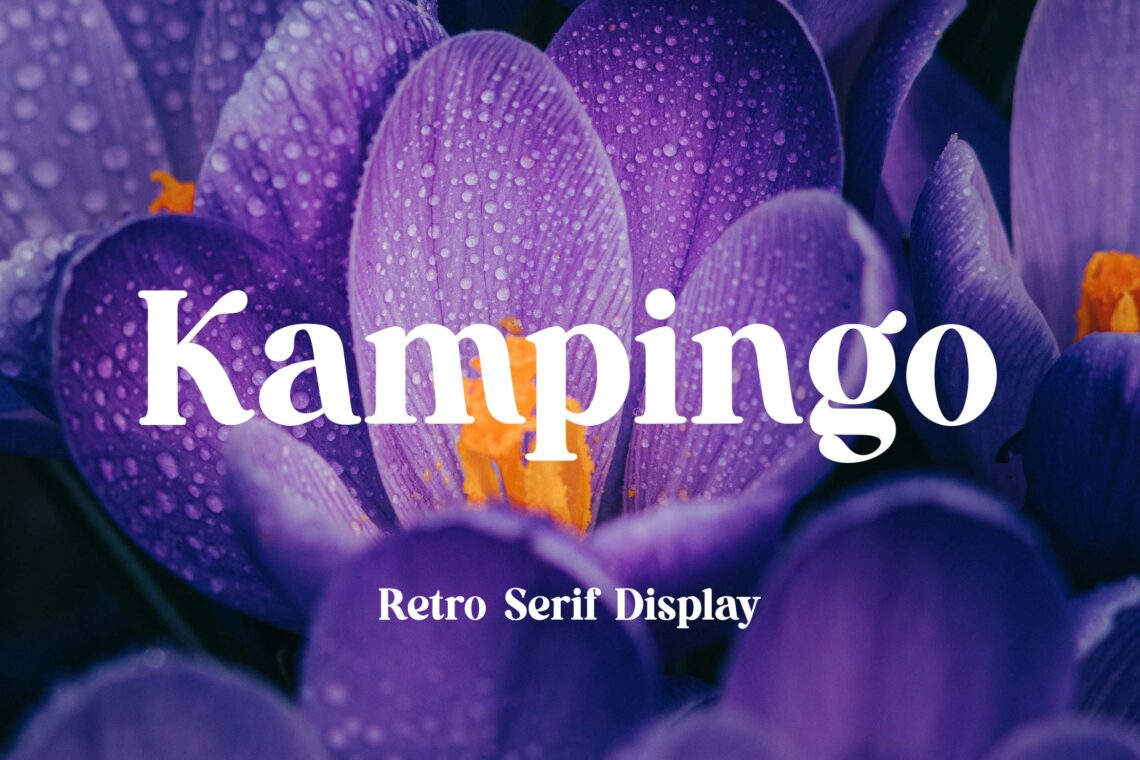
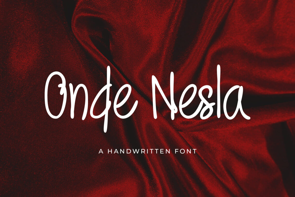
Welcome to the first basic step you should know. An invitation, whatever its theme should consists of readable font. Using too formal and sharp font avoid the feeling of romantic. What do you think about wedding? It should be romantic and soft. Even if you want to make it casual, make sure you insert signature style of font or handwriting. It good in eyes and leave polite and greeting sensation. This will give the classy, sophisticated look you are going for if you select sans serif style. Limit your font choices to two at most. It is not unusual to have a wedding invitation with multiple fonts, but using more than two can become overwhelming to the eye.
2. The Size and Shape of the Font
Traditional size and shape is welcome, but you may try to have modern shape too. Circular and square will look good especially if you can use a bulky shape. Sending out invitation for many people is challenging. Think about the cost. When you use bold shape, it needs extra ink. Although it depends on paper type you have chosen, make sure you know how to deal. When you want to add text over your image, you come to the clear image. Do not miss the message you want to put on website. Eye catching and cluttered come from landscape style background image. Keep them minimalist like cool tone colors, black on white text pages, simple graphics, and simple tone of elements. You can bring your website looks professional and attractive.
Also Read : Wedding Invitation Tips and Ideas
3. Checking Colors and Patterns
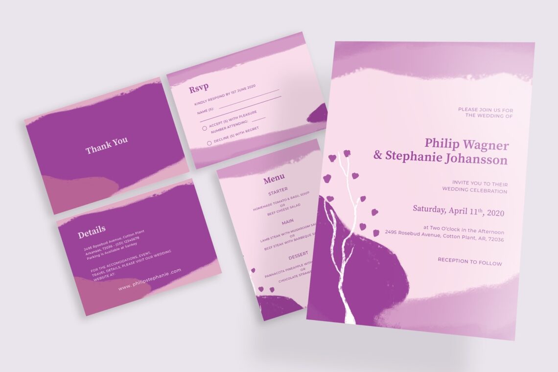
Change the color easily but you need to concern its matched to the font. Creating a boredom is a fatal mistake. When light color of font meets to light color of background or a dark color of font meets to dark color of background. This rule is a basic too. Anticipate the difficulties to read, notice, and knowing the name of groom and bride. Choose only maximum three colors. You cannot make it looks to busy. Contrasting color like what we already discussed should be consider well. Make the same color of wedding invitation, RSVP, and save the date. Background, font, and elements need the same or similar tone to go.
A timeless choice is white website backgrounds. The full body backgrounds need impression to make huge impact. The body background in gradient, solid block of color, and full image would execute the website appearance. Therefore, you should make sure if the image is not too bright. The most important thing is users could read the content clearly.
Adding layer masks or use CSS would help you to make image becomes readable. If it is not help you more, you can try to choose the right font type and its size.If photography is not suitable for your website, try to use illustration. However, make sure the color aligns with your invitation
4. Decorate the Card
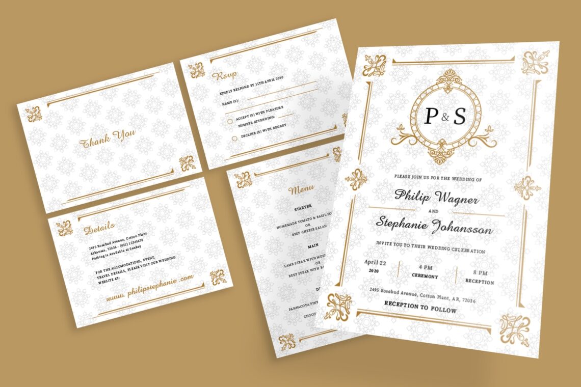
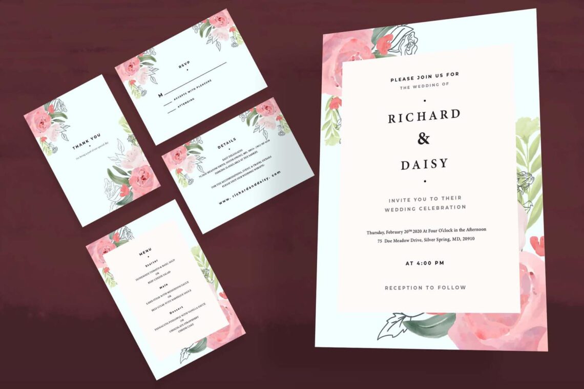
Elegant, traditional, and modern are three designs you might choose to be used on your wedding card. Conventional design is suitable for all. To add glamour touch, add glitter as the borders or frame of the card. You are able to deal with any decorative style. Just make sure people will appreciate the design. Decoration is also for illusion background. navitations these days can be incredibly detailed and have many additional pieces and stylistic elements outside of the invitation itself. Consider embossing, adding ribbons or bows, using confetti, or adding glitter to your invitations.
Also Read : 15 Design Tips Create Amazing Wedding Invitation
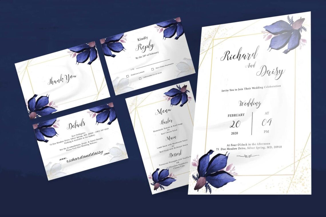
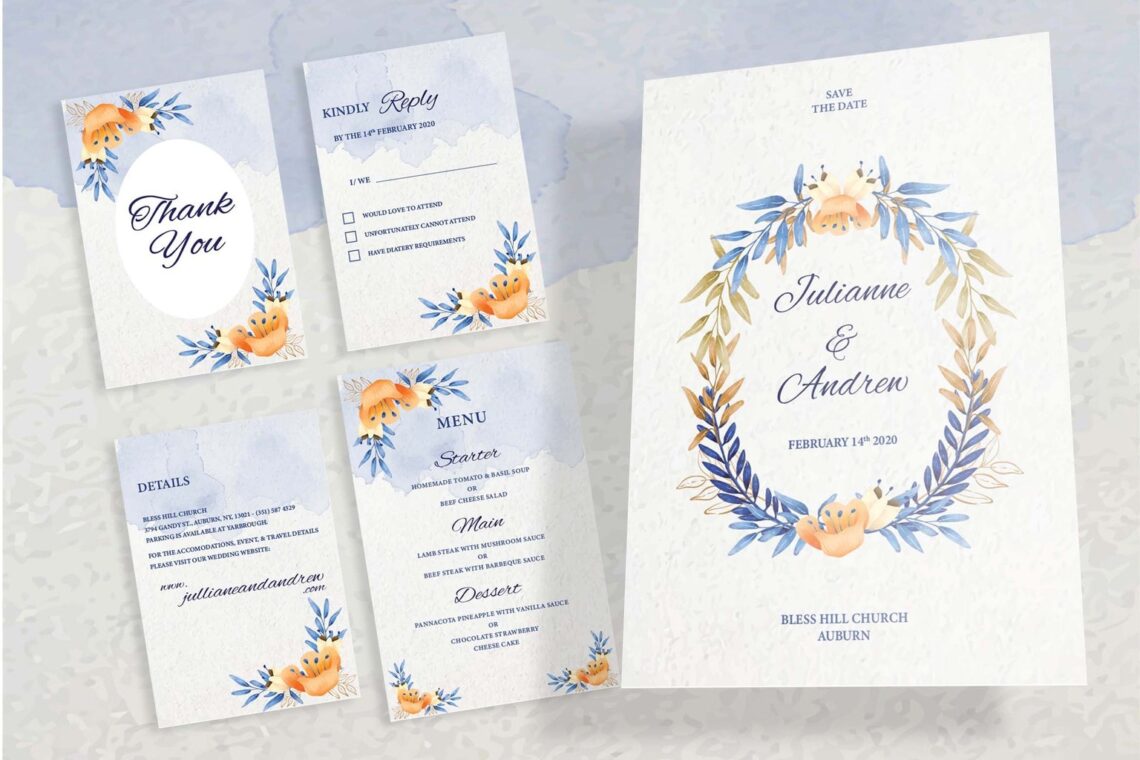
Wedding Invitation – Elegant Blue Flower
5. Early Design
Since wedding needs lots of preparation, you are better to decide the design early. Once you have chosen the design, later you will be easier to concern the structure and planning of the card. It takes much effort if you design it by yourself. However, when you could ask for professional to make it, it takes less time. You still have a choice to buy it from UI Creative since the design is ready – to -use design. It is editable and you may print it in CMYK color. How about the price? It is very affordable! When it comes to the background, you need to consider it seriously because it affects your wedding theme. Fun wedding needs fun color like gradient. Formal comes with white or soft color.
The wrong color contrast make the website difficult to read, especially the content. Before you go, check the contrast ratio first. In addition, you should remember that a solid colored background will be the most basic type and the default basic color is white. It is very clean and sleek.
Maybe you need combination colors, so you need colors that complement each other. It is important to pick theme colors that go together. You may start with black, grey, and white. In color theory, there are three color categories. Primary, secondary, and tertiary. Business person should notice it. Mixing light or we know it as additive color mixing model helps you to create various intensities.
CMYK (Cyan, Magenta, Yellow, and Black) will suit to printers and screen. If you use red, green, and blue, they would result in inaccurate color, especially if you print it. Complementary colors make imagery pop. However,if it is used too much, it would be tiresome.Analogous color in brand is not only peaceful eyes, but also effective to instruct the visitors to take action.
Triadic color makes visual contrast and harmony simultaneously. Each item would stand out.Branding and marketing are two key points to play with colors aim.
6. Avoid Clumsy Style
Input too many elements, decoration, and symbols in the card will make it clumsy. Get positive suggestion from professional about it. Since it is for wedding, the design must be elegant and semi-formal or formal. Avoid to put not important information. Incorporate all the things which could annoy the invitees to the marriage venue. They should blend together into something recognizable.
7. Do You Need Floral Decoration?
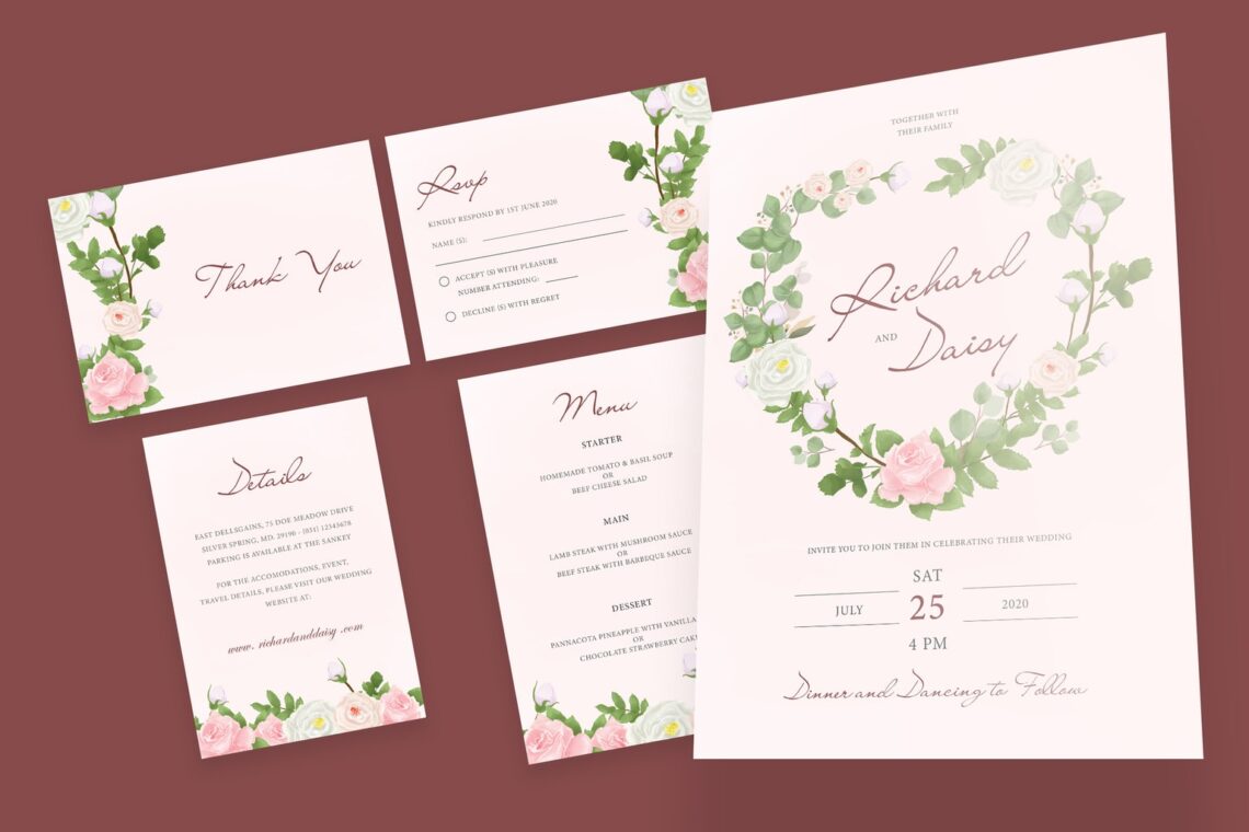
You may abandoned floral motifs. However, it means you should pay to the new floral decorations. Browse more about it to get more ideas. You are better to try to have unique floral style. Ready or not, being innovative and brave in design is something that you should give a clap.
8. Think about the budget
When it comes to the budget, remember to fit it. Wedding is not only about the invitation. It is about venue, wedding dress, make up, food and beverages, host, and more. Therefore, try to calculate it in detail.
Also Read : 20 Best Wedding Invitation Design Templates
9. Proof Checking
If we made anything in writing, we need to do proofreading. When it comes to design, we need to proof checking. Before you print, ensure the design is fix. The color, font, content, and information are no errors. Therefore, the readers will not get confused or miss perception.
10. Classic form and Designing the envelope
Short and experimental design is more risks than classic style. Therefore, try to use classical if you are in doubt. It does not matter if you only have a little knowledge of it, but make sure it makes sense. After all, the envelope should be in tone with the wedding card. There are hundreds of different envelope styles on the market, many specifically designed for wedding invitations. This part of the process may not be able to be hand-made, except for the most adventurous brides. Find envelopes in the right size, shape, and color online to match your invitations.
11. Organize The Sections
Put this point as important aspect too. Wedding invitations have three parts. The wedding invitation, save the date, and RSVP card. Which one do you want? Here are the difference:
a. The save the date includes announcement or engagement and marriage. The date and time of wedding, the couple name, and family name. In this type, you do not need to put location and any details.
b. The wedding invitation. At least you should sent it out six weeks before the wedding date. The information includes the location, date and time, and the name of couple. You are able to input more than just basic information.
c. The RSVP card. it is smaller card. you sent it with invitation. Although it seems not usable, but it is helpful. It comes with an envelope and recipient would tell you if they would come. The number of guests and their preferred of dishes also will be send back to you. It is good information because you can prepare everything in right amount.
12. Now, it is Time to Make Guest List
How to organize it? Make a spreadsheet of it. Highlight the name of RSVP guests. It is good for you to know it because you could estimate the amount of not confirmed guests yet. You need to check the amount of the guests who need special invitation like online invitation because they live in rural area. On the other hand, some of them might be use different language. it is your time to translate and prepare it left.
13. Concern the Language
You have a chance to choose language you used. Informal or formal wedding invitation has differences in some parts. For example is in couple name. Classic formal uses surname of the groom’s parent. Informal wedding use couple’s name. Again, do the proofreading to anticipate grammar and spelling error. Having the direction to the wedding venue is good choice to input. You could have more than one version. It is great to compare them and grab only the best one.
14. Having image on invitation card
If you want to put image, it is important to know how it would be put. Illustration, vector, and caricature can be your option than real picture of couple. How to print the large pixel of image should be thought well too. Too many images break down recipients focus. It is not suggested for you to put too many image whether it is real picture or not.
15. Choose your paper
Try to visit local craft or print shops. You may see different style of paper. Check the price and change in cost if you buy in bulk. You need to avoid matte and glossy photo paper. It is easy to get damage. It is less risk to use cardstock. Ensure you could cut the paper into your invitations size. Choose the paper with individual layer, especially if you desire layering pieces of paper.
Now, how you want to print them? Print it at home or go to a print shop? Save much money by designing it by yourself and print by yourself. Your printer should be compatible, if you want to print it at home. You also may call multiple print shops to get estimated costs. You should print them in accurate size. Do not waste time and money to do it more than once. only because of mistaking printing.
Assembling invitation, yes you need it. Do not only lick and sealed the envelope, but use wax seal and sticker to make it more valuable. Write down the address or print stickers for it. Whatever it is choose and give the best style you could have. The last thing to do is send!
After you know the tips, it is better if you start to practice. Whatever you want to do, explore your creativity. Do not stuck in one design. It is your turn to have your wishing wedding invitation. Make it memorable and people will not directly move it into the trash. UICreative will help you to find the right wedding invitation design template that suits to your wedding theme. Are you ready to browse more?


