How to find the font of a logo? The typeface that a firm chooses to use for its logo has the potential to become a piece of lettering that customers associate with the brand. Consider the logo font used for Coca-Cola, Disney, and even eBay. There is a close relationship between those typefaces and the brands they represent, even if the brand names are not there.
That is important to consider which font will work best for your company’s logo. So how do you do it? Here is a list of ten guidelines that can assist you in selecting the most suitable font for your company logo, along with some examples of logos that showcase outstanding typography. Also, we have some logo font ideas you can get on the UICreative.
1. Adjust the font to reflect your individuality
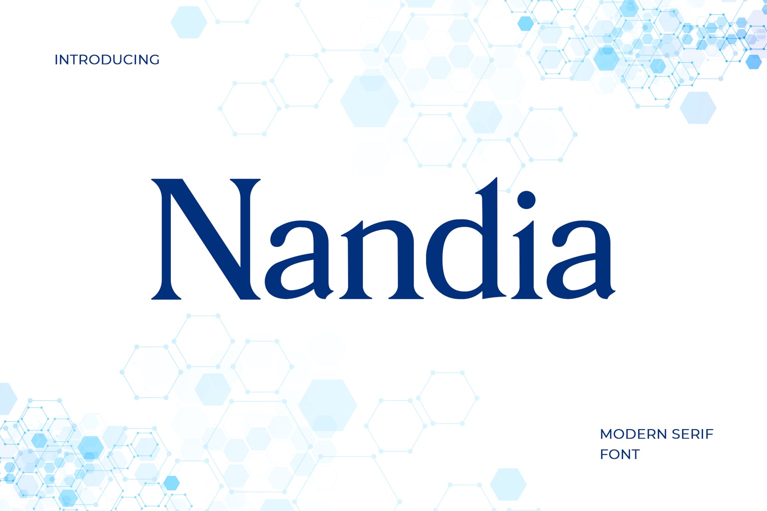
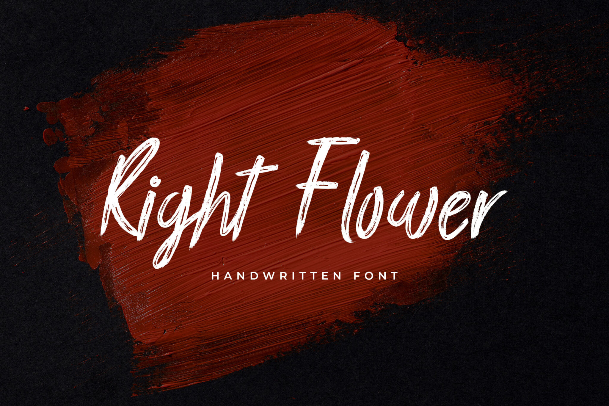
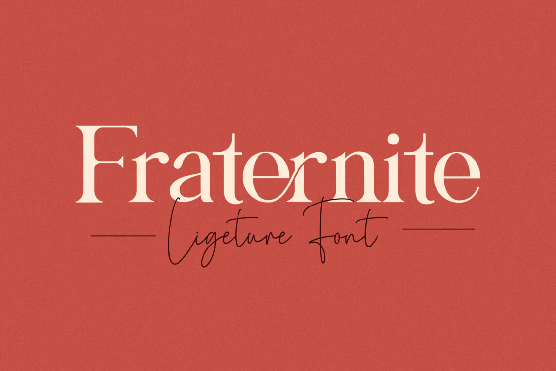
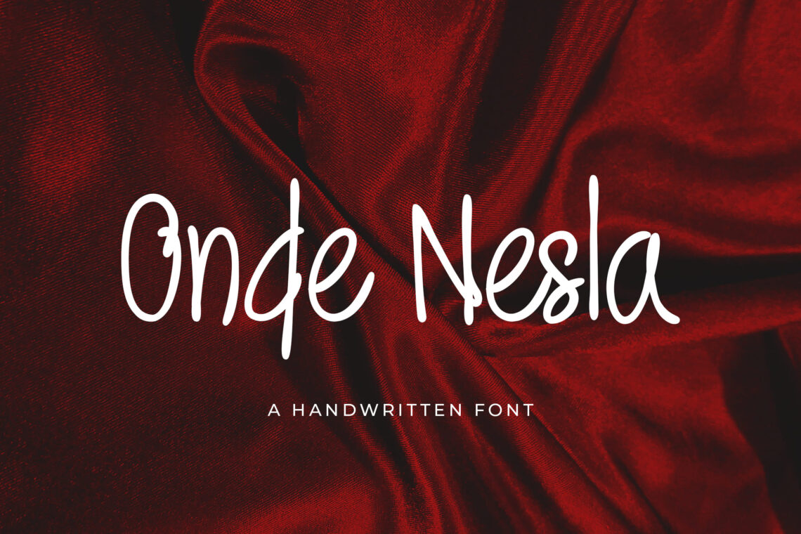
So, what font is the office logo? It is essential to search through available fonts for a logo design to pick a typeface that is congruent with the character of your company. You can begin by selecting a type category to use as a broad guideline, which includes:
- Serif: Class and traditional
- Sans serif: Modern, simple
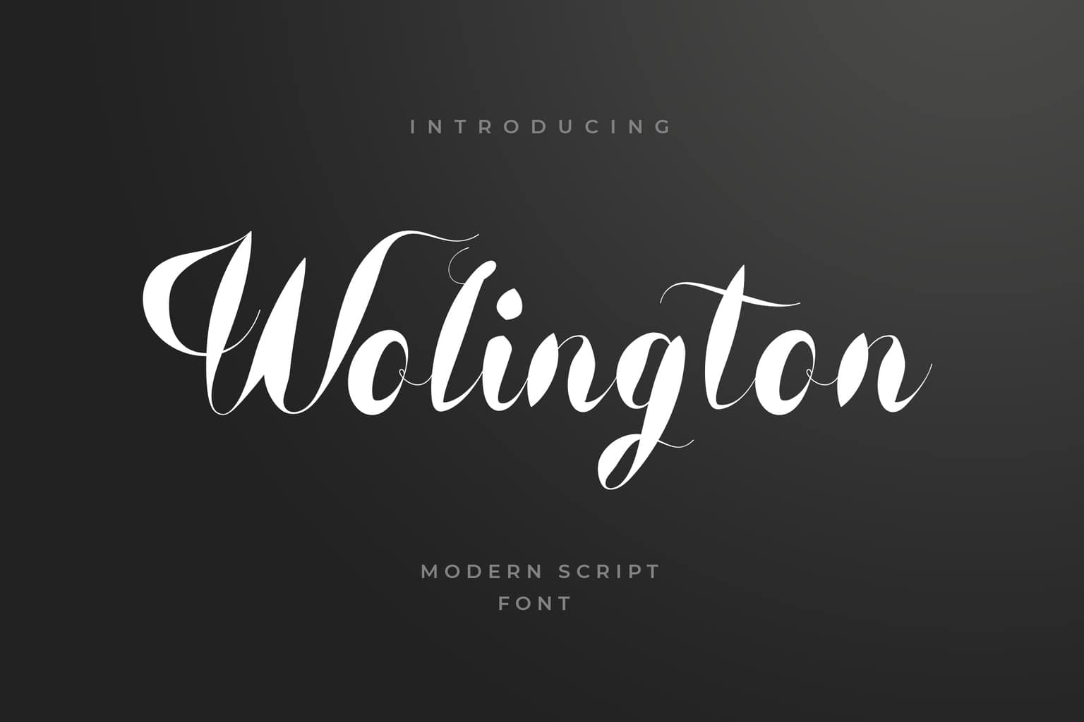
- Script: Feminine (most commonly), elaborate
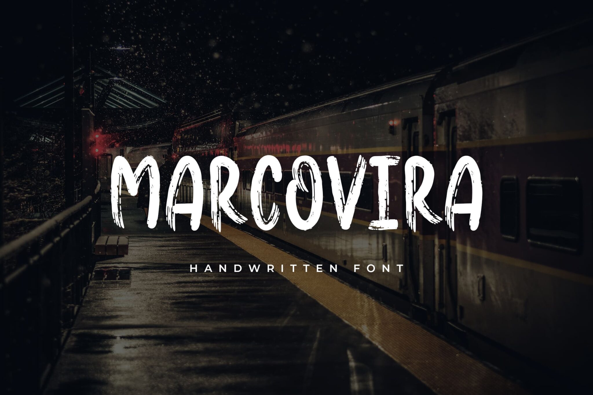
- Novelty: Funky, unusual
2. Steer clear of trendy logo font
When selecting a logo font for a company, it is preferable to steer clear of highly trendy typefaces. There is a good chance that you will desire to keep utilizing the terms in your logo for a considerable time.
If you use a logo font that is now trendy, your design may quickly become out of date or lose its “trendy” charm.
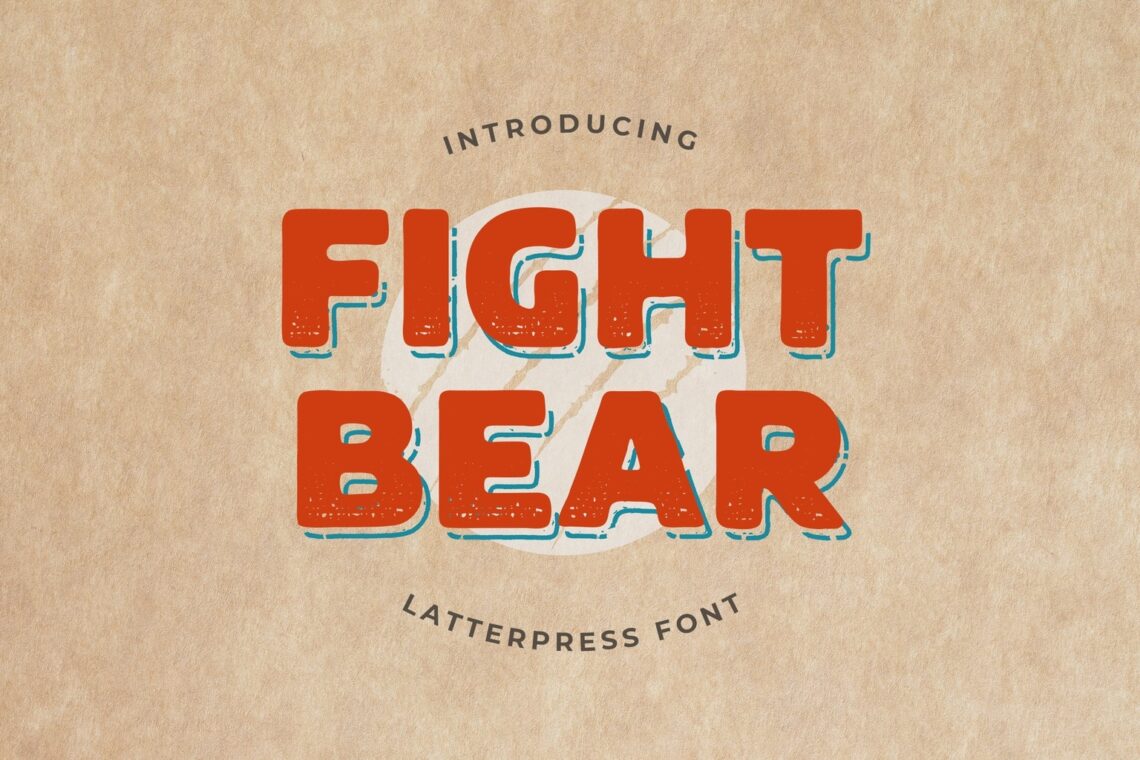
Choose a typeface that’s been around for a while in the trend space if you’re looking for something that has a more contemporary feel to it. One of which, choose bold logo font for your company’s logo. Better still, choose a typeface with traits you enjoy from something trendy but avoid selecting the identical font.
3. Think about creating your unique logo font design
Several fonts have become synonymous with a particular brand because they were designed specifically for that business. This can be a terrific choice if you have sufficient time and money to create something unique.
A personalized typeface for use in a company logo is something that is uniquely yours. You won’t have to be concerned about competing brands using the identical component. And if you discover a typographer who is a good match for your needs, they will be able to design a character set that represents your concept for the logo.
This alternative may be worth considering, even though it may not be feasible for everyone.
Also Read: 16 Best Fonts For Logo
4. Make it one of a kind
Even if you cannot have a completely bespoke font created for your company’s logo, you may still look for a typeface with particular characters or glyphs that will give your letters a unique flavor.
To personalize your company’s logo font, you can also experiment with different techniques, such as filling letters or modifying the stroke or style of a letter. Many excellent character sets are available, some of which include bonus components as an integral part of the typeface bundle.
5. Test it out both in color and black & white
A good logo typeface should be adaptable enough to function admirably in color design applications and those that do not use color.
As soon as you have one or two potential typefaces in mind, begin with the lettering for your logo in black. Do you like what you see? If this is the case, you should also consider the color options. If the typeface of the single-color logo does not appeal to you, keep looking at different possibilities until you discover one that does.
Remember that you will probably utilize a logo typeface with just one color almost as much as you use color. Therefore, it is essential to maintain contentment with either choice.
6. Make it simple logo font
For your logo to be successful, you don’t need to use any wild, elaborate, or insanely distinctive font. The solution that is straightforward and uncomplicated to comprehend is most likely the one that should be chosen. (You do want people to be familiar with the name of your company or brand, don’t you?)
You need to use the Coca-Cola typeface again. Even though it is a custom script, it is pretty simple to read and comprehend. This is how you simplify things for yourself. On the other side, do you know F.R.I.E.N.D.S font? What font is the friends logo? That’s one of the best examples of a simple font.
7. Establish an effective connection on an emotional level
There is more to selecting a logo typeface than selecting text that looks lovely. It has the potential to forge the psychological connection that customers have with your company’s brand, product, or service. When selecting the ideal typeface for a company logo, it is essential to consider the emotional connection it will establish.
8. Research your rival companies
When selecting a typeface for your company logo, the last thing you want to do is select something visually identical to that of another business in the same industry. Do your homework.
Pay close attention to the typefaces, both in terms of style and type, used in your competitors’ logos. Choosing a typeface that is not similar to a rival is essential, even though you might be tempted to select a sans serif logo font as they use.
Consumers mustn’t confound your company’s name with theirs. Even if you use a font with the same general style, you still have a lot of room to choose something unique to reflect your company, and a script logo font can be one of your choices.
9. It’s all about the quality
For the design of your logo, you shouldn’t just settle for any old typeface. It’s all about the quality.
You need to use a high-quality typeface that can maintain clarity and precision at any point in the scaling process. The words in your logo on a business card or a social media symbol might be minimal, but they might be much larger than life on a billboard.
Any application might call for a different level of readability and comprehension from the typeface, but it must maintain its integrity.
10. Use only the font that is specified for your company’s logo
Choose a typeface that you wish to use for your logo and commit to using it consistently if you want your logo font to stand out from the crowd. You should use only a logo typeface for a logo.
Because doing so can lessen the significance of the font as a brand mark, it is best to avoid using it for headlines, body text, or any other area of the design.
It will make the typeface used for the logo more unique in and of itself and help it stand out among the other components included in the design. Because you will be using it less frequently, it will help you remember the typeface better for a more extended period.
Conclusion
Take as much time as you need to develop a font for your company logo that you adore. Do not settle on a typeface simply because you are pressed for time or unsure of what you want. It would be best if you got used to the fact that you’ll probably have to deal with this for some time.
When selecting a company’s logo font, the most significant consideration may be to ensure that the font embodies the character of your business and possesses a unique quality that sets it apart from other logos.
Also Read : 6 Tips How To Write Annual Report Template
Also Read : Tips On How To Use Instagram Post Template
Also Read : 10+ Digital Flyer Design Ideas in 2023
Also Read : 10 Simple Resume Template To Get Hired
Also Read : 7 Tips on Tattoo Business Cards Design
Also Read : 10 Tips Choosing Logo Font For Company
Also Read : 10 Steps How To Create White Paper Template
Also Read : 5 Things to Improve Your Magazine Design
Also Read : Tips on How To Make Facebook Cover Photo
Also Read : 10 Best Flyer Template For Your Events
Also Read : 12 Event Proposal Template To Growth Business
Also Read : 10 Best Script Font for Logo and Branding


