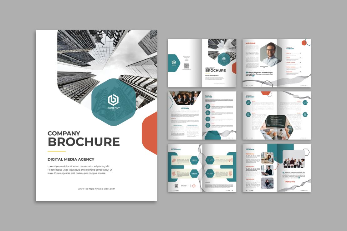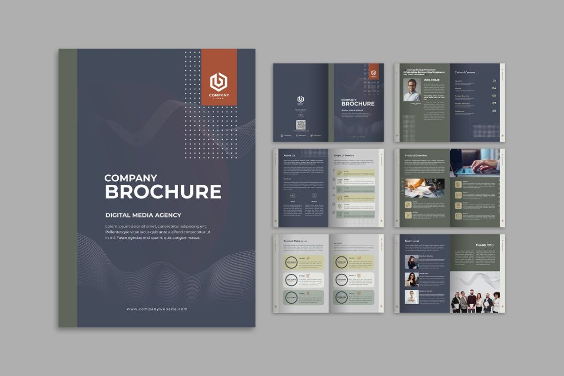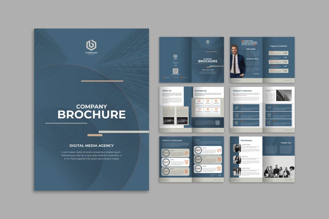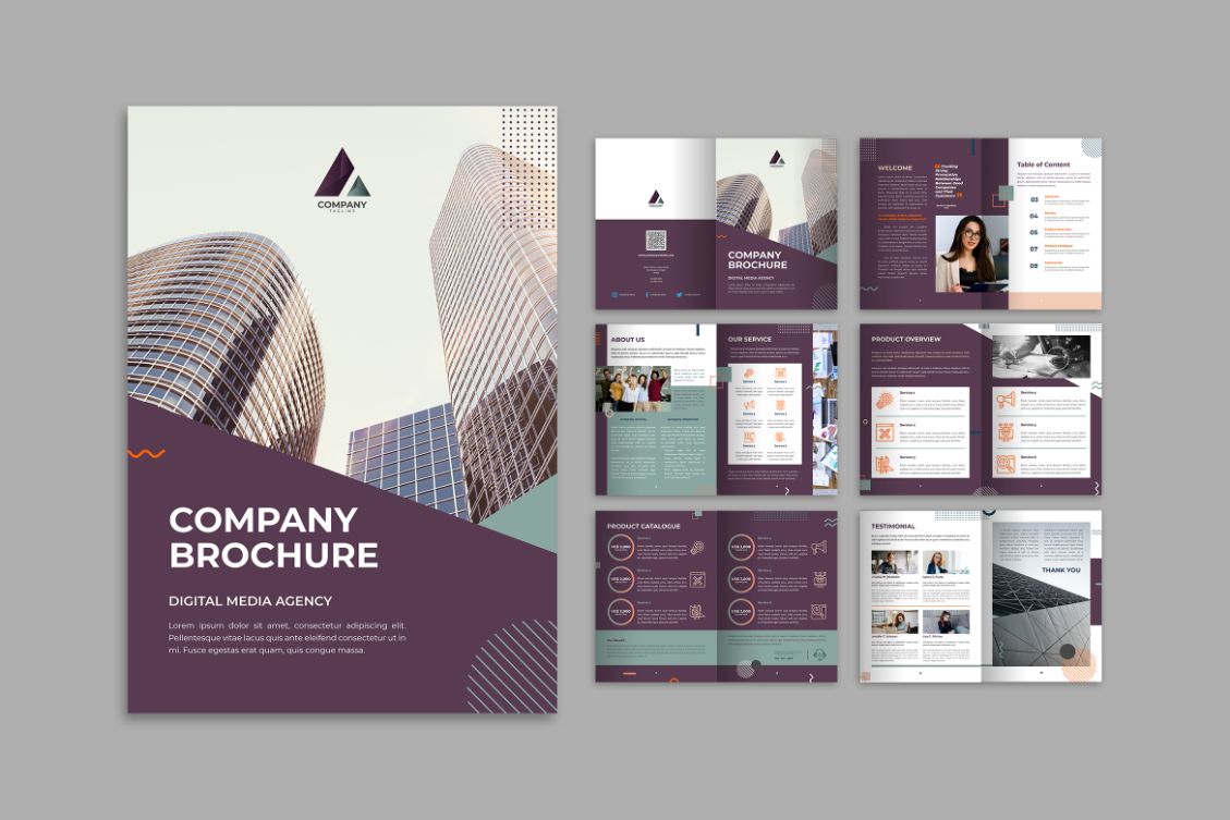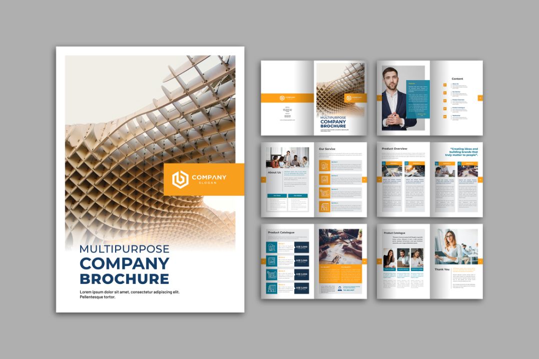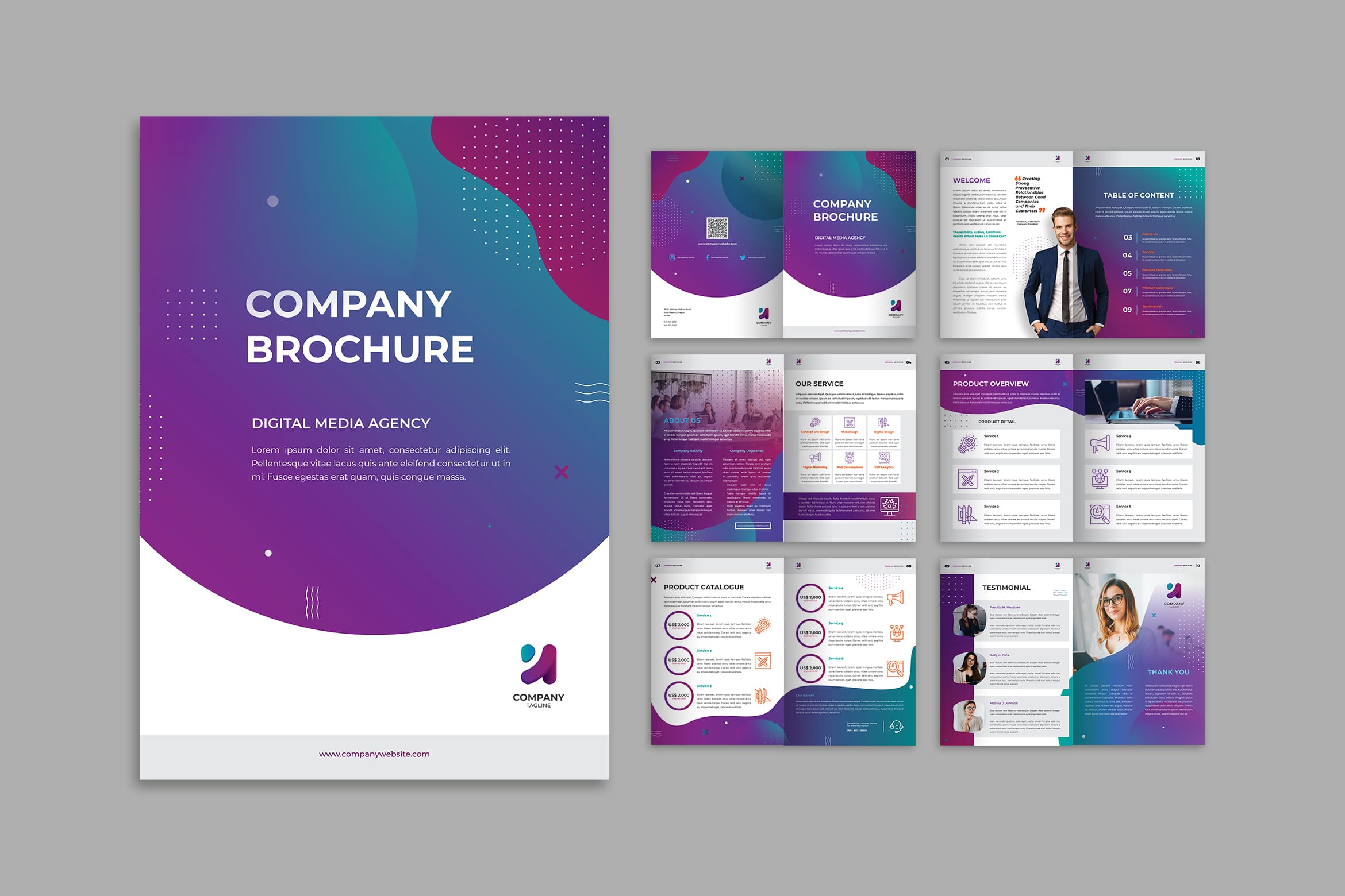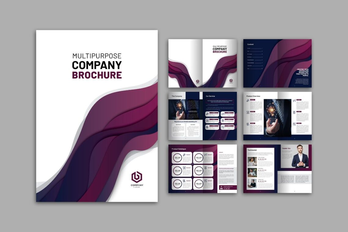
10 Best Factor successful brochure design will help you to gain wider sales and profit.
Brochure design influences your product impression. Not only the design, but people would also pay attention to some aspects. Therefore, it would be better to know the whole successful keys of the brochure. The competition is pretty tight in the worldwide market. We would discuss it here, so you should stay tuned to read it till the end.
1. Brochure Design Template in A Right Template
See in the newspaper, article, novel, and everything that asked you to read, what makes people get interested to read? It is not about the content, but the primary thing they consider is the headline. Therefore, attract readers by making a unique and memorable headline. For you who are in the culinary business, you could make a simple headline.
“Everyone can eat lots without worry to get diabetes”. This headline would attract people to read more because they are curious about the tips you give in the writing. By having more flight time in reading, you would understand how to make a gorgeous headline which would attract more readers to read because they are curious.
At least you do not spend much money only on making brochures and it ends without reading. It will be very painful. Remember the goal of a brochure is to give information to others. They should know if your company exists in this world.
2. Don’t Ignore Something Fundamental
It does not matter if you cannot fill the front page with your full information. You still have another page to go. The brochure can be on a page, two pages, bi-fold, or trifold. Just think about how to make everything looks simple and readable, and readers could contact you easily. Therefore, it is the basis for you to input the logo, address, and company phone number there. There is also the main color of your company as the main printout color.
Be ready for its budget because all you have to do is preparing much money to have a beautiful and attractive brochure. Although it depends on the age and strata level of your target audiences, printing in any amount is important.
3. Skip Jargon
Jargon just makes readers get confused on reading your brochure. Too many acronyms are not good for everything. For readers, something confusing will make them do not want to approach and get everything inside a brochure. They feel too lazy to continue to read it. Well, it is better to concern with a message only in a brochure. If it is about promoting a product, it means you should focus to promote and give a message about promoting an interesting touch.
If a brochure is about an event, give the right narration which would influence people to read. Well, everything seems difficult to try if you do not start to make it. Therefore, it is a good chance to make everything happens.
4. Call to Action
It is wasteful when you create a beautiful and professional design of a brochure without you try to remind or recall readers about your goal. For example, you ask them to attend an event. It means at the end of the sentences in a brochure, you need to put Call to Action words. For example, “Please contact us or visit www.blablabla.com to register your attendance.
If you promote any discount, the CTA could be, “Come and Choose! This Coupon is valid until 12th May 2021 Only!”. There are still many words that can be used. You should be creative to manage it.
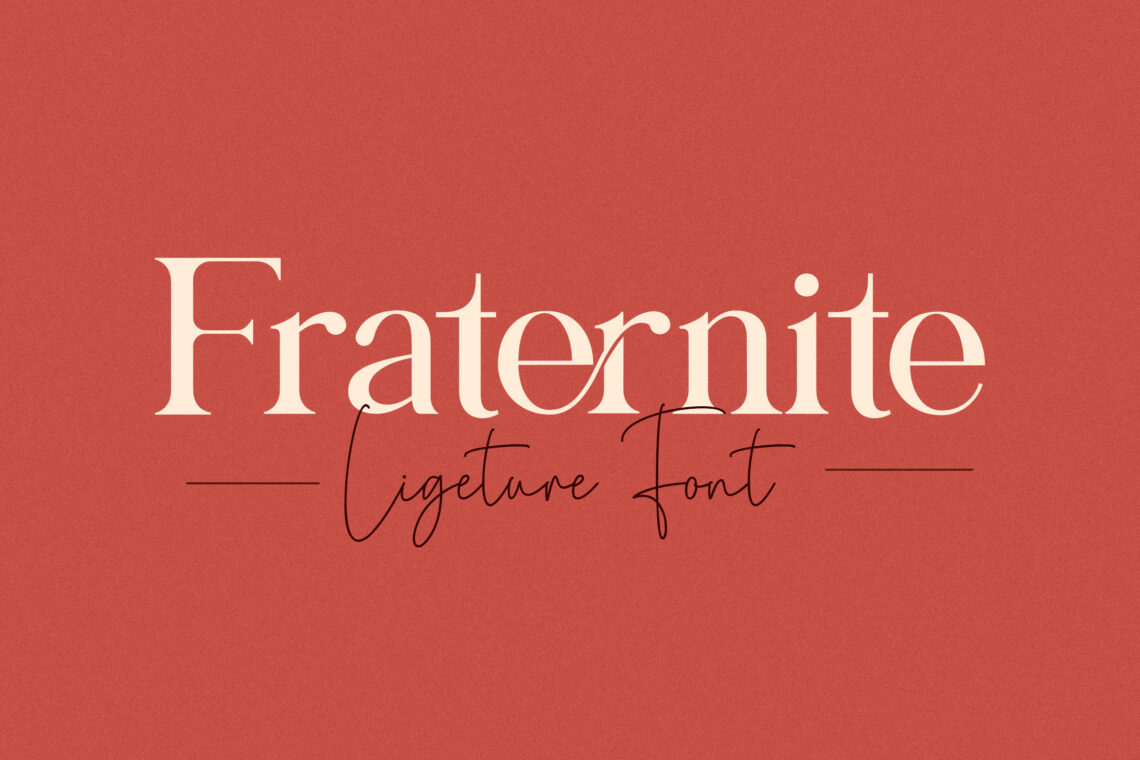
5. Font and Font Size
A brochure contains a message and goal. How to reach the goal in literal marketing is by how readers could get the message. Delivering the message is not always easy. Some components of the paper must consist of many aspects. One of them is its font style and size. Since the goal of the brochure can be reached by reading action, the size of the font should be readable. The font style is also readable. Do not try to make it messy or use not general font style. Maybe only you would understand the content in a brochure.
Try to manage everything well. Arial in 12 or Times New Roman is two common fonts for marketing devices. All people of any age could read it as long as you put the right size like 14 for the headline and 12 for the content. There are also some modifications in a font like combining Arial and Calibri but only using a maximum of two font styles.
Evaluate your client’s target age too because young and elderly have different font styles to prefer.
6. High-Quality Image Only
Attracting people to read is not only by making interesting titles or headlines but also by making everything interesting visually. People love to see something colorful like images. However, there are two types of images. Low resolution and high resolution. If you want to save more data or print a brochure in ‘just the way it should’, the low resolution would be fine. As long as the image does not give a huge impact on your brochure goal.
For example, you want to promote a ‘packing service’. You do not have to insert the full-color and high-resolution image of the packing machine. People will not feel bad about it. If you promote new dishes in a restaurant, the high-resolution image increases public appetite and they would desire to try because you increase their appetite. Indirectly, it happens. You should learn from the psychology side about it.
7. The Target Audiences
Analyze customer types including their social strata to help you build a great brochure. By knowing their basic information, you will know how to highlight the message in your brochure. Brochure design should consist of the exclusive and professional design if you have targeted people in high social strata environment. Well, the style of it can vary. You just have to make some categories based on audiences’ ages, social-economic strata, and education.
8. The Content
You do not have to be the updated person in the world to make the content of the brochure. However, do not also insert the ancient topic to go, except it has not been solved yet. A brochure usually creates a solution, so there must be a problem around. In addition, you need to focus on one problem and narrow anything to be more focused. What to have to note is its language. Do not skip to have -easy to understand – the language.
For example the word “Hi Guys!”. It is not suitable for the elderly when your prospective clients are elderly. So match everything well. Being polite is the most aspect to go.
9. Print It Well
Everything would be done after you proofread your brochure. This is a great strategy to minimize your budget. Check and recheck its spelling, color, design, and elements. When it is already done, print on a sheet only at first. It is to check whether the size of the brochure is suiting for the printer or not. The color on a paper type would give a different appearance too. Therefore, too many aspects to go to see.
When there is no problem inside, it means you are ready to print it in bulk. What do you have to check? paper, spelling, color, and design!
10. Place And Share in Right Place
The last, related to readers’ age and typical category, it is time for you to share it in public. If you prefer to share in digital form, make it locked, so no one could easily edit it. It is important to protect our design. On the other hand, if you prefer to go with paper, put it in right place, like a public area. If your prospective customers are students, try to share it in front of their school. Or you can just put it in their canteen or information center.
If your prospective clients are business people and employees, you may put it in the train stations, bus stations, and offices, and stand in front of the office gate. Anything should be tried to have a maximum impact. Ready or not, this is the key to ensuring whether your marketing strategy is successful or failed.
In this fast generation, people want something fast to do the fast movement. If you think so, you should make a fast design. Everyone would love to buy something instantly, commonly.
Brochure design can vary from one company to others. Marketing staff should know how to attract people with it. To help you get a professional style, you need to hire a designer, especially if your company is a big company with a fabulous image in public. There should be well-managed on its detail. If you have no time, you can get our design and select the one you love the most. You can visit our website to get the best deal from us.


