
Modern Serif Font and Modern Sans Serif Font are good options for newsletters. What is the main point for something to read that you wish someone to read? READABLE! So, the main point before you put a title in a newsletter is finding a readable font. It does not only have to be readable but also clean and clear. The reason is that you will not only show a title to everyone but also a complete story behind a title. It should ask everyone to keep their eyes on it until the information has finished to write down. Getting confused to find the font? We will help you here. Check this out!
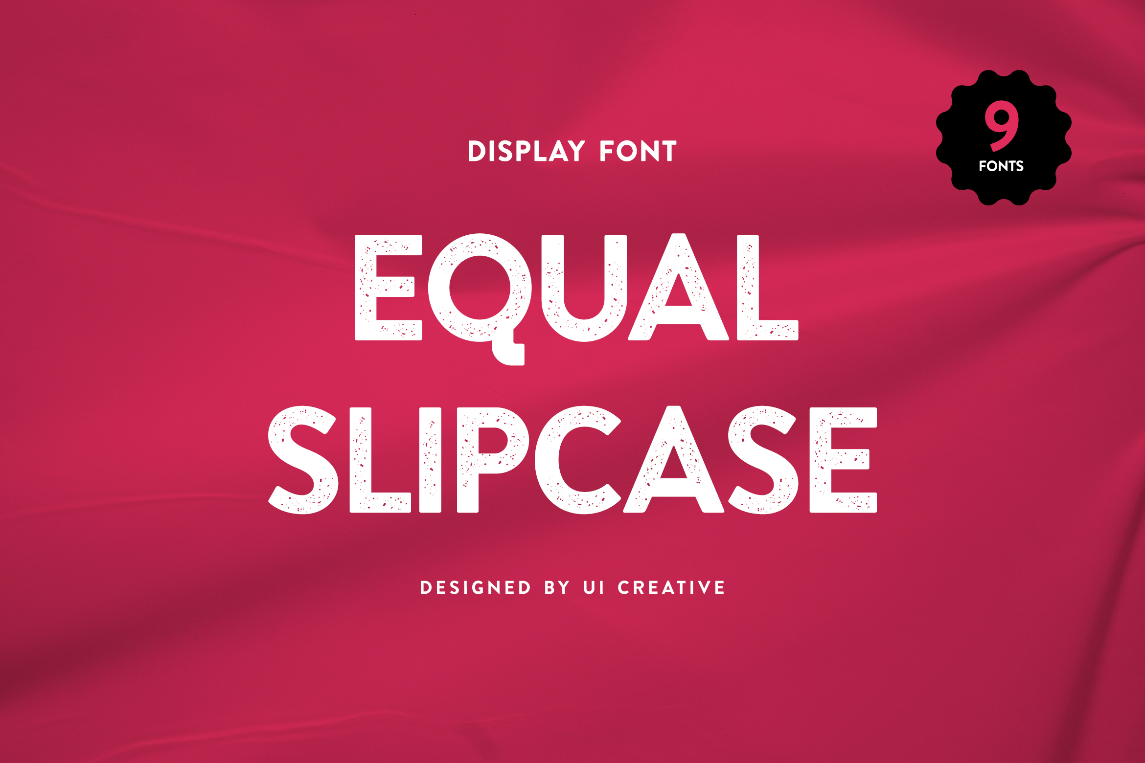
1. Equal Slipcase Modern Serif Font
Well, what are the components to be had in a newsletter?
a. Title
b. Content
c. Pictue
Make sure your font collaborates well with these components. Our first best font would look great as a title. Newsletter design can be either very simple or complex. But there are a few basics that all newsletters should have, besides the content. As the modern serif font, this first pick font would help your audience to be interested to read your newsletter. After you get the audience’s heart, you can influence them to buy your products. Is it so simple?
Specifically designed for luxurious brands, this sophisticated font with thick, block-like serifs and angular strokes that result in uniquely shaped corners can make your body text look more stylized and expressive.
Also Read : 20 Best Romantic Fonts
2. Govandi Adhiwan Modern San Serif Font
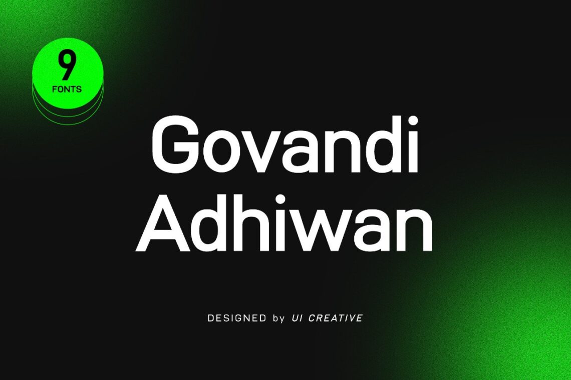
Modern Sans Serif font that feels beautiful classy, elegant, and modern. This font is perfectly suited for a wide variety of projects, such as signature, stationery, logo, wedding, typography quotes, magazine or book cover, website header, clothing, branding, packaging design, and more. Also, fashion-related branding or editorial design displays both masculine and feminine qualities.
Choosing the best font for your newsletter can guarantee that your message is properly conveyed and will evoke the right emotions from readers. So, this font would look perfect for your modern target audiences. You can build their modern impression too only by using this font.
3. Avoidance Genevra
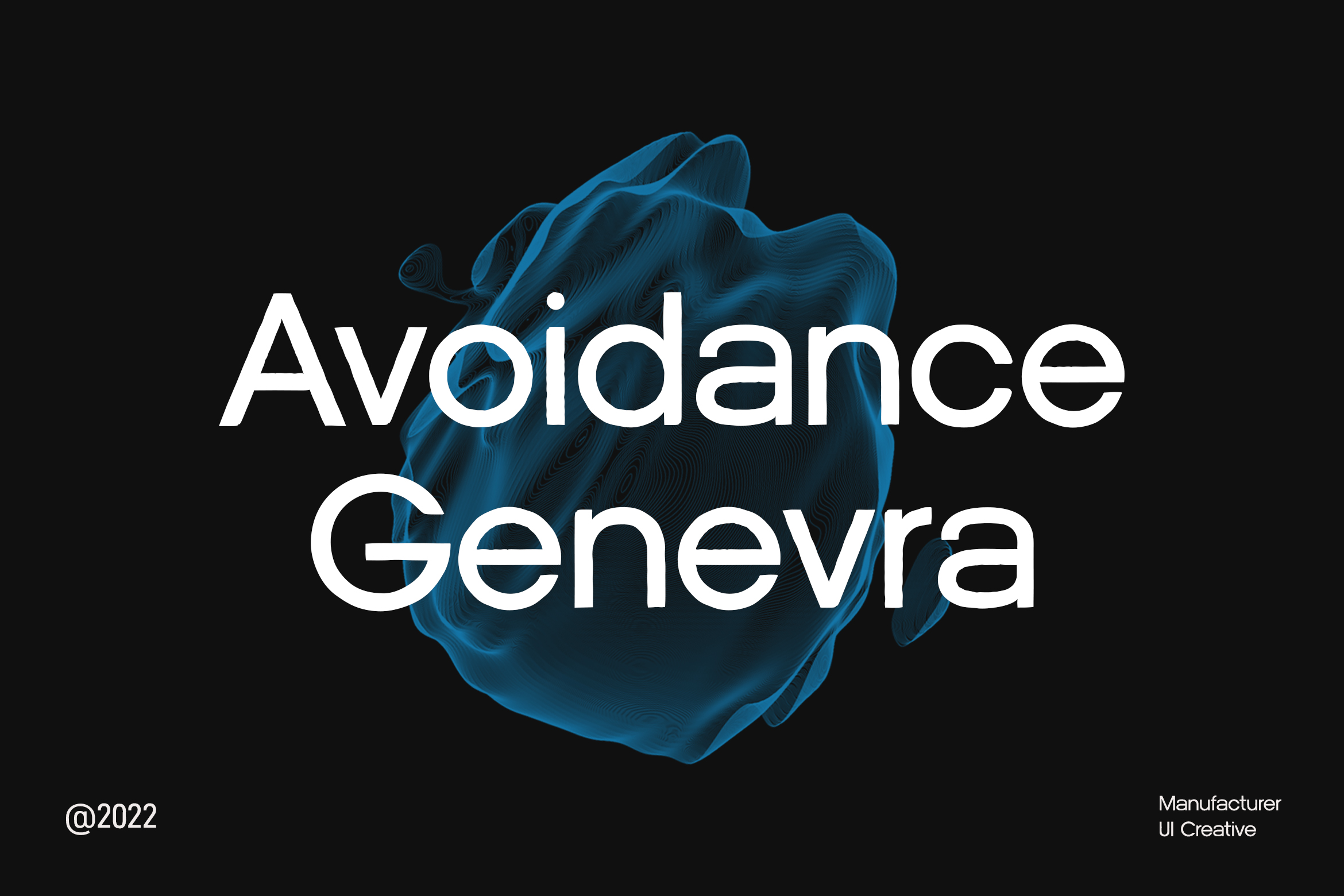
Just like our previous pick-up font, this one is perfect for modern, casual, masculine target audiences. Whether you want to be simple and serious or creative and casual, your font selection will be responsible for the overall look and feel of your newsletter, make sure it is easy to read. Your newsletter font should be clear and easy to read. If you should use loud or elaborate fonts such as decorative or display fonts, use them only for your header. Your header is mainly for attracting attention while the rest of your text is for reading, so highly legible and readable fonts such as serif fonts and sans serif fonts are the best way to go for your body text.
Even if you want to combine the font, just pick two types of fonts only. The headline can be this font and the content can be another one. Before you print it, as some people to read it. If it is less attractive, especially when you use too many words in a flat layout like a newspaper, be ready to get less attention.
Also Read : 30 Best Font for Movie
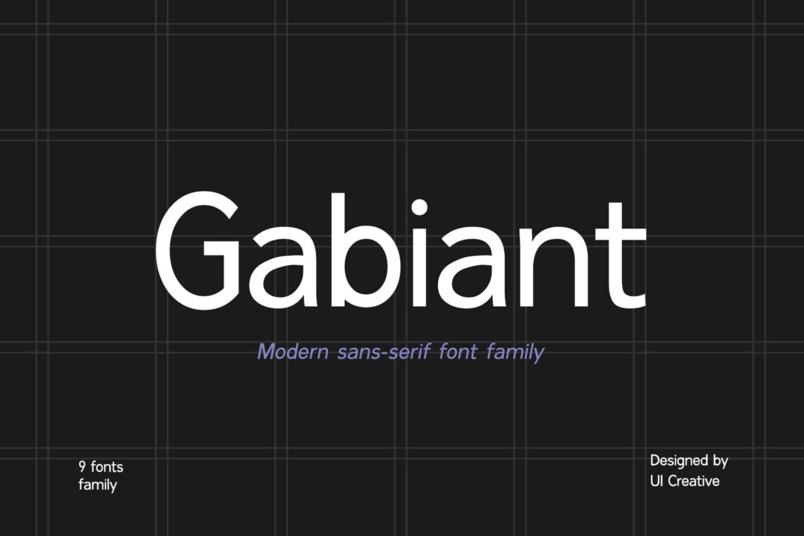
4. Gabiant
There are two types of newsletter, the printed one and the email one. If you’re creating an email newsletter, choose web-safe fonts or fonts that render correctly online regardless of where the email will be read. You can also use web fonts or fonts that are downloaded by web browsers and then applied to the text as the message is being opened and the web page is being loaded. A web font is specifically created for websites and is usually stored on a web server.
However, if you don’t want to get stuck and confused on browsing, pick the font that we entered you here. Its thin, low-contrast strokes are perfect for making the text flow in your paragraphs, and when used in all caps or with additional ligatures, this font can help you create strong, eye-catching headlines.
Also Read : 40 Best Fonts for Branding
5. Flagoria Calintha
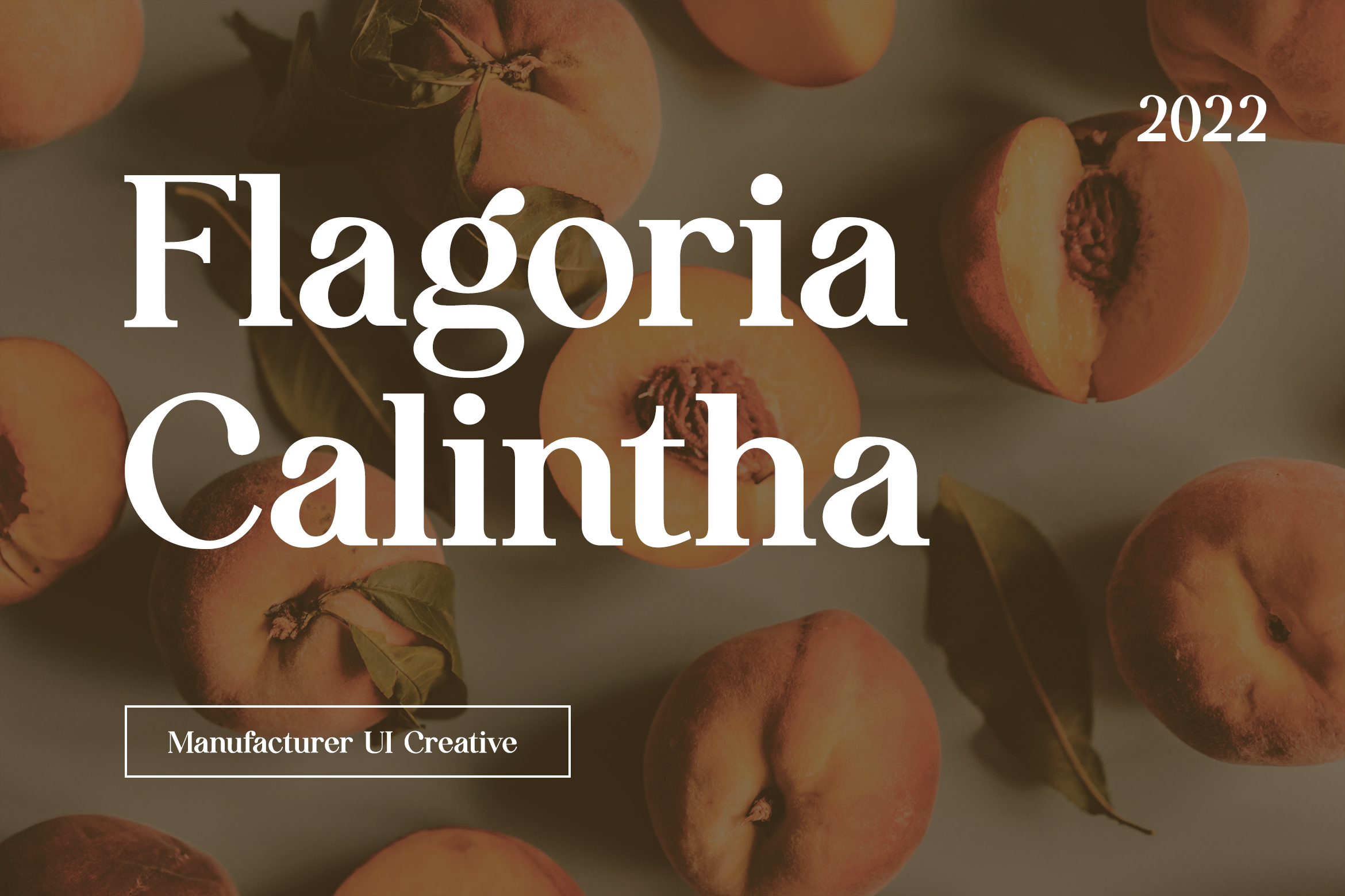
As we already discussed before, the main point to use any font as your newsletter content, it should be readable. The main copy for most newsletters is set between 10 and 14 points, so you should choose a font that will allow readers to view your newsletter naturally and won’t require them to squint or zoom in on their screen just to be able to read it. Fonts with a taller x-height, normal kerning, wider set width, and shorter ascenders and descenders will be much more legible at smaller sizes. That’s why I recommend you ask someone to read it first before you print it.
Also Read : 16 Best Fonts for Logo
6. Walkie Valkyrie
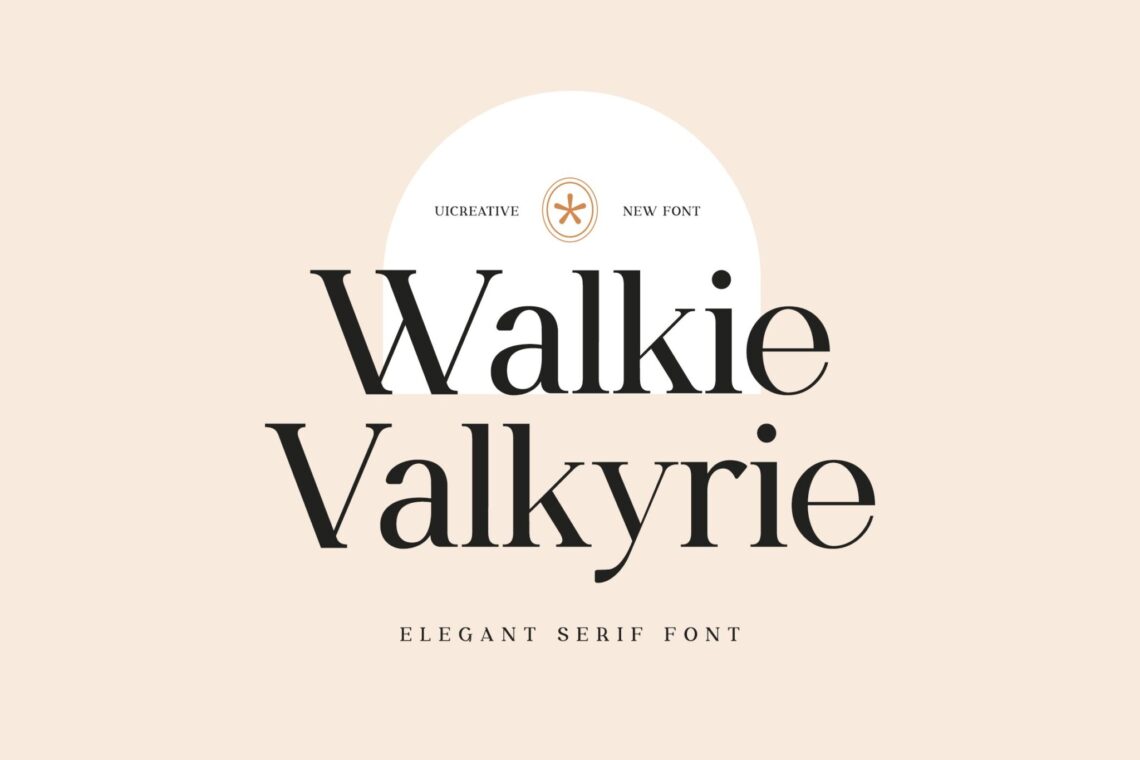
The higher level of customers needs something different. Don’t give up because all of your worries are solved here. This font interprets your professional service and great details for anything. It gains more trust from customers, especially women at work. They consist of a variety of content and sections and can include interactive features such as GIFs and animations that you can match with fun, distinctive fonts for your headers and headlines. Since email newsletters generally have very little body copy, you can focus on making your headers and headlines more visually appealing.
Don’t skip our help then!
Also Read : 20 Best Extra Bold Fonts
7. Vinka Duscha

This modern serif font gives a historical feeling to everyone who reads it. If you want to introduce classic, historical, and vintage products or service majors, try to make content with this font. If your brand is more on the organic, natural, or minimalist side, this font with a semi-handwritten style can help you achieve a softer, cleaner look for your newsletter. There is no matter to combine two fonts, but no more. Even if you want to play with the color, make sure you are not using more than three colors.
This serif font family is characterized by sharp lines, a wide set width, and thick, low-contrast strokes. From clear and readable body text to big, attention-grabbing headlines, don’t skip it.
Also Read : 40 Best Font for Brand Design
8. Agafia Rosdina Modern Sans Serif Font
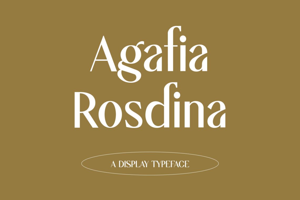
As with books, fonts for printed newsletters should stay in the background and not distract the reader from your content. Since serif fonts look better on print, using a combination of sans and serif fonts for your headlines and body copy is recommended for putting in the media. Try this modern sans serif font with another type of font. However, not all people love to read, so make sure your newsletter is right to the point.
Even if you want to insert the background of the history in a newsletter, make sure it is simple. Do you know how to make it simple? Grab some resources to help you on making a structural newsletter. The main point is you should ensure the readers’ notice and get your message.
Also Read : 10 Best Font for Newsletter
9. Quick Peachy
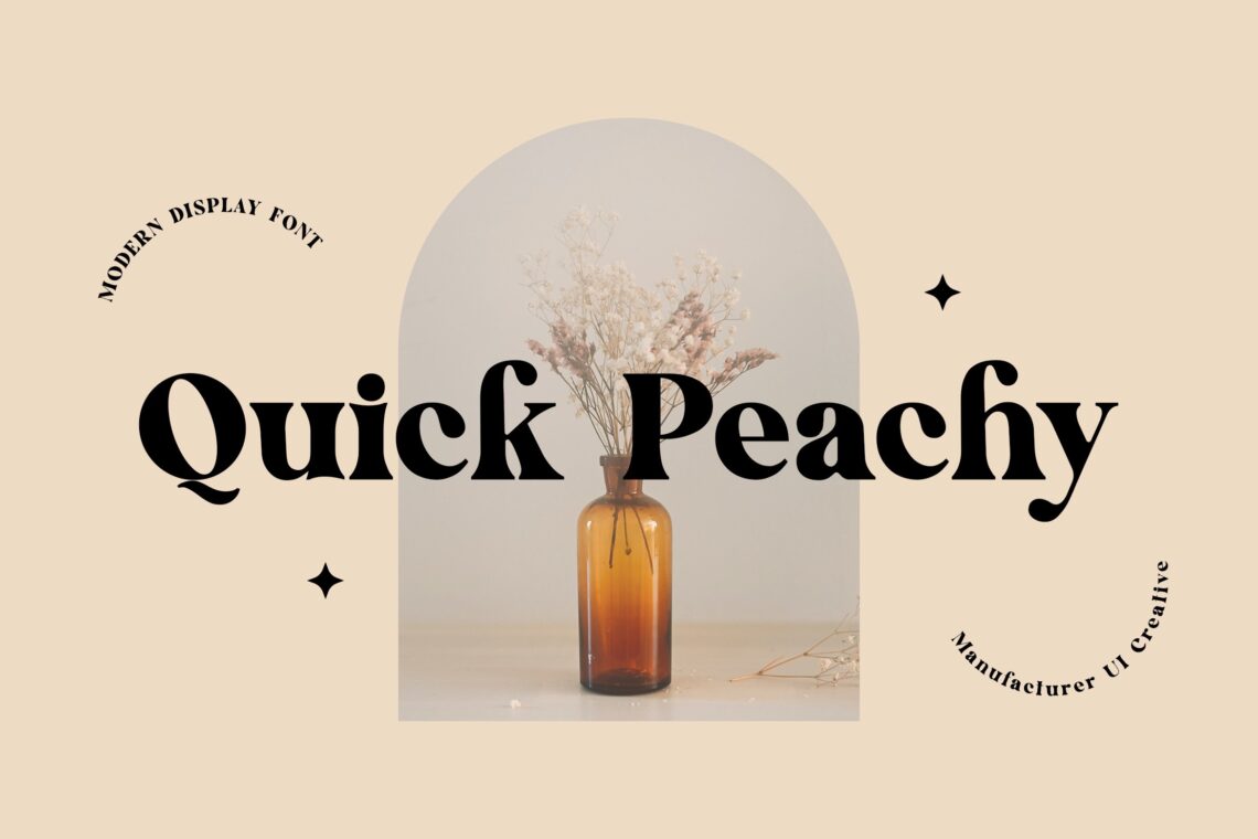
Since women always have more and more products and favorites, sure to introducing your products and service to them is not complicated. You have plenty of fonts as options. Take one or more just like this one. For myself, this font looks perfect to promote your perfume products and everything related to the aesthetic. Put some images in the newsletter, insert some headlines as the title of the products, insert some explanations, and done!
Do not forget to choose the suit layout and make everyone, especially women fall in love with your newsletter and keep reading and saving it. If you want to use the printed one, you can select the glossy paper to give a glowing effect.
10. Workbar Modern Serif Font
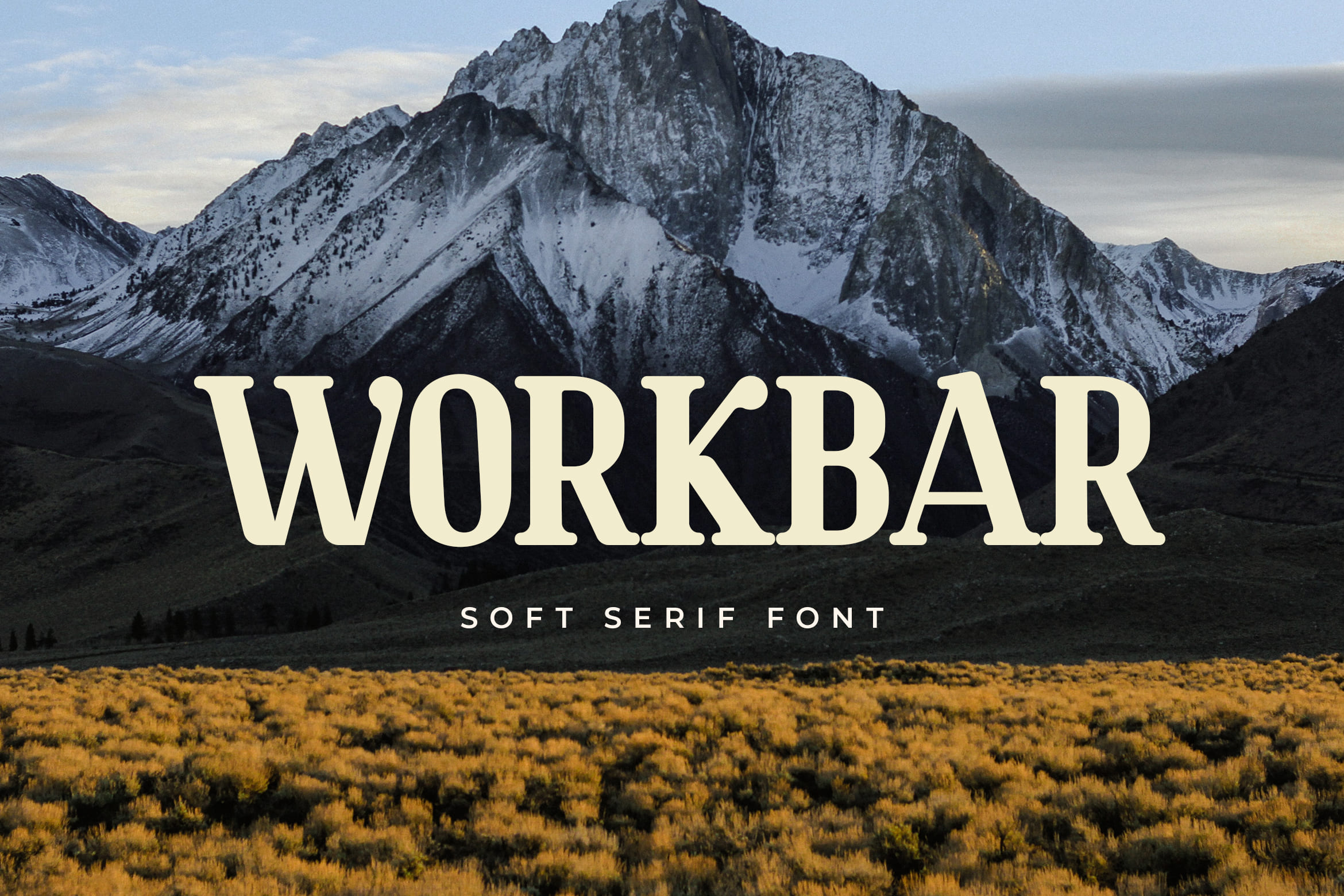
Workbar Serif Font with its unique curves and cut-ins makes it one of the most memorable caps fonts on the market. This font is perfect for fashion-related branding or editorial design and displays both masculine and feminine qualities. Also, you use this font on Logo & Label Design, Apparel Design, Advertising, T-shirts, Brochures, And more!
Inspired by style fonts on cigar box labels that were common in the 19th century, it harkens back to the beauty of the typographic design at that time. Classic and victorian characteristics allow you to create beautiful ornaments to suit your needs. Suitable for greeting cards, covers books, product labels, short texts, logotypes, photography, blog headers, T-shirts, and much more.
Also Read : 10 Best Fonts for T-shirt Printing
Well, we have already discussed the best font for the newsletter. I hope you get what you want here. Having it by buying in us means you do some investments. It is because you still could use it in the next newsletter projects. Modern serif font will keep developing each time. Even the modern sans serif font would not want to get lost. When you want to see more collections from UI Creative, please do not hesitate to visit our official website.


