Slab Serif
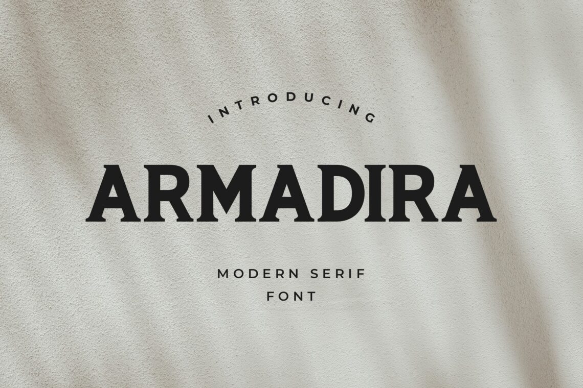
Dive into the treasure trove of typography with our unique collection of premium slab serif fonts. Perfect for any project, these fonts blend classic charm with modern elegance to make your designs stand out. Whether you’re crafting a logo, creating content for a website, or designing a book cover, our slab serif font range promises to infuse your work with an iconic, timeless look. Don’t just design, make a statement with the enduring beauty of slab serif fonts. Download now and let your designs tell a story that transcends time.
Explore another font Blackletter, Caligraphy, Grotesk, Retro, Display (bold, attention-grabbing), Sans Serif (modern, clean), Modern (sleek, elegant), Logo (varied styles for branding), Script (cursive-like), Handwriting (personal touch), Slab Serif (bold serifs), Serif (classic, readable), Vintage (retro feel), and Calligraphy (artistic, handwritten style).
Trending Sales Slab Serif
ALL PRODUCTS FORM Slab Serif
Slab serifs have their own individual look and are easily recognizable. The blocky, thick, and enormous serifs that these fonts have to make them stand out in any statement, advertisement, billboard, or website on which they are shown.
Most of the time, the strokes and stems of their typefaces are equally broad and bold, resulting in a typeface that is simultaneously aesthetically pleasing and authoritative.
Slab serifs, which belong to the family of types known as serifs, are characterized by the presence of distinctive feet or little attachments at the terminal points of the strokes that make up individual characters.
When more and more typographers and designers began to employ them in a widespread manner at the beginning of the 19th century, serifs had an unprecedented meteoric rise in popularity that caused them to sweep the globe like a sudden hurricane. Since then, these fonts have nearly wholly taken over the design of the world around us, which can be seen everywhere.
Designers of all stripes will be able to learn how to use slab serifs with more excellent results than they have ever achieved if they first understand what these fonts are, what they are designed to do, and their distinct place in the world of typography.
The Characteristics of Slab Serif Font
Like all other families of fonts, slabs have distinctive qualities that distinguish them from one another and make them suitable for use in particular contexts. When designers are more knowledgeable about the numerous components of slab serifs, they can make more informed decisions on the design of their projects.
Terminals: Terminals are the endpoints of strokes in a letterform that are not finished with a serif. Terminals are also known as bare ends. Slabs might have terminals that are rounded, as in the case of Courier, or they can have terminals that are angular and blunt, as in the case of Rockwell.
Boldness: The thickness of slabs can vary greatly depending on their intended use. To attract people’s attention, slabs intended to be shown in stores as advertisements, for example, have to be extremely vivid. Slabs, on the other hand, which were previously more legible at smaller sizes (such as for reading on devices or in print), won’t be anywhere near as bold to continue to assure readability.
Stroke Width: The straight or curved line that makes up a character (for example, the diagonal line that makes up the capital letter N) is called the stroke width. Again, different goals call for different widths of strokes while working with slabs.
For instance, slabs with a geometric design (such as Rockwell or Memphis) have a more uniform stroke width, making them simpler to read. Because of this, they are excellent choices for text. Slabs, such as Clarendon, on the other hand, have wider stroke widths in the stresses of the Cs and the bowls of the Bs, which makes them superior for headlines.
How to Use Slab Serifs in Design?
Slab serifs can be implemented into your designs in various ways.
One option is to include them in a design project that strongly emphasises presentation. The bold letterforms will generate a powerful visual effect, which will assist in breaking up the design and producing an arresting focal point that will attract the audience’s attention.
Slab serifs can also be used in a project involving branding in another one of its many applications. This will assist you in developing a unique visual identity for your company, increasing the likelihood that customers will remember you and your brand.
Slab Serifs in Branding Design
Because of their substantial and blocky serifs, slab serifs are frequently employed in the design of brand identities. This is because slab serifs are an excellent choice for logos. They are frequently selected due to the directness and straightforwardness of their statements. These typefaces have the potential to make a significant impression when utilized in large print projects.
However, they can also be utilized in more manageable projects such as signages, advertisements, and publications like newspapers. For instance, the video game “The Legend of Zelda” logo uses a Slab Serif typeface because it is uncomplicated and enables the letters to be readable regardless of the size at which it is displayed.
Clarendon is the name of the typeface that was utilized for this logo. Robert Besley was the designer behind the Clarendon typeface, first made available in 1845 by the British Monotype Company.
When looking at the typeface, it is easy to see why this font would be a good choice for the logo design of the video game “The Legend of Zelda.” The serifs are strong, broad, and blocky, making them ideal for logo creation.
The versatility of slab serif fonts is one of the reasons why they are so appealing. They are straightforward but nonetheless possess a unique appearance that sets them apart from other typefaces, enabling them to operate effectively in various diverse designs.
Because they can be constructed quickly, slab serifs are frequently employed to design logos. Because they are typically more geometric than other serif fonts, so they are ideal for logos that can be easily read from a distance or reproduced in small quantities. This makes them ideal for use in print media such as business cards.
The logo for Google, the logo for Verizon, and the logo for Target are all examples of logos that use slab serifs.
Slab Serifs in Magazine and Newspaper Ads
Advertisements in magazines and newspapers are a great place to make use of slab serifs because of how effective they are there. In order to provide a forceful and recognizable appearance, slab serifs are frequently utilized in headlines.
This is made very clear in the advertisement for the film Black Panther. Since the movie is about black power, the headline should be written in slab serifs because it is appropriate. To emphasize the black power concept, it is designed to seem like the Black Panther emblem, which features big slabs.
In addition, slab serifs are a popular choice for logos. This is due to the fact that the strong serifs make the logo simple to read from a distance, in addition to contributing to the logo’s overall aesthetic.
The letters in this logo all have slab serifs, and a giant slab is placed smack dab in the middle of the logo to provide a touch of flair.
This poster has a unique and distinctive appearance due to the use of bold slab serifs, which helps differentiate it from other posters.
Explore another font:
© 2025 UICreative ( member of Mediatechindo.com ) - All rights reserved