Serif
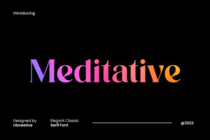
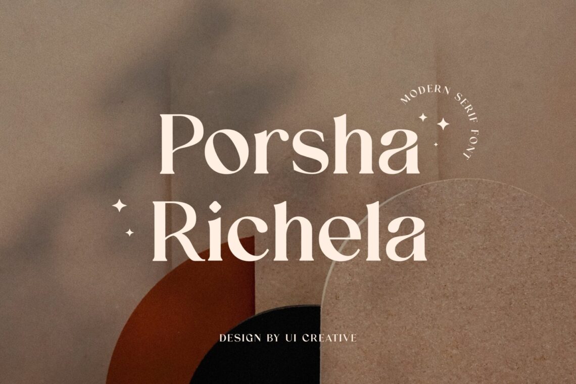
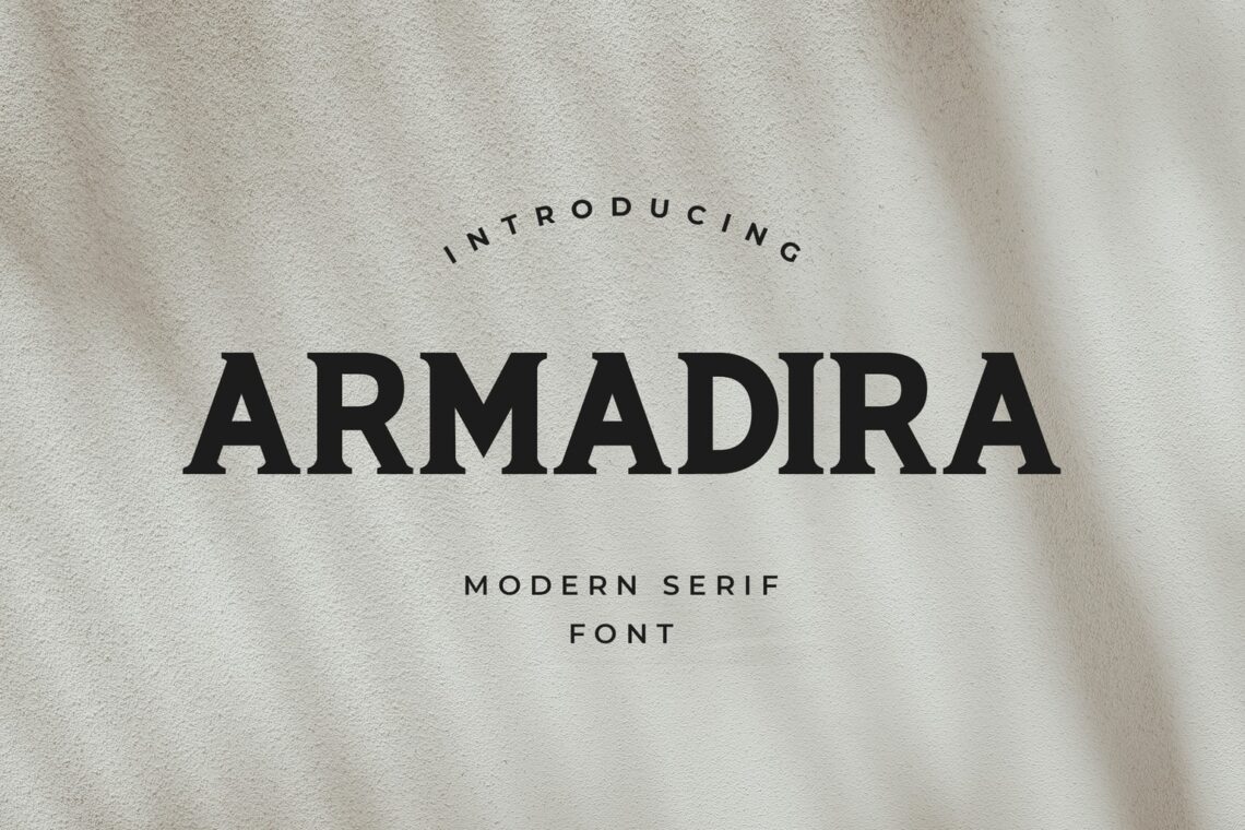
Discover the power of serif fonts with our curated collection of design assets. With a wide variety of styles to choose from, including traditional and contemporary options, you’ll find the perfect fit for any project. Our serif fonts are meticulously crafted to enhance readability and elevate the visual impact of your designs. Whether you’re a budget-conscious designer or looking for premium options, we have something for everyone. Explore our selection now and take your designs to the next level.
Explore another font Blackletter, Caligraphy, Grotesk, Retro, Display (bold, attention-grabbing), Sans Serif (modern, clean), Modern (sleek, elegant), Logo (varied styles for branding), Script (cursive-like), Handwriting (personal touch), Slab Serif (bold serifs), Serif (classic, readable), Vintage (retro feel), and Calligraphy (artistic, handwritten style).
Trending Sales Serif
ALL PRODUCTS FORM Serif
What is Serif Fonts From UICreative?
A serif is a little additional stroke that can be found at the end of the power vertical and horizontal strokes of some letters. Serifs are used in typography. Some serifs are more understated, while others are stronger and more evident.
The readability of a typeface can be improved by serifs in certain circumstances. Any typeface with serifs is referred to as a “serif font,” and “serif fonts” is used interchangeably. (The term “sans serif” refers to fonts that do not have any serifs.) The use of serif typefaces has been widespread for a significant amount of time. One example of a serif font is the Times Roman font.
Uses for Serif Fonts
Large blocks of text benefit tremendously from using fonts with serifs. Because of the series, it is easy for the eye to move over the text. There are a lot of serif fonts, and many of them have gorgeous designs that make them stand out wherever they are used. The readability of books, periodicals, and magazines is significantly improved using serif typefaces.
Regarding web design, serif fonts are less proper than sans-serif fonts, particularly in smaller sizes. It may be challenging to read the text on some computer monitors because of the low screen resolution, which causes the tiny serifs to be obscured or pixelated and makes the text difficult to see. Web designers frequently choose sans-serif fonts for a more unpretentious, uncluttered, and contemporary appearance.
Serif Construction
There are many different types of serifs. However, they can be categorized as follows:
- Hairline serifs
- Square or slab serifs
- Wedge serifs
The powerful strokes are significantly thicker compared to the hairline serifs. Square or slab serifs are far more substantial than hairline serifs, sometimes even reaching a weight heavier than the primary stroke. The shape of a wedge serif resembles a triangle.
There are two different styles of serifs: bracketed and unbracketed. The stroke of a letter and its serif are connected by a bracket, which acts as a connector. Most bracketed serifs include a rounded transition between the serif and the primary stroke of the letter. Serifs that are not bracketed are attached directly to the strokes of the letterform, and this attachment may be abrupt or take place at a right angle. Within these divisions, the serifs can be blunt, rounded, tapered, or pointy or have a shape combining these four.
When do Designers use Serif Fonts?
Let’s look at the function of employing serif fonts from a designer’s viewpoint now that we’ve discussed the numerous kinds of serif typefaces and provided a response to the question, “what is a serif font?”
Company and brand logos
Sand-serif fonts, which do not feature the serifs outlined here, are typically the typefaces of choice among contemporary designers. For instance, the first version of the AOL logo was set in a sans-serif font.
Similarly, firms like Uber and Google have used sans-serif fonts to represent themselves in their logos. Google switched from using a serif typeface to switching to a sans-serif font. Most contemporary businesses go for the sans-serif option when designing their company logos. It symbolises strength and sophistication, so many designers want to incorporate it into their logos.
Print media
Serif fonts are more commonly seen in traditional print media than sans-serif fonts. Many newspapers continue to employ Old Style fonts such as Times and Garamond because these typefaces are more aesthetically pleasing to the reader and offer the publications a more traditional appearance.
Even though they now employ sophisticated printing equipment, some of the world’s oldest newspapers still use serif fonts. One of the reasons for this is the authority shown when using a serif font, which is why these newspapers continue to use serif fonts. That exemplifies how potent the right font can be.
Font combinations
Using serif fonts to contrast with sans-serif fonts is another common application of serif fonts. Pairings are the collective name for these combinations. They can use a serif typeface in conjunction with a sans-serif font or use the same font in two distinct sizes and/or weights combined.
As you can see, when used correctly, serif fonts can convey a compelling message to your audience. However, this requires that you utilize these fonts in a suitable context. The use of serif fonts dates back to antiquity and will likely continue long after our time on earth has passed.
Serif typefaces, when utilized creatively, are undoubtedly the way to go if you want your work to have a lasting impact. Our advice is to begin by working with free serif fonts until you feel comfortable working with them; after that, you can move on to exploring expensive options that will make your designs stand out. Explore another font:
© 2026 UICreative ( member of Mediatechindo.com ) - All rights reserved


