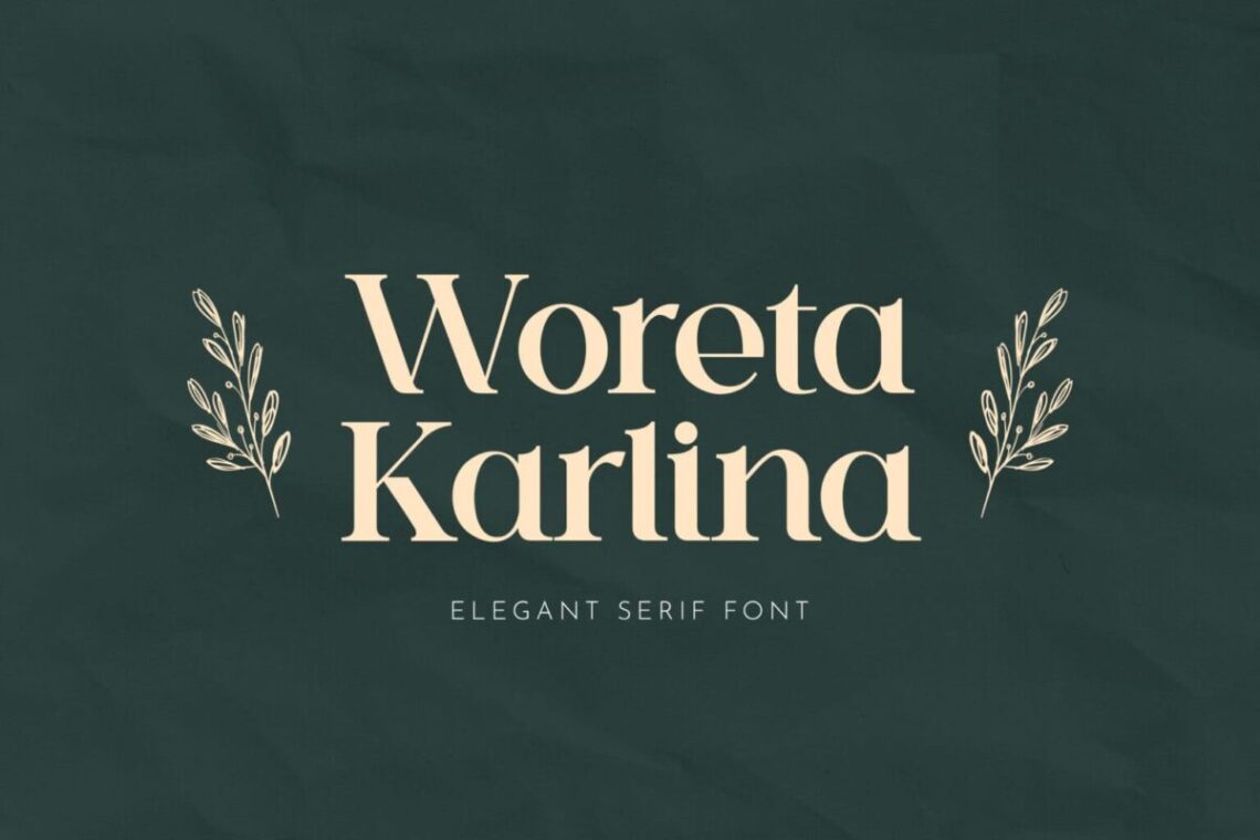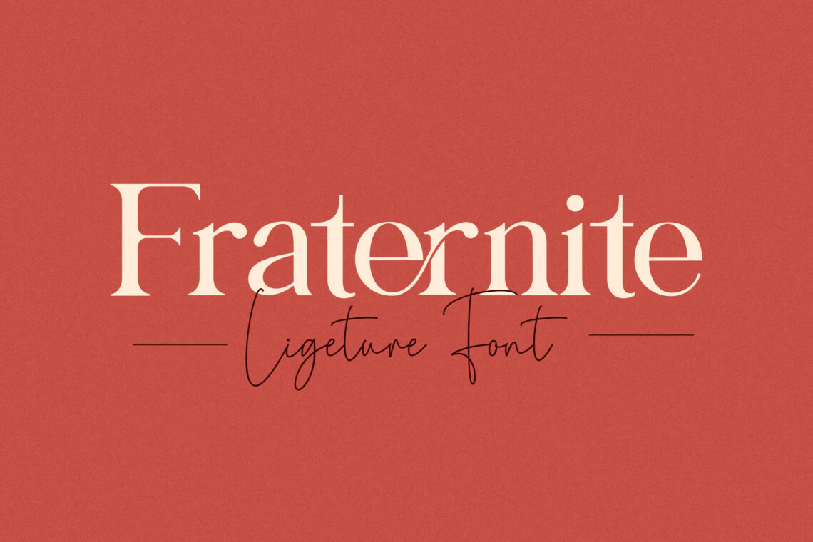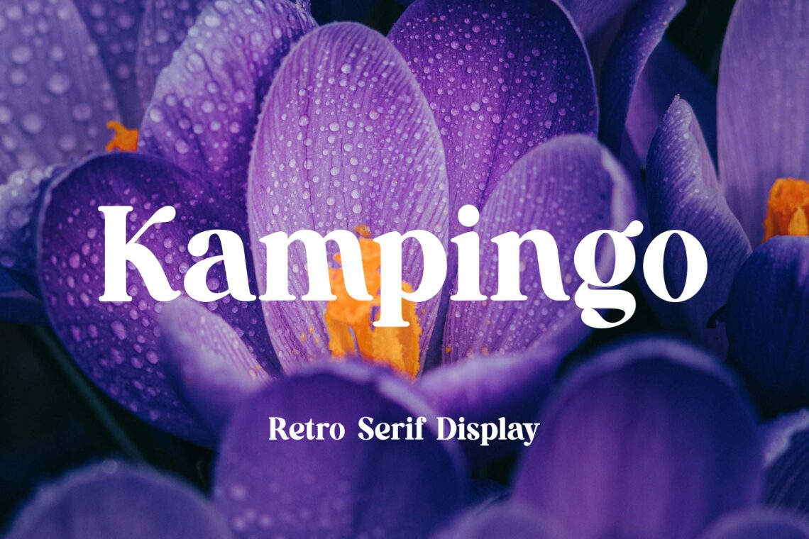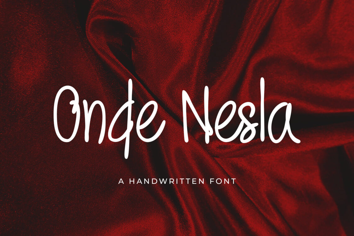
A slab serif font (Egyptian slab serif font, Vintage slab serif font) has its look and is easily recognizable. These fonts have blocky, thick, and enormous serifs to make them stand out in any statement, advertisement, billboard, or website on which they are shown. Most of the time, the strokes and stems of their typefaces are equally broad and bold, resulting in a typeface that is simultaneously aesthetically pleasing and authoritative. We have some slab serif font examples for you without any further ado!
What is Slab Serif Font?
A slab serif font, which belongs to the family of serifs, is characterized by distinctive feet or little attachments at the terminal points of the strokes that make up individual characters.
Serifs had an unprecedented meteoric rise in popularity that caused them to sweep the globe like a hurricane. Since then, these fonts have nearly completely taken over the design of the world around us, which can be seen everywhere.
Designers of all stripes will be able to learn how to use slab serif font with more awesome results than they have ever achieved if they first understand what these fonts are. It’s like what they are designed to do and their distinct place in the world of typography.
The Characteristics of Slab Serif Font
Slabs, like all other families of fonts, each have distinctive qualities that distinguish them from one another and make them suitable for use in particular contexts. When designers are more knowledgeable about the numerous components of slab serifs, they can make more informed decisions on the design of their projects.
Terminals
The parts of a stroke that aren’t finished with serifs are called terminals. Slabs can have rounded ends (like Courier) or sharp, pointed ones (as in the case of Rockwell).
Boldness
Slabs’ level of audacity varies with the task at hand. Slabs for advertising displays, for instance, must be quite garish to attract the attention of passers-by. Slabs that were previously easier to read at smaller sizes (such as on smartphones or in print) will now need to be significantly lighter to maintain legibility.
Stroke Width
A character has a straight or curved line. Its stroke width is the width of that line (think of the diagonal line in a capital N). Slabs can have a variety of stroke widths, each serving a unique function. Slab serif font with a geometric pattern, like Rockwell or Memphis. They are excellent for text since their stroke width is more uniform. Slabs, like Clarendon, have wider stroke widths in the stresses of the Cs and the bowls of the Bs. It makes them ideal for headlines.
How to Use Slab Serifs in Famous Media
Despite being around for a few hundred years, slabs’ rapid rise in popularity meant they would soon be employed prominently throughout many other media types. We’ll look at some more prominent areas where slabs have been featured.
The Montgomery Ward Logo
In 2001, American retail giant Montgomery Ward filed for bankruptcy and was subsequently liquidated. But in the 1980s and 1990s, the vintage slab serif font Serifa was featured heavily in the company’s logo. Serifa was a simple choice for Montgomery Ward because the company used a wordmark logo, a text-only typographic approach.
Martha Stewart Living Magazine
Since it was first published in 1990, Martha Stewart Living has been an industry standard for guiding interior design. The magazine dabbled with slab serifs for a while. It utilized the Archer typeface because the Archer font was designed specifically for the magazine’s typography and was commissioned by the magazine.
It was initially believed that the font would be an excellent choice for this lifestyle magazine because the designers of the font described it as having many qualities that magazine publishers would want. It includes being easy to read, well-balanced, aesthetically pleasing, and easy to work with.
Amazon Kindle
The widely used e-reader sold by Amazon is not immune to slab serifs either. The default typeface is a slab called PMN Caecilia. It can be found on various Kindles. Ranging from the earlier ones (the Kindle 7s) to its newer Paperwhites. This typeface can be found on all Kindles (3rd Generation). This slab’s beginnings, which were heavily influenced by humanism, are one of the reasons it was selected for the Kindle. These origins make it an excellent choice for simple reading.
Ironically, PMN Caecilia was developed for use in print environments. Still, the fact that it can be adapted to the screens of electronic devices such as the Kindle speaks volumes about how easily it can be read and legible.
The Slab Serif Font Design
You should know better how to use slab serifs now that you’ve read this.
A slab serif font is a font on the younger side because it has only been around for about 200 years. Despite the limited amount of time they’ve had, they’ve made a significant contribution to the field of design. Naturally, the fact that none other than Napoleon Bonaparte and his infamous Egyptian expedition helped to establish these fonts in the public mind of western countries is helpful. This can be seen either positively or negatively.
This chance encounter with an important historical figure is on the side for a moment. It’s possible that the popularity of slab serifs is because they are so useful. This typeface family works wonderfully for anything from flamboyant. Also, loud advertisement displays much more compact reading sizes. It is required for mobile devices and tablets. When a typeface has such a high degree of adaptability, it is certain to attract the attention of a great number of typographers. Then, as a result, amass a sizable following.
To incorporate some slabs into your designs and projects, you must go to the slab serif font category on our marketplace’s homepage (UICreative). We have hundreds upon hundreds of slab serif font that may be used for any project.
You can also check our product!
special restaurant company profile | digital marketing agency company profile | car repair company profile | company brochure | business development service web banner | modern marketing company profile | marketing agency company profile | technology agency company profile | interior design brochure | finance business company profile | bag collection catalog | product design brochure | digital marketing seo brochure | invoice green white theme | modern home design ig carousel | fashion business company profile | employee management admin dashboard | business card founder company profile | digital business company profile | company news business magazine
You can also check our categories product!
company profile print template | web element background | web element admin dashboard | web banner web element | social media | mobile ui kit | handwriting | anual report print template | sans serif font | fonts


