How to Avoid Website Design Mistakes: Make the Best Website Templates Design
How to avoid web design mistakes: make the best website templates design should be done or your brand awareness is going down. It is not too much different from making a website commerce template design. No matter what you want on your web whether it is about commerce or information, make sure to avoid these mistakes.
1. Overcrowding Your Web (It Disturbs Your Website Template Design Process)
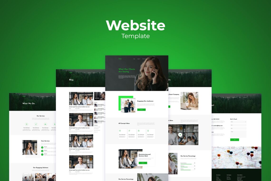
You do it accidentally, but this thing gives a high effect to your website. It is how you add excess elements without controlling them just because they are available.
Therefore, you should read up on basic principles of design first. It’s important to start with an idea of what you want your website to achieve and how it is going to do that. The reason is today, the web design software offers a vast range of tools and available animated logos, pop-ups, and embedded video. The amateur designer would love to use it to practice.
Don’t get swept up in busy designs that overload users with unwanted pop-up ads, auto-playing videos (plural) and a hectic navigation bar; Make your website clutter-free! So, avoiding this first mistake is quite easy. It merely requires that you avoid the temptation to add extra elements to your web page “to see what happens”. You should explain the reason why a particular element in your page is designed to do if you want to keep them on your website. So stay focused on building a solid, simple structure to gift users the most positive, seamless experience possible.
2. Directly Turn On Your Computer (Write Down Your Website Commerce Template Design Plan)
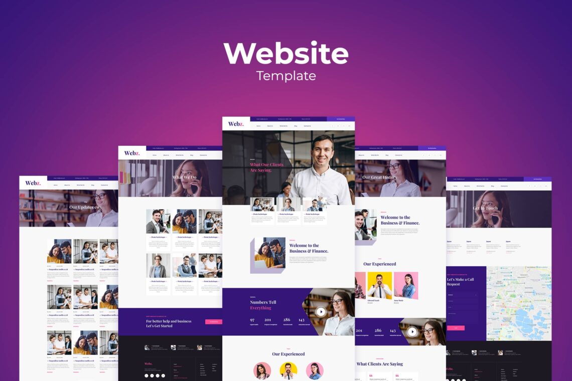
The second common mistake in web design takes us to look like the real professional web designer. Most business owners and a fair proportion of amateur web designers, still think of web design as a process that takes place “on the computer”.
The website templates design you expect to have cannot be directly done on the computer. It’s true that your eventual creation will be seen in this way, nothing could be further from the truth when it comes to its design of it. It is better to turn to more traditional artistic methods when it comes to beginning to design your website before you turn to use a web design program or builder.
Specifically, the best way to start designing a web page is to grab a pencil and a piece of paper. Start by writing a list of objectives for your website, and then design a set of pages that are focused on achieving this core objective. If you do this, it will allow you to spot any clear redundancies in your design and help to streamline your site. This kind of approach is one of the reasons why the best web designers can charge seemingly high fees to their clients. It’s not because they know how to use website-building software that almost anyone can do today, but because they know how to structure your site properly. They also help you ensure that your vision works long before either of you touch a computer.
3. Over Reaction on Columns, Guidelines, and Grid
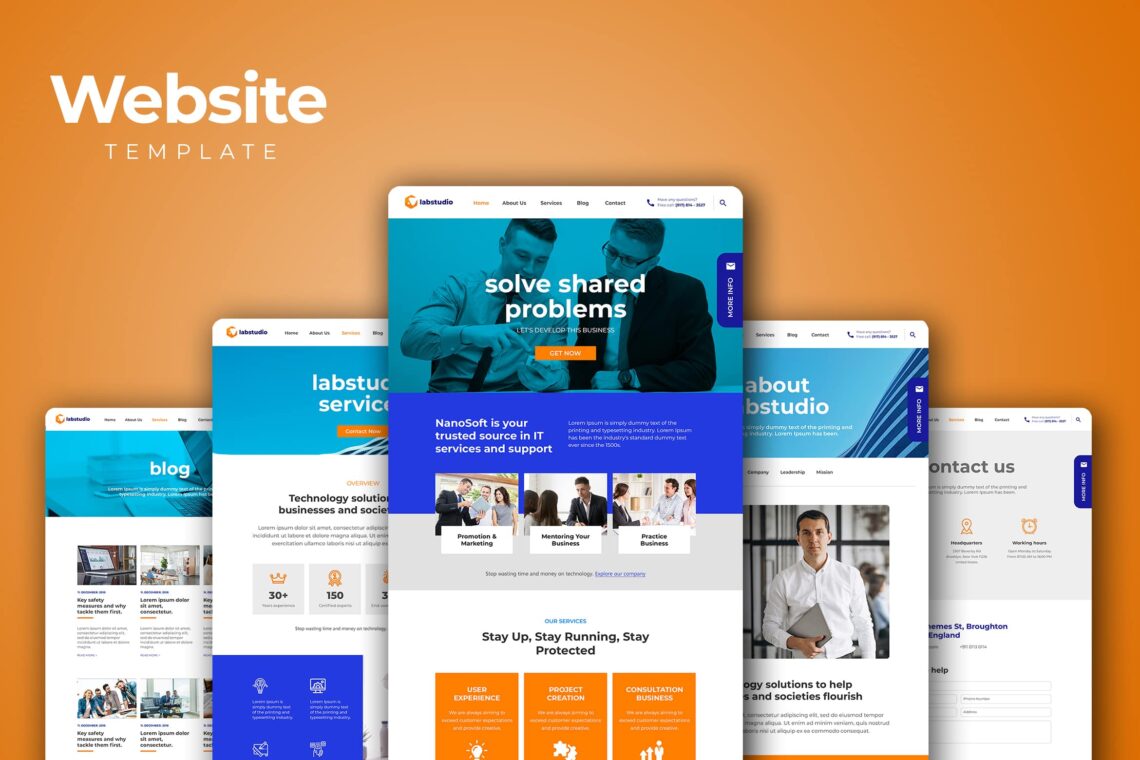
Start building templates for your pages is what you need to do now. When it comes to creating the website commerce template design, even the most basic website builders come with tools for setting grids, guidelines, and columns. Young web designers should not overlook on them.
- Grids remain the core structural element for every well-designed web page. They should always be used to arrange the visual elements of a page.
- Grids and guidelines formed the basis of the core graphic design skillset long before web design came around. They’ll certainly continue to be a fundamental tool for years to come.
Whether the lines for your grids and columns are visible on your web page, they still form the basis of the underlying framework for your site. They are also the proportions between elements. Grids help to split web pages both horizontally and vertically and dictate the alignment between different design elements.
It’s also possible to combine grid-based design with more modern design and consumer research techniques to make different types of web look and feel. The range of ways in which consumers interact with the web has given rise to a similar range of expectations when they see your website.
4. Where is The Visual Hierarchy?

The fourth website design mistake is a slightly more complex one, at least for those new to web design. One of the most common mistakes we see on recent websites is that they overlook the importance of visual hierarchy.
Visual hierarchy is defined as the orderly arrangement of elements, according to their importance. Users could be bombarded by the different features of your designs if they do not get on it. They won’t be guided efficiently towards your CTA, which means no conversions.
To create a strong visual hierarchy, think carefully about what your visitors will be coming to your site for. Try to do UX research and make sure the user flow is intuitive and seamless.
A good example of this is afforded by eCommerce sites. The best ones keep their branding mostly out of the user experience. Website commerce template design acts as a portal for customers to find out about and buy the products that have been tailored towards them. Typically, well-designed eCommerce sites will only remind the user which site they are on at once.
5. Overlooking
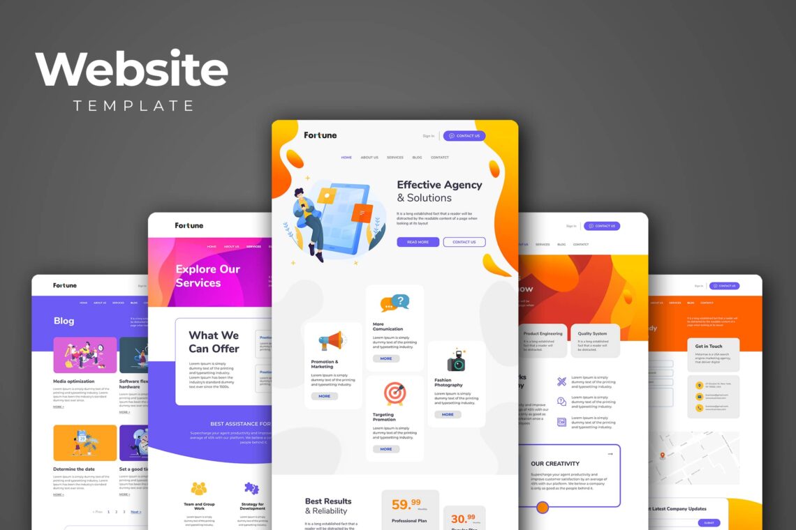
In web design, accessibility is very important. Overlooking would affect the results seriously to your site. Many companies realize the importance of making their website available for visitors with a broad range of impairments and abilities.
There is a moral argument for making your site usable by the broadest range of people possible. However, there is also a business case for doing the same. Widening your audience can only increase your chances of making a successful sale in the future.
Even if you are not legally required to make your site accessible at the moment, try to make a website that was not designed with accessibility in mind. However, it will be more expensive but you have to be more struggles in it. Start thinking about how you use text, imagery and sound across your web designs before you start making them. Add alt tags to images, include audio descriptions and keep copy well-spaced and in a sans serif, legible font, just make sure it is readable. If you’re featuring videos, allow users to choose to press play rather than leaving them on an auto setting and conduct research into the user experience you want to create. The User Interface takes a high role in it to boost your company awareness.
Enjoy the freedom of making a website. Designing with accessibility at the forefront of your mind creates more innovative, creative and intelligently designed websites. Make sure you know how to implement some elements into your design with purpose. No good design should hinder exposure and if your website is not accessible to some, this is exactly what it’s doing.
6. Skip The Mobile Version on Website Templates Design
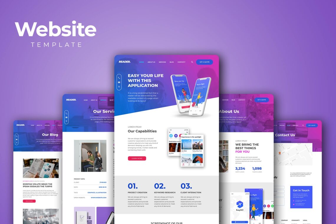
This last mistake is still made by the majority of companies looking to design a website for the first time. Today, in this modern era, we do not see web design is still thought of as something that happens “on the computer”. Many people still think of mobile browsing as an “alternative” to the “main experience” of a website—the desktop site. That’s simply not the case anymore.
Mobile browsing now is used for the majority of internet traffic and so many designers will make a mobile site before they make the desktop site. This is known as a “mobile-first” strategy. It is now a very popular approach among large and small companies. Related to the previous mistake, designing desktop-first can be a mistake because you risk making your website too cluttered or slow so it doesn’t appear user-friendly on mobile devices. Instead, design your website for mobile devices first and then expand to a desktop version of the site next.
The reasons for designing your site with mobile are clear enough. Improving conversions should be your main goal when designing a website. In a world where the majority of visitors are going to be using a smartphone, they need to be able to buy products straight from their phones.
The same point is used for tablets, smart devices, and almost any other type of internet-enabled hardware available today. Your web design needs to be accessible over different devices. It should be responsive enough. It can automatically adjust to look and feel right on as wide a range of devices as possible. Achieving it becomes difficult, but you still have the solution in it. Hiring professionals can be a short way to heaven. You need to find a way to get professional web designers or just buy the ready website templates design around you. Click and purchase are the short gateway to have a website in quick.