
Tips Annual report from UI Creative helps you to make the formal and complete annual report. There will be no more missing items and amounts in it. Here are, 20 useful annual report design tips.
1. Make it Simple
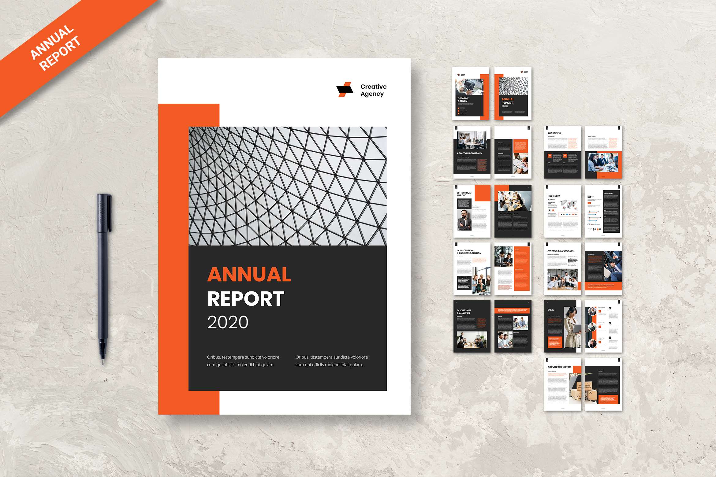
It is challenging, tiring, complicated if your company asks for making an annual report design. To anticipate it, you should know how to make it simple. You may go to the website that provides a ready-to-use template. For example, is UICreative. It has lots of templates to pick from. All of them are at an affordable cost. Report a few of few elements there because if you directly put too many reports on it, you will get stressed.
2. Mix It Up
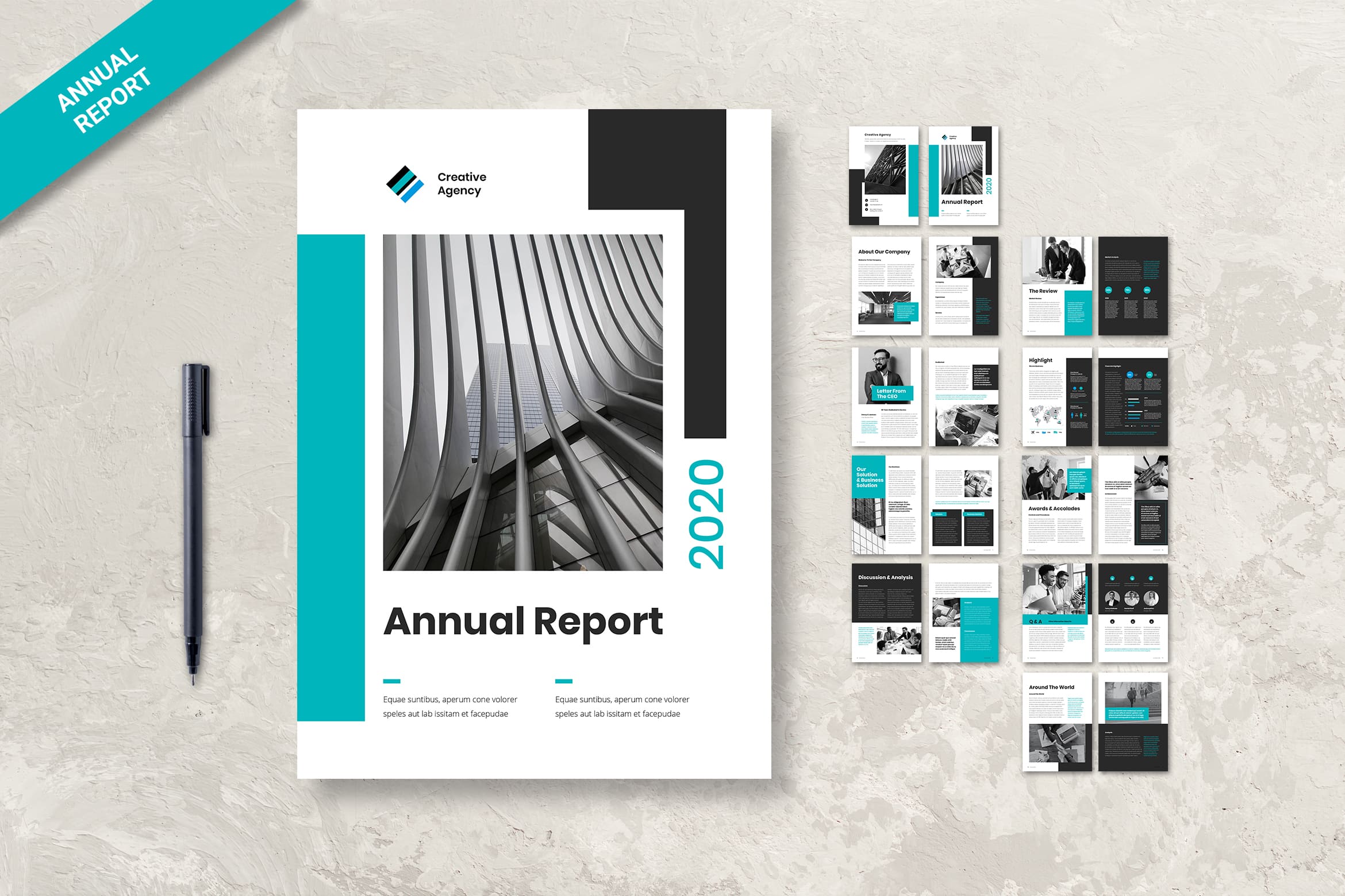
The next annual report design tips are mixed up the elements in it. You do not need to fill it with too many words or too many numbers. Everyone who sees it will get stressed and overheat. Therefore, change it into a graphic, tab, or diagram. Anything which makes it easy to read and understand to read the report. The good point is, you could get it from our design template.
Also Read : 20 Best Annual Report Templates
3. Insert Emotion
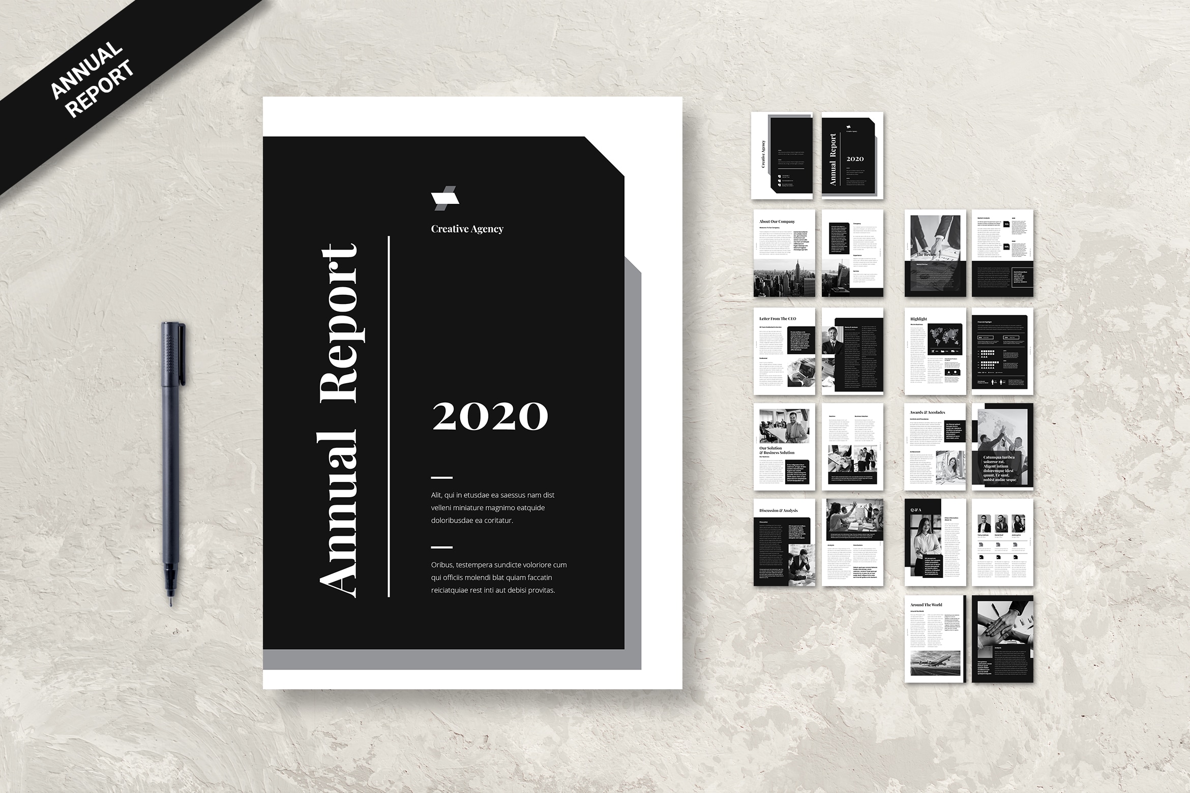
Give the explanation on every image in it or graphic. The conclusion also needs to be inserted there. The annual report template from us is already gives you a form to fill it with the story of your business in a year. Something important should not be missed to write.
4. Infographic
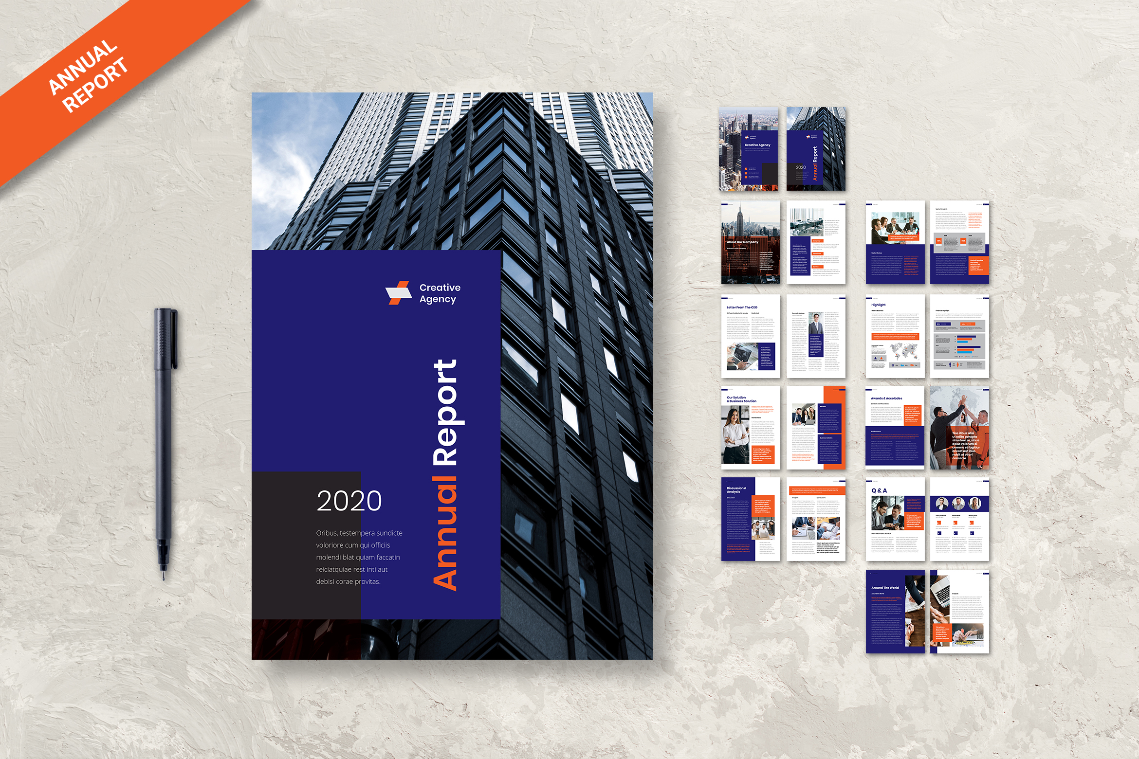
Information is important, but do not skip it with an only image. You need to insert eye-catching and attractive color graphics. Therefore, try to search the website that provides free tab, graphic, and similar content to help you and readers reading the annual report. If you could make a conclusion at the last of the year, you may only make some graphics there and present the conclusion.
5. Scalable
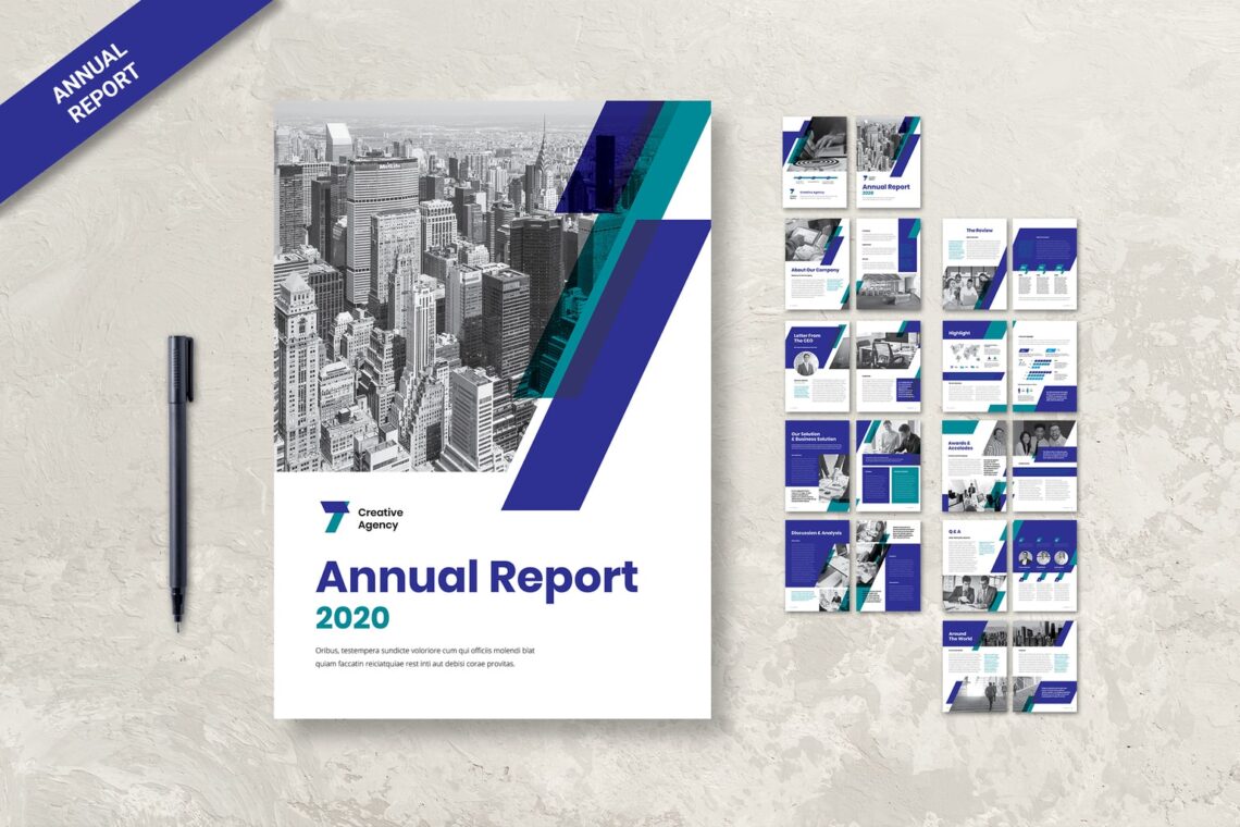
It is better to make it scalable for every three months or every six months. Therefore, you do not have to get dizzy on reading the conclusion. Mark some important words there and let readers quickly read it. It means the more efficient you made it, the higher prospect you will get in the future for long investment.
6. Replicable
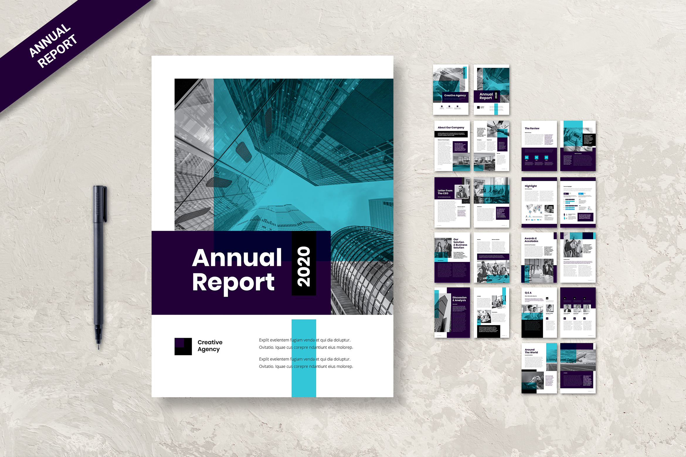
On the first page, if you have to fill vision and mission of the company, it will be great. If it is same for year by year, copy the data. Use the old data. Prepare everything with data. It helps you to look professional. Look at the reports that your managers and executives use regularly. What other performance data are you already tracking, and can it be used in the report?
7. Do the ProofReading
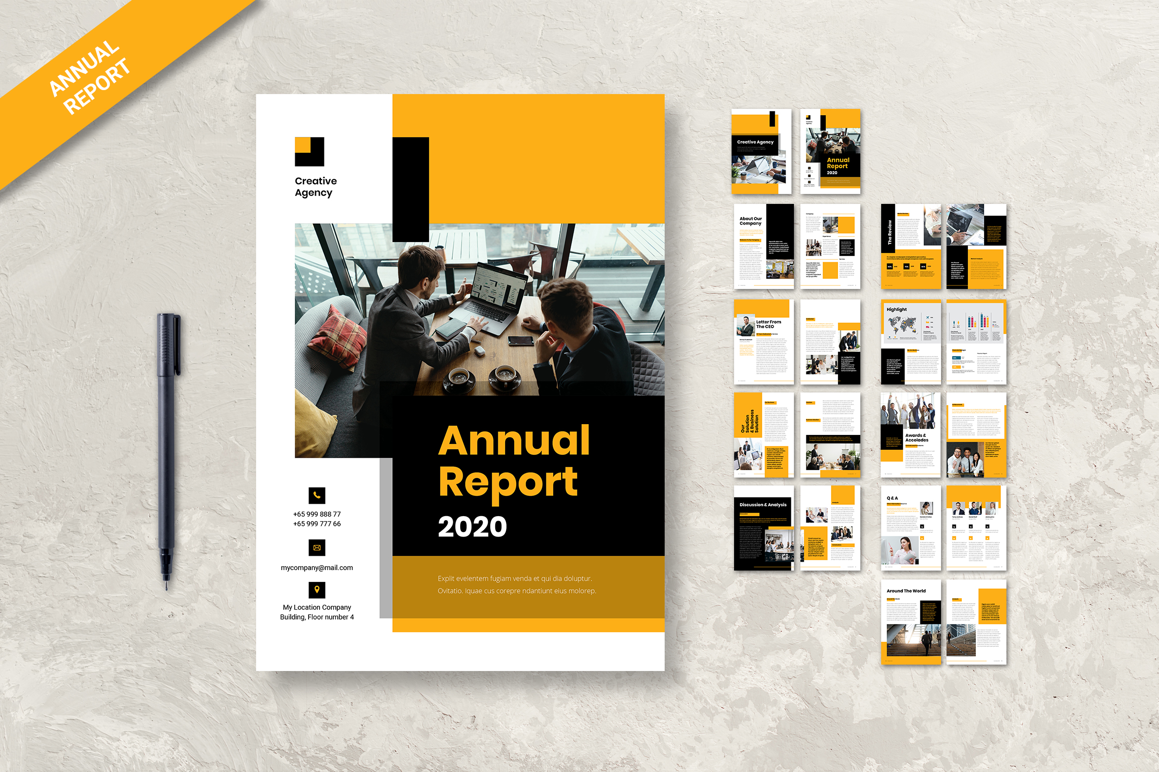
Making a professional, elegant, readable, and well-organized annual report is not easy. An Annual Report serves as a transparent accounting. It is filled with what you’ve accomplished over the past year. It is also a marketing piece. A great Annual Report can attract new donors, renewed donations from your base, and non-monetary support. Double-check each page or two-page by doing proofreading.
8. Use a Consistent Color Scheme and Style.
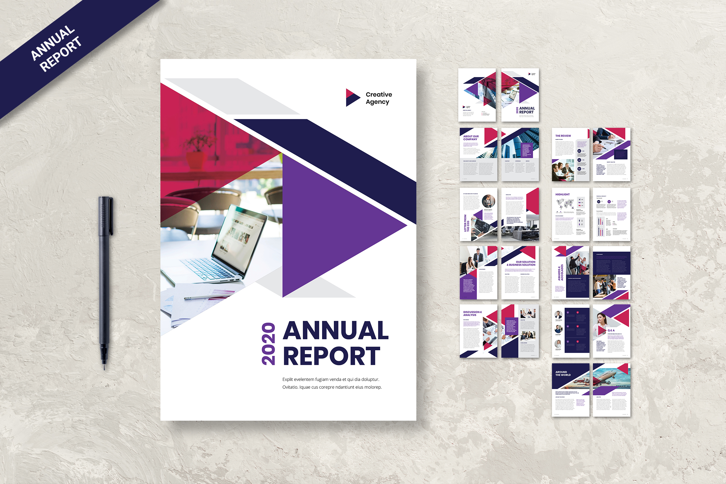
It is not like you make a diary that you could easily put any color based on your mood. You should make the same style and format for the whole page in a report. At least the reader can read and notice the icon. Although your report may be largely reflective of past events, you can also take the time to look ahead to your goals and dreams here. It is pretty simple!
9. Present Only The Professional and Formal Content
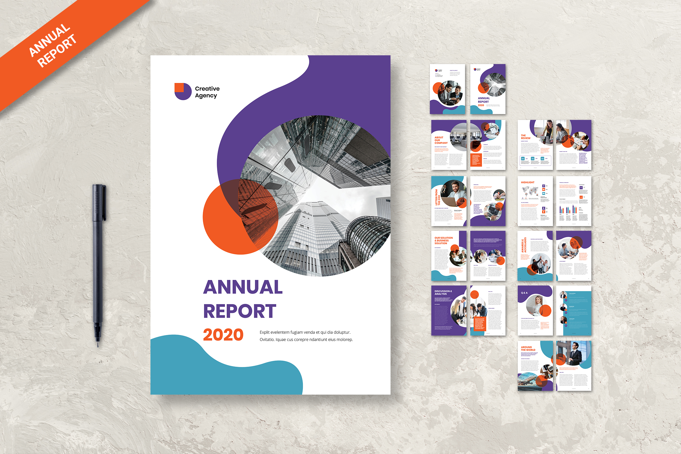
A good annual report addresses all stakeholders and presents precise information in informative and interesting ways. Therefore, you cannot use acronyms and jargon. Make sure you use the right spelling and grammar. Skip telling the long story on it. It is your turn to write only the points and main content to share.
10. Skip Inconsistently
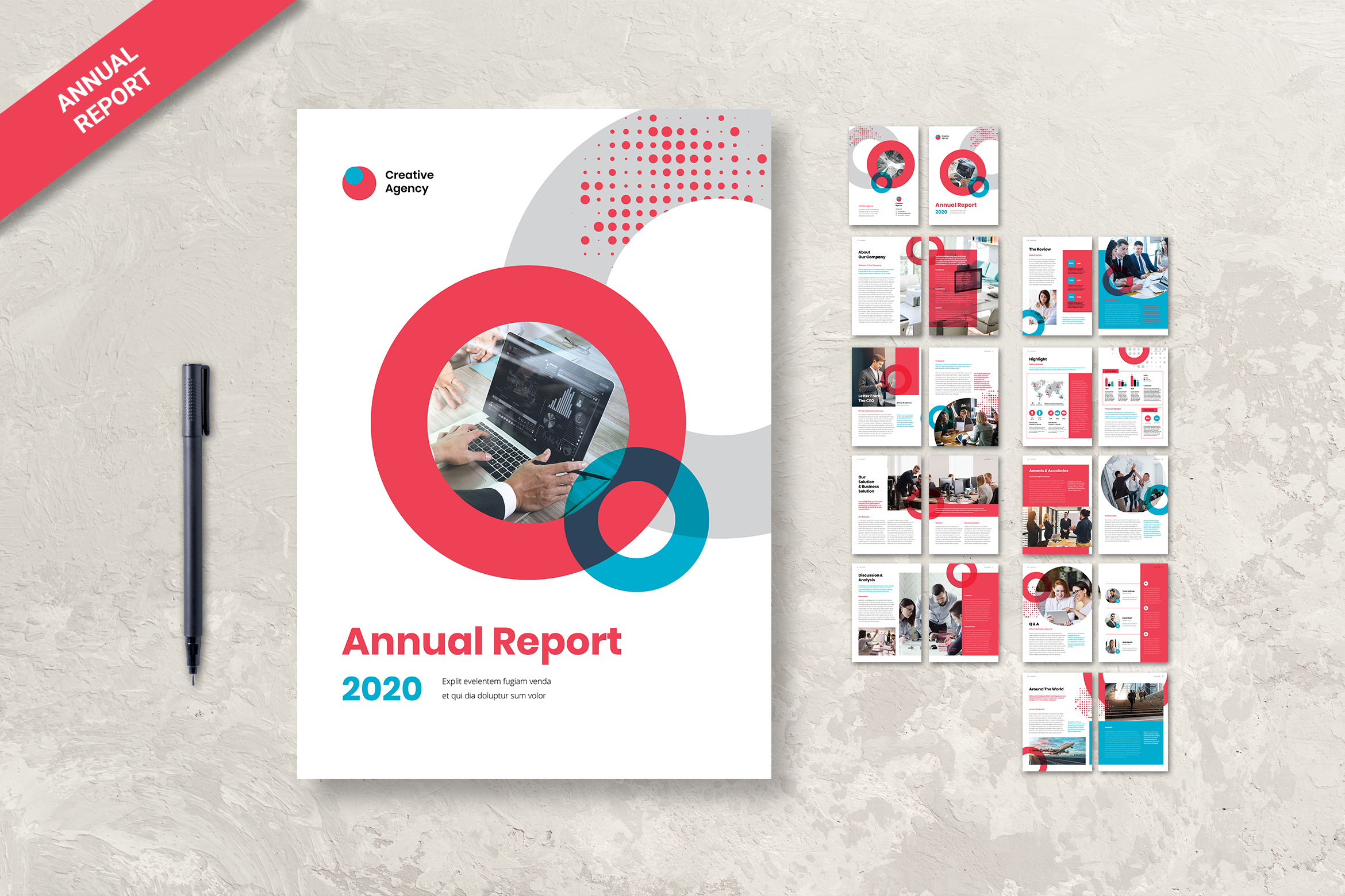
Do not let too much emotion there. Readers avoid the consequences of this disconnect. They grow tired of the inconsistencies and instead of reading on, they flick through the pages to check they’re not missing vital information then close the report. You cannot fill three pages only to explain a thing.
11. Keep Transparency
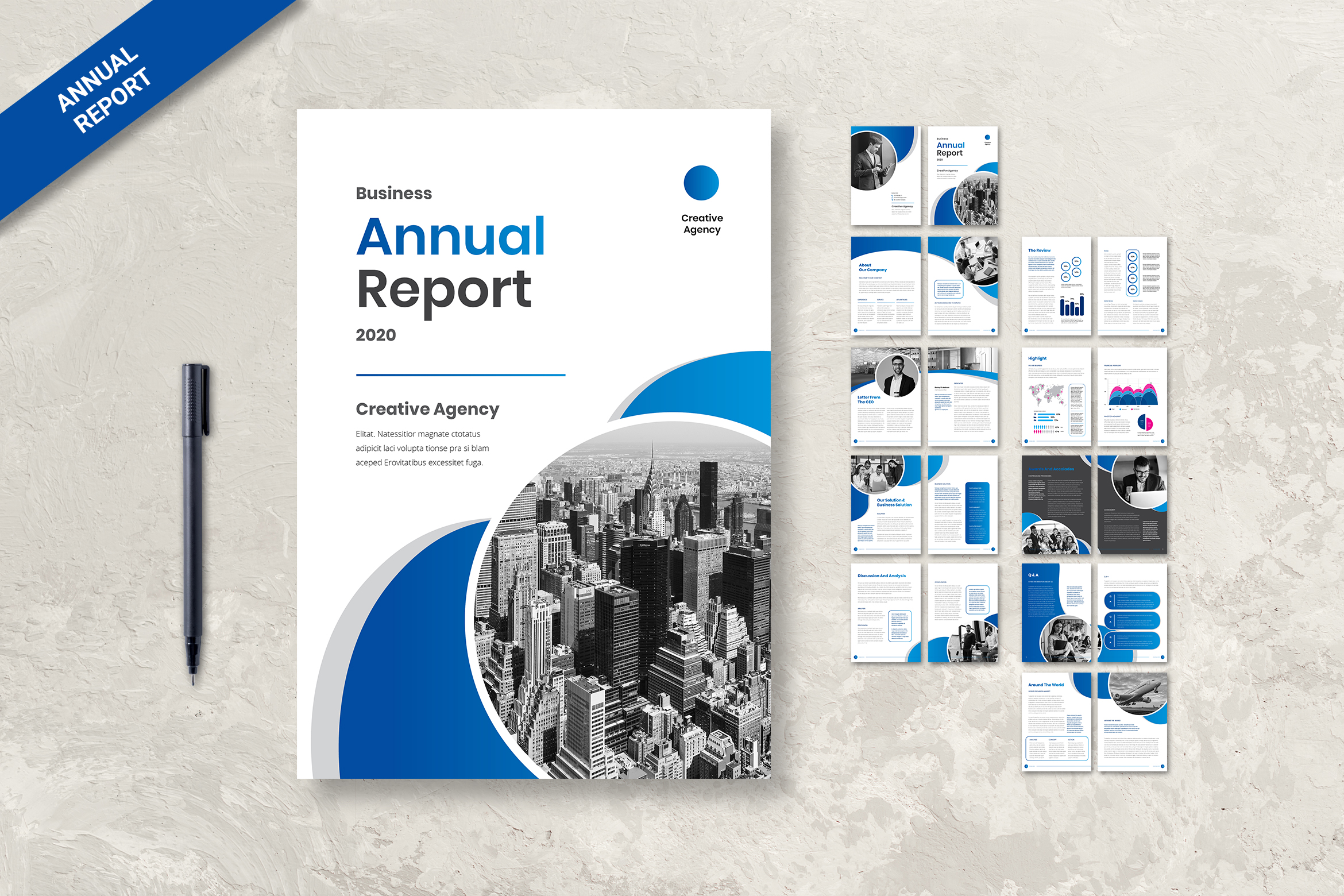
If your company’s performance has been poor, or there’s been an unfortunate work accident, be upfront and address it. A good writer, together with a good editor, is great support here. Everyone wants to have a great company achievement, but you cannot hide the poor and weaknesses of your company. Be transparent about what you have written there.
12. Evaluate the Design Again and Again
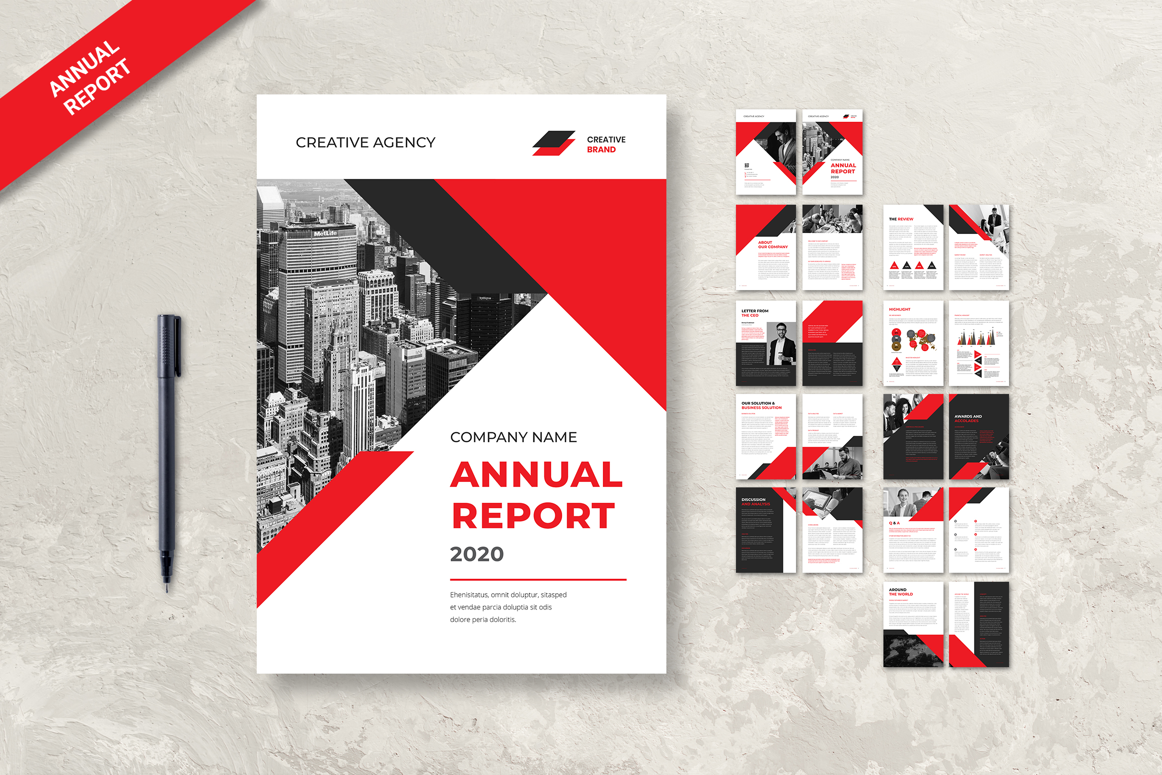
You may use the instant annual report design, but make sure it is suited for your company’s main color. In the logo and brand, usually, there is the main color to perform. The layout, the size, the color, and everything need to evaluate. Maybe they should be adjusted or they need to resize. It is your turn to make it perfect and ideal.
13. Accountant is Your Source
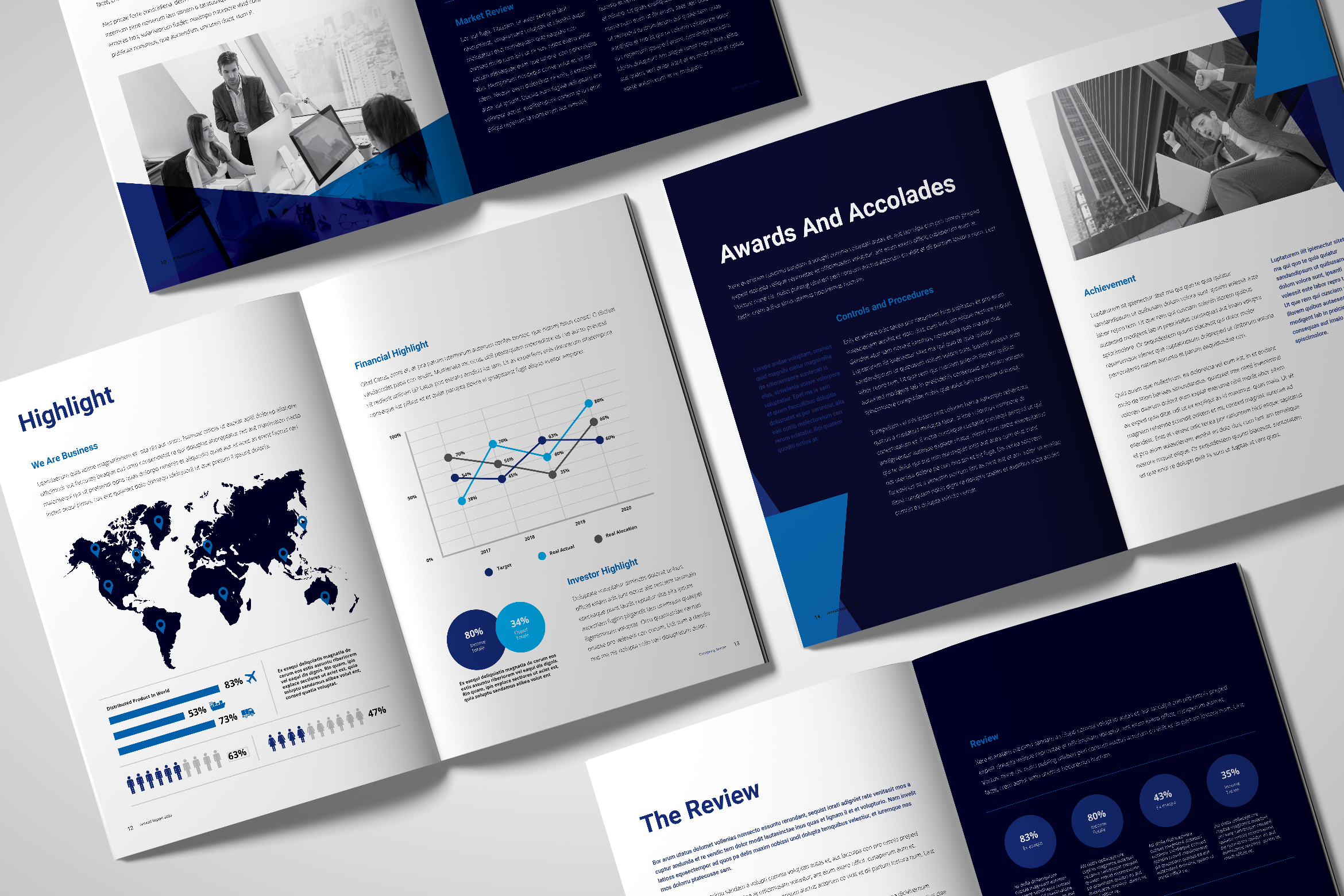
Make sure you get the financial data from an accountant. She or he might directly insert the financial data into your annual report, or you copy it from him or her. However, do not manually input it because it could be a mistake to see.
14. Avoid Error
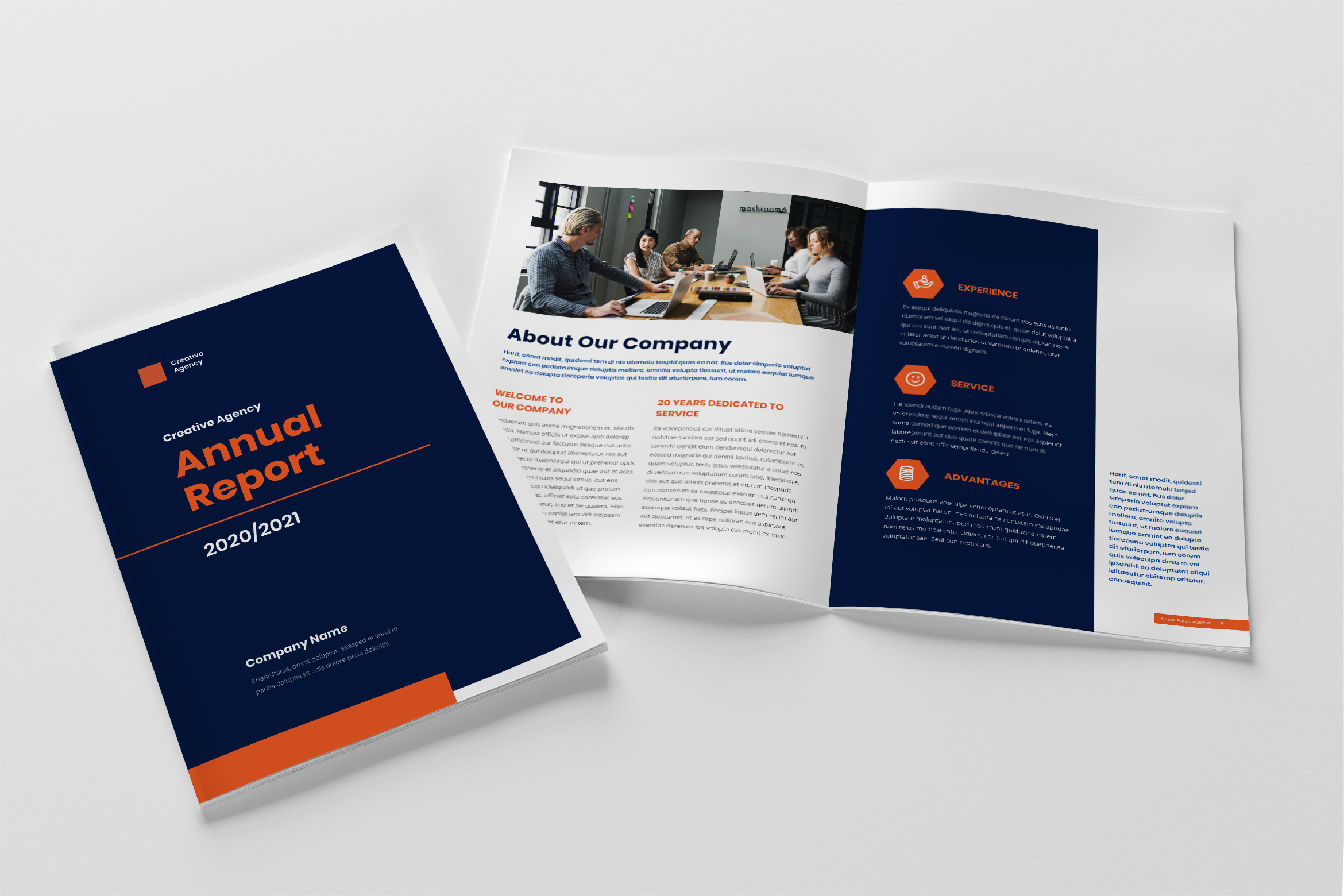
More than a thousand copies were printed with the wrong date on the spine. It is because you had not updated the template from the previous year. Spine errors are one of the commonest mistakes in publishing, and the consequences are always embarrassing and expensive. This is why you should become a professional editor too. you need to checklists that cover every aspect of the publishing process.
15. Insert Company Profile
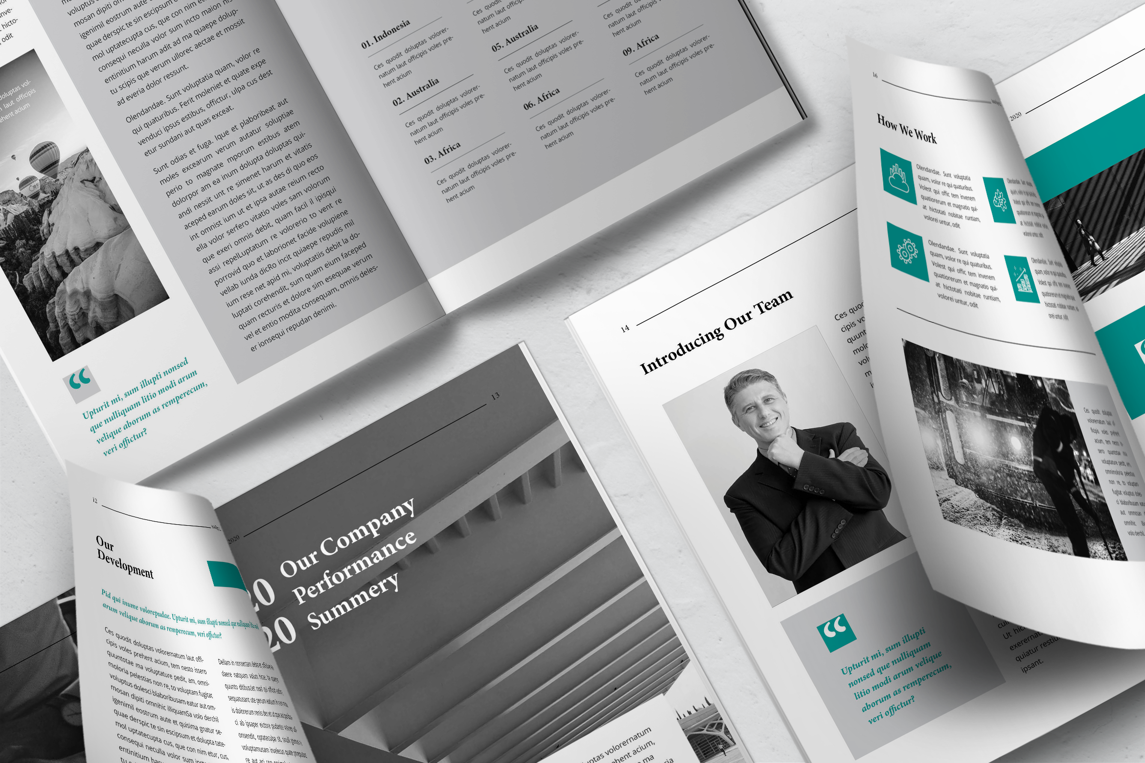
You cannot skip it out. For company profile business template design, you can see it in this article. Your vision and annual report mission statement, details about your directors, corporate offices and branches, products and services that represent the main source of your income, competitor profile ( if it is necessary), industry risks, and investor profile.
16. Business Overview
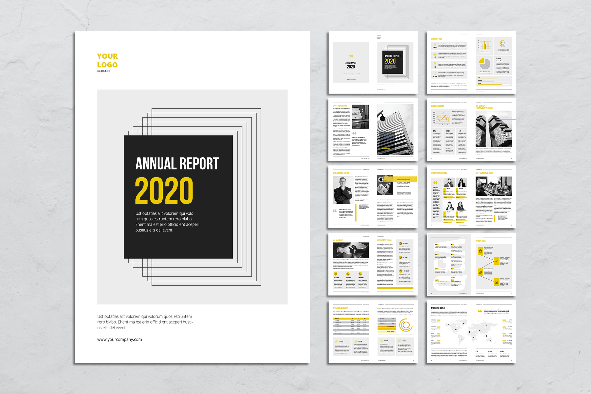
Do not skip to provide your shareholders and investors with necessary financial information. It shows how your company is doing. It includes your sales numbers, overall income or profit, and your profit margins. This part can also include mentions of new services or products you have launched. It changes in the industry or marketing trends. The investor should know how your company notices him. Therefore, try to collect as much information as you can, but resume it.
17. Practical Financial Information
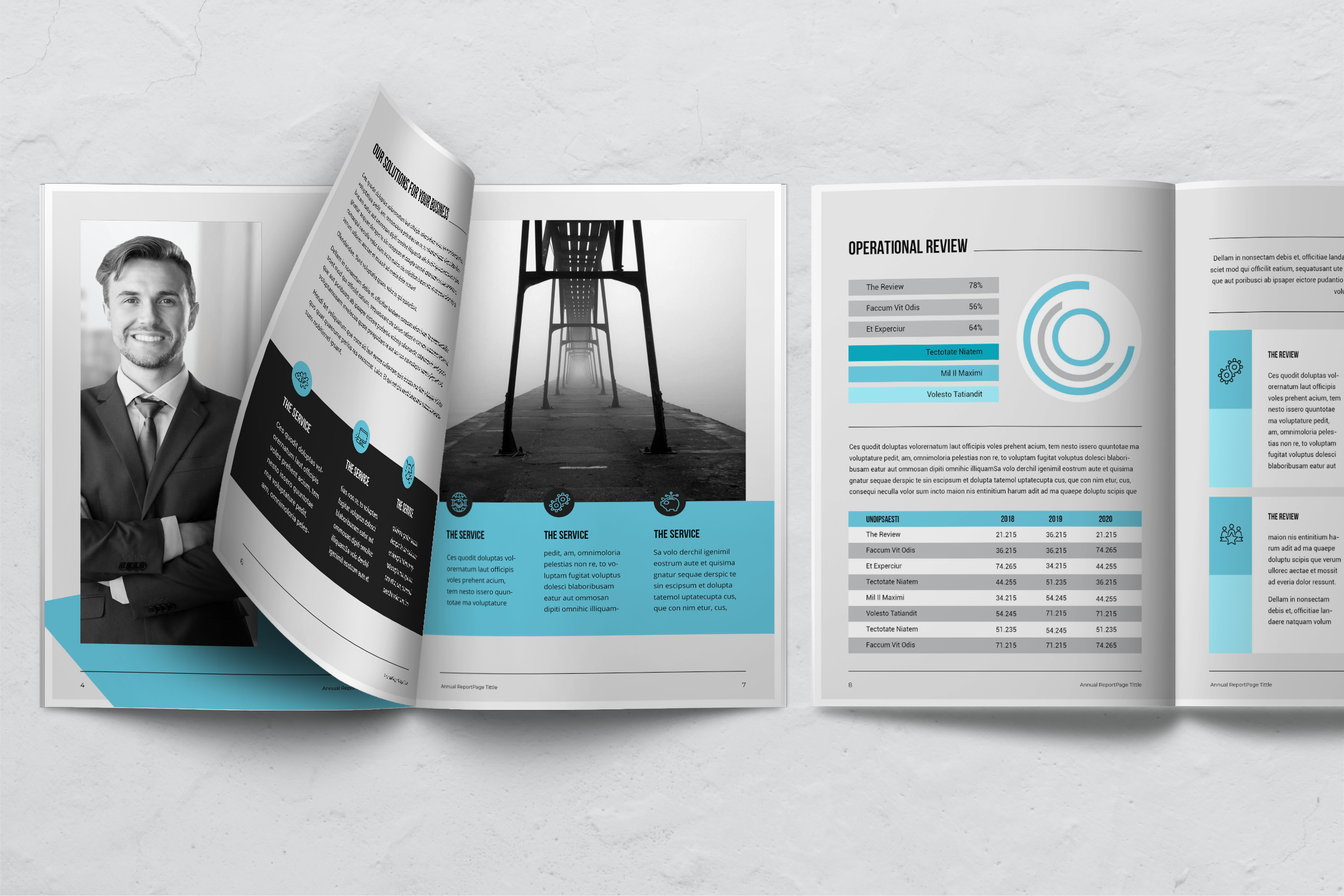
This part is the most important part of your annual report. It makes it easy for your shareholders, investors, customers, and employees to see how well your company is. It includes performance in the past. In addition, how profitable you are, and how you plan to scale the profits in the future also should be described.
You need to include the following statements: company balance sheet and cash flow statement, company income statement, financial statement for your shareholders, the market price of your company shares, and the dividends that need to be paid out. You can also include information or comments by auditors, accounting policies, and other income and expenses.
18. Insert Photo
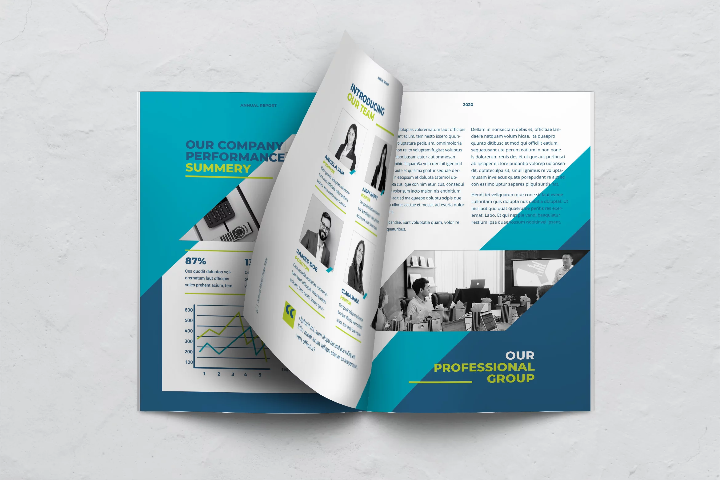
Human loves something visual. Picture or photo helps them to get the real fact about the report. If it is necessary, insert photos more than letters. It is a refreshment of yourself. The investor also would notice everything well and not make a sleepy face during reading your annual book.
19. Pay On the Cover of The Book
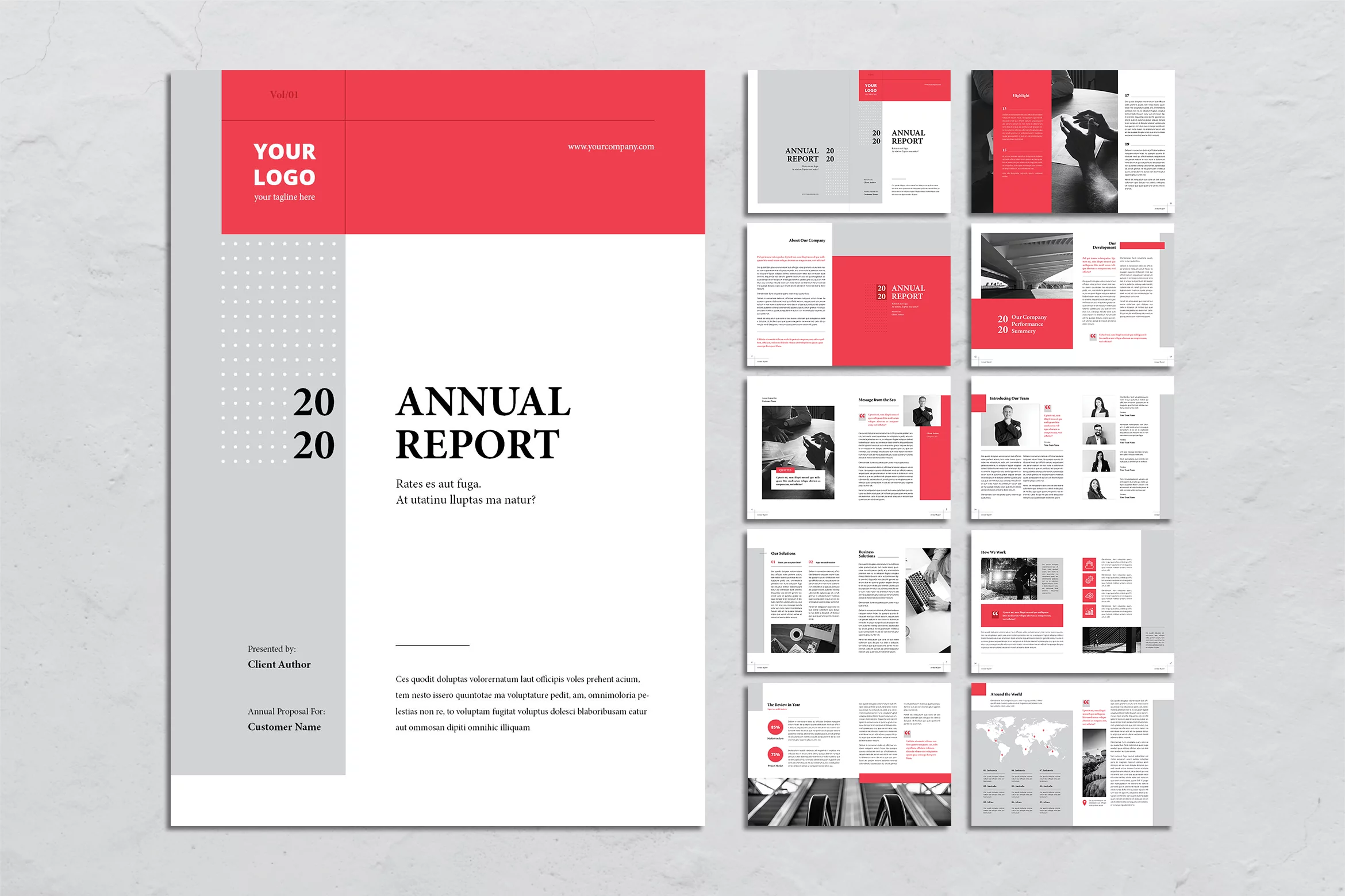
If you already bought the instant template design, you do not need to hire a professional designer to change and edit or make the new design. Select the attractive design and take your time to browse more from UI Creative.
20. Use More Than a Font

It is better for you to collaborate with more than one font. For example for the title, choose the straight and serif style. The content needs a formal font style. Grab it. It is good to have formal colors too. Another tip when it comes to fonts and text is to make use of bold and italic text to make important information stand out more. This will also make your annual report easy to read. You can also make use of colors and use one of your brand colors for headings, quotes, or any important key that draws the eye towards certain parts of the page.
Writing and designing a great annual report may seem exhausting. However, once you know what’s involved in the process, you can knock it out of the park in no time. those are the tips from UI Creative. You could start to try and cut the time. Select an annual report design that suits your company style, purchase, and the file is yours. Even to use it again for the next year, it sounds good. You just have to edit its layout, color, and font. Are you ready to use our design?


