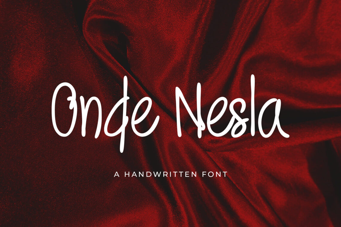
Top 15 Sans Serif Fonts to Use on Your Resume will be your choices to make a formal resume. Attract the business owner to recruit you by making a sophisticated resume. Here is the font you may choose:
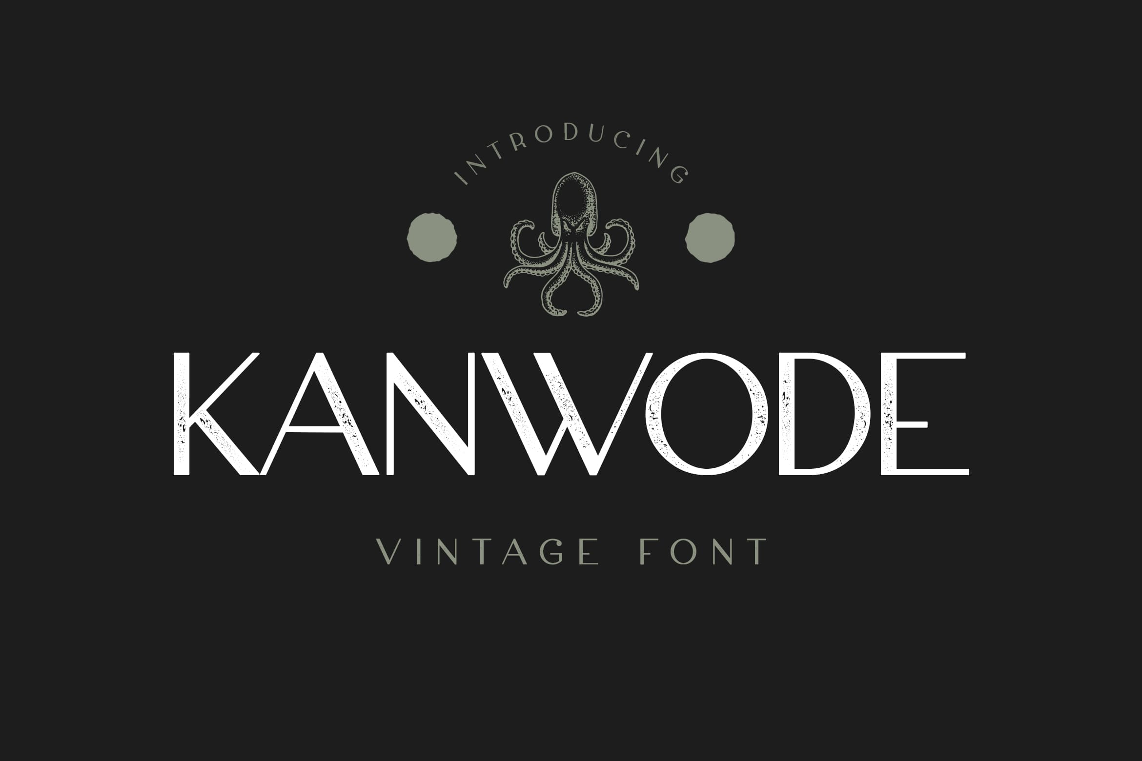
1. Kanwode Sans Serif Font
Drafting your resume starts with a good choice of font. Recruiters typically scan resumes in seconds. It means you have a limited chance to catch their attention and impress them. Putting effort and consideration into your font choice can help you demonstrate your professionalism and attention. With a resume, there is a way to detail and express your personality and uniqueness at the same time.
Sans Serif font is used for advertisements, titles, presentations, and brands. However, lots of modern styles of it are available now. It has geometrical touch, curved shape, and sharp edges that make it more clear than before. The proportional design makes everyone could read it well. Without too much ink to print, it keeps great to concern as your proposal font or annual report.
The attractive font comes from Kanwode. This one is a simple font that has a clean, classic, and more professional look. Kanwode is also easier to read. It is enabling recruiters to read and focus on the content of your resume should be your number one priority. Complex fonts that are hard to read can already put off recruiters who will only put your resume.
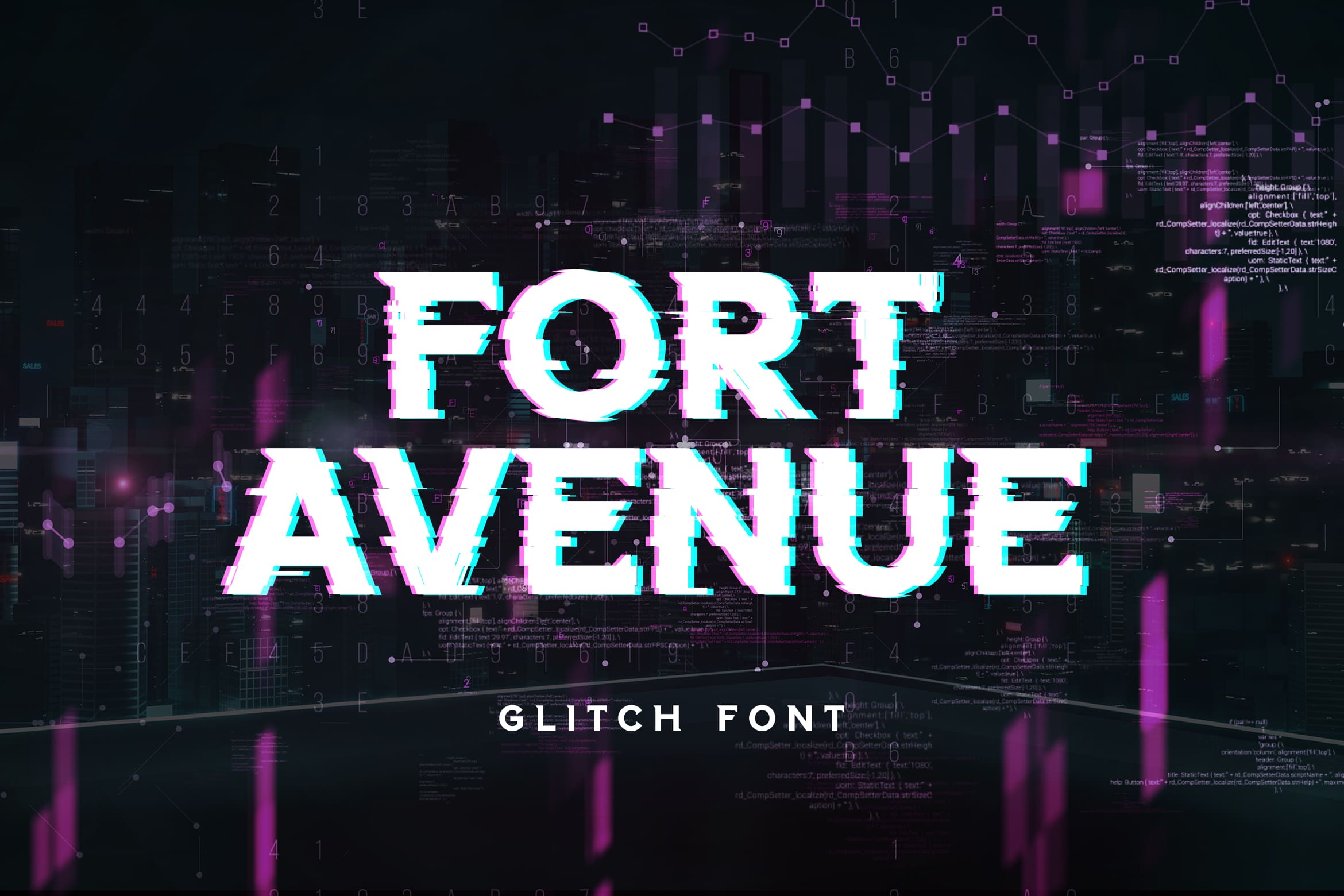
2. Fort Avenue
The optimal resume font size is from 10 to 12 points. It is ideal to keep your resume to only one or two pages, so you can try starting with a size 10 font. See how your font size will impact your resume layout. If it is not readable enough, size it up if you have more space but never go down below 10 points just to keep your resume within 2 pages.
Unique and attractive are two words to explain Fort Avenue. You may use it for cinema and posters. However, it is better to make it a video content title because its light of gold could shine every time. Created to make a huge statement, it even comes in unique styles and textures to offer a vintage feel to any work.
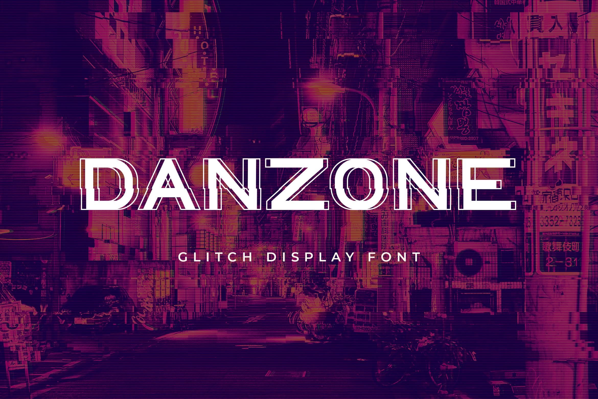
3. Danzone
You can add special details to your resume, but in Danzone type, you don’t need to while still keeping it uniform. Try using a different font and a bigger font size for your name and section headings. On the other hand, emphasizing certain text by bolding, underlining, or italicizing. Remember to be consistent with the style and keep it up to only two fonts as multiple fonts can distract the reader.
It has a geometric shape on each side. It is giving the impression of neatness and character. Danzone is also can be used in posters, invitations, book covers, logos, or packaging of movies. It helps to gain great promotion. A special look will be in the resume.
4. Bunch Bonaire
Serif font is actually easier to read on-screen. It is more readable in print too. Therefore, before you choose a font, first take into account how recruiters will be viewing your resume. Applications are now usually submitted online, so choosing this font for your resume will be much easier on the eyes.
This font also represents the characteristics of natural paint. it is firm and thick. It has a combination of basic fonts with curves and shapes. So, if you want to have something that does not look too formal, use this. The font will look neat and clear and suitable for being displayed title. 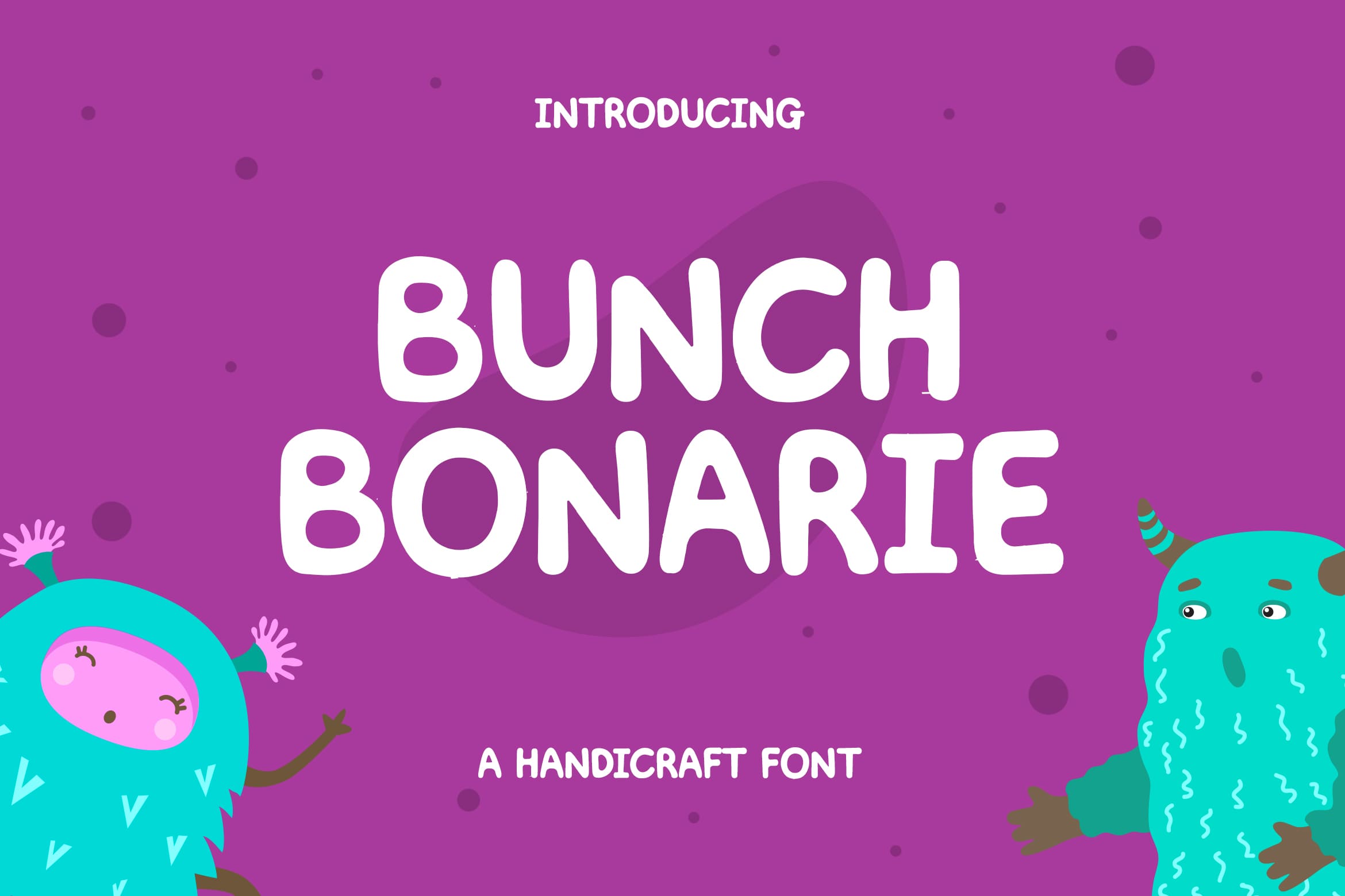
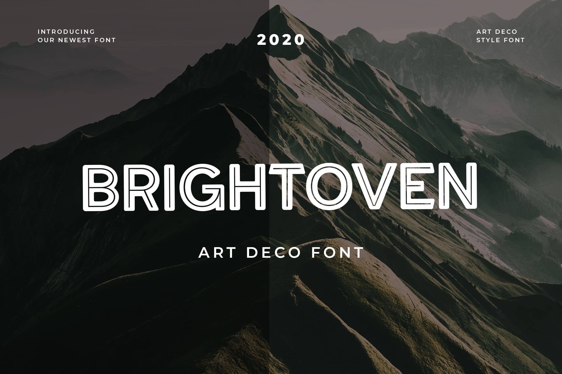
5. Brightoven Font
Looking for a good font for a resume? use this. It is an art deco-style font that has a neat and line edge. The line inside builds attractive touch and makes the initial letter of it becomes clear. It is hard performance like a paintbrush over the basic letter. In addition, it is unique. The great typography attracts people’s attention. Brightoven Font is simple and upright. It shows a formal and clean impression. This attractive and premium font is perfect for your resume since it is clear enough.
You may think it has a sleek typeface which is perfect if you want to portray yourself as more on the logical and analytical side of things. On the other hand, it is better than having something creative and artistic. Sharp lines and edges depict strength, dominance, and precision
You will benefit more from choosing this stylish font as your resume because it represents your work and skills as a creative. If you’re in a creative field like advertising or graphic design, you may have this just to show who you are. However, keep in mind that your resume is still a formal document that needs to be clear and easy enough to read.
6. Headway
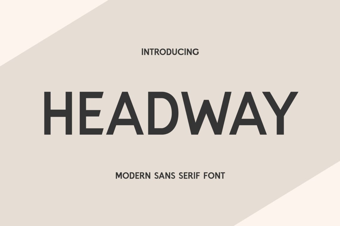
Rounded shapes tend to look softer and more approachable, so if you want a simple sans-serif font that looks neat and professional without looking too formal, then Givonic’s rounded strokes can help you achieve it. It easily blends with other typefaces and comes in different weights ranging from thin to extra bold so you can use it on both your headings and body text.
This font is a natural pen style and there are elements of the modern painting style. It has a combination of brush strokes on each side of the font and horizontal splinters. Both of them make this font look stylish, unique, and striking. It is suitable for various design projects that want to take a modern and stylized theme. You also could play around with size and see the difference. Even if it has various typefaces, it is good for resumes too.
7. Proxon
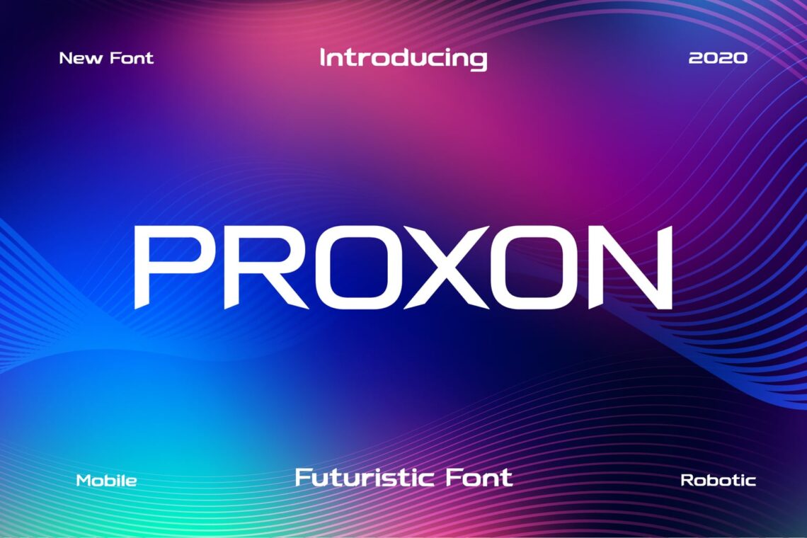
Modern and light fonts help you to get attention. You could use it to show your modern brand. Young and teenagers that are full of energy may have it. Whether you want to present an up-to-date project, comes with this font as a title. The curves on each edge are like a pen touch on a bigger scale so just arrange its size. It is aesthetic for any technology projects and items. The blend of colors implements modern touch. It is the most popular font today.
8. Signcore Texture
Being old in a style is unique. This high-resolution font reflects vintage style. They have a clean, minimalist, and dynamic look. Technology brands specifically opt for this kind of font to promote a more human look and it means this font does that. The abstract touch like a brush eraser completes its appearance into something casual. It is ancient and curved, making it becomes the suit font in semi-formal and formal events. You will see its vintage style and apply it to your resume just to refresh the job owner with something different.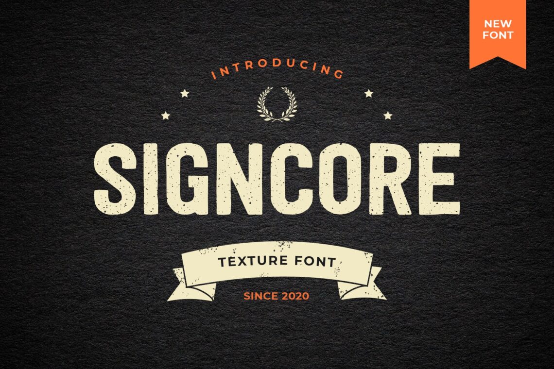
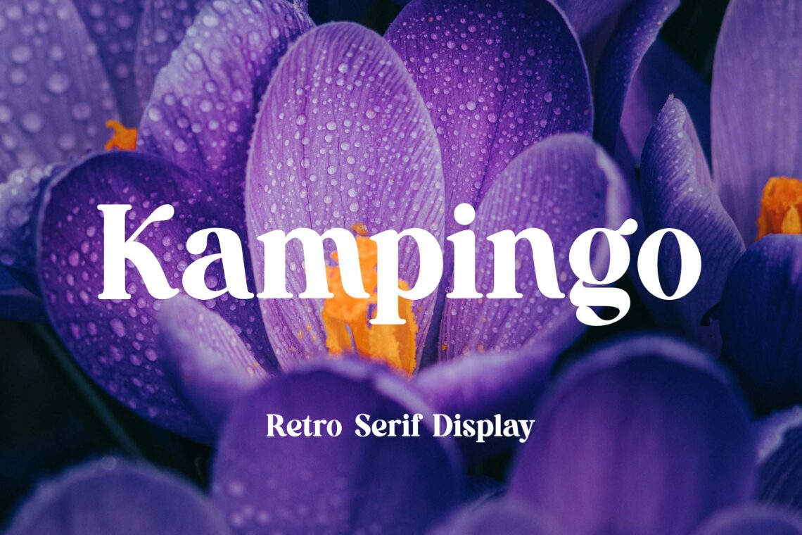
9. Camptown
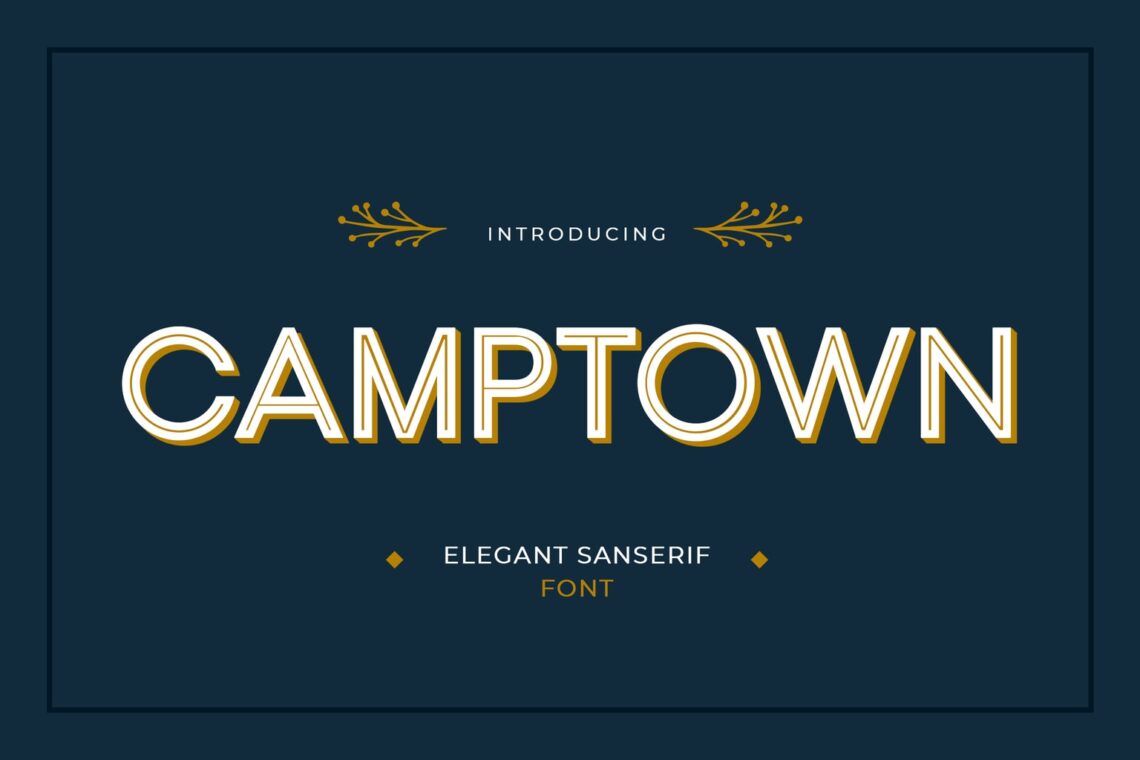
Camptown has a geometric style in each component. This font contains an attractive design. It suits to be used in your job application title and body. Making a resume never be this fun.
It has a combination of letters that are simple and upright. The style is giving a strong and formal impression, sure it is good for a resume. This attractive and premium font is perfect for a variety of brands and projects that require clear and classy font types
It has a bit contemporary style. The bold and handmade style makes it such a perfect combo for a resume. Remember to not use more than three fonts in your resume.
10. Broken Mirror
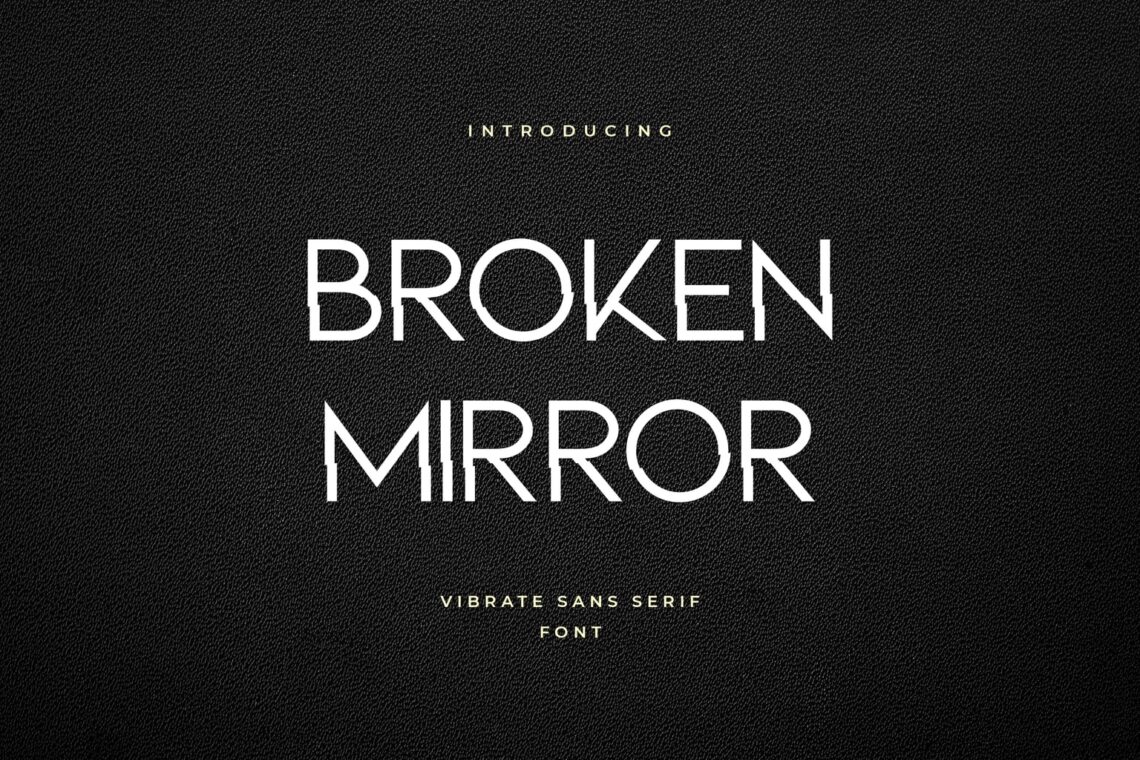
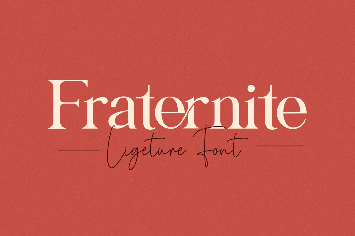
Broken Mirror is a two-dimensional style of font. It shows the reflection of each to influence readers. It is applied on its uppercase, lowercase, numbers, and punctuation. This is the way how you put it, in edge, in the professional layout, or in the top of paper size. The bigger size of the first letter of the word has a great style. It looks like a handwriting font and is package in exclusive ink.
Sometimes at a glance, we see the classic and stylized typeface. With its curved tails and varying stroke widths that almost make it look like it’s handwritten, Broken Mirror is a unique and eye-catching font that can add a touch of elegance and creativity to your resume.
11. Anteroly
Anteroly Modern Sans Serif is a clean and simple sans serif. This is your new go-to font as it is an extremely versatile font. It can be paired seamlessly with other font styles. Iconic geometric san that has enough style and personality without being too loud is adaptable here.
12. Godshine Sans
Godshine Sans has great readability and a clean and modern look. It comes in 12 different variations and each has a distinct design when you write in bold, italic, or all caps, it will look like it’s an entirely new font. Going to use it in your resume? You are welcome!
13. Golden Wings
This smooth and neat professional font offers a modern and minimalist alternative to other fonts to keep your resume from looking too boring or conventional. It is fresh in appearance and readable.
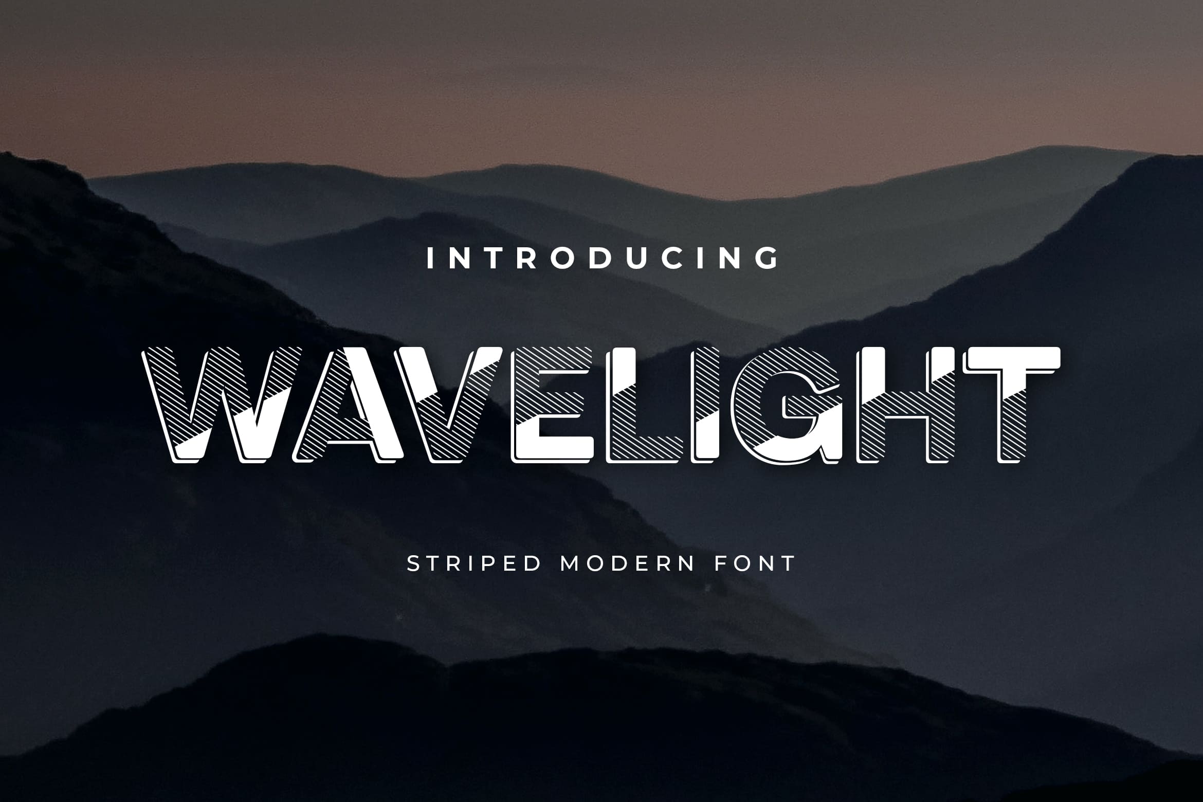
14. Wavelight
Add flair to your resume with this font that combines sharp corners and soft. From body text to big headlines to classic and bold looks, it is great to make a big attention.
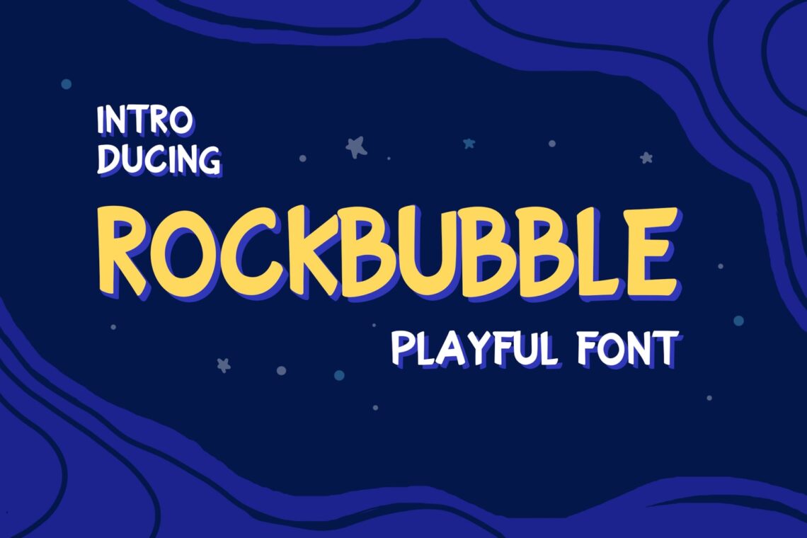
15. Rockbubble Display
Having a high contrast between thick and thin strokes creates an elegant and warm typeface that will look great on any resume. This serif also contributes to its increased readability.
Let UI Creative helps you to choose the right Sans Serif font. Everything related to the font is affordable. Therefore, you could try to select one and easily change to another one without worrying about cost more. You are a decision-maker.


