Design Tips to Create Attention-Grabbing Websites That Keep Users Hooked
in Inspiration on September 26, 2025The digital world out there is constantly pulling people’s attention in a million different directions. The moment they open their eyes, they are hit with a flood of notifications, headlines, and videos all competing for their focus. It’s exhilarating and overwhelming all at once. While the human attention span isn’t as short as that of a goldfish, research suggests that the average attention span may be decreasing. Over the last two decades, the average time a person can focus on one thing has dropped from around 2.5 minutes to just 45 seconds.
As a website owner, that number might ring alarm bells for you. That is because you don’t have long to capture interest, communicate your message, and encourage visitors to stick around. But you’re not powerless. A few smart design choices can keep visitors hooked long enough to explore what you offer. Read on to learn tips that can make your website not just eye-catching, but also engaging enough to hold even the shortest of attention spans.
#1 Cluttered Layouts are a Big No-No
A crowded, confusing website is a direct cause of a high cognitive load. For a user with a short attention span, it can be an instant deterrent. Too many buttons, flashing banners, or crowded text blocks overwhelm the brain. Instead of exploring, users feel stressed and bounce off the page. The best way to fix this is to follow the principle of less is more. Try adding more white space to your design. The strategic use of white space directly improves a website’s readability and scannability, which are crucial for a user who is in a hurry. It separates different pieces of information, allowing the user’s eyes to rest and preventing fatigue.
Also, stick to a simple navigation menu. Visitors should not have to hunt for what they need. If they need to dig through dropdowns to find what they want, you’ll lose them. Don’t forget the content. To prevent users from ignoring your content, avoid long, dense paragraphs. They create a wall of text that can be a visual barrier. Visitors often scan content rather than reading every word, so break down information into bite-sized pieces.
#2 Design for Mobile First
Do you know that the U.S. had 331.1 million internet users in January 2024? Nearly all of them, 96.3%, access the internet with a mobile phone. This means your website is much more likely to be seen on a small screen than on a desktop computer. That makes a mobile-first approach more important than ever.Designing for mobile first means starting with the smallest screens and focusing only on what matters most. This naturally leads to cleaner layouts, faster loading times, and a better experience for everyone.
Text should be easy to read without pinching or zooming, buttons need to be thumb-friendly, and visuals must resize smoothly without slowing things down.Creating a mobile-first site manually can be time-intensive, however. Mistakes are also easy to make. Overlook one detail, like image compression, and the experience suffers.Why go through the hassle when you can use an AI-powered website builder to relaunch your site? Hocoos explains that these tools use artificial intelligence to generate web designs based on the parameters you set. They can automatically optimize your design for mobile, test across devices, and help you relaunch a polished site much faster, with fewer errors.
#3 Make Your Headlines Pop
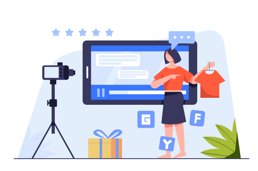
In a world where users are scanning rather than reading, a headline is a website’s single most important opportunity to grab attention. For around 40.2% of people, headlines have a strong influence on their decision to explore the content. Skip the clever wordplay and inside jokes that only make sense to people who already know your business. Instead, focus on clarity and immediate value. Avoid confusing jargon or mysterious phrases.
Some of the most effective headlines are benefit-driven. That is, they tell people how your product or service will help them.Want to spark curiosity? Try phrasing your headline as a question. It naturally pulls readers in because it speaks directly to their experience.Size matters when it comes to headlines. Make headlines big enough, so people can read them easily, especially on mobile devices. Don’t just rely on size; use typography strategically. Choose fonts that match your brand personality while remaining highly readable. Think about hierarchy as well. Your main headline should be the biggest, followed by a slightly smaller sub-headline, and so on. This helps skimmers quickly grasp the main points without reading every detail.
Capturing attention online is tough, but not impossible. Follow these tips and you can make a quick and strong impression. Add in bold headlines, smart navigation, and a little interactivity, and you’ve got a recipe for a website that keeps visitors hooked. At the end of the day, it’s about creating an experience that feels effortless, enjoyable, and worth returning to. When your design respects short attention spans while still delivering value, you not only keep people engaged, but also build trust and loyalty. And that’s what turns casual visitors into lasting customers.
Recent Posts


Most Viewed